This is the first in a series about Shadows in Digital Scrapbooking.
Most software programs come with standard options for adding shadows to items. And shadows make a BIG difference. Here is a layout without and then WITH shadows: Shadows add realism and make a layout POP!
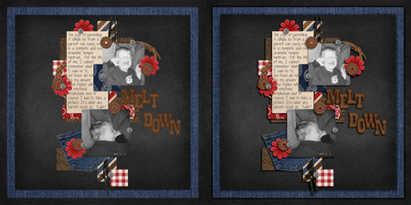
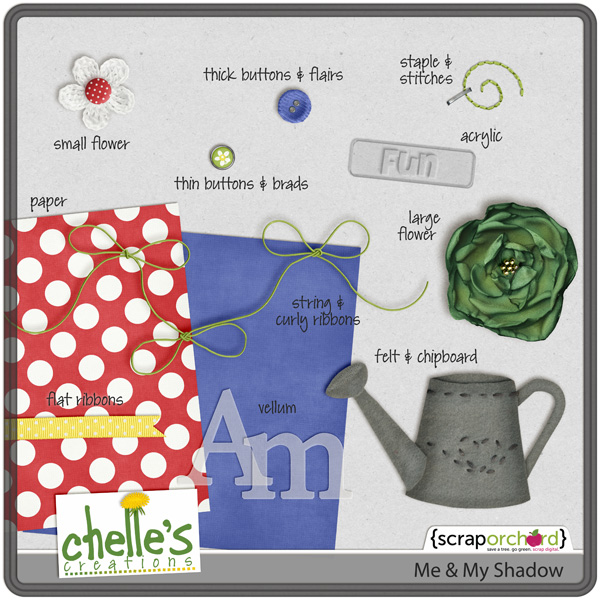
But the reality is that shadows are different. Papers have smaller shadows than flowers. Buttons have smaller shadows than strings. Vellum & acrylic have unique shadows. If you use Photoshop Elements or full Photoshop, you can use layer styles to quickly tweak your shadows so each item will have a shadow that fits with its style.
First you need a set of shadow styles. For example, Me & My Shadow:
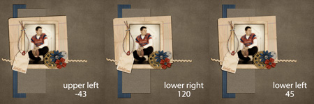
You should pick a shadow direction and stick with it. At least use the same direction on a single layout. But I use the same direction on ALL of my layouts for continuity. Here’s an example showing all three of the shadow directions in Me & My Shadow. My favorite is Upper Left.
Next you need to install the styles. That is a little complicated because the directions are different depending on which version of photoshop/elements you use & which operating system your computer uses. If you use PSCS or PSE 8 & lower, the Daily Digi has this tutorial. If you use PSE 9 or 10, I would google “install layer styles in PSE 10 Windows Vista” (but use your version & operating system) There will be plenty of tutorials for your specifics.
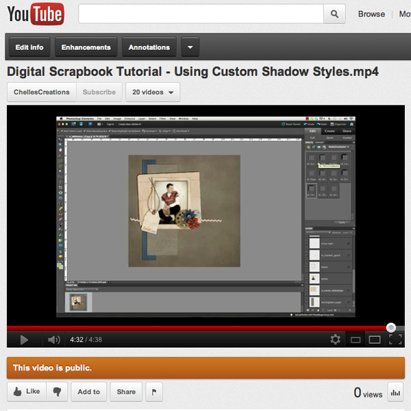
Finally you can use the styles. Here’s a quick video showing how I used the styles to shadow this layout.
Here’s some inspiration from the CT using Me & My Shadow.
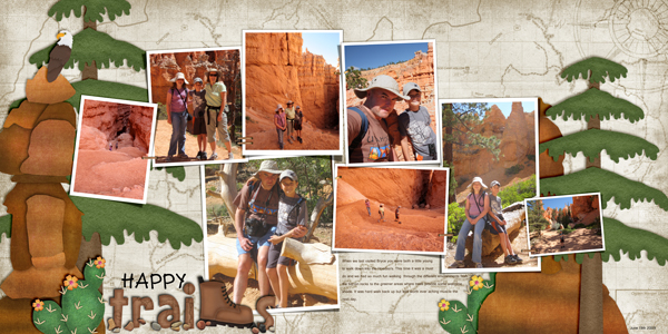
From Ronnie using On the Trail
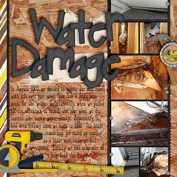
From Jenn using Under Construction
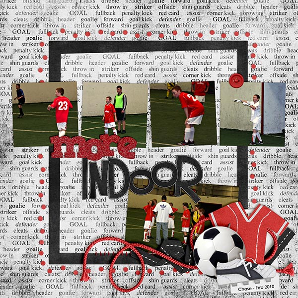
From Kayla using Kick It! and Rainbow Reds
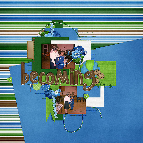
From Melissa using Girl Power




 Hi! I'm Chelle: a 40 something mom of 7. My husband & I live in a rural community in the rocky mountains with our 4 children still at home. In the winters we enjoy sledding & snuggling by the fire. I the cool fall evenings we love relaxing around the campfire & meeting friends at the county fair. Admiring the stars