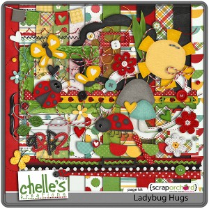
I don’t know about your house, but things have been pretty crazy around here this summer. I’m hoping that things will settle down as the kids start school this week and we get back into our school-year routines. The annual change to summer activities & schedules provides some rejuvenation, but to be honest, I could use a re-charge.
Yearly Archives: 2012
Mark My Words Playdate | Digital Scrapbooking Inspiration
Hello Friends!
Where has August gone? We’ve got some great new things and LOs to show you this week. I hope you’ve been enjoying the Q&A chats we had this last week through Creative Club Digi(CCD) & Creative Club Digi Designer Edition (CCDDE). I was able to participate in the both club chats this week. AWESOME! I learned a lot and it’s great FUN to interact with all of my NEW friends! If you haven’t joined yet, you are missing out. Join the club.
This week Chelle gave us Mark My Words and everyone went CRAZY. Definitely put it in your cart, you are going to use it so OFTEN! Sometimes you need a little something to draw attention to your story. Pencils, markers, highlighters…we’ve got it all in this HUGE 140 image set of markings. Circles, arrows, boxes, brackets, underlines…even some line sets. EVERYTHING you need to “doodle” up your story.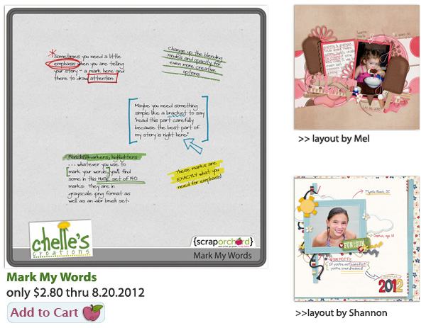
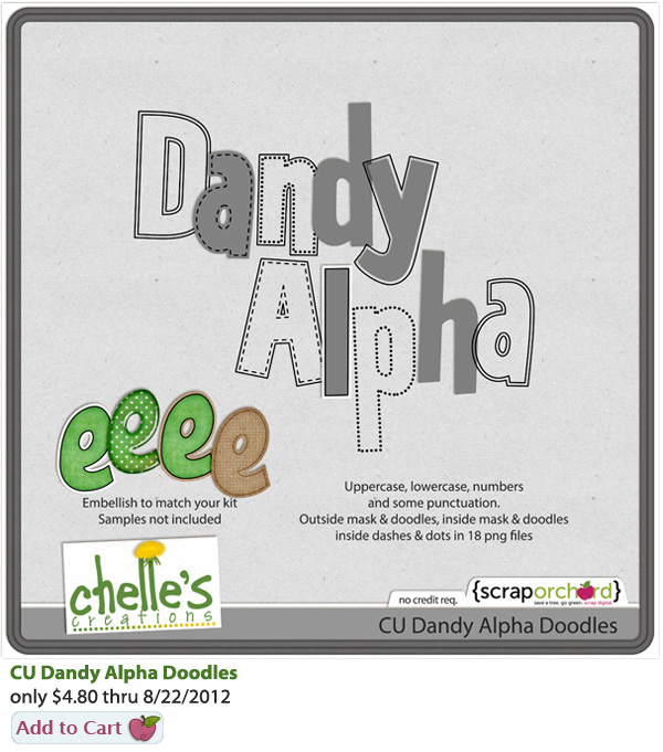
For our CU Friends, a fun new “DANDY” of an Alpha Doodle. These wide, playful, almost vintage alpha doodles in a variety of styles will make it super easy for you to create the perfect alpha for your next kit…and the next…and the next.
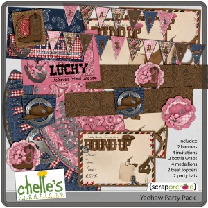
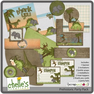
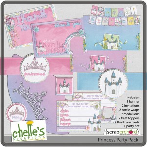
Wondering what to do for your next PARTY? Chelle’s Creative Team has come through with 3 great new Party Printables: Yeehaw, Prehistoric & Princess. Each kit contains: 1 Happy Birthday Banner, 2 invitations, 2 drink bottle wraps, 2 medallions (cupcake toppers, etc), 2 treat bag toppers, 2 thank-you cards, & 2 party hats. Print exactly the number you need. Easy to assemble.
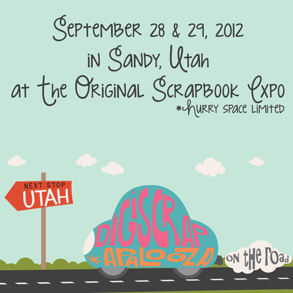
Reminder! Register for Digiscrapapolooza On The Road: Utah! Register here and get a ticket to the Original Scrapbook Expo. The fun starts September 28-29 in Sandy, Utah. Save $25 until Aug. 21st. Space is limited. Your Digiscrapapalooza [Utah 2012] Retreat Ticket Includes:
• Admission to The Original Scrapbook Expo on September 28 & 29, 2012
• Entrance to the “Digi Lounge” at The Original Scrapbook Expo [a $90 value]
• Digi Lounge Crops & Digiscrapapalooza Team Events
• 20% Discount in the Scrap Orchard Booth
The Creative Team’s layouts are WONDERFUL. Because Mark My Words can be used on any layout, the variety from the team is very inspirational. Wait ’til you see what the team has done with Chelle’s stuff. Your fingers will be itching to MOVE & CLICK. Here you go:
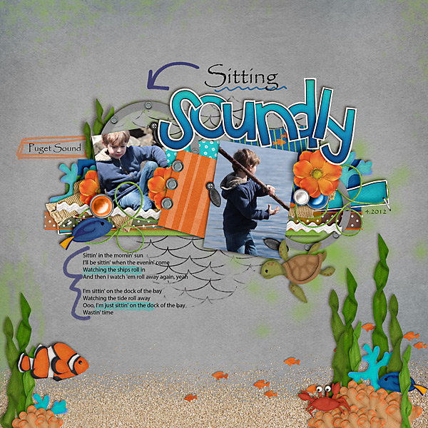 Carol used Something Fishy.
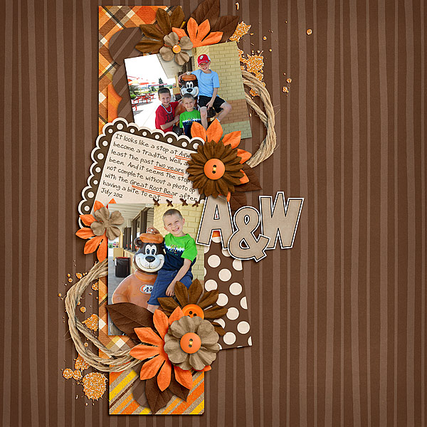 Jenn J used Rainbow Collection, Chocolate Lovers, and Midnight Crow Reloaded.
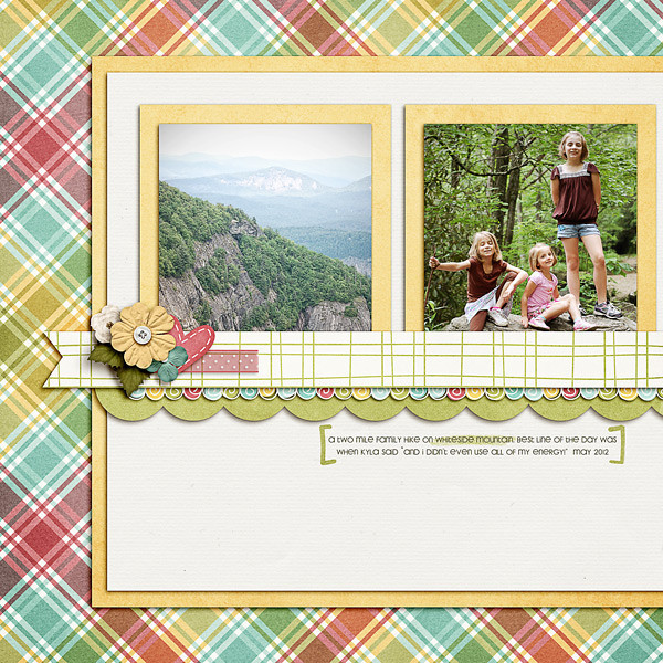
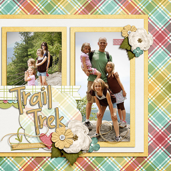 Jenn M used Oh Snap!, Traveler, & Spic n Span.
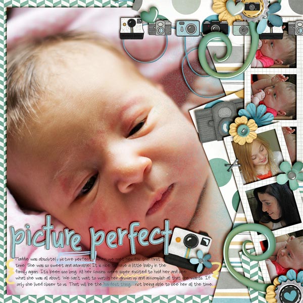 Jenn S used Oh Snap!
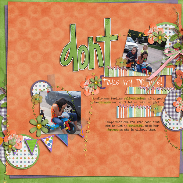 Karen used Bugcatcher & Celebrate
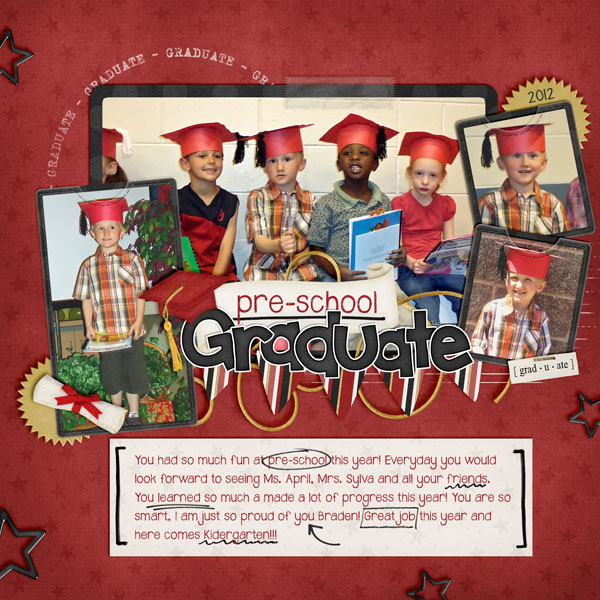 Kassie used Graduation.
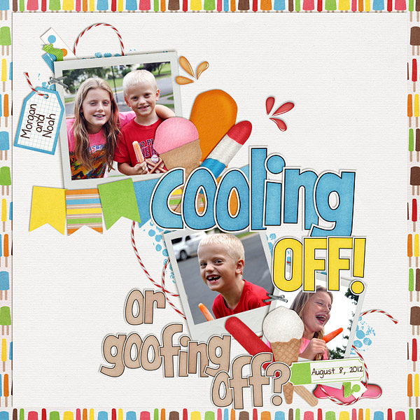
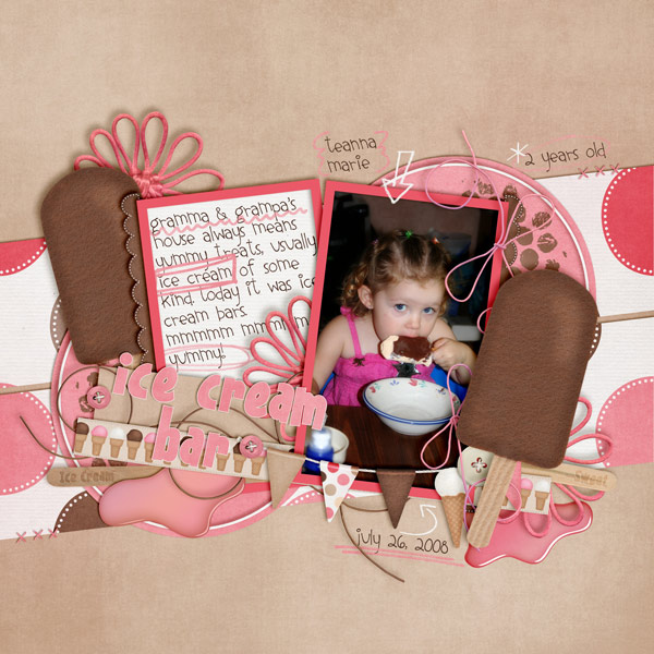 Mel used Beat The Heat.
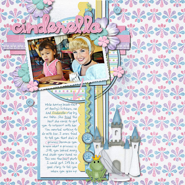 Ophelia used Happily Ever After.
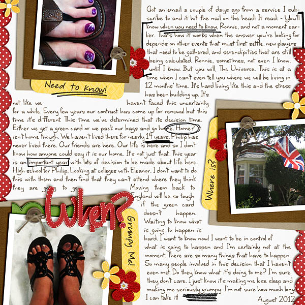 Ronnie used Ladybug Hugs.
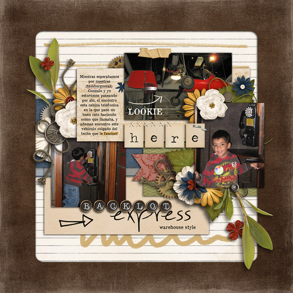 Roxana used Traveler.
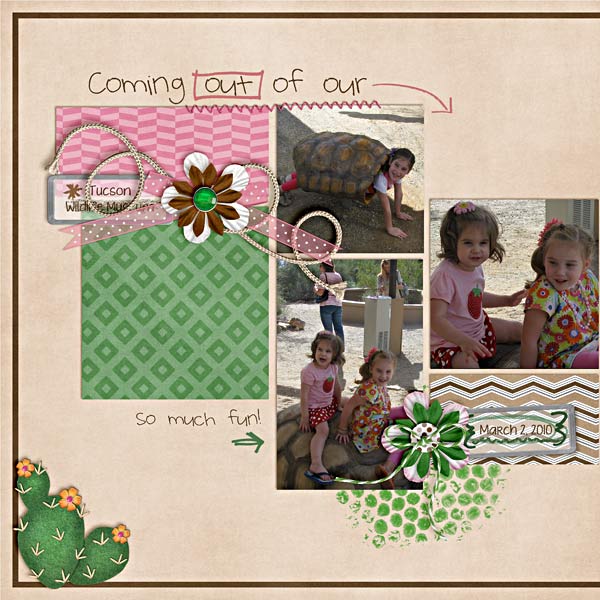
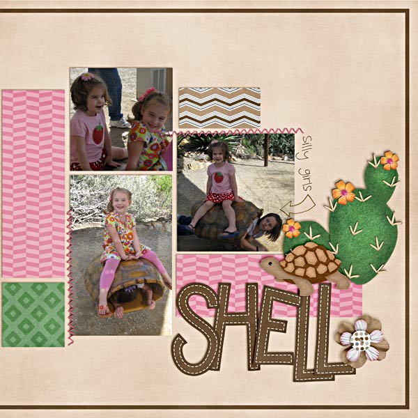 Shanell used Rainbow Collection, On The Trail, & recolored the tortoise from Gnome Sweet Gnome.
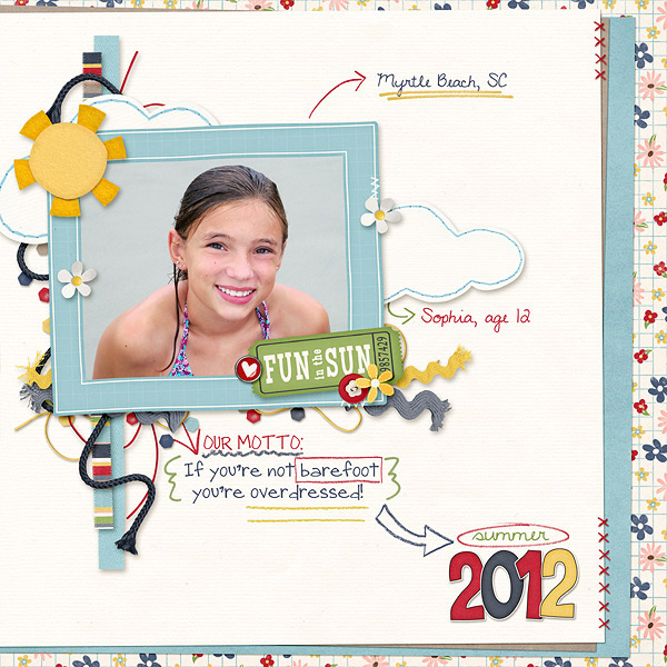 Shannon used Summer Lovin‘.
Hope you all have a great day! C ya soon!

Friday Freebie: Traveler | Digital Scrapbooking Freebies
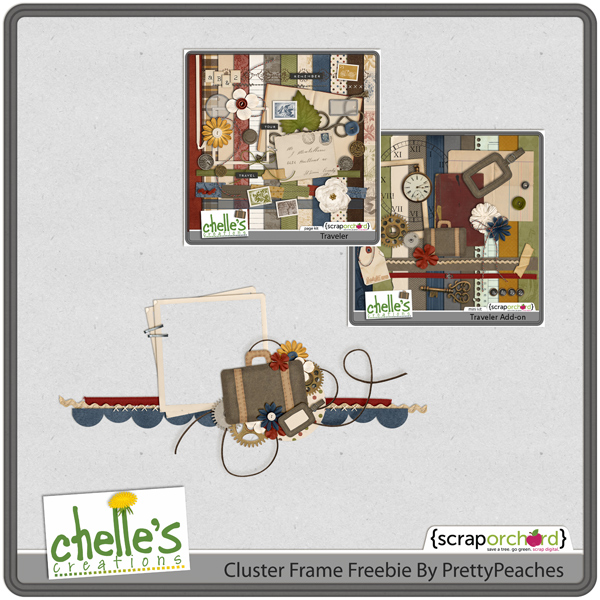
Melissa here aka PrettyPeaches, with today’s freebie. I created a cluster frame from Chelle’s Traveler and Traveler Add On for you. Hope you all enjoy!
Click on the above Image to Download!
Filling A Frame | Digital Scrapbooking Tips
Fill a Frame Photoshop Elements 10 Tutorial
by Kayla Chamberlain aka keepscrappin
We’re gonna start with my layout that is almost finished. I used Chelle’s Creations E-I-E-I-O kit/alpha and E-I-E-O Quickies to make this layout. Gotta love those quickies. They make for a really quick layout!
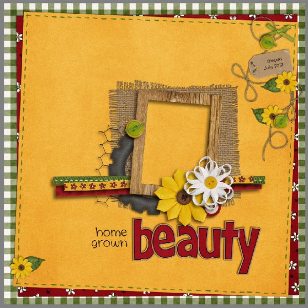
I’m going to show you how to add your photo to the pre-made photo cluster. This method can be used on any square or rectangle frame.
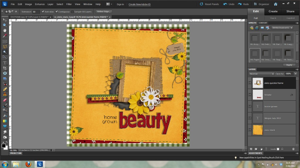
There are many ways to fill a frame in PSE, but today I’m gonna show you what works for me. My favorite way is to create a fill or photo mask layer for the opening of the frame. An easy way to do this is by using the magic wand tool to select the area inside the frame opening. This works great for non-shadowed frames, but the one I’m using already has all of Chelle’s fabulous shadows and I don’t want to have to do all that shadow work again. When I use the magic wand tool on the frame with shadows, it doesn’t nicely select the area I want to fill. See the image below to see that the marching ants are inside the frame where the shadows are.
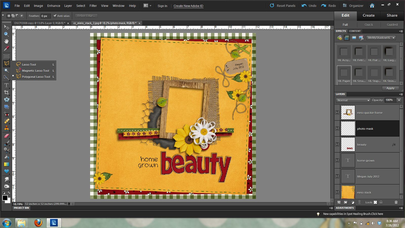
Don’t fret though PSE has another tool that will help me easily select the area I want and still be able to use the shadowed version of the frame. This tool is called the polygonal lasso tool. It is the sixth tool down in the tool palette and is grouped with the lasso tool, and magnetic lasso tool, so you may have to click on those and hold for the fly-out menu so you can get the one pictured below.
The nice thing about filling this frame is that we don’t have to be totally exact on selecting the inside of the frame because we will be putting our photo underneath the clustered frame layer. We will want to make a new layer under the clustered frame layer. You can do this by being on the frame layer and then holding down the ctrl key and clicking on the new layer icon at the bottom of the layers palette.
Once you’ve made your new layer under the frame layer, you will use the polygonal lasso tool to click on the upper left corner of the frame and draw a rectangle around the frame. See the image below for what the marching ants should look like.
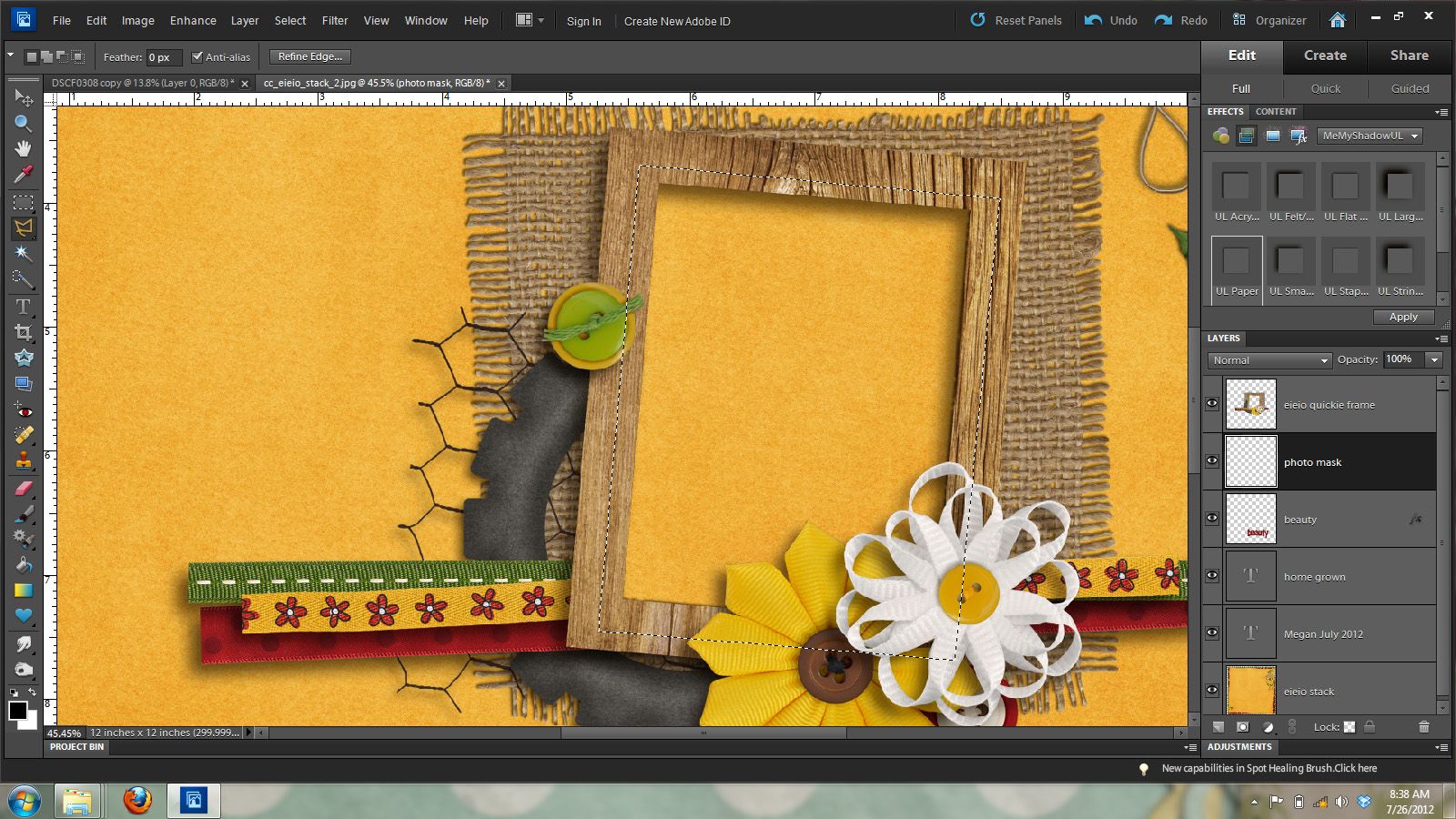
While you have the marching ants selecting the area you’d like to fill you will now make your fill layer or photo mask layer on the new layer you just made. To do this you will hold down the alt key + the backspace key to fill that layer with your foreground color. Don’t worry about the color of this mask, as it won’t show once we clip our photo to it. See the image below to see that my black photo mask now fills the open spot in the frame.
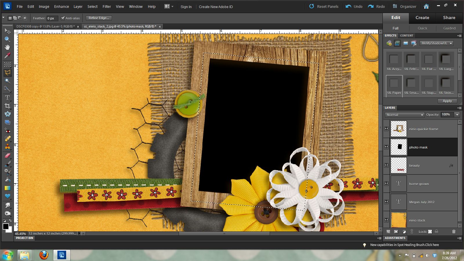
Ok – now you can remove the marching ants by pressing ctrl and D.
Now, it’s time for the photo. Open your photo and do any necessary editing and then add it to your layout on the layer above your photo mask. See the image below for how the layers should look in the layers palette.
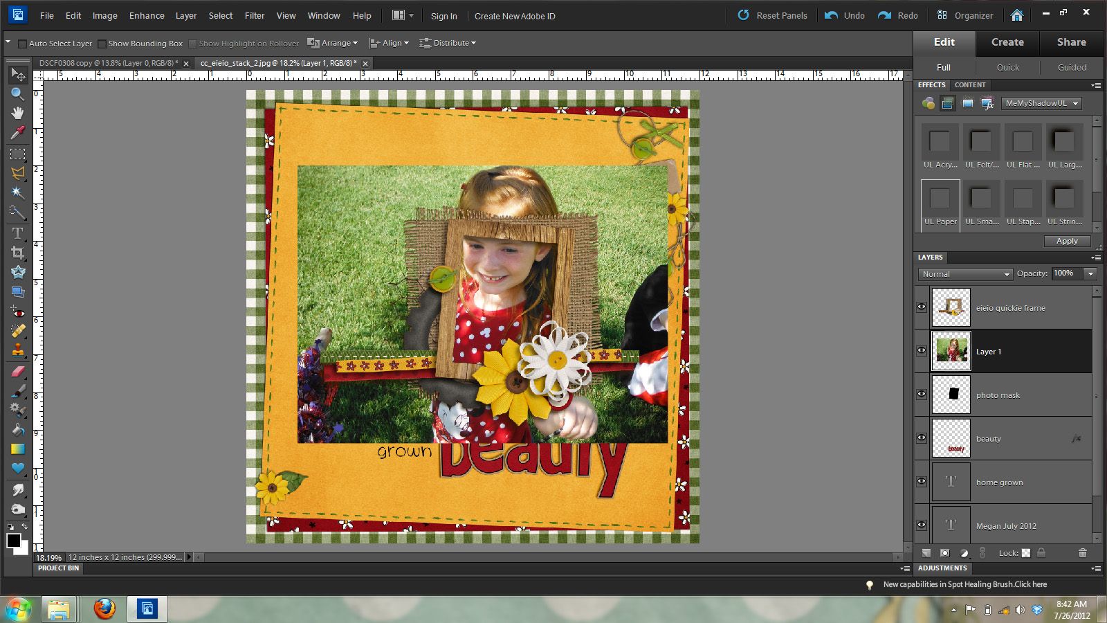
As you can see from the above image my photo is too large for my frame. So I’m going to clip it to my photo mask layer by going Layer ] create clipping mask. Or pressing control and g.
In the image below you will see that it looks like my image has been cropped, but really it all still there but is just showing the part that is clipped to the photo mask. I can move it around, resize it and such so it will show what I want it to show.
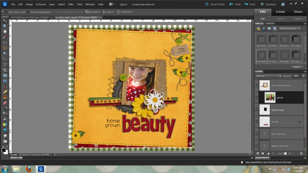
I want to resize this photo to show more of my daughter in the frame, so I’m going to check show bounding box in the top options bar. This will give me a box with handles to resize my photo as shown in the image below.
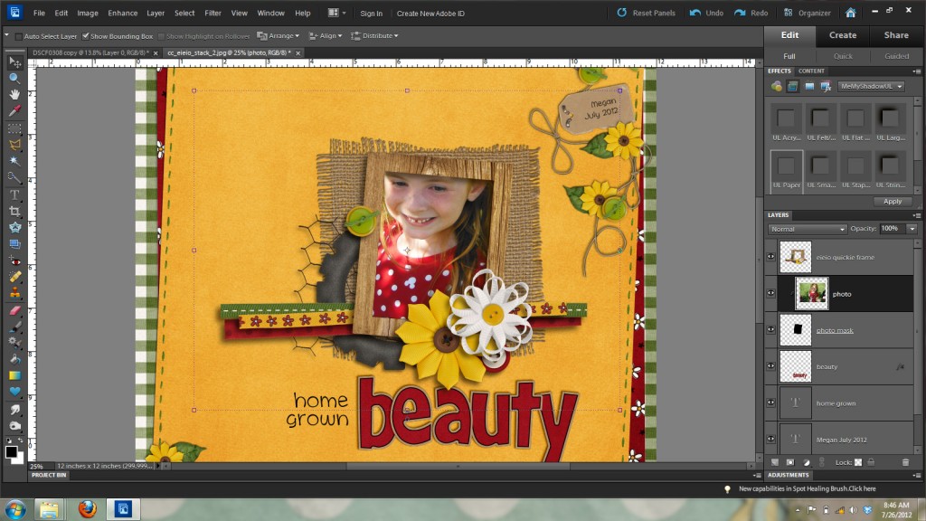
I want to bring in my photo from the corner handles so it will constrain the proportions of my photo. If I resized it by clicking on one of the center handles it would distort my photo and make my daughter either look tall and skinny or short and fat and not good at all. It is really important to always resize from a corner handle and make sure that the proportions are constrained so you don’t get weird looking people on your layouts. The people on my layouts are weird looking enough without any help from me and photoshop. LOL
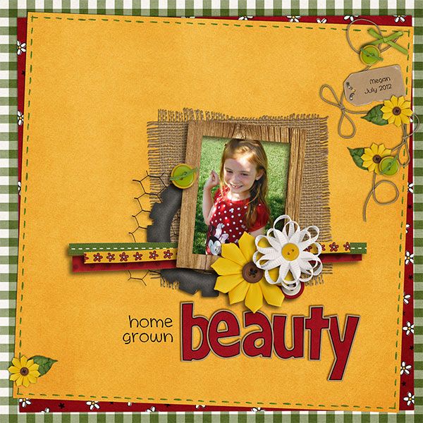
Here’s what my photo looks like in the frame now that I’ve resized it and used the mouse and/or arrow keys to position it to show what I want shown in the frame.

And here’s my final layout zoomed out so you can see my little home grown beauty.
But wait you say! How do I fill a circle or oval frame? Well, let’s take a look at that right now. Here’s my same almost completed layout with a circle frame cluster from the E-I-E-I-O Quickies.
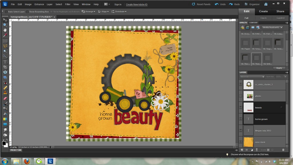
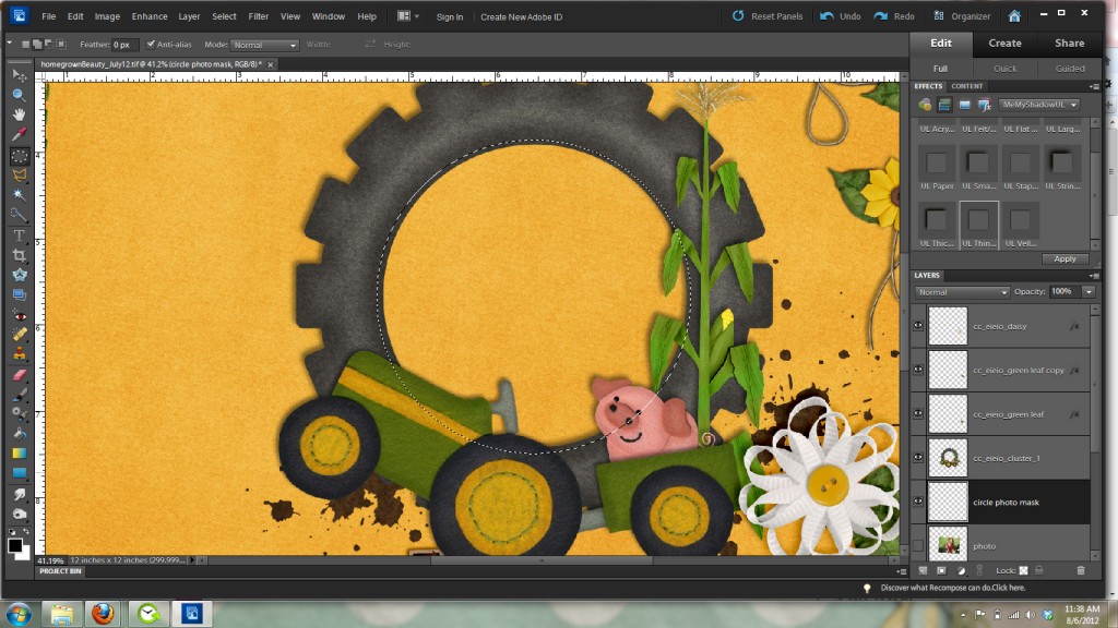
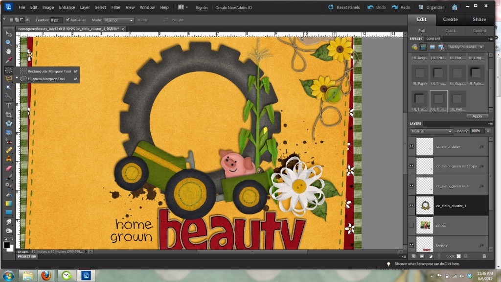
The easiest way I have found to fill a circle frame is by making a circle photo mask layer. We will do this with the elliptical marquee tool. It is nestled in the toolbar with the rectangle marquee tool. See the image below for where it’s located.
Make sure feather is set to zero in the top options bar and draw a circle around the opening of the frame. Holding the shift key down while you draw out the circle will keep it a perfect circle. You can also press the spacebar while drawing to move the circle to the position you want. When you have finished you will have marching ants around the circle like in the image below.
You will now need to make a new layer under the frame layer for your photo mask. This will be the layer you will clip your photo too so it will fit inside the circle frame. Click on the new layer icon at the bottom of your layers palette to make this layer and then hold down the alt and backspace keys to fill the layer with the foreground color. As before the color doesn’t matter because it is just a place holder for where the photo will go.
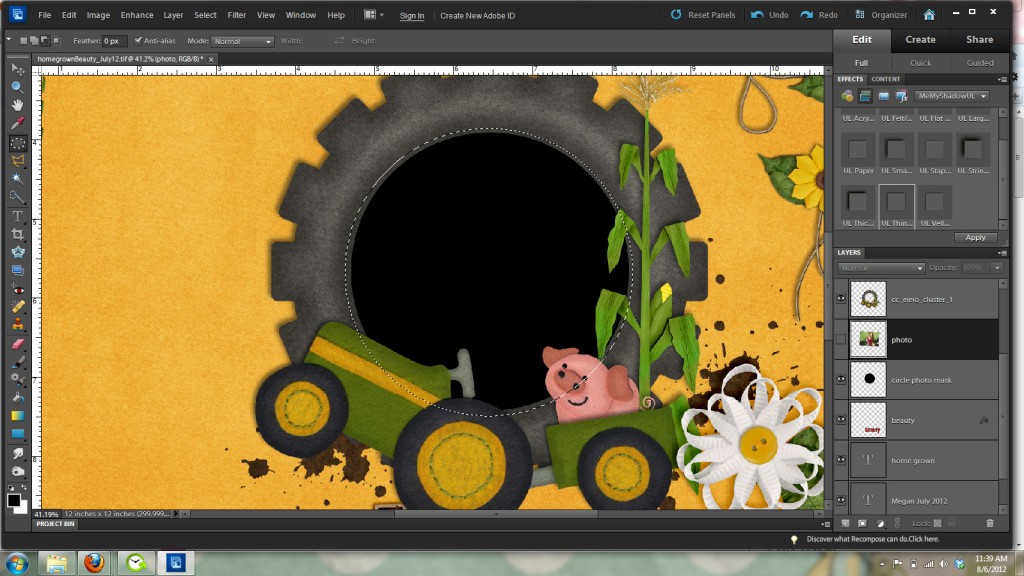
Now you can get rid of the marching ants by pressing control and D. We will now bring in our photo to the layer above the circle photo mask you just made like in this image.
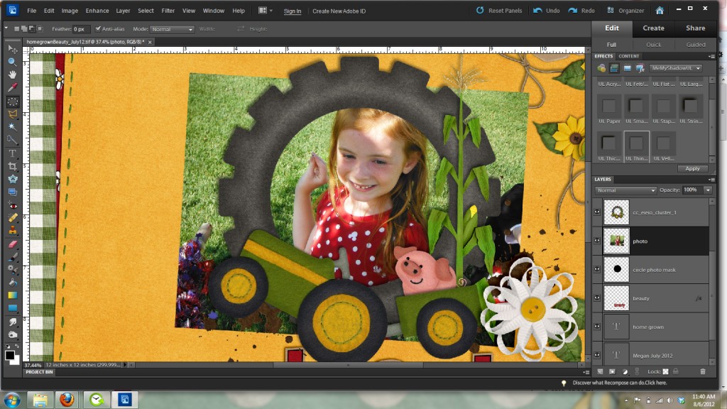
As you can see from the above image my photo is too large for my frame. So I’m going to clip it to my photo mask layer by going Layer ] create clipping mask. Or pressing control and g. Then like before move and resize the image to fit in the frame how you’d like it. Remember to always resize from a corner handle to NOT distort your image.
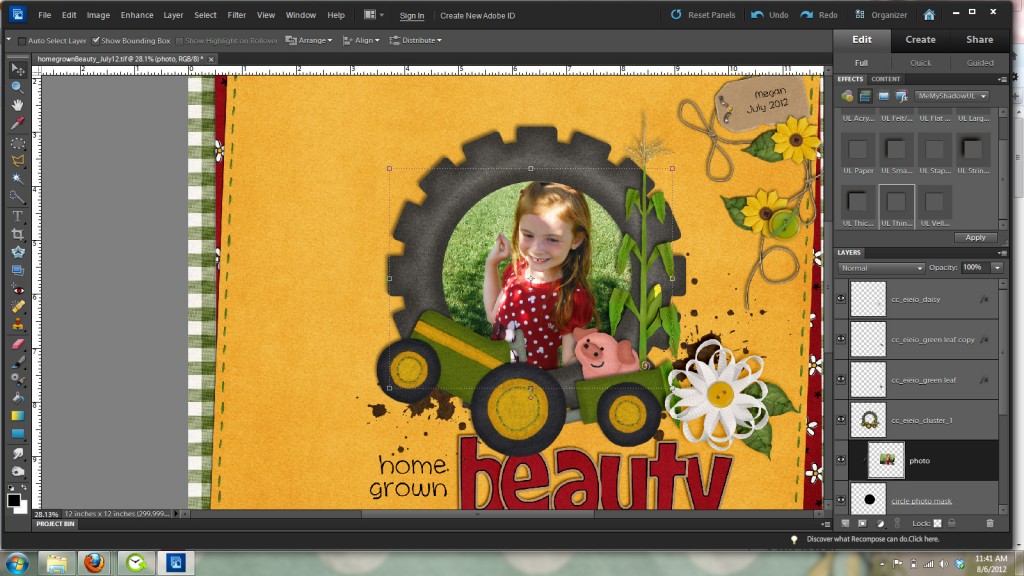
And here is my finished layout with a circle frame instead of a rectangle frame.
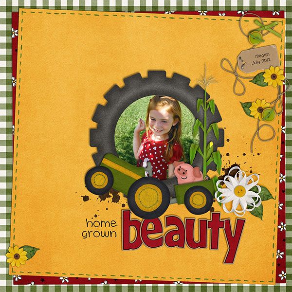
Here’s some fabulous filled frame layouts from the Chelle’s Creations Creative Team.
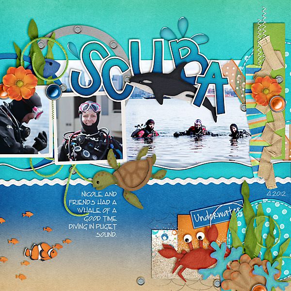
From Carol using Something Fishy
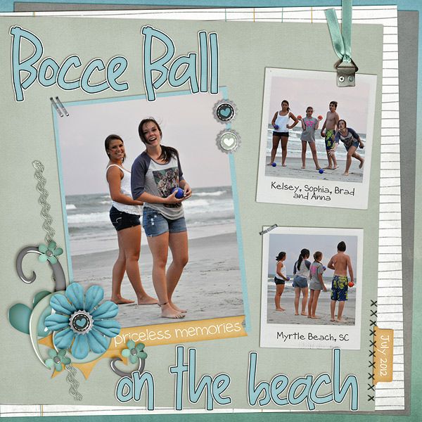
From Shannon using Oh Snap Quickies.
I hope you’ve enjoyed this tutorial and I can’t wait to see all your wonderful layouts in the gallery with filled frames.
8.15 Words On Wednesday: Then & Now | Digital Scrapbooking Words on Wednesday
Howdy! This month one of the challenges we gave the creative team was to create a then and now LO. I missed out on a perfect photo opportunity this last week. My little nephew Zion (age 2 1/2) got home from church and everyone went to change… except Zion. My brother rounded the corner into the kitchen just in time to catch Zion poking his finger in the last roll and deflating it. He saw his Dad and grinned from ear to ear and said, “I did it! I did it!” He was so proud of himself. I can never resist the “I’m-So-Cute-A-Boy-Smile.” His Mom makes rolls of some sort 3 of 4 times a week… so I’m sure he has wanted to “do it” before. He didn’t even get in trouble, they just all laughed. They did have dinner a little late…. after the rolls had a chance to rise again. LOL! Aunts who are 3 hours away don’t usually get “those” pictures. I wanted to share the idea because it was fun! A pan of “before” and “after” rolls with a cute little blonde-haired boy. What ideas do you think of with a then & now theme?
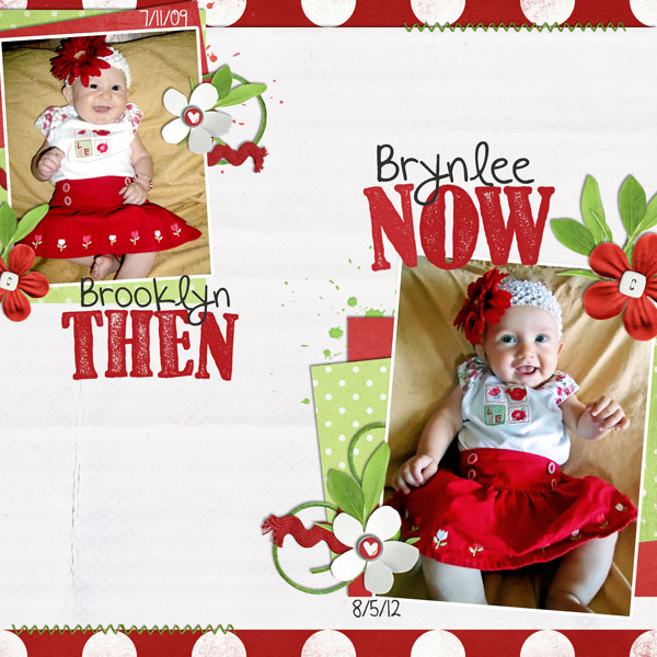
The ladies amazed me again. First up is Kassie showing us a delightful LO of her two girl’s wearing the same dress about 3 years apart. Polka dots make everyone smile & that headband is sooo darn cute. It’s a very simple design with great white spacing, and the journaling is sweet. It’s a lovely timeless design. Makes me wonder if she’ll keep the dress and do the layout again with her first granddaughter. I just want to pick them up off the page and hugs those little darlings! Love the stitching!
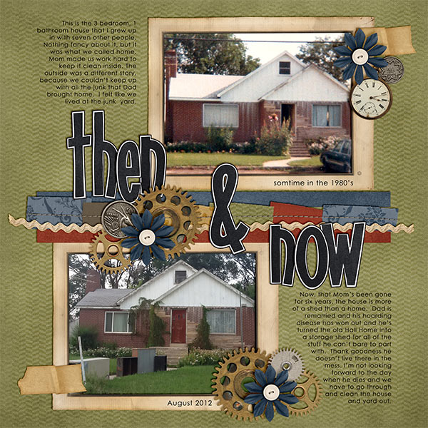
Next up is Kayla. I love this idea. One of my niece-in-law’s wanted to decorate her home with pictures of her grandparents and my grandparent’s homes and some of the homes my family lived in before I was born. My sister, Arlene, took pictures of the houses (some while she was in high school) and a fellow elementary teacher painted the houses. (Arlene bought a photocopy of the paintings so that her siblings could each have those pictures. Chelle might have them too.) My Grandma Pitcher had a pink house, My Grandma Griffin’s was white. The home I grew up in was white with green trim. Now that all of the houses have changed ownership and colors, it’s nice to walk around my apartment and see those images from my childhood and youth. Look at what Kayla designed.
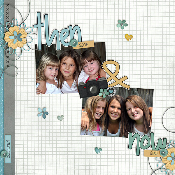
I saw a story on the TODAY show just this morning about a group of 5 guys who took a picture of themselves in high school. Somewhere along the passage of years, they kept re-enacting that picture and updating it. They have redone that same picture several times through the years. I believe they do it ever 5 years. Shannon has one of her favorite pictures of her girls from 7 years ago and then a more recent picture. What a wonderful way to update and compare her girl’s. I’m sure this design will be a favorite of her girl’s for many years to come.
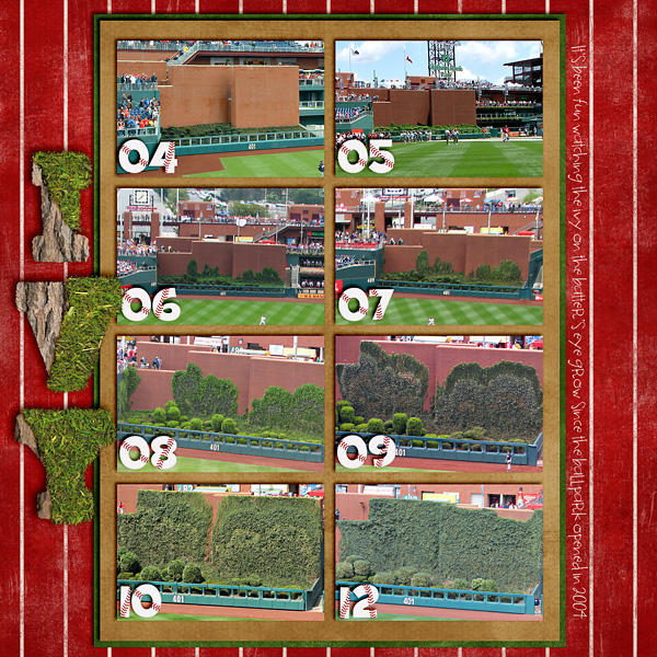
Heather used the ivy growth as a marker for the passage of time at a baseball stadium since it opened in 2004. I think we all use pictures or something physical to help us mark the highlights of our lives. How many of us have a wall where we have pencil lines showing a child’s name and date marking the passage of time and growth?
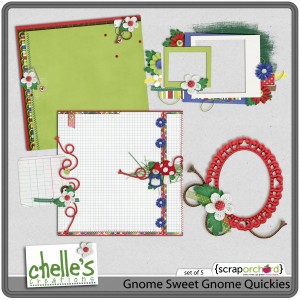
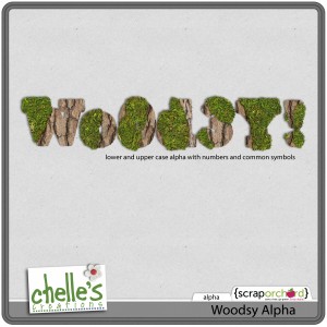
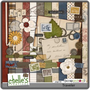
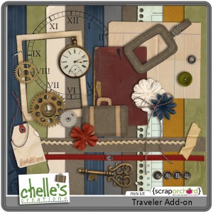
Let me give you a wrap-up of the products the ladies used.

Hope we gave you lots of ideas for Then & Now.
Hugs!

My Sweet Valentine | Digital Scrapbooking Classics
Let’s talk chocolate, shall we? I LOVE chocolate in all varieties. Chelle has a yummy digital scrapbooking kit called My Sweet Valentine that has lots of chocolate elements in it, so, naturally, it is one of my favorite kits. Yes, the kit is great for a Valentine’s Day themed page, but it works for many other subjects. It is also full of hearts and red and pink patterned papers, so it is perfect for pages about things we love, whether they include chocolate or not.
Mary felt like making a page documenting a few things she loves right now. Her page is simple and sweet, and it really gives us insight into her heart which is so very important in getting our memories on pages. I love that red heart embossed paper, and I love how she used the heart-shaped cookie as a place to journal the date on her page.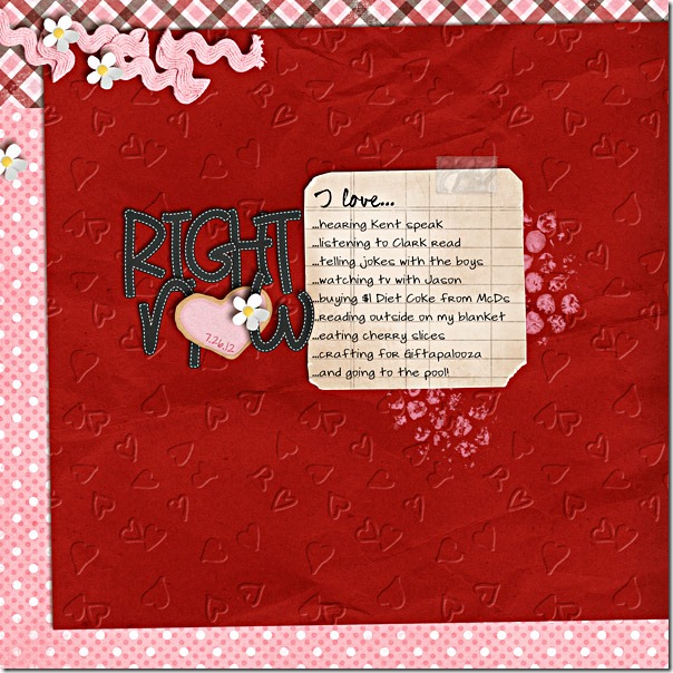
Jenn also made a page about something she loves – fudgy brownies. I love fudgy brownies, too, and I love how she took a picture of the brownie box to include on her page. I think she will enjoy looking back at this page in years to come to see how this product has changed and think about how much she loved those treats back in the day. 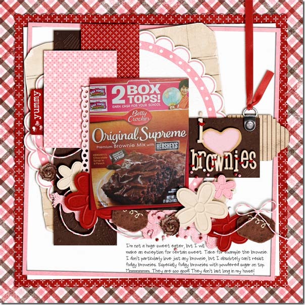
As I said before, this kit is one my personal favorites, and I found it the perfect kit to use for pictures from a recent trip to New York City. My friends and I had read about a cupcake bakery in the city before we arrived, and when we discovered there was a storefront for Baked By Melissa on the same block as our hotel, we felt it our duty to support the local economy. Of course, we took pictures, and I just had to use the embossed cupcake paper and felt cupcakes to make this page. 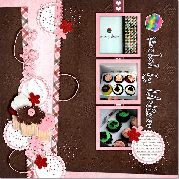
I’ll leave you with a closer look at the kit in the market. I’m feeling like I need a snack already. 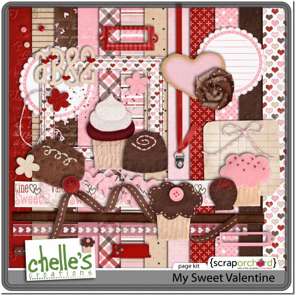
Gallery Standouts | Digital Scrapbooking Inspiration
Hello Everyone! Here are some great layouts I recently found in the galleries. I hope you enjoy them.
- Carolina scrapper shows us this LO from Chelle’s Hole In One kit. What a great opportunity to show a Father/Son teaching moment. Love the use of the arrows.

- Sunflowersbaby designed this lovely family LO. I absolutely am in LOVE with the pocket used for journaling! It uses Summer Lovin’.

- Collins7350 shows us this patriotic image of this little guy and his favorite flag. I love the use of all the stars. It uses Fireworks & Fireworks Extra.

- Last we have lovebug’s “Pounce” design. Love all the layers & stacks. What a great picture, I can almost FEEL the kitty getting ready to jump. Great Job! Lovebug used Chelle’s Here Kitty Kitty kit.

See you soon! Sari

Why I love digital scrapbooking…
I’ve been a scrapbooker for many years. My first scrapbooks were typing paper, construction paper mats, held together by rubber cement. I really have done this for a LONG time. LOL! I’ve tried lots of techniques and scrapped through tons of trends. This week I was reminded of a few reasons why I LOVE digi.
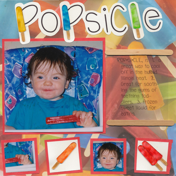
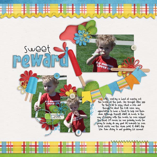
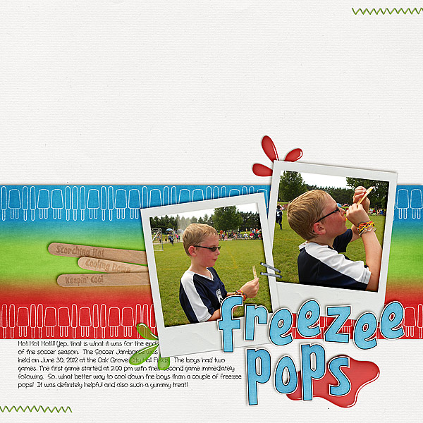
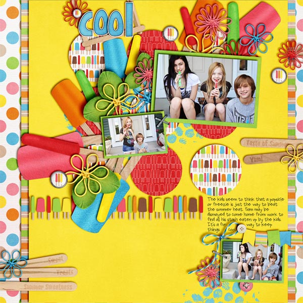
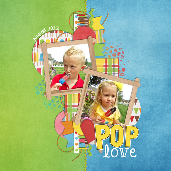
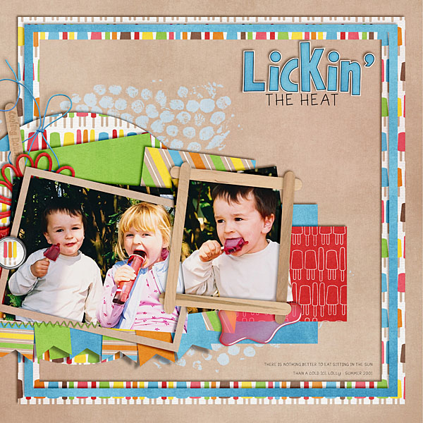
Several years ago I wanted to scrap a photo of my teething toddler eating a popsicle. Hunted and hunted. The only “popsicle” things I could find was this popsicle background paper.
So I pulled out my markers & my shrinky-dinks and made myself some “acrylic” popsicles. It took me a few tries to get enough popsicles that laid flat. At the time I was pleased with the results, but this page took me several hours. AND that was only for the one copy to go in her album. I still need a copy for our family album (the book I’ll get to keep when everyone grows up, moves away, and takes their albums with them). I don’t even know what the page cost me. (Frankly it’s probably one of my “cheaper” pages…just popsicles, printable transparency, & all that clear shrink-dink material.)
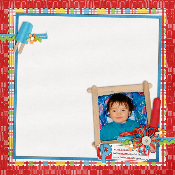
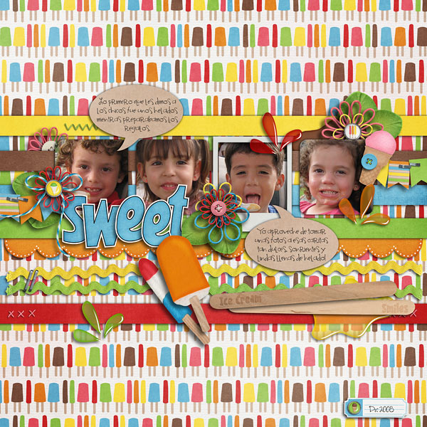
This week as I was finishing up my newest kit…and needing a page to use for the video tutorial, I found my photo…the one I’d saved for our family album. In 15 minutes I completed this layout:
MUCH less time.
MUCH easier to make multiple copies.
Less money.
At one time my scrapbooking supplies took an entire wall of our family room. Now everything fits on my EHD = MUCH less space.
No toddlers getting into my supplies.
And we can eat on the kitchen table. LOL!
Beat The Heat Playdate | Digital Scrapbooking Inspiration
Hello Everyone! Chelle’s Aunt Sari here. Have you ever Beat The Heat with Lemon-Lime-‘Lectricity? I have. Back in 1991, my sister Ellen and I lived in in an apartment community in Salt Lake City, Utah. We decided to go to Lagoon Amusement Park and meet up with some other family members. Ellen made some Lemon-Lime drink for us to take along. We had a fun and exhausting day. When we rolled back into the apartment, we both thought we had rinsed the remaining few drops of lemon-lime drink out of the cooler and left it on our kitchen counter. A few days later we heard this loud pop we thought was an electrical wire popping. Scared us good. We called maintenance and for the next 3 weeks, they opened up walls following the electric lines trying to find the “popping” noise, but it just kept moving to different points in the apartment. Being “good” tenants, we kept moving our “stuff” out of the way for the maintenance worker, which included the box the cooler was in. Imagine my sister’s horror and embarrassment, when she saw the pop-up lid on the cooler make the “noise” one day will the maintenance workers were in the apartment. They were clearly frustrated they hadn’t found the problem. [Start Laughing -HARD- now!) As the remaining drink mix in our cooler fermented, it built up pressure in the cooler until it “popped” to release the pressure. Then the pressure would build up again until it needed to “pop” again. You get the idea. Let’s just say when our lease expired, we moved to another location. Ellen still remembers the maintenance worker’s faces when she told them what was causing the popping? I was at work (Whew! Thank Goodness!) We were sooooo embarrassed! It’s been 21 years and I still get a little-red-faced when I think about, but then I just have to LOL!
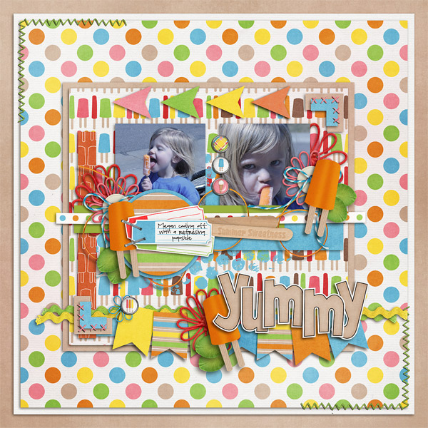
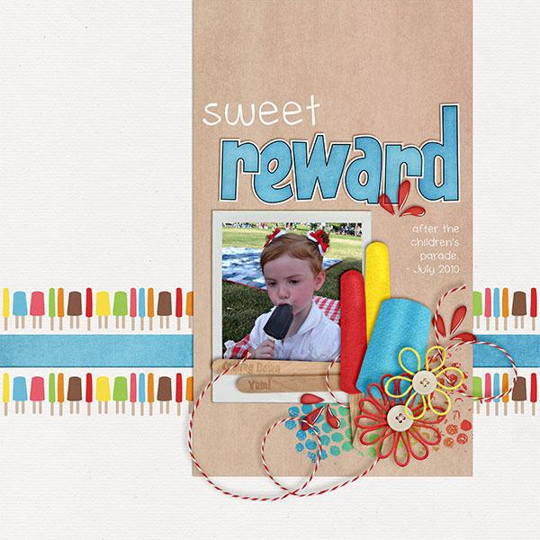
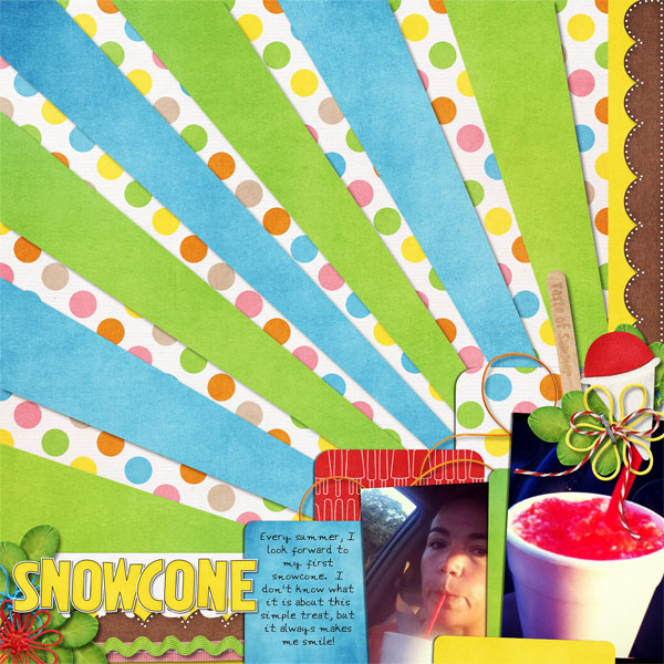
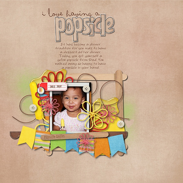
Chelle’s designed some great things this week. She released the most melt-in-your-mouth, Beat the Heat kit that has had my mouth watering for the yummy coolness in the kit. She adds in Beat The Heat Word Art Sticks, & Beat The Heat Blog Freebie. I had to go buy myself a snow cone! LOL
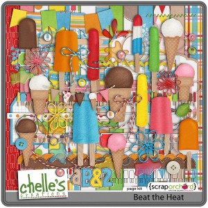
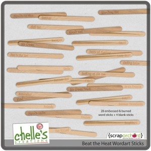
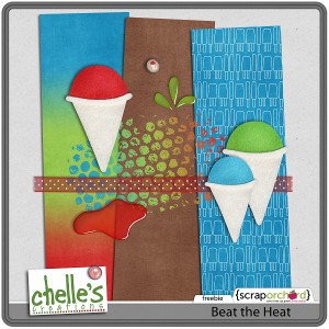
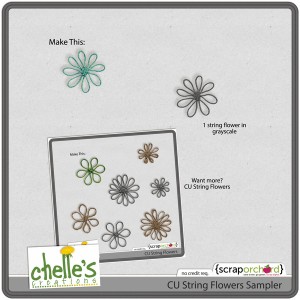
For our CU Friends, she gives us CU String Flowers & a CU String Flowers Sampler.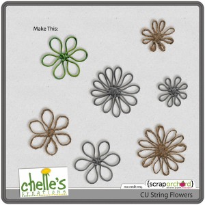
Chelle released Clipping Digital Paper Clips in her ongoing instruction of Digital Scrapbook Tutorials. If your mail client doesn’t play friendly with the video, you’ll find all Chelle’s videos on her You-Tube Channel.
Chelle is a sponsor at the Mousescrappers Minnie Marathon and Banner Collection is her participation prize. It’s only available through Mousescrappers, but will be available in the market at a future date.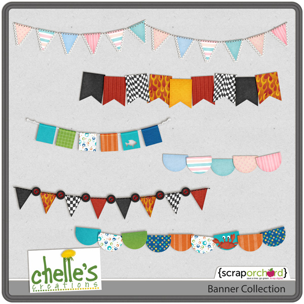 Reminder! Register for Digiscrapapolooza On The Road: Utah! Register here and get a ticket to the Original Scrapbook Expo. The fun starts September 28-29 in Sandy, Utah. Save $25 until Aug. 21st. Space is limited. Your Digiscrapapalooza [Utah 2012] Retreat Ticket Includes:
• Admission to The Original Scrapbook Expo on September 28 & 29, 2012
• Entrance to the “Digi Lounge” at The Original Scrapbook Expo [a $90 value]
• Digi Lounge Crops & Digiscrapapalooza Team Events
• 20% Discount in the Scrap Orchard Booth
Don’t forget about Creative Club Digi (CCD) and Creative Club Digi Designer (CCDD). If you haven’t yet registered, click here. Members get Chelle’s products at a reduced rate & 2 free chats each month. The first CCD Question & Answer (Q&A) Chat is on the 14th @ 7pm MDT. & the CCDD Q&A Chat is scheduled for the 16th MDT. The Tips & Tricks chats are scheduled for the week of August 19th. Join now! You’ll be glad you did! Learn more in these 2 video’s where Chelle tells about the clubs. (Just click on the images.)
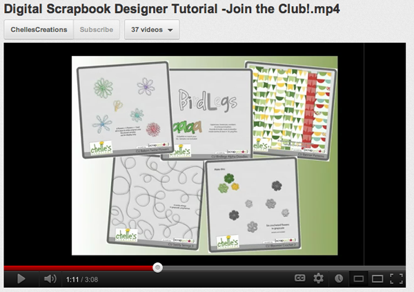 On to the CT’s LOs. Love them! Had to give you a “big” view so you could see their creativity at it’s best.
Talk to you soon! Hugs!

Friday Freebie: Gymnastics | Digital Scrapbooking Freebies
I’m SUCH an Olympics addict! In honor of my favorite summer Olympic sport finishing up earlier this week, I decided to make a journaling cluster freebie using Chelle’s collab kit with mle Card, Gymnastics!
The journaling circle is from my favorite winter Olympic sport related kit, Toe Picks & Figure 8s. Click the image to download!
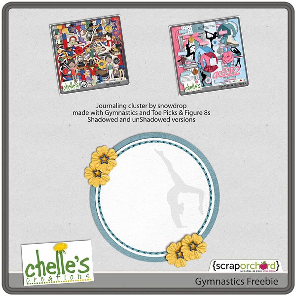
Enjoy!!







 Hi! I'm Chelle: a 40 something mom of 7. My husband & I live in a rural community in the rocky mountains with our 4 children still at home. In the winters we enjoy sledding & snuggling by the fire. I the cool fall evenings we love relaxing around the campfire & meeting friends at the county fair. Admiring the stars