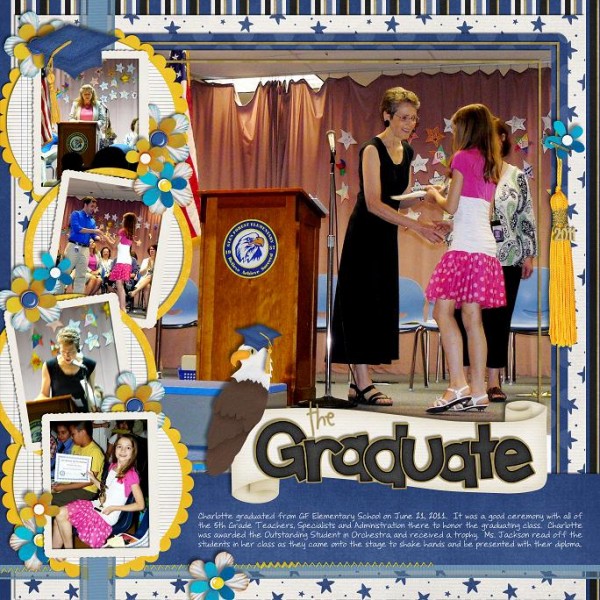
It’s that time of year again, when the sure sign of Summertime on the horizon is graduation day. Last year I had a DD graduating from Elementary School and this year a DS from Middle School. Where does the time go? I still can’t believe I’ll have a kid in High School next year.To celebrate Graduation, Chelle has designed a beautiful kit and word art set appropriately called Graduation and Graduation Wordart. It’s chalked full of goodies made especially for that special event whether it’s for your preschool tot or college grad. Here is the page I made of DD’s graduation, using Graduation, Graduation Wordart, Rainbow Collection, On The Trail (for the bald eagle, the school mascot) and Stitch Me Up.
I’ve made a freebie frame for you to make your scrapping just that much easier.
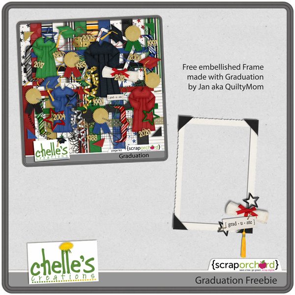
Enjoy! And we look forward to seeing your graduation pages using Graduation in Chelle’s ScrapOrchard gallery.

Yearly Archives: 2012
5.15 Tutorial: Swiss Cheese Font Edition
Hi Everyone! i’m Jenn, aka jk703 here this great Thursday! Hey… it beats Monday in my book!  Hope you are all having a great week and getting some scrapping in! There is so much you can do with your layouts, and so many new techniques that are out there to try! We often use alphas, and font on our layouts, as well as part of our journaling. Alphas help up spice up the titles and add a little more to the page than just a plain font. Fonts can be decorative, handwriting or even themed. So, let’s see what we can come up with today!
One that I like is the “Swiss Cheese” Technique. Today’s tutorial is a spin on that technique, by using the font as the “swiss cheese holes.” For my example, I used Chelle’s Happy Papers. This is just one great part of the Happy Collection of goodies – Papers, Brackets & Frames, Elements and a Alpha! Fun, and can be used for a perfect or magical day! 
Step #1: Open some papers, and make sure to have at least 2 papers open in your workspace.

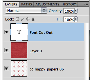
Step #2: Select the Text Tool from your Tool Menu. Then choose your font. Mine is Cooper Std. type in the words that you will cut out. Before the next step, make sure to put your words where you want them to be on your layout. You will not be able to move them easily later on. Here is what your layers will look like as of now.
Step #3: Command (Control) + Click on the Font Thumbnail, and you will see marching ants all around the outside of your font.
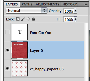
Step #4: With the marching ants still marching, select the topmost paper in the Layers Palette. This should be the paper that is your background, the one that will have the cut out. Press Command (Control) + Delete. This will delete the font’s shape from that paper.
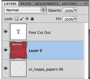
Step #5: Turn off the visibility of the Font Layer – Click on the Eye on the left side of the layer.

Step #6: Lastly, Command (Control) + D to stop the marching ants from marching. Add a shadow Style to the top paper layer. There you go – Swiss Cheesed Fonts. 
Here are other fun techniques that you can do with fonts and Alphas.
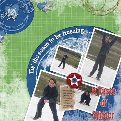
Ronnie (ronnie_texas) used a font for the main title “A Taste of Winter.” She then simplified the layer, clipped paper and merged layers. Lastly, she added a white stroke. The subtitle was also created using a font, adding an adjustment layer of white and once again, she added the white border using stroke to give it more impact.
Heather (snowdrop) also created a sticker look with the word Fairmount – it almost looks like it is a thick sticker and it might be raised with pop dots! Cool!
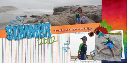
Roxana (roxanamdm) created this layout with such pop – and added some cool effects to her subtitle word. See the word memories – it looks almost like a puffy sticker to me! That is awesome!
This layout by Cara (colson) made a bright a fun layout with an awesome blend to boot! Check out that cool font that she stickerized (yes, my own term, lol) and then outlined! It really stands out!
Well…. lots to see and try on your layouts! Thanks for coming by and visiting – hope to see you again soon!
5.16 Scrap Skills: Hexagons
Have you seen all the hexagons everywhere? I did a quick search for hexagons on Pinterest because I had noticed in the digital scrapbooking community that I was seeing a lot of them. They’re everywhere! My Pinterest search turned up hundreds of pins in everything from home décor to board games to quilting, and of course, there were dozens of scrapbook pages that used them. Chelle’s Creations has a great CU item in the market that has lots of hexagon patterns that are extremely versatile. 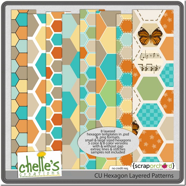 The kit has 8 layered templates, with small and large sized hexagons, some with spaces, and some without. It even includes the lines and stitches that can be used to enhance the patterns. In addition to the PSD files, it includes PNG files of each pattern, which makes it easy for users of SBC+ to add to their pages. It truly should be a staple for your stash of supplies, especially considering how popular hexagons are right now. If there isn’t a hexagon in the kits you are using, you can clip your papers to the templates in Chelle’s CU Hexagon Layered Patterns. Chelle’s Creative Team has been playing with this item so that you can see what I mean.
Patty made a page to showcase her photos she took at a zoo recently. She used some of the layers of the hexagons and clipped papers from the Zoopendous kit to the layers. It makes a perfect background for her photos.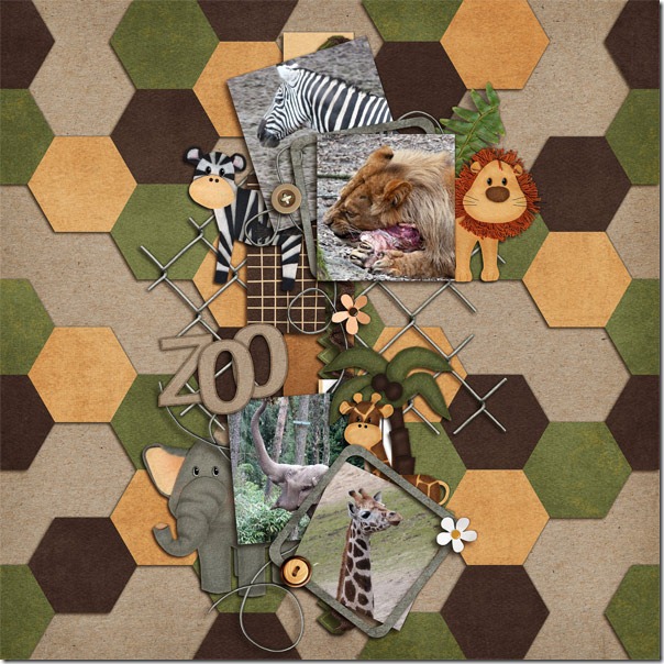
Ronnie also used the Hexagon patterns, but she took it a few steps further making a very intricate and interesting pattern. She made a patterned paper with the Hexagons. To have even more hexagons, she used a template with hexagons which cut the Big City kit papers into hexagons thus having hexagons within hexagons. 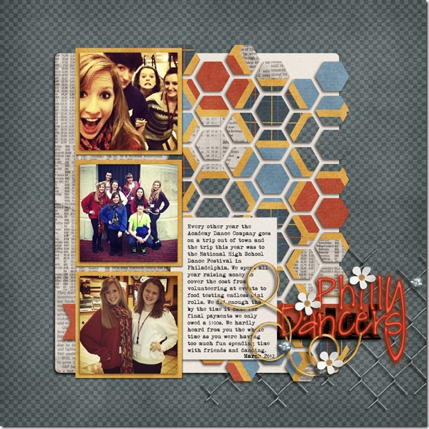
Another CT member, Ophelia, used a template from Fiddle-Dee-Dee Designs to make her page that has a building theme. Hexagon shapes are perfect for this page, and she has filled some of the shapes with papers and some with her photos. Look at how well the road signs blend in with the geometric shapes on the page. 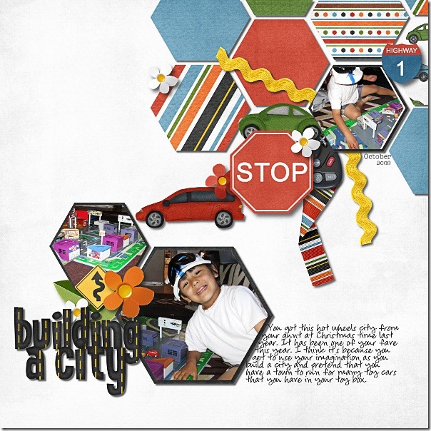 Cheryl of Fiddle-Dee-DeeDesigns originally made this set of templates for her Facebook fans, but if you missed it on Facebook, you can find it in the market at Scrap Orchard. The image is linked.
 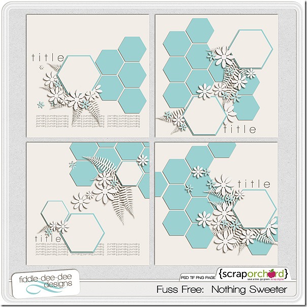 I hope you’ve found your inspiration here for getting your memories and precious photos preserved for future generations. Try using the popular hexagons, and see how easily they can be used to make a big visual impact.
5.14 Sneaky Peek
Hello everyone! I’m here today to give you sneak peek at what Chelle has coming out this week. This kit will help you create so many different types of layouts. Be sure to check back on Thursday for the full reveal.
You can enter to win this kit in any or all of these ways:
1. Comment on this blog post.
2. Like this Facebook post. Or post about the sneak on your own wall and link it to this blog post.
3. Tweet about the contest.
Remember, since the winner is chosen using a random number generator, be sure to come back and post when you’ve done #2 & #3 each in their own comment.
Deadline: 11:59 PM EST Wednesday.

Unlikely Pairs: Bedrock Alpha & Under Construction & Vrooom | Digital Scrapbooking Kit Combinations
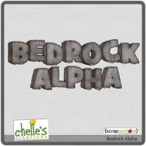
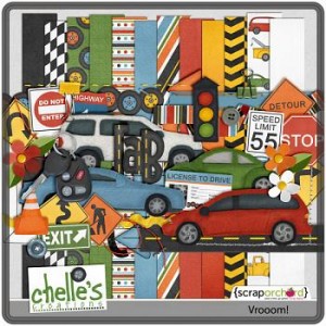
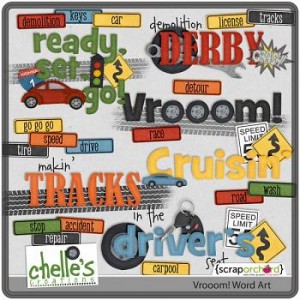
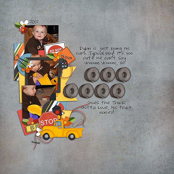
Hi scrappers! Sari here looking at some unlikely pairs. Chelle’s Bedrock Alpha combined with Vrooom and Under Construction. First up, is Melissa B aka Pretty Peaches, who did a really creative cluster using Chelle’s Vrooom! kit. I like the use of the binder clamps and construction signs she uses to convey her son’s love of his truck. ‘m loving the key remote and the use of the string with the staple. Do you just love Dylan’s face in the top picture, you can almost “hear” him revving his lips to let the ‘vrooom!’ out. Great job Melissa!
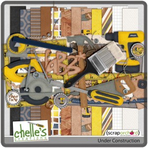
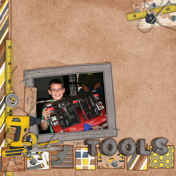
 Next up is Mel aka kscroppychic. She used Under Construction to show us how excited her son was to receive his own tools. Love the border on the bottom made out of so many different “pages” and cluster at the top of the page. You’d never know that “Bedrock Alpha” wasn’t part of the Under Construction Kit. I absolutely love the recolored hexagon paper to match her theme. I have the advantage of knowing kits the CT is using and I still have to go back and look because the LOs are so AMAZING!
 Here are Chelle’s kits that Melissa and Mel used:
Chelle Scraps 5.13
Happy Mother’s Day! I have an inspiring post over at ScrapOrchard today. And besides taking a long nap this afternoon, I did a bit of scrapping. I thought about not posting these pages. They aren’t my favorite. But I decided that you should see the good, the bad, and the ugly. LOL! Not that I think these are ugly, they are just kinda mismatched…photos that I don’t really have anything spectacular to go with them. Single photos of events that I do want to remember. So here you go:
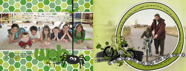
For the one on the left I used lots of greens from the Rainbow Collection. That is such a HANDY collection. The spider is from a long retired Halloween kit called Jeepers Creepers. On the right side I used Ride Skate Roll by Faith True & MLE Card. Turns out I don’t have a bike kit yet, & this one had a bright lime bike…exactly what I needed.


