Yearly Archives: 2012

Chelle Scraps…

I know. You were wondering if I really do know how to scrap. LOL!
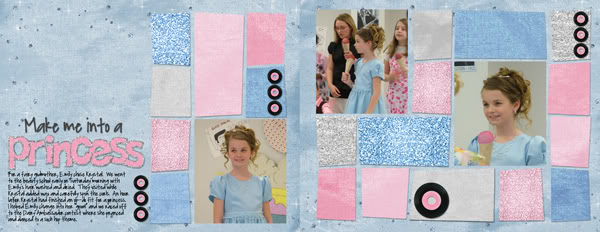
Four years ago my timid 11 year old “tried out” for Dairy Ambassador.

(scrapped a long time ago)
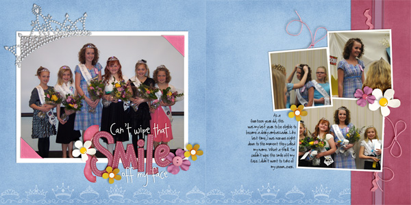
Last year she tried out again and made it.

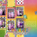
(scrapped this week — with Happily Ever After and my new Rainbow collection…did I tell you how HANDY it is?)

Yesterday she handed of her crown to a new set of Dairy Ambassadors.  I was so proud as I watched her conduct the program & teach dances to the “nominees” and her fellow ambassadors.  In fact, I’ve enjoyed watching her leadership skills grow and develop all through the year.  With the help of my fabulous CT (THANKS LADIES!) I presented her with a fun scrapbook of her year…and we gave one to each of the girls she served with.  They’d seen her book earlier in the day, but they were THRILLED to have their own copy.  (Isn’t DIGI great!)

Here’s the other layout I contributed:

Now if I can just remember that warm fuzzy feeling while I’m teaching her to drive this week.  LOL!

3.3 Rainbows of Color Playdate

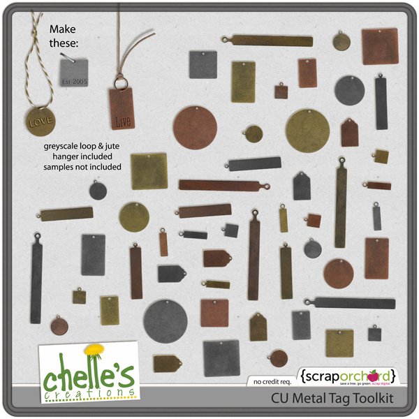
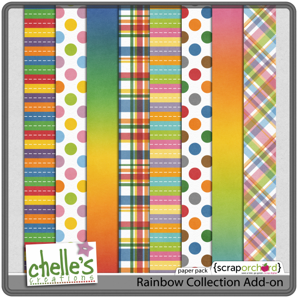
Hi Scrappers, I was just thinking how colorful this week was. I was pondering what my favorite color would be. Interestingly enough, another of my neices, Mylie, has been telling me what “our” favorite color was since she could talk +9 years. It made me think to see what color I would have chosen for “my” LO.  Guess what? It would be all of them. I really don’t have a favorite color. Last week I said I was picking out my favorite LO of the week. It’s Mary! Don’t those CT layouts look great?  Good Job Ladies! Here’s Chelle’s new products for the week…

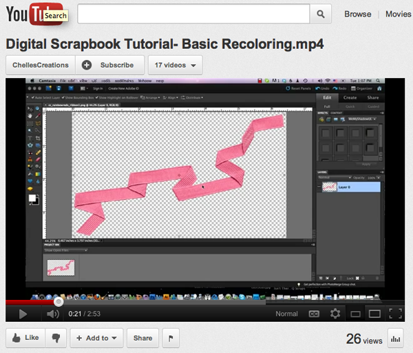
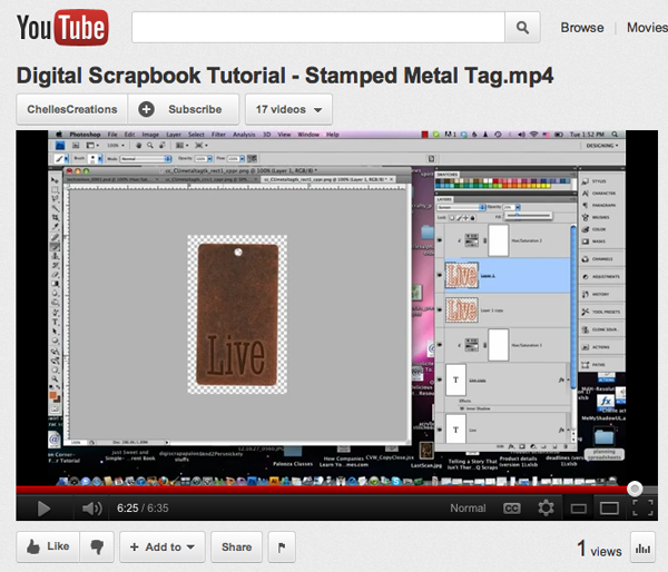
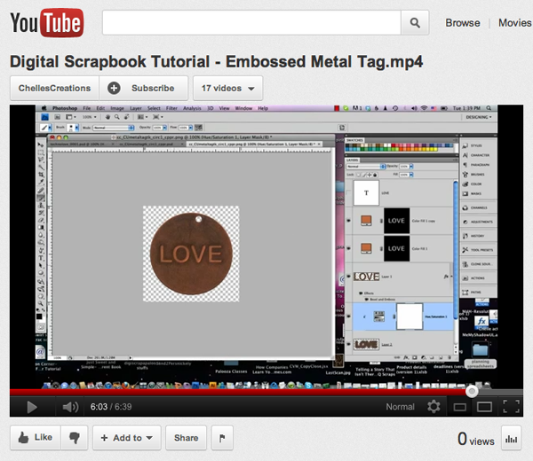
And the freebie…You Tube Classes…
p://www.youtube.com/watch?v=FGyPF97QRds&feature=channel”>

And the LOs…Whoot!

Shanell

Monica

Melissa N.


Lynett

Mary

Roxana

Fonetta #1

Carol

Fonetta #2

Karen S.


Jenn Schultz #2

Jenn Schultz #1

Heather

Jan #1

Jan #2

Kayla

Rule of Thirds for Photography | DIgital Scrapbooking Photo Tips

What is the Rule of Thirds?  The basic principle behind the rule of thirds is to imagine breaking an image down into thirds (both horizontally and vertically) so that you have 9 parts.
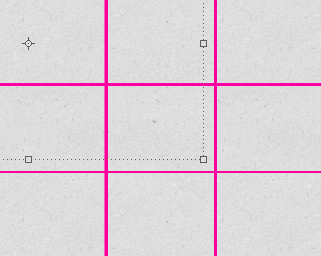
As you’re getting ready to take a photo, you would have imagined this grid in your mind through your viewfinder, or in the LCD display that you use to frame your shot.  Some cameras have settings to turn on this grid.  The ‘rule of thirds’ now identifies four important parts of the image that you should consider placing points of interest in as you frame your image–the four places the lines cross.
The theory is that if you place points of interest in the intersections or along the lines that your photo becomes more balanced and will enable a viewer of the image to interact with it more naturally. Studies have shown that when viewing images that people’s eyes usually go to one of the intersection points most naturally rather than the center of the shot – using the rule of thirds works with this natural way of viewing an image rather than working against it.
Read more: http://www.digital-photography-school.com/rule-of-thirds#ixzz1nqSrgSmf

BUT…I’m not always that good at framing my photos.  Sometimes my subject is moving.  Or I need to quickly capture a photo.  The Rule of Thirds can also be used when cropping your photos to scrap them.  The concept is the same.  Crop the photo so that the point of interest of your photo falls along one of the lines or at the cross-points.
I’ve made a .png “photo cropping guide” for you to use until you get accustomed to doing this.
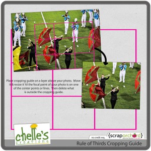
Place the cropping guide on a layer above your photo.  Resize and move it around until the point of interest is in the cross-hairs OR along one of the lines.  Select the area OUTSIDE the cropping guide, select the inverse, and crop.

Here’s some samples from the CT:
From Roxana using Make a Splash.  See how her son is along the right hand 1/3 line?

From Carol using On the Water.  Check out how the space needle is right along the left hand 1/3 line.

Try using the rule of thirds next time you pick up your camera.  And the next time you are scrapping, be sure to crop your photos using this rule.  We’d love to see your layouts!  Link us up in the comments!

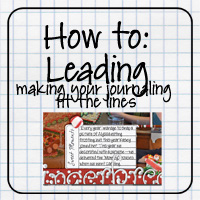
(Leading) Making Journaling FIt on Lines | Digital Scrapbooking Tutorials

Have you taken a look at the tutorials here?  This is an oldie but goodie.

I LOVE the “undo” part of digi-scrapping…and typing my journaling so there are no errors, but I also like the look of “hand-written” journaling on all those fun journal elements…especially the ones with lines.

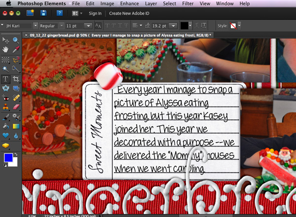
There is a simple tool in photoshop & photoshop elements for quickly and easily lining up your journaling on those lines. It’s called adjusting the leading.
Here’s how to do it:
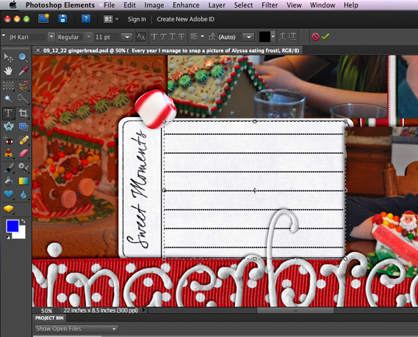
Step 1: Make a text box. With the text tool, click down in the upper left corner of the journaling element, then drag down to the bottom right corner without letting up on the mouse button. When you are in the bottom corner THEN let go. You should see your new text box highlighted (the marching border)

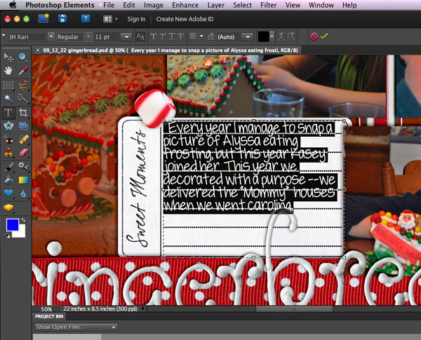
Step 2: Paste your text in the box. I suggest you write your story in a program with spell-check, then paste it into Photoshop/Photoshop Elements. You may need to edit it to fit. Move the text so that the TOP line of your journaling is sitting nicely on the top line of your journaling element.

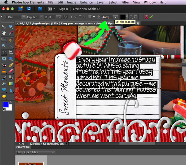
Now we’ll be adjusting the leading. THIS is the little box where we adjust it. (In Photoshop it’s under Window>Character.)

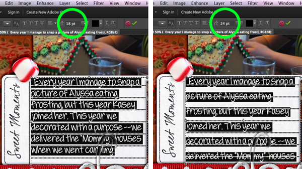
Step 3: Highlight all of your text (Ctrl-A) Then using the drop-down box try some of the preset numbers. Here I tried 18 (too small) then 24 (too large)

Step 4: Be a little goldilocks and figure out the exact amount to make your text line up with your journaling element lines. Mine turned out to be 19.2

That’s all there is to it. Now you can have “hand written” journaling “on the lines” on all your layouts. It also works great on lined papers…like those in back to school kits.

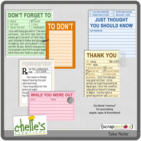
Here’s a couple of freebie journaling elements to practice on:

Here’s a few samples from the CT:

From Karen using Gone Fishing:

From Carol using Chilling & Grilling:


Sneak Peak Giveaway Winner!

Happy Leap Day Everyone! I am here to announce the winner of Chelle’s new “Rainbow Collection!”  Thanks to Random.org the winner of the Rainbow Collection is:  #34  That is Kim! She said:     “Kim says:FEBRUARY 27, 2012 AT 1:30 PM Love the colors! Thanks for the chance.”

Congratulations, Kim! Email Chelle at     chelles.creations1@gmail.com   to claim your prize!

Thank you to all who entered this giveaway! Stay tuned for the next one!  And don’t forget the Leap Year SALE at Chelle’s store at Scrap Orchard.  You can get the “Rainbow Collection” and so much more on SALE today only!


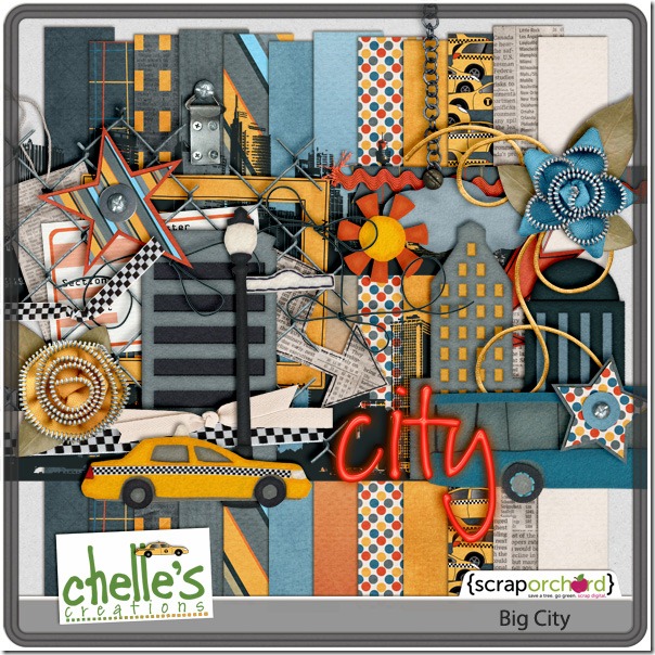
2-28 Perfect Pairs: Big City and Techno Love

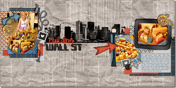
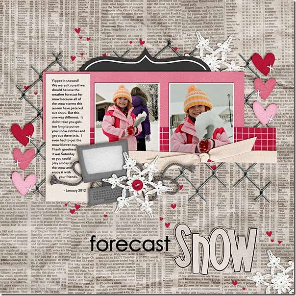
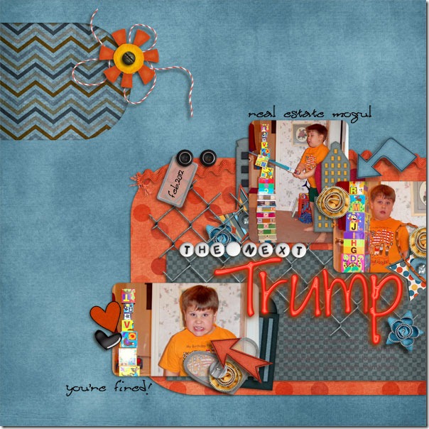
Today we’re looking at some of my favorite digital scrapbooking goodies from Chelle’s Creations: the Big City kit and Techno Love. The creative team has been busy making layouts combining these two kits so you can see how to stretch your stash. First, take a look at the two page spread KairynLisa made about her daughter’s building project regarding the history of Wall Street. I think that newsprint paper is one of my all-time favorite background papers. 2009-07-12WallStreet-2pgKairynNext, Neenee also used the newsprint paper, but she added a gray paper from Techno love on top of it to make an appealing stack. Look how well the black and white heart elements from Techno Love coordinate with the Big City elements. chelle_bigcity_techno_webNeeneeKayla took an entirely different approach to mixing the two kits, still using the newsprint for background, but she made a winter snow page using the pink and red elements from Techno Love, and the computer fits perfectly since the page is about the snow in the weather forecast. forecastSnow_Jan12_webKaylaErica chose to use a different background paper, and she has an equal mix of elements from the kits. The computer elements from Techno Love are complemented perfectly with the zippered flowers and ribbons from Big City.Kit by: Chelle's Creations Techno Love and Big City Template by: Litabells Designs Head Start vol. 4Finally, Cara made an adorable page of her son’s building projects by mixing the elements and papers of the two kits and even made the title by mixing the alphas. Look at his face – no doubt he will do as well as Trump in the future, right? the-next-trumpCaraDo you have both these kits? Do you need a closer look and maybe a trip to the store? Here they are! cc_bigcity_preview_2postcc_technolove_kit Happy Scrapping! 

02.27.12 Sneaky Peak & a Giveaway

You will want to watch for THIS wonderful goodie coming out this week from Chelle! It is A-M-A-Z-I-N-G!! Truly!

I have a feeling that this will be a HUGE staple of scrapbooking bliss on your hard drive! (PSSST!!!! You will NOT want to miss Wednesday’s reveal! It could save you money!)

Do you want to win the collection?  You know the drill.

1. Post here to enter.

2. Post the image with a link to this post on facebook (then come back here and post to let us know you entered again)

3.  Tweet about the contest with a link (then come back here and post again to let us know you entered again.)

CONTEST ENDS at midnight EST TUESDAY 2/28.

2.25 Playdate Tagged Sew & Sew

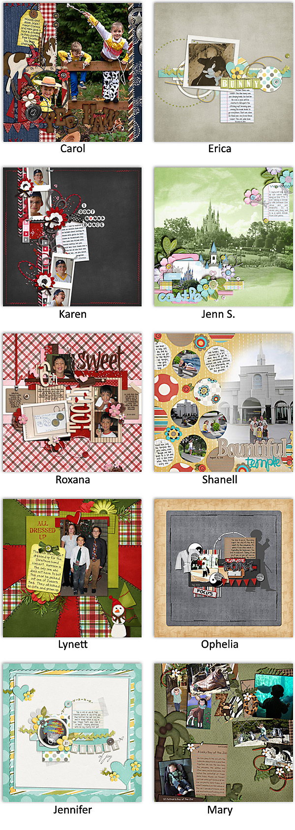
It’s always so much fun for me to see the playdate LOs. You guys are amazing. I particularly loved Carol’s (Iowan) layout this week. I decided to pick one each week as my personal fav. Since I have no digi-background, I’m sort of like a patron in a library looking at photo albums.  I’ve also been reading the cc announcements back-posts of all you wonderful gals. I feel like I am getting to know you all better. Now if I’d just read them again, 3 or 4 days in a row, I might be to remember them. My silly brain…

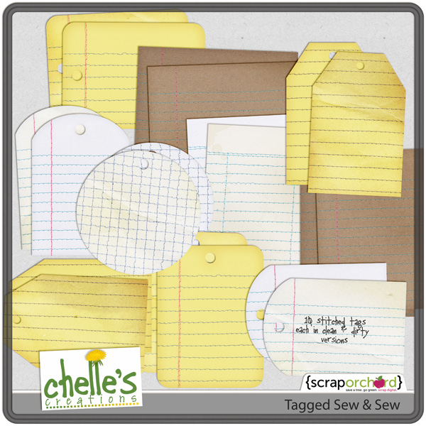
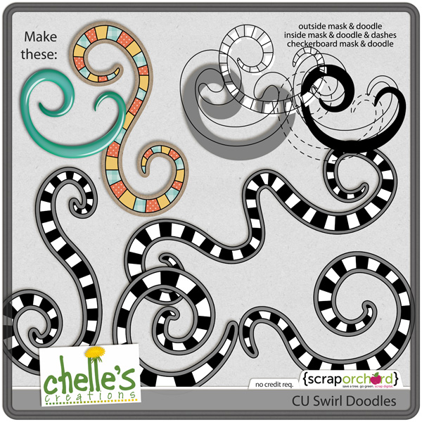
Don’t miss out on Chelle’s latest products. Loved the Tagged Sew & Sew and CU Swirls & Doodles.

And finally my friends… (duh, duh, duh) the LO’s from the playsters: