Do you ever have a creative “block” when you want to make a new digital scrapbook page? One way to overcome is to start with a basic design element such as a border. A good border brings a strong visual anchor to your page and can give you a place to “attach” your photos. Chelle’s friends have been making pages with bold borders to show you some examples.
First, Jennifer made a page about a child’s first haircut, and she used the elements in the kit Mane Event to build her border. She layered a ribbon with rickrack and a comb horizontally across the page and then placed part of the title alpha on top. All her photos, elements, and journal spots are anchored to this border. This gives a calming, solid line that draws your eye to the “mane” event. 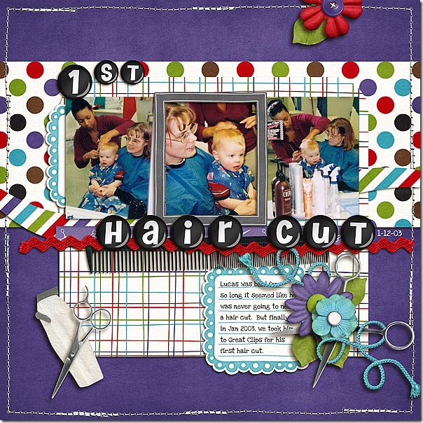 Next, Lynett also made a horizontal border of flowers and string and other embellishments from the Gnome Sweet Gnome kit. She made it lighter in appearance than Jennifer’s by giving the elements some space and allowing some of the background papers to show through. This type of border gives a more playful and dynamic feel and it compliments her layout perfectly while giving it a visual bottom to hold the reader’s attention toward the photo and journaling above.
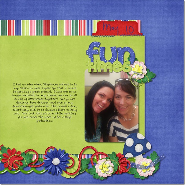
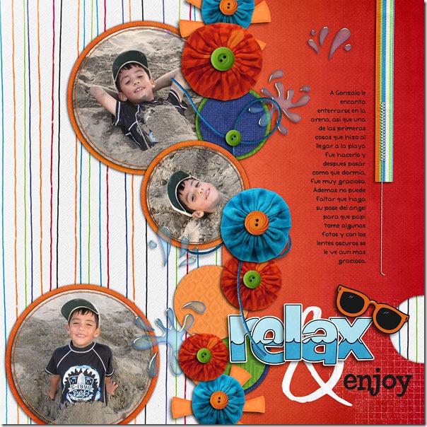
Finally, Roxana made two pages with borders as major design elements. The first page has a strong horizontal border made with circular elements – flowers, paper circles, and buttons – and her large photo is also circular and anchored to the border. This gives the page movement much like the movement of waves crashing onto the beach. 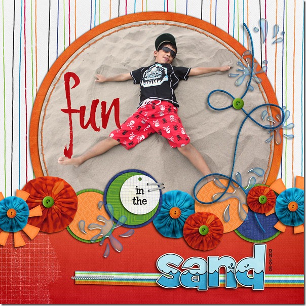 Roxana’s second page has a similar border, but this time it is vertical on the page. While still being made with circular elements, this linear approach mimics the vertical lines on the background paper and the vertically striped ribbon stitched to the right side giving the page a downward flow toward the title “relax & enjoy.” The title here actually forms a secondary border that is horizontal and less structured than the vertical one. Notice how this vertical arrangement suggests movement toward the more calm horizontal resting place with the appropriate title.
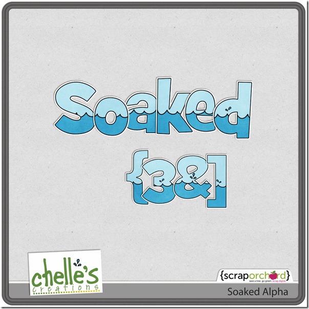
  Did you notice Chelle’s new Soaked alpha Roxana used on both her pages? Here’s a closer look at it in the market.
I hope I have given you some inspiration to begin your next page. You can make a border from almost anything in any kit you use, just as these ladies have, and you will be well on your way to making a visually interesting page to scrap your memories.





 Hi! I'm Chelle: a 40 something mom of 7. My husband & I live in a rural community in the rocky mountains with our 4 children still at home. In the winters we enjoy sledding & snuggling by the fire. I the cool fall evenings we love relaxing around the campfire & meeting friends at the county fair. Admiring the stars