Ever notice how some digital scrapbooking layouts in the galleries look so real you have to study them to see if they were made from paper supplies or digital? One of the things that can make or break a layout is shadowing. Realistic shadowing is not too difficult, but there are a lot of details to get right. I like to use Chelle’s Creations shadow styles called Me and My Shadow, and her Creative Team likes her shadow styles, too. But, they are going to show us today how to take shadowing just one step further to enhance our layouts.
First, let’s look at Erica’s layout. She has a title on her page made from the alpha in the Prehistoric kit, and she merged the letters together before shadowing to make the title have a more solid look. 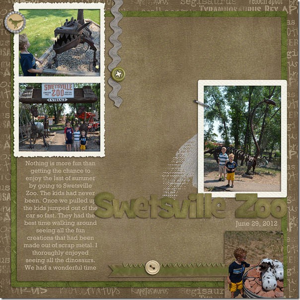 Next, Ronnie made a card with examples of shadowing and an explanation off to the right of each card. Notice how tweaking the shadow on the ribbon helps the card to have a more realistic 3D look.
 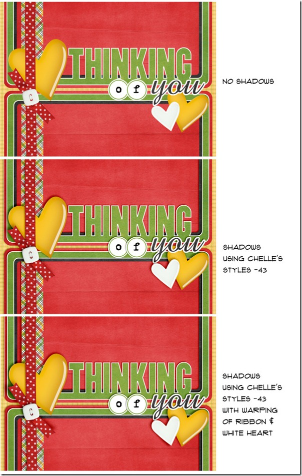 By the way, the angle she mentions (-43) corresponds to the Upper Left shadow style in Me and My Shadow.
Next, Jenn has a layout and an explanation for what she does with shadows in general. She said, “I use Chelle’s -43 shadows for most of my shadowing needs. Depending on the layout, I sometimes adjust a layer’s shadow or add a shadow on the opposite side for extra definition. I do this by separating the shadow layer (in Photoshop go to Layer->Layer Style->Create Layer). I will then nudge the shadow layer just created up or down depending on how I want it to look.” In her layout below, she nudged the Upper Left (-43) shadow on the fence posts up a little – just so they would look like they were sticking out a bit more. Also on this layout, she added a slight definition shadow on the opposite edge (shadow angle of 120) of her two paper layers and the bed of nails journaling strip.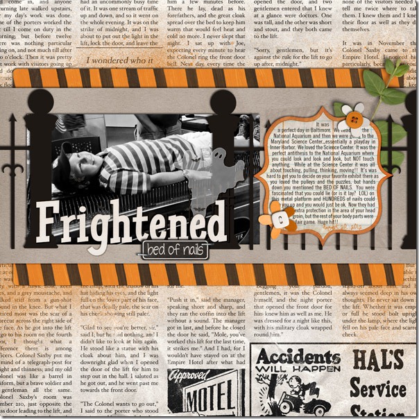
Here’s a closer look at the shadow style in the market. The image is linked. 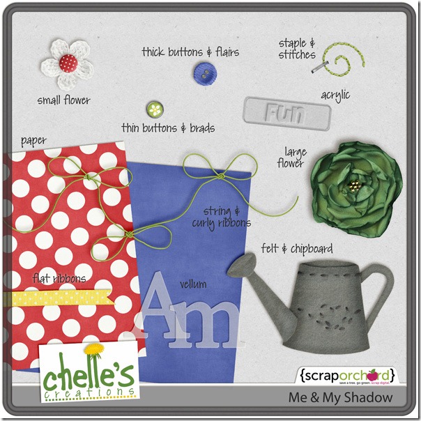
Good luck tweaking your shadows!






 Hi! I'm Chelle: a 40 something mom of 7. My husband & I live in a rural community in the rocky mountains with our 4 children still at home. In the winters we enjoy sledding & snuggling by the fire. I the cool fall evenings we love relaxing around the campfire & meeting friends at the county fair. Admiring the stars