Hi Chelle’s Creations friends! I am really excited about today’s post because I have some really creative digital scrapbooking pages to show you from Chelle’s team. Chelle asked the team members to make pages with black and white photos. There are four very different layouts for us to see, some using old photos and others editing newer ones, so let’s get right to it.
First, Wanda made a page with a photo from 1994, so it was certainly made in an era of color digital photographs. But, look at the expert job she did converting it to black and white. It truly looks like it was shot in film, originally without color. She chose Chelle’s Indian Summer kit for its retro colors and warmth. Her favorite aspect is how the photograph pops against the warm colors in that huge flower cluster. The center of attention is definitely her terrific photo. 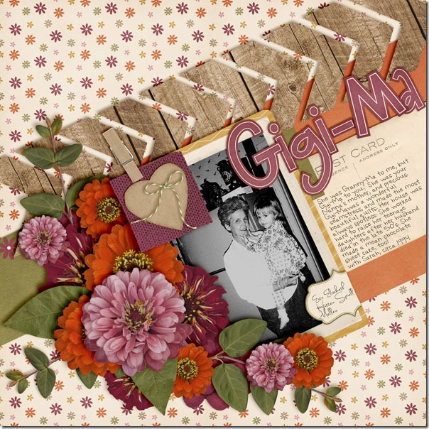
Next, take a look at Jan’s page where she has used an authentic vintage photo, shot with a Brownie camera, no less. She went all the way back to 1970 to grab this one, and it looks fantastic with Chelle’s newest kit, In the Backyard. The photo was taken at Disneyland in Tom Sawyer’s treehouse, and the kit she chose is a perfect match more than 40 years later! I love the Little People face peeking out of the window of the felt tree house – so cute! The colors in the kit give a hint to the colors that would have been seen in the real setting of the photograph, and the kit really helps to set the stage for her story. 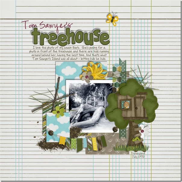
Next, we have Kayla’s page. She had a photo that captured her daughter’s expression perfectly, but the photo was a bit fuzzy. If used in color with the other color photos on her page, its lack of sharp focus would have been a distraction. But, Kayla used the black and white edit to totally transform her photo, and it has become the focal point of her page. It no longer looks fuzzy, and she was able to save that happy memory of her daughter opening that special gift. By the way, she used a couple of kits to complete her page: Tutu Cute and Berry Berry Sweet. 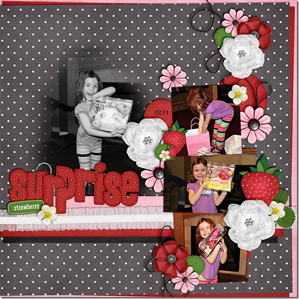
Finally, we have a page by Jen. She has done something I hadn’t thought to do before, but I am certainly planning to do this in the future! She had an adorable picture of her Lottie, and she wanted to highlight it as the only photo on the page. She knew that the purples and greens in Chelle’s In the Backyard kit were a perfect match for her photo, but she wanted to do something a little different. She copied the picture layer and turned it black and white and layered it above the color copy. Then she lowered the opacity of the colorless layer down to 85% to let some color peek through. It allowed just enough purple and green to show through to highlight the colors in the photo without the color being the main focus, and it really helps Lottie’s sweet face be the center of attention. Adorable! 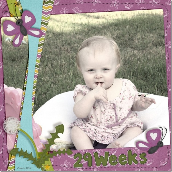
I hope you are inspired to play with black and white photos. You can dig through a box of precious memories or just find the button on your editing software; either way, having a monochromatic photo might just be the start of your next masterpiece.





 Hi! I'm Chelle: a 40 something mom of 7. My husband & I live in a rural community in the rocky mountains with our 4 children still at home. In the winters we enjoy sledding & snuggling by the fire. I the cool fall evenings we love relaxing around the campfire & meeting friends at the county fair. Admiring the stars




Thank you for the last example, I love knowing how to do that! I am enjoying your daily downloads, thanks for them and the work you are doing on the tutorial portions. I appreciate them!