Happy 4th of July to all those who celebrate! Hi Everyone – it’s Jenn, aka jk703 here with a quick tutorial! So much is going on, so I won’t keep you for long. Adding warmth to photos are super easy to do… and can really make a cooler photo look nice and warm with a sunny feel. Sometimes shadows, clouds, and skin tone will look a bit blue… so this will help you change it a little. This little tutorial can also be done for many other color changes for photos.
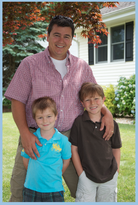
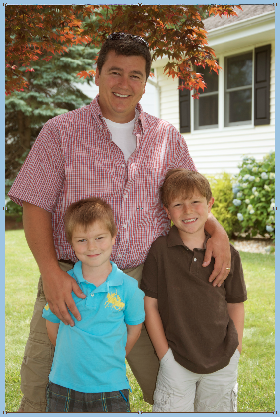
Open your image and re-save it. This was you will have your original available if you need it later. Here is mine of my boys on Father’s Day this year. Not a bad picture, but I like my images a little warmer most of the time.
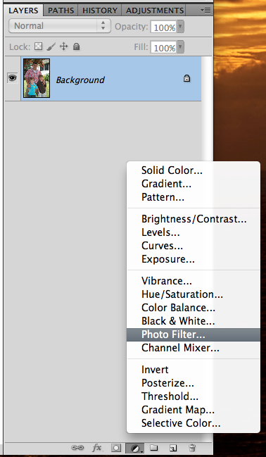
Next, on the bottom of your Layers Palette, there is a black and white filled circle. Click on that and the Adjustment Layer options will pop up. Choose Photo Filers.
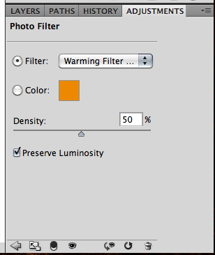
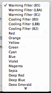
You will automatically be looking at the Adjustment Palette. you can click drop down menu next to “Filter.” There are so many options available to you to enhance your photo. You can also use a specific color by clicking on Color. You will then get an option to change the color by double clicking on the color box.
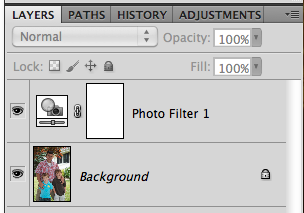
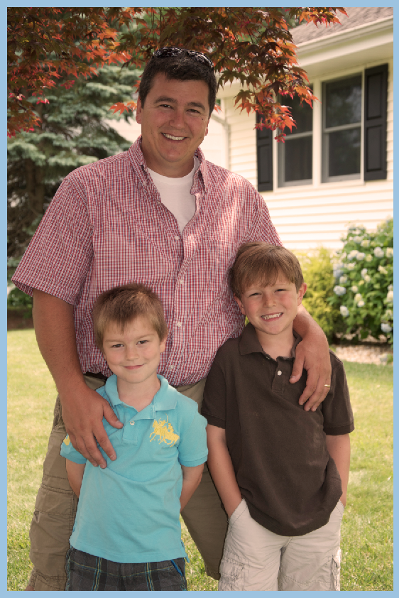
I’ve chosen the first warming filter, and have moved the opacity to 50%. Then you are done!
Here is my image… and my Layer’s Palette so you can see what yours should resemble.
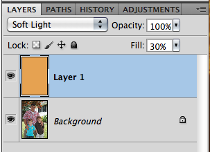
Another easy way to add warmth (or any color) to your photo is to add a layer above your photo. Click on your background color in the Tools Menu. Use the color picker to get a color that you want to add to your photo. I used an orangey color for mine – similar to the one available in the previous adjustment layer. Press Command + Delete to fill the layer with the background color.
Next, change the blend mode to Soft Light, and play with the opacity of the color layer. You can use any blend mode and opacity combination that you like for your photo. Here is mine – Soft Light and an opacity of 30%.
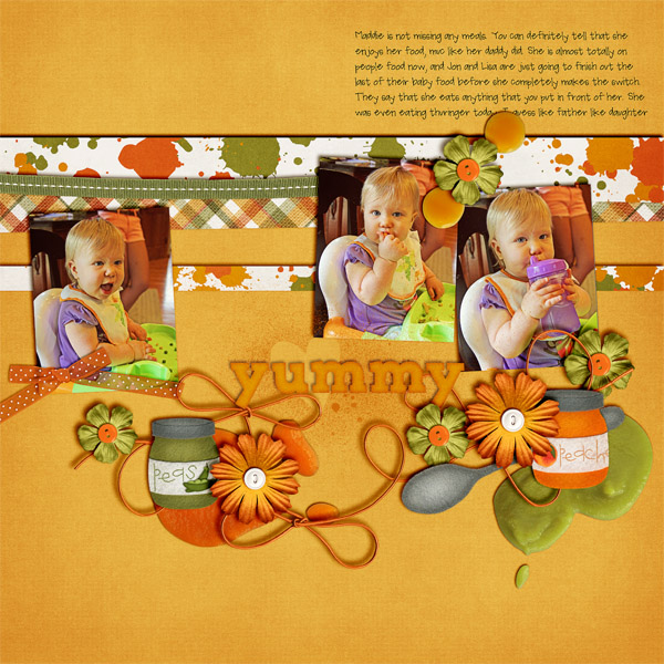
Here are layouts using these techniques from the CT. Here, Jenn (jennschultz) created this layout using First Foods.
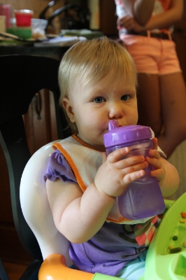
Here is her original picture:
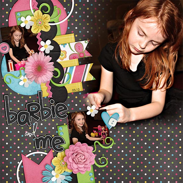
Next, Kayla (keepscrappin) made this layout using Girlfriend, Toadally, and Toadally Add-On (and a Little Green Frog Template too!)
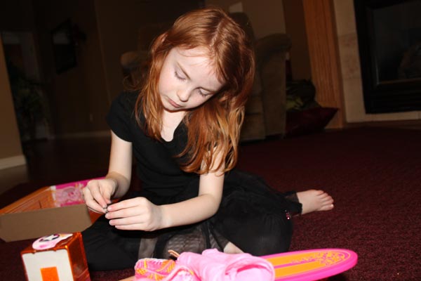
And Kayla’s original image:
There you go! Simple and super fast too! Thanks for stopping by today, be sure to keep checking everyday for Chelle’s freebies for the month of July! Have a great week!







 Hi! I'm Chelle: a 40 something mom of 7. My husband & I live in a rural community in the rocky mountains with our 4 children still at home. In the winters we enjoy sledding & snuggling by the fire. I the cool fall evenings we love relaxing around the campfire & meeting friends at the county fair. Admiring the stars



I will try this-thanks for another great tutorial.