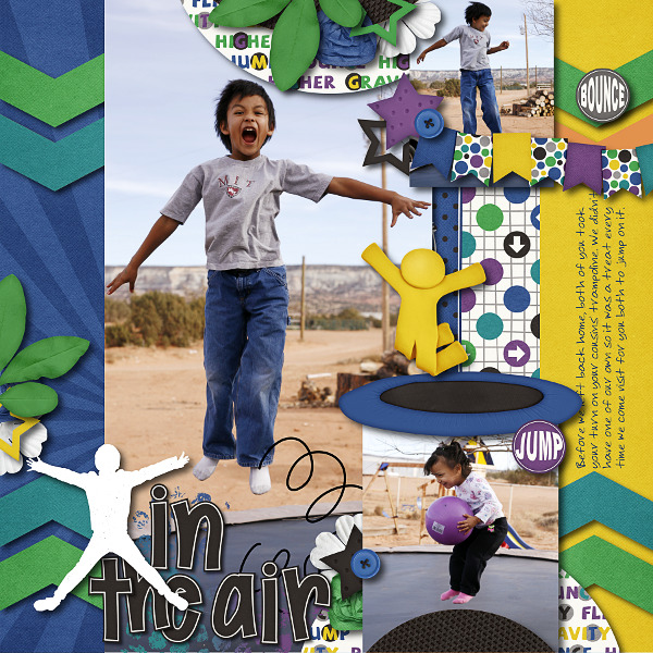
Hi Everyone, it’s Jenn (jk703) here to share some tips with you today. I’m going to focus on shadowing and preferences – because everyone shadows differently, and everyone has their likes and dislikes. It can depend on the blend modes, distance of your shadows, the size of your shadows, the color of the shadows, and the opacity of the shadows. There are so many different things that can change, so that is why I’ll show you a little of my shadowing and preferences. For today’s example, my page is using Chelle’s newest kit – Jump Zone and it’s coordinating (but so versatile) alphabet – Zone {Alpha}. Here is my page: 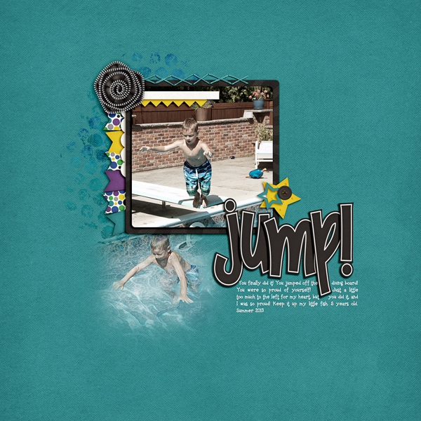
Now, let’s get a little closer. First up, the banner.
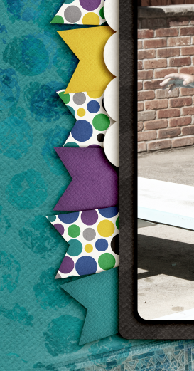
For this particular banner, I have it tucked under paper layers, so it is closer than if it were on top of the photo. For this and the paper layers, I use what I call “Paper Layer + Opposite Edge.”
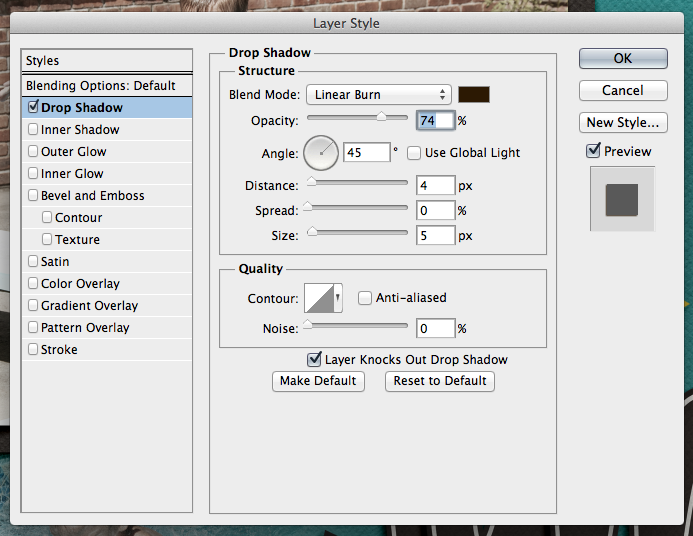
Here is the shadow information. For the basic Drop Shadow layer, my style uses a Linear Burn, 50% opacity, with a Distance of 13, and a sir of 24. The distance will change how far away the shadow will be from the paper or element. The size will determine how “crisp” your shadow is, or how blurry it is.
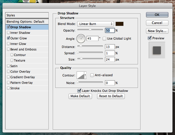
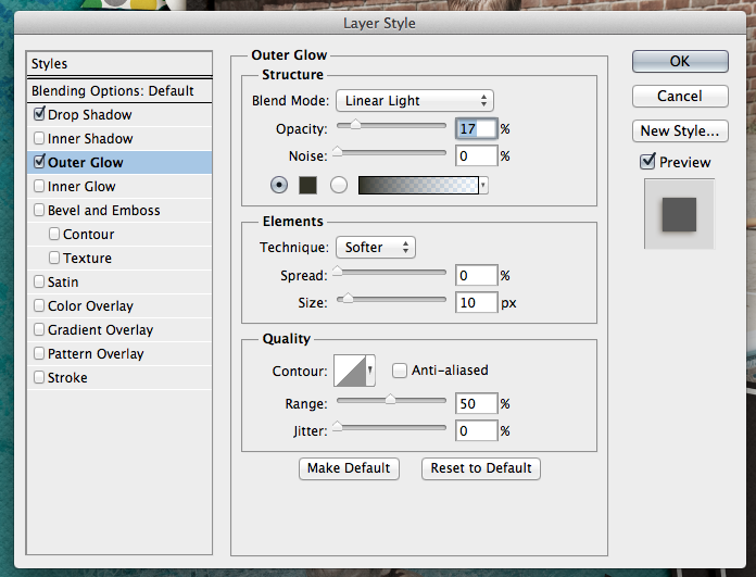
For this and most of my paper layers, I add a shadow to the opposite edge. When I look at a paper, it doesn’t sit perfectly on top of another when stacked – there is a slight shadow around the edge so you know they are separate pages. To get this effect, I add an Outer Glow. I use Linear Light, at 17%, color versus a gradient color, and my size is 10 with a softer Technique.
Next up, how I add shadows to stitches. They are really close to the pages, so I shadow these with a heavier “color.” For me, when I look at pages, the closer the item it and how “heavy” at item is will dictate what kind of shadow you need. You may think otherwise, and that’s ok. This is all about you and your preferences. Here are my settings for the stitching:
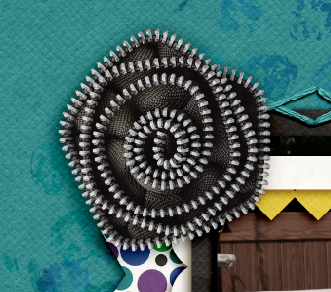
One last shadow, and then I’ll share what the CT made! Flowers. There are SO many different flowers, realistic, paper, doodles, etc, and there are so many more ways to shadow them. For this particular page, I have a zippered flower. To me, that is a heavier flower/fabric, and metal – which deserves a heavier shadow. Here is my normal “higher” flower shadow with a little added for the opposite edge. 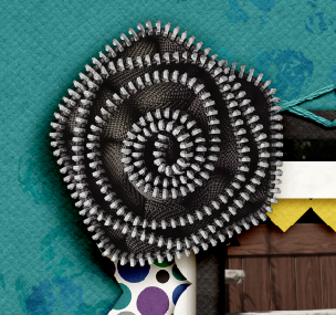
It looks too dark to me. Especially on the darker teal paper. So, I adjusted it, and the color of the shadow to make it more to my liking.
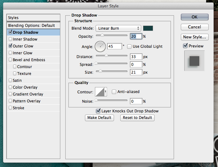
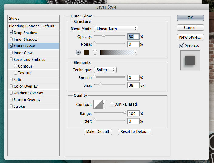
Here are the settings that I used for the second flower. I changed the color by clicking on the color box, and then clicking on my background paper. I then chose a color on the darker end of the slider. I also lowered the opacity, and made the size a little smaller than usual. This isn’t my normal settings, so it took some time to make it pleasing to my eye.
For the opposite edge of the flower, I used the Linear Burn Blend Mode at 30%, along with the Technique: Softer at 38 pixels in size.
Play with your shadows, and make them how YOU like them. Use the shadowing and preferences how you like them! Once you like them, get a test print of one page before printing. By doing that, you can make sure that you like how they look when printed. I wasn’t sure when I printed my first album, but it turned out wonderfully. Recently, I printed a Wedding Guest Book as a gift for a cousin, and again, I loved the book so much, and the shadows really made it stand out. People were “petting” the pages.
Here is what the CT shared with me. First, Ophelia (navaja77) uses Gimp for her scrapping! So she gave me some information to share with you all and a sample page of hers! She used Jump Zone and Zone {Alpha}.
“I used GIMP 2.6 and Drop Shadow Script-fu. For the papers – I typically use X: 15, Y: 15, Blur radius: 25 and 65% opacity. For this page, I used X: 20, Y: 20, Blur radius: 35 and 65% opacity. For the elements – X: 25, Y:25, Blur radius: 55 and opacity 65%. This page didn’t have stitches or washi tape but for those I typically use X:4, Y:4, Blur radius: 4 and opacity 40%. For leaves, to get the realistic feeling, I will increase to 30, 30, 60 and opacity 60%. My settings place the shadows on the lower right side. If you prefer lower left side, then change X to negative number (e.g. Papers: -15, 15, 25, 65%). If you shadow like Chelle, ten both X & Y would be negative numbers so you get shadowing at upper left.”
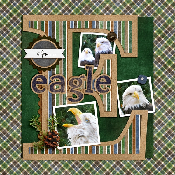
Next up, is Donna (dip332) who created this wonderful page. She added shadows using Chelle’s Me & My Shadow, and then tweaked it to her taste. She said “I made the pine and pine cone really stand out by using both an upper and lower large shadows. I also used a chipboard shadow on the word eagle. The buttons are both a flat button setting. The rickrack is a flat ribbon shadow style.” Perfect way to make it stand out – using two shadow settings on one element! Great idea! (She also used Let’s Camp S’more and On The Trail)
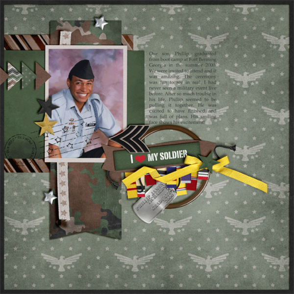
Lastly, here we have a honorable page from Leah (Cat Lady). She said “I start with Chelle’s shadows and expand from there. And I love to put shadows on their own layer and expand and move them to cause elements to “lift” off of the page!” She used Chelle’s Rolling Along kit and Scrapping with Liz’ December Tuesday’s Template.
Hope you enjoyed today’s post – Thanks for visiting!






 Hi! I'm Chelle: a 40 something mom of 7. My husband & I live in a rural community in the rocky mountains with our 4 children still at home. In the winters we enjoy sledding & snuggling by the fire. I the cool fall evenings we love relaxing around the campfire & meeting friends at the county fair. Admiring the stars


Thanks for the great freebie! You have been listed on http://www.digiscrapfreebiefinder.blogspot.com a website featuring hand-picked designer digi freebies (with a link to your page for downloading)! Visit the website if you would like a badge.