Hi everyone! Can you believe it’s the end of the summer here in the US? I can’t – I’m in denial! This is Jenn (jk703) here, and I am in complete denial that the summer is ending! LOL! We’ve gotten our teacher assignments, and classroom schedules, and I keep telling myself “It’s Summer!” Uh oh!
Anyway, summer is BIG for me! BIG as is lots of freedom, time, fun, and even more pictures! I bet you have great summer pictues too! I know that once I get a great photo, I like to make it the focus of my scrapbook pages! So…. how to you do that? By making the photo the center of the page! Here are a few tips for you!
1. Let the photo shine….
Really. It’s ok. Trust Me. Many templates out there are one photo, two photo. or multiple small photos. You don’t have to follow the template! I know, it’s hard not to, but you can switch it up! try using a photo as the “background paper” and moving the clusters to one side or corner! Play with your templates! Remember they are not set in stone, you can change them how you choose.
2. Make it Big and Layer It Up!
Many of my pictures are layered and “matted” up. I like the look of a big picture with matted edges. All you have to do is stroke the edge of the photo with a few pixels and you are set! It doesn’t have to take up 10×12 of a 12×23 layout to shine. Just make it the focus!
3. Add a Title!
You have a great picture, now what? Nothing but add a title! Really! If you love the picture that you have, make it work for your page – just add a title and even some journaling, and you are set. Done. East Peasy!
Here are some inspirational pages from Chelle’s CT to show off some BIG picture pages:
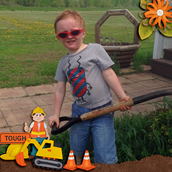
Here is Jenny’s page using Hard Hat Required! Look at that BIG photo -perfect with just the clusters in the corners!
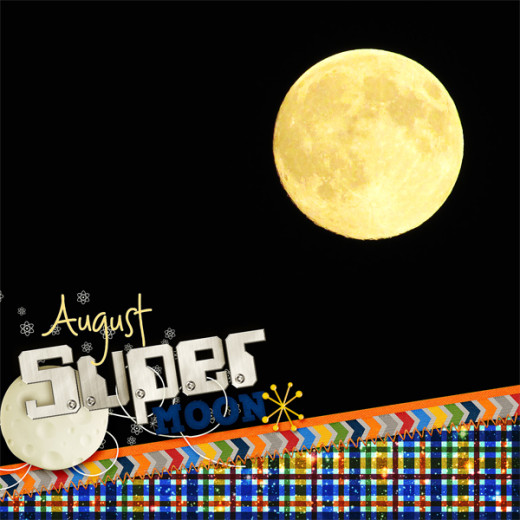
Look at this Super Moon pic by Donna! You can’t help but admire it! She used Out of the is World by Chelle!
Last, but not least, Lisa, made this wonderful page about life size games, specifically, Chess! I think I have to dig out my pictures lie this too and scrap lift her! She used Game On by Chelle! 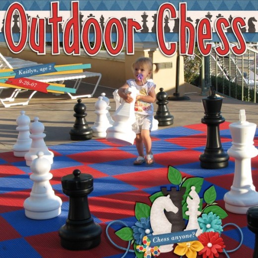
Big pictures are a good thing. Don’t be afraid to use them!
Have a great week, and thanks for visiting!






 Hi! I'm Chelle: a 40 something mom of 7. My husband & I live in a rural community in the rocky mountains with our 4 children still at home. In the winters we enjoy sledding & snuggling by the fire. I the cool fall evenings we love relaxing around the campfire & meeting friends at the county fair. Admiring the stars



Jenn … you are so right! i never actually THOUGHT about a layout with the photo for the whole page and the elements as incidentals! thank you! great idea!
These are such great tips & examples! I wanted to say thanks for these AND for the great JC’s you’ve given out! Thanks!
Great kit – thank you so much for the coordinating freebies!
Pingback: CraftCrave | DigiFree | CraftCrave