Several members of Chelle’s Creative Team love to make double pages for digital scrapbooking layouts. I asked them what they liked about it, and several of them, including Chelle, said they like to use lots of photos on the pages and have both sides of the spread be “matchy matchy.” Helen said, “I like that I can scrap lots of photos without having to make them smaller to fit on a single layout or have to ‘ditch’ some off the layout all together.” Besides being cohesive in theme, Melissa also said she prefers to use only a few photos on her pages, so having a double allows her to use more photos and not have a crowded look.
Personally, I like using double page spreads for vacation books when I have lots of great scenery photos that I want to print in large size. Jan must agree with me because she made a double page with some photos from her trip to Yosemite. The views of El Capitan and Half Dome certainly warrant large photo spaces. She used a template by Little Green Frog Designs and Chelle’s kits Let’s Camp S’more and On the Trail. 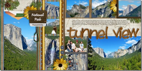
Next, Jenny made a double page from photos of a zoo trip. She also used a double template by Little Green Frog Designs, and she used Chelle’s Prehistoric with her Bedrock Alpha. Because she used 2 pages to tell her story, she was able to enlarge her son’s photo on the left side of the page and still have room for photos of the animals at the zoo. 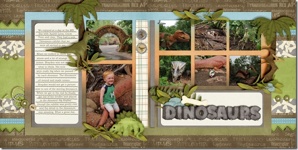
Tammy was able to use no less than 9 photos on her layout because she used a double spread, and she was able to show off her little cuties at the beach while still having lots of room for her story and cute elements from Chelle’s At the Beach kit. I love the sand castle in that kit, and it looks great as an anchor to the photos on the left side of the page.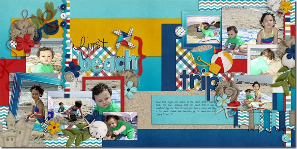
Heather also loves to show lots of photos on the page at time, and family play time at the bay was the perfect reason to do so. She chose to have the title extend across the middle of the page, which works well since several printing companies now offer lay-flat pages with no gutter. She used At the Pool and a template by Little Green Frog Designs. 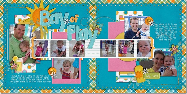
Like Jenny, Donna used a double page spread for her zoo pictures so she could include lots of animal photos. She has used a template by Scrapping with Liz and Chelle’s Bluebird on My Shoulder for the main kit and a few elements from Zoopendous and Forrest Friends. 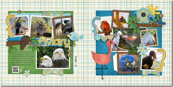
Finally, Kimberly has a great tip to share with us regarding the making of a double page spread. She started with a template from Fiddle-Dee-Dee Designs and used Chelle’s Anchors Aweigh kit. She also mixed the use the styles on the template with Chelle’s Me & My Shadow styles for added elements for a huge time saver. She doesn’t like to see seams on the background papers, and since the papers are generally only large enough for a single page, the combining of papers is necessary for a double. But, Kimberly uses three papers on the background layering the third paper on top in the middle of the spread. Then she blends the outside edges with the eraser tool into the 2 papers behind. That way, no seams show and the background appears to be one long 24 inch paper. 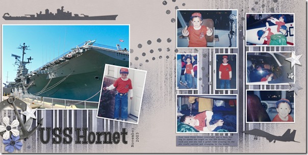
I hope you’re inspired to double a page now. I know I am!





 Hi! I'm Chelle: a 40 something mom of 7. My husband & I live in a rural community in the rocky mountains with our 4 children still at home. In the winters we enjoy sledding & snuggling by the fire. I the cool fall evenings we love relaxing around the campfire & meeting friends at the county fair. Admiring the stars