Hello Everyone!
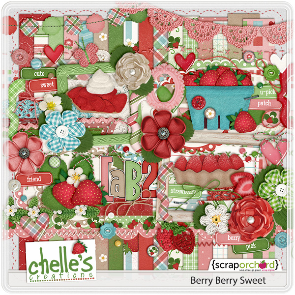
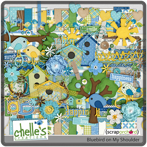
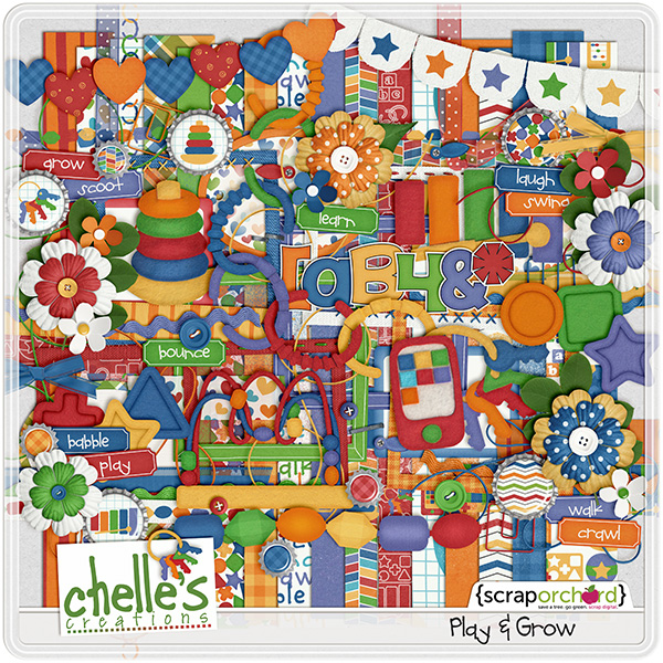
Where do you sit on Titles & Subtitles? We seem to either love them or hate them. One fun way to change things up is to separate your title into a title & a subtitle. Chelle does this all the time with her digital scrapbooking word arts. One or two words are large & made with an alpha, the rest are done with a font. {For more information, click on the images.) Whatever you choose to do, word art titles really add color and fun to any LO.
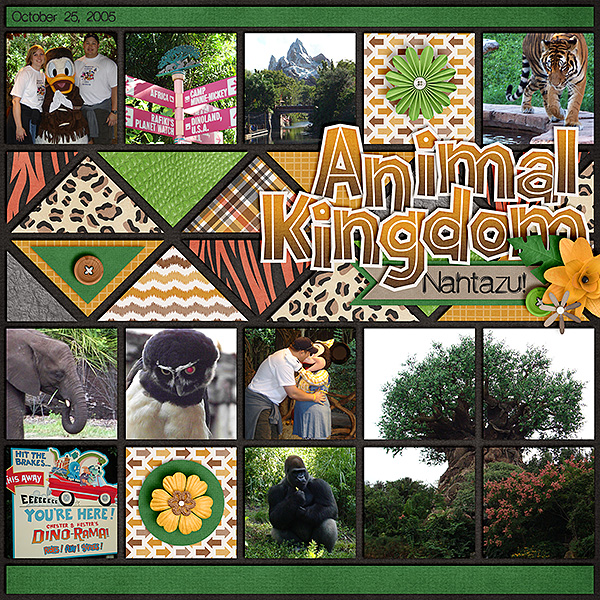
I found a web site with some great title and subtitle ideas. The Perfect Title Check them out. Tons of ideas! Let me show you what our CT came up with as ideas. Look how fun this layout from Karen is.Isn’t that title fabulous? Then the subtitle. The Zoo Crew Safari Alpha Lion Alphabet really add some great dimension to the layout.
Karen used Zoo Crew {Safari Bundle} Zoo Crew {Jungle Bundle} & Zoo Crew {Animal Prints). The images below are linked to the store if you want a closer link.
Let’s look at Lisa’s layout. She’s used two colors with her title & subtitle. She has also included word bits at the bottom of her layout.
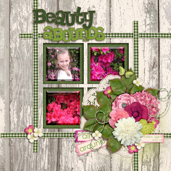
Lisa used CU Balsa Bloomers: Anemone, Begonia, & Chrysanthemum, Fleur De Violette & In the Forest {Alpha}.
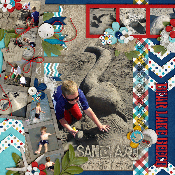
Next we have Leah’s layout. She has made her title & subtitle perpendicular to each other.
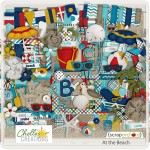
Leah used At the Beach.
How would you do your title and subtitle?





 Hi! I'm Chelle: a 40 something mom of 7. My husband & I live in a rural community in the rocky mountains with our 4 children still at home. In the winters we enjoy sledding & snuggling by the fire. I the cool fall evenings we love relaxing around the campfire & meeting friends at the county fair. Admiring the stars