Hello Friends!
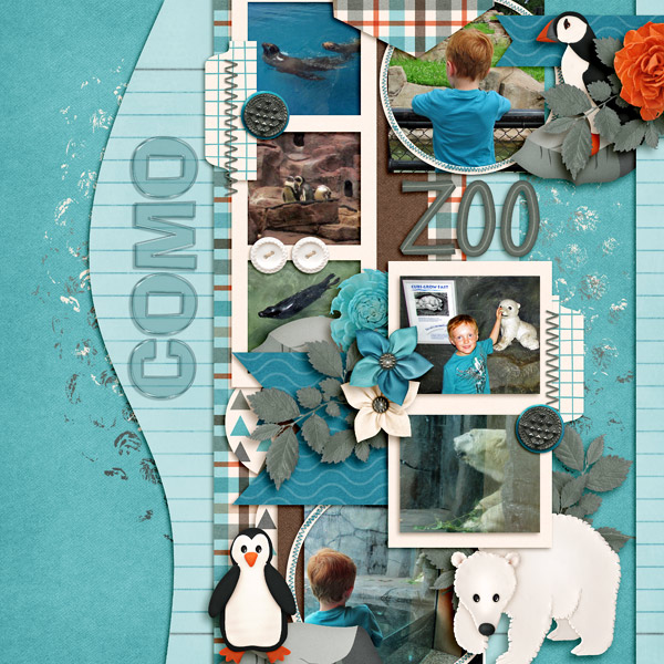
What reasons do you have for using vertical titles in your digital scrapbooking layouts? I asked our creative team to help me with a list.
- to indicate verticality–like a waterfall, or something very tall like a skyscraper
- sometimes it’s just a lack of space in the horizontal axis
- that’s the way it’s shown on the template {my favorite response)
- works with the composition of pics
- because that’s what space there is available
- sometimes to simulate movement
- using a vertical title with blocked layouts
- When the title won’t fit any other way
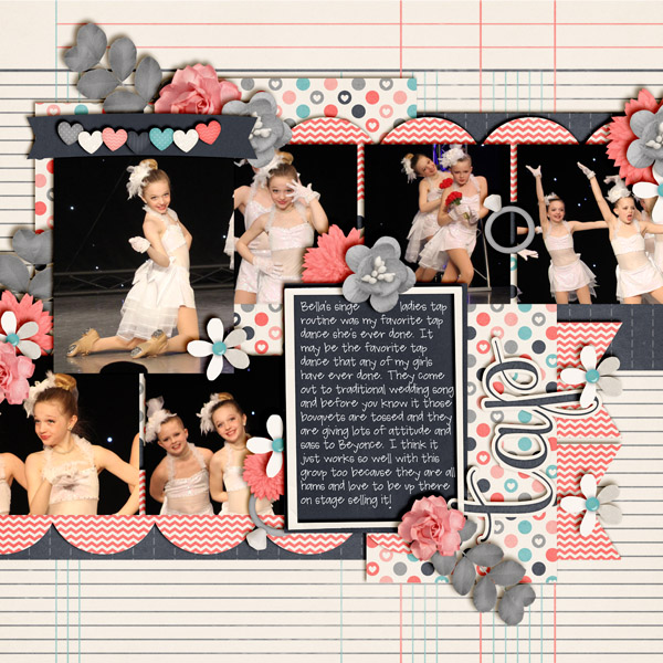
What other ideas do you have? Let me show you what our creative team came up with. Kayla created this layout. Her title is on the other side of the page from her journaling.
Jenn S used a verticle title on the side of her journaling.
Jenny split her titles up. One horizontal and one vertical.
What other ideas do you have for vertical titles?




 Hi! I'm Chelle: a 40 something mom of 7. My husband & I live in a rural community in the rocky mountains with our 4 children still at home. In the winters we enjoy sledding & snuggling by the fire. I the cool fall evenings we love relaxing around the campfire & meeting friends at the county fair. Admiring the stars