Are you looking for a way to add a more realistic touch to your layouts? Chelle’s Creations video tutorial is going to share how to give papers in your layouts a torn edge look. Chelle Creations has created a bundle to make it even easier.
Here are a few inspiration pages from Chelle’s creative team.
Krista (kc71595) combined the CU Torn: Whites with Anchors Away and Liberty to create her lovely page. She also chose a template by Scrapping with Liz. I love how the torn paper adds a little texture to the page.

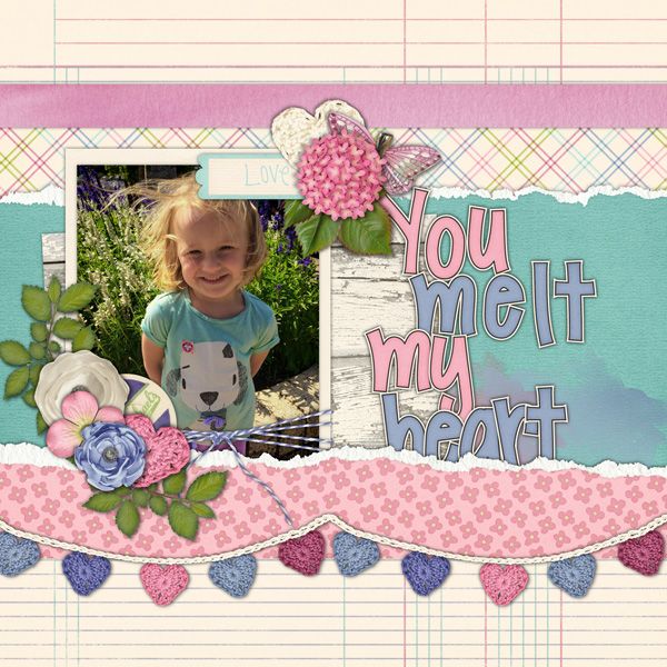
That smile would definitely melt my heart. Helen (winipeg1) used Fleur de Violoette to create this adorable page.
Do you want to easily be able to create the torn paper look on your own pages? Check out Chelle’s Creations CU Torn Bundle featured in the video. While there check out other great products that Chelle has to get your pages going.



 Hi! I'm Chelle: a 40 something mom of 7. My husband & I live in a rural community in the rocky mountains with our 4 children still at home. In the winters we enjoy sledding & snuggling by the fire. I the cool fall evenings we love relaxing around the campfire & meeting friends at the county fair. Admiring the stars


This is fabulous! Thank you for sharing this great tip!! I have several torn paper edges but have struggled in using them – now after watching your video three times to see what I wasn’t doing correctly, they are a breeze to use. I must say that your edges have a much more realistic look to them than other designers. They actually have texture to them! Thank you, thank you, thank you!
Pingback: CraftCrave | DigiFree | CraftCrave