Chelle’s Creations has so many alpha doodles to choose from in the store at Scrap Orchard. Today I’m going to share Chelle’s video tutorial with a few ways to add a little more pizazz to them. (Note some of the alphas in the video may no longer be available). Check out Chelle’s 10 tips.
Chelle’s very talented ladies have used some of the ideas in the video and here are the layouts they came up with.
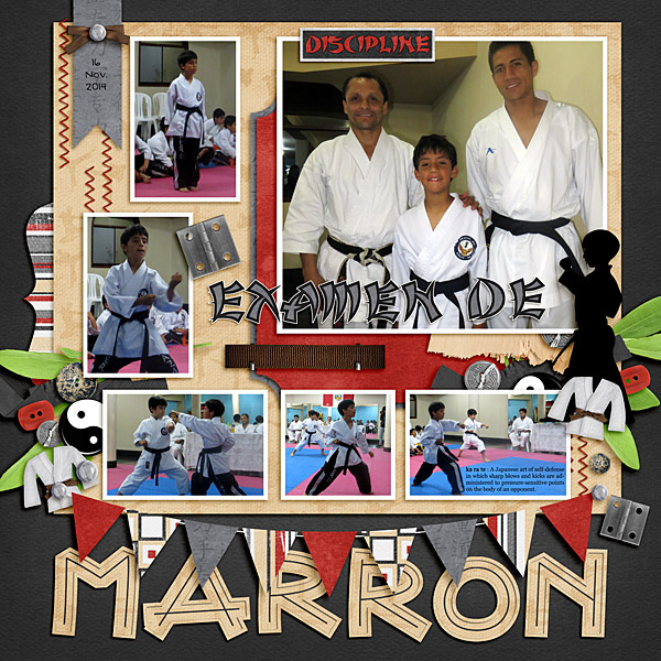
Roxana (roxanamdm) created a a wooden look to the CU Sketched Alpha on the bottom of her page. On the upper layer she added a drop shadow, an inner shadow, an inner glow and some bevel and emboss. On the second layer she just added a drop shadow and clipped a paper to the doodle. She used the Black Belt kit for this page.
Using some of Chelle’s new items (Slice of Summer {Sampler}, Slice of Summer {Alpha}, and Lay It On There {Singles} 1 & 2) Kimberly (enjoyyourpix) created this delicious looking layout. She placed the alpha on top or an element to create her title.

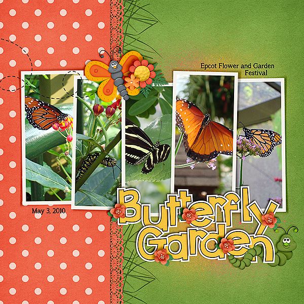
I enjoy seeing how the same template can be used but get a totally different look. Also using the Lay It On There {Singles} 1 & 2, Karen (zippoh) created this beautiful layout. For the layout she used Bug Town {mini kit} and Green Thumb. She took a flower and leaves from Green Thumb and shrunk them to use as accents on your title.
Head over to Chelle’s store and check out all the alpha doodles she has there. Then try one of the suggestions out on a layout of your own.
CU Cherish Alpha Doodles was one of the alphas featured in the video.


 Hi! I'm Chelle: a 40 something mom of 7. My husband & I live in a rural community in the rocky mountains with our 4 children still at home. In the winters we enjoy sledding & snuggling by the fire. I the cool fall evenings we love relaxing around the campfire & meeting friends at the county fair. Admiring the stars


Pingback: CraftCrave | DigiFree | CraftCrave
Very great post. I just stumbled upon your blog and wished to mention that I’ve truly loved surfing around your
blog posts. After all I’ll be subscribing on your feed and I am
hoping you write again very soon!
Great information. Lucky me I recently found your website by chance (stumbleupon).
I have saved it for later!