Hey Friends! This month I challenged our creative team to do a digital scrapbooking layout showing how photogenic they are. To put themselves in the photo. I referred them to a local show here in Utah called “Studio 5,” and a segment called, “Yes, YOU are photogenic.” I’ve linked it up for you if you want to take a look. Local photographer Kate Pease gave some great examples of how to take the photo so that you look your best.
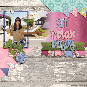
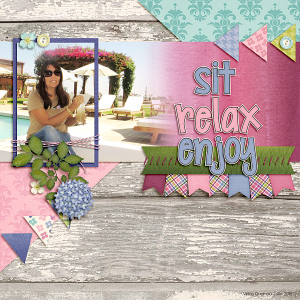
First let me show you what Roxana did as her before and her after. In the first one she thought it made her look “wider.” In the second, she changed position by crossed her arm and rotating the photo a bit. She felt like she now looked “thinner.” Roxana used Fleur de Violette.
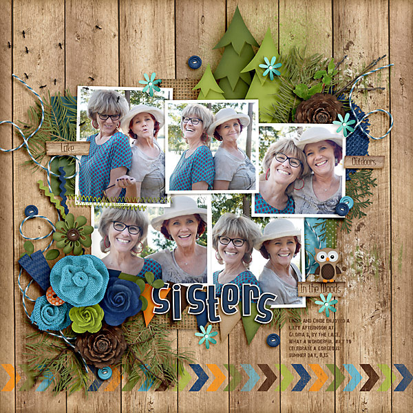
Another suggestion from Studio 5 was to include photos of yourself straight on and turned to your side. Let me show you Carol’s layout that she made using this principle. Carol used In the Forest & Great Outdoors.
Take a minute and check out the Studio 5 Blog, “Yes, YOU Are Photogenic.” I think it will provide some good tips and I can’t wait to see if that shows up in your layouts!
Hugs!





 Hi! I'm Chelle: a 40 something mom of 7. My husband & I live in a rural community in the rocky mountains with our 4 children still at home. In the winters we enjoy sledding & snuggling by the fire. I the cool fall evenings we love relaxing around the campfire & meeting friends at the county fair. Admiring the stars
