Hi Chelle’s fans! We have a real treat for you today. Three of Chelle’s talented Creative Team members have created digital scrapbooking pages employing varying techniques for adding texture to a large background photo. This can be very useful when the photo you want to use for a background is lower resolution than ideal, or when you just want to add that tactile feeling to a page with lots of textures in the subject.
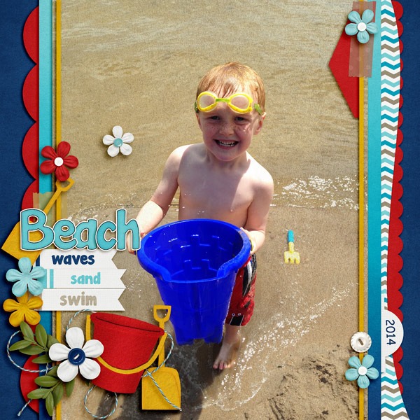
Jenny’s photo falls into the latter category: she had a photo of her son playing at the beach, and she wanted to add a little emphasis to the background. Here’s her original photo without any textures added.  Now, here’s that same photo with a sand texture added but erased over his sweet face. Can you see the dimension it adds to the page? She used At the Beach for her page, and she used the sand paper in the kit for the texture.
Next I have a page from Donna. I think she’s tired of the snow, but she made a gorgeous page with a texturized large photo in the background. Here’s what she said about her page. “The background photo was taken with my iPhone, and it was taken through the windshield of our car, so I knew that when enlarging to this size, the resolution would not be great. I used a snowflake paper from We Wish You a Merry Christmas, and changed the opacity to Overlay at 70%, then merged that to the photo layer. Still wanting more, I added Chelle’s CU Fabric Textures (linen) on top of the photo/snowflake layer and merged the two.”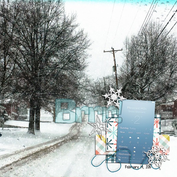
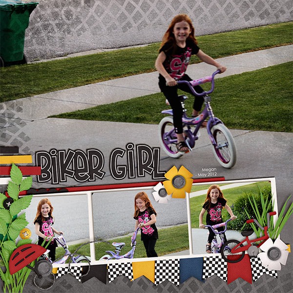
Finally, Kayla has used one Chelle’s latest kits Makin Tracks for her page. It was a perfect match for her photos. Here’s what she says: “ I wanted the tracks and grunge from the background paper to show on the photo. I placed the photo on top of the paper and scrolled through the blending modes with the photo layer selected.The overlay mode gave me the closest result to what I was looking for but it wasn’t quite enough. I needed the photo a little lighter, so I duplicated the photo layer again.That made it too light, so I adjusted the opacity down on the 2nd photo layer until it looked right. Then, I merged the 2 photo layers and used a layer mask with the linear gradient (foreground to transparent) tool to blend the bottom edge of the photo into the paper. I love how it looks like the photo and paper are all one layer.”
Personally, I LOVE it when friends tell me exactly how they achieved their artistic look on a page. A huge thanks to Donna, Jenny, and Kayla for sharing with us this week.







 Hi! I'm Chelle: a 40 something mom of 7. My husband & I live in a rural community in the rocky mountains with our 4 children still at home. In the winters we enjoy sledding & snuggling by the fire. I the cool fall evenings we love relaxing around the campfire & meeting friends at the county fair. Admiring the stars