Hi Everyone! This is Jenn, jk703, here with a fun and easy tutorial for your journaling! I’m here today to share Busy Background Journaling… or Not So Busy Background Journaling!  Don’t groan yet! I get it, journaling is hard for some, easy for others, but if you put the effort in, you want to be able to use the papers you like, AND read your journaling! Right?!
For my layout, I’ve used Chelle’s Doctor’s Orders, Chelle’s CU Watercolor Brushes, a Scrapping with Liz March In Review template, and the font Special Elite. I’m super addicted to this font, and have used it since January on almost every layout. I’ve never done that before.
Method #1
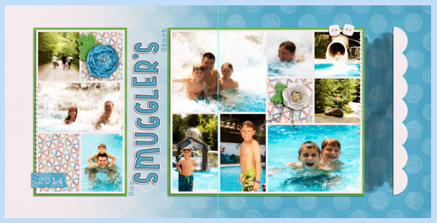
I’m working on this page. You can see my grey spots over on the right. That will be where my journaling will go. I’ve used the water color brushes (two of them), and lined them up how I like.
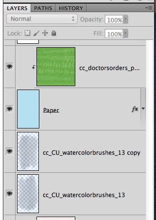
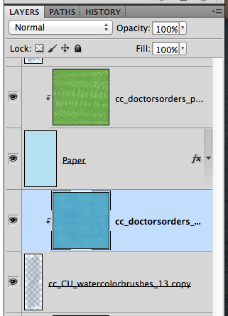
And my Layer’s Palette:
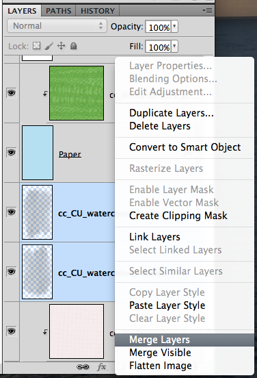
Next, I merged them together. This way, they become one watercolor shape/spot.
Next, I brought in a solid paper, that matched my background paper with the swirled circles. (Say that 10 times fast!) This paper is above the watercolor shape.
Next, I will clip my paper to the Watercolor paint. Just have the paper selected in the Layers Palette, right click and choose Create Clipping Mask. Like this:
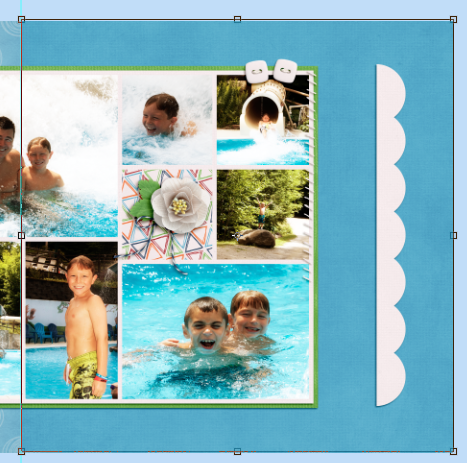
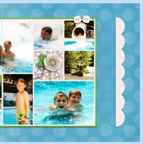
Once you clip the mask, it may or may not show up a lot if you’ve used the same color as the pattern paper. That’s ok and normal. Just like mine, right now. 
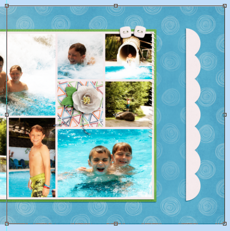
So, here is a quick fix. First, select the watercolor brushes layer, and go through each of the Blend Modes to see if any will work for your journaling needs. They did not for me. That’s ok. Select the watercolor layer, and the paper layer, and DUPLICATE them. That’s right. Duplicate – once selected, right click and choose Duplicate. Then your Layers Palette will look like mine below. The watercolor part has darkened the white swirls, just a bit more.
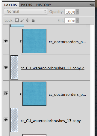
And my duplicated watercolor spots.
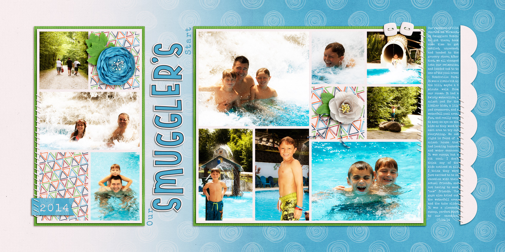
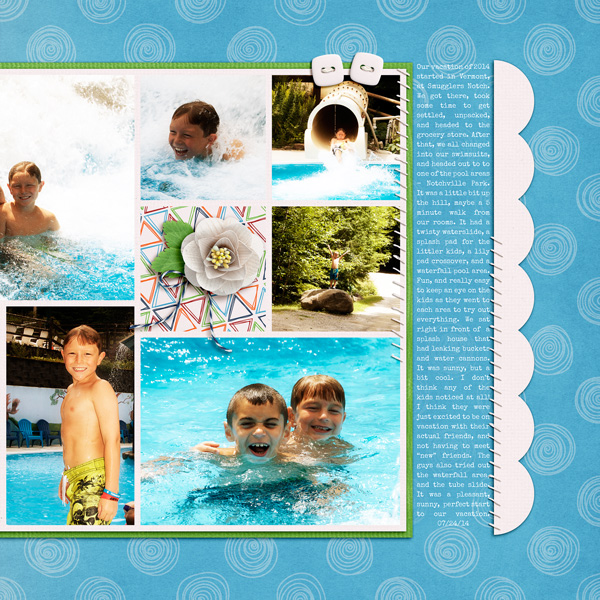
Here is what my final layout looks like. Even with the small size, you can see more journaling than paper where I’ve used the watercolor brush, and paper.
Method #2
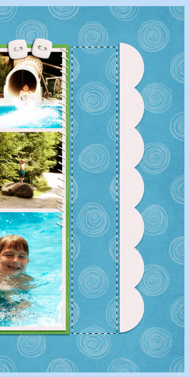
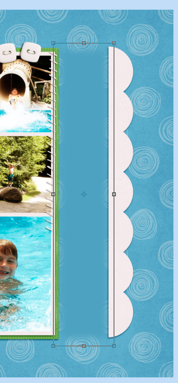
I’ve got one more trick up my sleeve. This one is super easy, especially if you don’t have a solid paper in a specific color! Again, I’m working on my layout. I’ve used the Marquee Tool, and drawn a box where I’d like my journaling to be. You should see marching ants.
Next, you will change your Background Color to the color you want to be prominent for your layout. In my case, I want a darker color to cover the light white swirls. So, I choose the solid teal. Here is my background Colors.
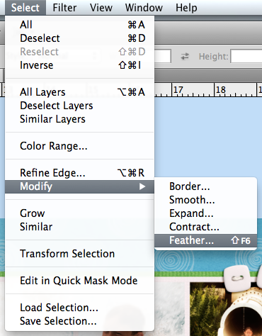
Your marching ants are still marching at this point. Next, you will create a new layer on top of the background paper (or right where you want your journaling to be. This layer can be moved later if you need. With that new layer selected, and your marching ants marching, you will choose Select > Modify > Feather. Feathering is expanding the edges of the selection, but more of a blend will occur as the edge moves away from the center.
A pop up will appear. I chose to feather by 30 pixels.

After you click ok, you will then press Command + Delete (Alt plus Delete on PC) and you will fill in the selection with the Background Color. See below. A filled in area that does not have distinct edges or really a total square-ness.
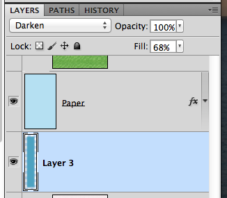
To make this seem less solid, all you have to do is play with the Blend Mode, and the Fill or Opacity. For my example, I chose Darken and a 68% Fill.
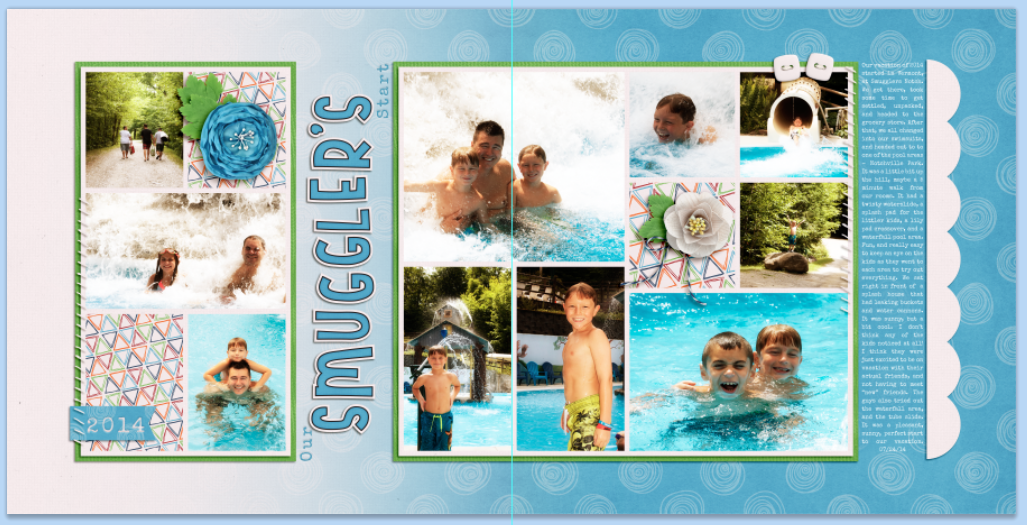
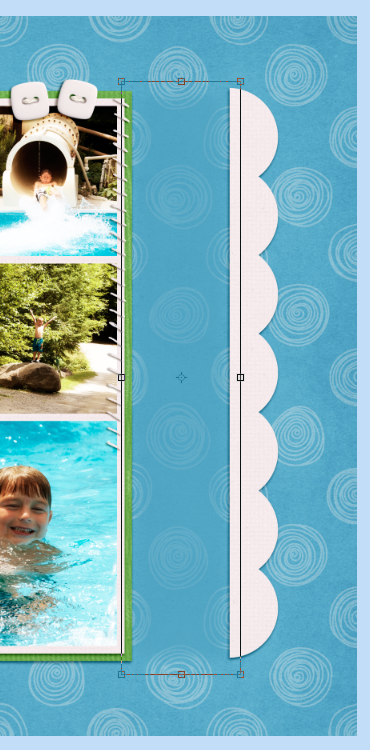
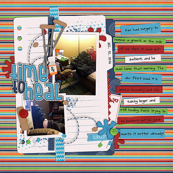
That’s it. Not too hard, and a super fun way to use all those wonderful backgrounds on your pages, but still allows room for readable journaling.  Here is my final layout:
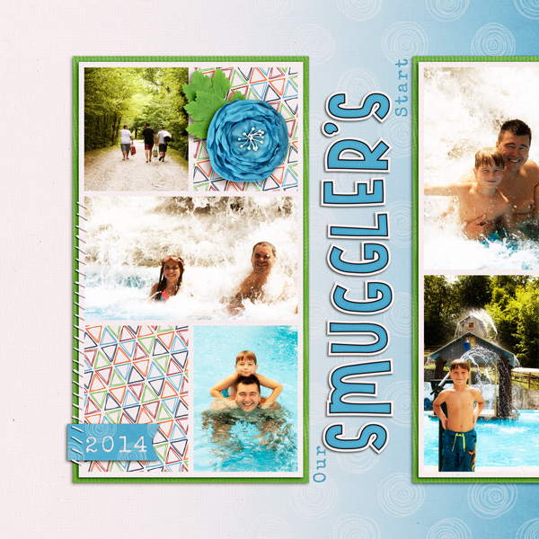
There are loads of ways you can journal on busy backgrounds. Journal cards, words strips, paper pieces, tags, or even darken and make your font bold.
Karen (zippyoh) used Doctor’s Orders too, and the Artsy Journal Templates by Scrapping with Liz. She used the word strips to journal for her layout.
Thanks for visiting! Hope these techniques will get you using a bit more of those fun patterns that Chelle makes!





 Hi! I'm Chelle: a 40 something mom of 7. My husband & I live in a rural community in the rocky mountains with our 4 children still at home. In the winters we enjoy sledding & snuggling by the fire. I the cool fall evenings we love relaxing around the campfire & meeting friends at the county fair. Admiring the stars


Pingback: CraftCrave | DigiFree | CraftCrave