Hi everyone! Happy New Year! I’m excited to show you my post today. This is Jenn, jk703, here today to share some fun ideas and some awesome pages using Chelle’s Creations supplies. This is so easy, and I had so much fun. And I’m sure you can relate – I made my layout for the post, and it became my newest most favorite layout. Actually, many of my favorite layouts are using Chelle’s supplies. They make me and my pages happy!
Today, we are going to play with flowers – specifically Flower Layering and Tips. For my example images, I’ve used Chelle’s At the Beach kit, and the At the Park Kit. So versatile, and they work well together!
Let’s get to it! Flowers are *usually* included in kits, and there are always so many and in so many colors. I want to use them all sometimes, but that doesn’t always look right for me or my style. So, this is an alternative. Layer them up, change, twist and flip them to make them work for you.
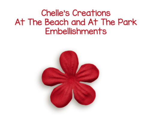
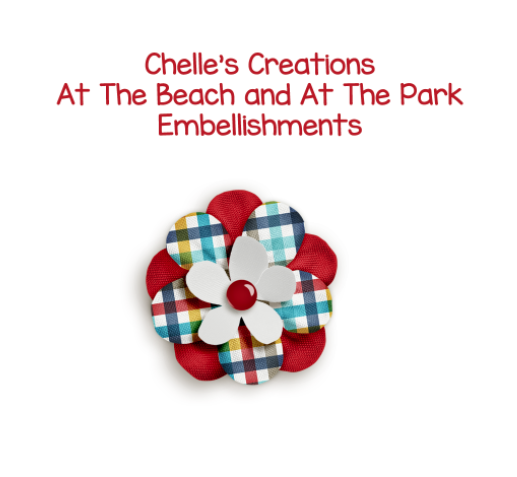
Here is the start of my flower. A pretty bright red, with a shadow style and it looks nice!
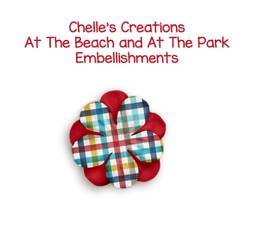
Next, I’ve added the same flower but one that has a pattern on it, right on top. Then I used my Move Tool and twisted it a little bit. Still looks a bit unfinished, right?
Next, I added one of Chelle’s super awesome little paper flowers to the middle, and your shadow styles – and you get this little gem. Viola! A perfectly pretty layered flower. Isn’t it pretty? I just love it! (Yes, I’m a bit dorky, lol – sorry!).
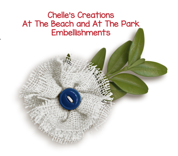
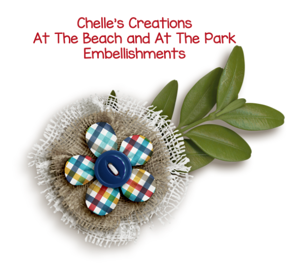
What about other kinds of flowers that you see in her kits? They all work with this method. Here is a burlap flower with a buttoning the center. It looks nice, and that blue looks great on the white. How can we add to it? We layer it up!
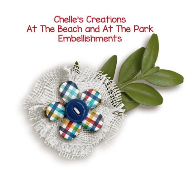
Adding that same plaid flower layer from above, just squeeze it in between the white burlap and the button. Just give it a little oomph, more than just a button.
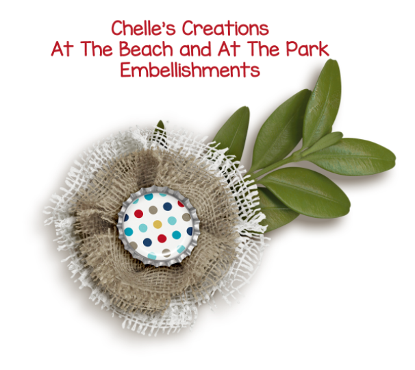
You could even layer up burlap flowers of different colors, and change out the button to a decorated bottle cap. Just remember to make the 2nd flower a bit smaller than the one in back, and add a shadow style.
Or, mix it up by adding the 2 burlap flower layers, the fabric flower layer and the button. Making layered flowers like this has infinite possibilities. You can stretch your stash another 100 flowers.
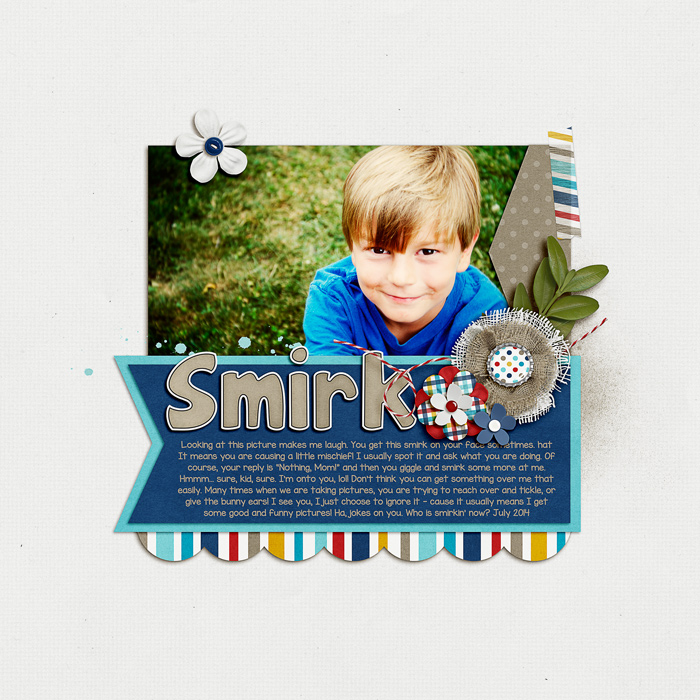
After I was done layering up and trying out all kinds of flowers, the ones above were my favorite mix. I made a layout and I LOVE it! For this layout, I also used one of Scrapping with Liz’s templates – New Year’s Templates. – which I modified a lot. Here’s my page:
Flower Layering and Tips:
Play and try out flowers you don’t think will work together. It might surprise you. I didn’t think the two burlap flowers above would look good, but with a little shrinkage and a twist, it came out pretty sharp looking.
Try bold patterns or shapes with classic colors. You might like the combination.
Give each layer a shadow style so that each layer of flower has some depth and definition. Shadow Styles make it look a bit more realistic. If you had flowers on your table and put them on top of one another, you would not have flat flowers. Neither should your layouts. 
Try clustering your layered flowers. My layout above combines the flowers I made and then adds another little paper flower. It’s a boy page, but the colors and types of flowers means that it doesn’t come off as a girly page. The burlap flowers give a sturdy solid feeling.
For flowers, I work in groups of odd numbers – 1, 3, 5. Above, my layout uses 3 in a cluster, and then 1 above the photo. With you eye, you may go from the white top flower, down over the photo to the flower cluster, and then over to read the title. (At least, that is how my “eye” flows over the page, lol!)
The layered flowers adds visual interest to the layout, as well as depth and different texture. You that toward your advantage and allow those flowers to convey feelings. My page above is bright, fun, on the boyish side, and solid. I think my flowers convey that – they aren’t soft, dainty or pastel.
Try different centers for your flowers – Brads, Buttons, Beads, Coins, or any other embellishments that might fit. Even a metal asterisk from an alpha might work.
I had some lovely layouts submitted for Flower Layering and Tips post from my co-CT members. Here are their pages. What is funny is that they both picked Cozy Christmas for their pages! It must be because it’s so cold out, and everyone would love to be cozy and warm.
Jenn (jennshultz) created this layout. She mixes up her flower layers with different types of flowers and lots of great colors – as well as adding shadow styles to give each flower it’s own depth. She also used the Cozy Christmas alpha that matches the kit. 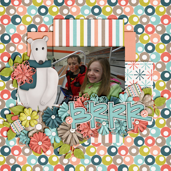
Jan (QuiltyMom) made the next chilly layouts with lots of snowflakes and flowers. Jan worked with the template by Down This Road Designs and worked the ideas into her flowers. She layered some flowers on snowflakes, and then layered more flowers on top – very clever. She alternated colors and added shadow styles. She also used CU Snowflakes for her layout. 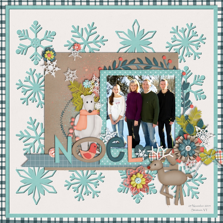
There you go. Flower Layering and Tips to start off your layouts. Give it a try and I’d totally love to see what you create! Thanks for stopping by today and have fun scrapping!





 Hi! I'm Chelle: a 40 something mom of 7. My husband & I live in a rural community in the rocky mountains with our 4 children still at home. In the winters we enjoy sledding & snuggling by the fire. I the cool fall evenings we love relaxing around the campfire & meeting friends at the county fair. Admiring the stars


Pingback: CraftCrave | DigiFree | CraftCrave