There are lots of ways to use frames on your digital scrapbooking layouts. Chelle’s CT members have shared a few pages to show you what they like to do. Let’s start with a one photo layout with a stacked frame choice. Jennifer did this to draw attention to her focal point, and it looks fabulous. I love the way she filled the paper frames with the same photo and stacked them one on top of the other. She used See Clearly Now and the coordinating alpha. 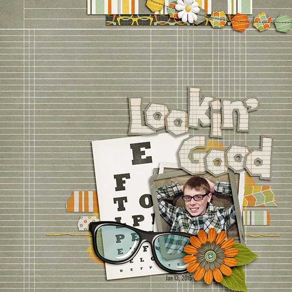
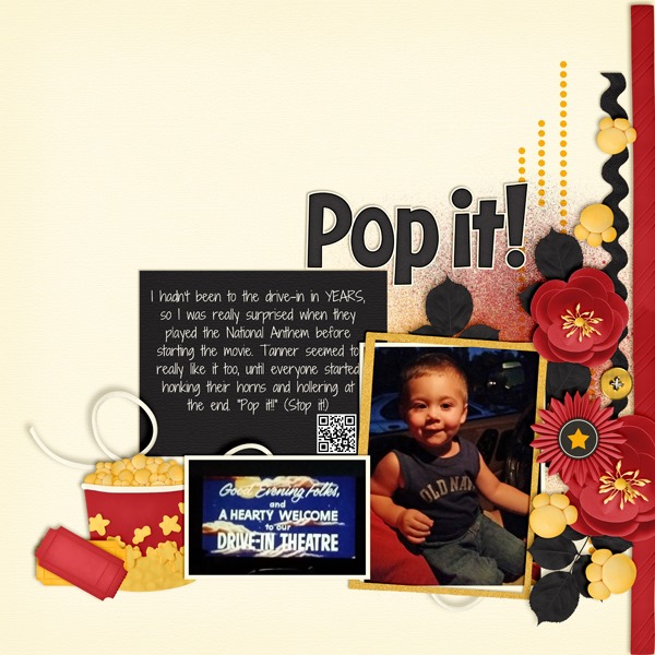
Next, Krista made a couple of pages for us. She used Chelle’s Movie Night for her pages, and instead of filling the frames with photos, she stacked the frames on top of a couple of her pictures to draw attention to them. It’s a great technique and very easy to do since the photo doesn’t need to fill the frame but just hang out underneath it. 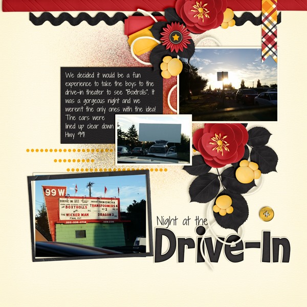
Finally, Lisa has used a plethora of framing ideas on her page. She has angled frames to attract attention much like Krista’s, mats that frame/outline points of interest, word art tag outlines to frame text, and she has used frames and elements to create scenes. She used Down On the Farm to create her adorable page. 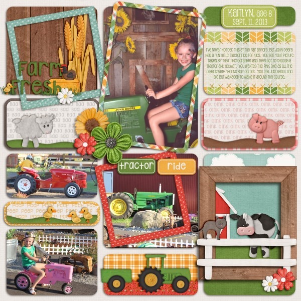





 Hi! I'm Chelle: a 40 something mom of 7. My husband & I live in a rural community in the rocky mountains with our 4 children still at home. In the winters we enjoy sledding & snuggling by the fire. I the cool fall evenings we love relaxing around the campfire & meeting friends at the county fair. Admiring the stars