Quite often in life, it’s the details that matter. That’s true in digital scrapbooking, also. In traditional paper scrapbooking, shadows are added by the light source used for viewing, so in digital pages, shadows need to be added to make a page look as they would on a traditional page. They can be tricky, but the right shadows make a world of difference. Take a look at the following pairs of pages that show a page first without shadows applied and then with. Look closely at each example to see how different thicknesses of elements are shadowed with different depths just as they would be in real life.
First, an example from Donna: she used Big City and a template from Scrapping with Liz. Look at the shadows on the photos compared to the thickness of the shadows on the felt pieces. 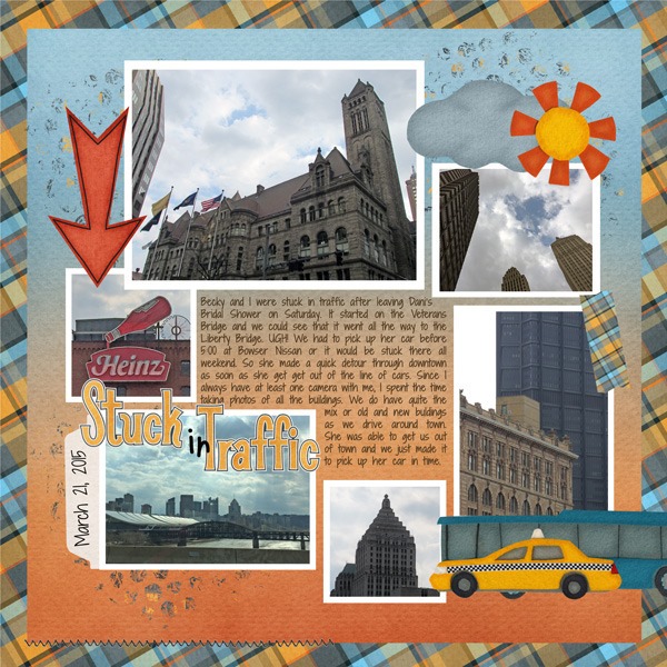
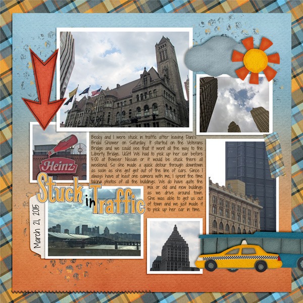
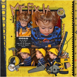
Next, a page from Carol using Under Construction . The intended thickness of the cluster of elements is really obvious is the second layout, as it should be, and is much more realistic that the un-shadowed version. 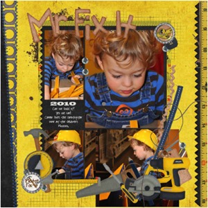
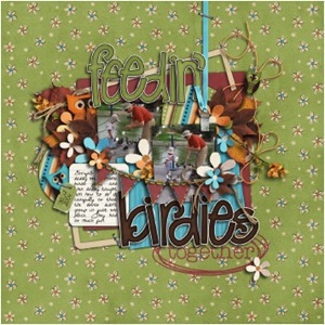
Finally, it’s easy to see the stacked effect of the elements on the next page. Wow, what a difference those shadows make! 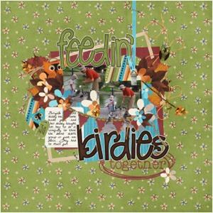
If you need help with shadows, the easiest thing to do is add Chelle’s Me & My Shadow Styles to your software. She has taken the guesswork out of shadowing for us, and they are perfect for taking your shadow skills up a notch.





 Hi! I'm Chelle: a 40 something mom of 7. My husband & I live in a rural community in the rocky mountains with our 4 children still at home. In the winters we enjoy sledding & snuggling by the fire. I the cool fall evenings we love relaxing around the campfire & meeting friends at the county fair. Admiring the stars
