Pick a color, any color, and use it as the ONLY color on your next digital scrapbooking page. You might discover details in your photos you hadn’t noticed before, or that other colors in your photos pop instantly. Or, you might just notice that the monochromatic scheme you’ve chosen has a calming effect on you when you view your page. Chelle’s Creative Team Members have a couple of pages to show you how they used a basic brown color scheme to achieve two different feelings on their pages. Let’s take a look:
First, Roxana made her page from the brown elements in Give Thanks and Chocolate Lovers, the perfect choices for her trip to the Chocolate Museum. I can’t think of a better reason for a field trip than to visit that place of deliciousness, and Roxana’s page leaves me feeling satisfied and calm when I view it. I love the way she layered the flowers with the chocolate pieces in the Chocolate Lovers kit. 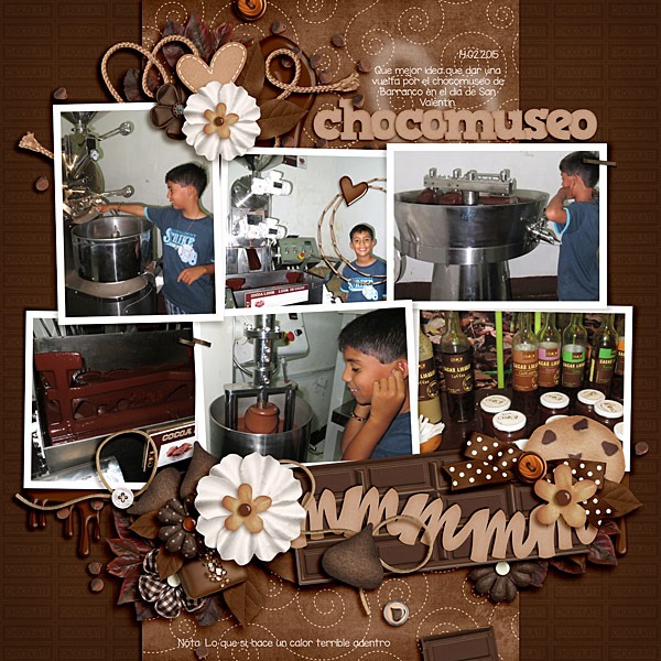
In contrast, Jan’s page is also made from brown and neutral-toned papers, this time from Choo! Choo!, but the purpose of her color scheme was to bring out the exciting pops of color in her photos. Her page is very dear to my heart since I spent many wonderful years in that fun city of Chattanooga. The Choo Choo is definitely a fun destination and her color scheme has served her well in conveying that feeling. 
I hope you’ve been inspired to try this technique. It might seem awkward to stick to shades of one color on a page, but I think you’ll find the results well worth it.






 Hi! I'm Chelle: a 40 something mom of 7. My husband & I live in a rural community in the rocky mountains with our 4 children still at home. In the winters we enjoy sledding & snuggling by the fire. I the cool fall evenings we love relaxing around the campfire & meeting friends at the county fair. Admiring the stars
