One of the most important features of a digital scrapbooking page must surely be the shadows. If done well, a digital scrapbooking page can be so realistic you find yourself touching the print to feel the edges of the photos layered on the page. Luckily, Chelle has a product in the market that helps with shadows. It’s called Me and My Shadow and it works with PSE, PS and programs that use .asl style files. But what if you don’t have those programs for your scrapping? Never fear: I’ll show you an example from Jan who uses Artisan 4 (same as SBC 4.0), but I’ll also show you an example from Kayla who can and does use Chelle’s shadow styles with PSE. They each have some great tips for us regarding shadowing.
First, here’s Jan’s page. She used from the In the Pocket bundle and Down on the Farm and In the Backyard. Take a look at how realistic her layers are. Here’s what she had to say about how she manipulates the shadow settings in Artisan 4 to get that look. “I usually start with the smaller shadow (Depth 0.9; Softness 0.7) for my papers and other lower-level/layer elements that I don’t want to focus on, for I want them to look like they are laying flat down on a surface, rather than ready to fly off the page. I use the higher-level shadow (Depth 2; Softness 2) for those elements I want to stand out a bit more, like photos, elements that are laying on top of photos, and the like. I will play with the settings a bit for fun, or to make things look a bit more realistic. For example, I set the shadow for the stitches at Depth 0.3; Softness 0.1, to make them look like they are actually stitched onto the page. And I wanted to draw more attention to the title and the framed photo, so I set them at Depth 2.5; Softness 2.5. The butterfly is set at Depth 3; Softness 3. I typically don’t use anything higher than that because I don’t want anything to look like its floating away on it’s own! And I didn’t shadow the text part of my title for I wanted it to look like I wrote it on the page.” 
Next, Kayla used Chelle’s shadow styles along with Pajama Party Sampler 1 and Pajama Party Sampler 2. Her shadows definitely make the page look 3-dimensional, don’t they? In addition to using Chelle’s preset shadow styles, she has another great time-saving tip – copy and paste the shadow styles for similar layers. She explains, “For example I added the desired shadow style to one of the letters in my title and then right clicked on that letter in the layers panel and selected copy layer style. Then, I highlighted the rest of the letters and right clicked on the layers panel and selected paste layer style. That gave me instant shadowing for my title. I did the same for all my paper layers to quickly shadow my layout.” 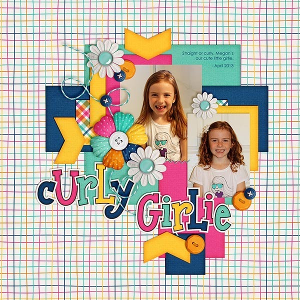
Maybe you have a time-saving tip you could share. Leave us all a comment below.






 Hi! I'm Chelle: a 40 something mom of 7. My husband & I live in a rural community in the rocky mountains with our 4 children still at home. In the winters we enjoy sledding & snuggling by the fire. I the cool fall evenings we love relaxing around the campfire & meeting friends at the county fair. Admiring the stars