Hi Everyone! It’s Jenn, jk703, here. Did I get your attention!? By me telling you to Stop the Crop isn’t referring to actually stopping your scrapping, but toward the cropping of your photos!  We all scrap and the reason could be for many reasons – photos, creative outlet, recording our memories and sharing the stories. Sometimes, you can use the photo to give more information, or just as a backdrop for your journaling. Maybe you don’t have any space to journal, as you filled up your page with all photos!There may be times the story could also be in the surroundings in your photo.
Journaling on photos isn’t hard, but there are a few tips that might help you.
- Make sure the font is legible on the photo. My thought is that you wouldn’t want to use a fancy script that will be hard to read on busy background photo.
- Check the color, and change it to see what reads easier over the photo. Try changing the Blend Modes on the Type Layer.
- Work with the space and shape of your photos. If your program allows, try using the Type Tool, and the Shape Tool to create Text Paths for your journaling.
- When journaling on the photo, try to determine the best spot to journal. Sometimes you can journal on one spot, but then another it gets to hard to read. Choose wisely.
- Lastly, to keep the surroundings visible, but to allow for journaling on a busy background, add a paper piece of vellum. You can then still see the image slightly, but your journaling will be easier to read.
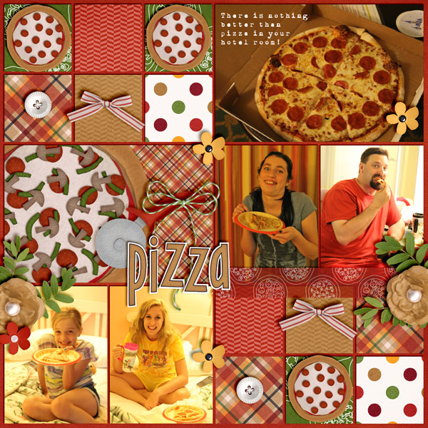
Here are some examples that the CT created. Jenn created this YUMMY layout – using Pizza and Pasta Journal Cards, Pizza Amore and the alpha from Pasta La Feasta. She added some journaling to the photo, used a typewriter font, and used a lighter font on her picture.
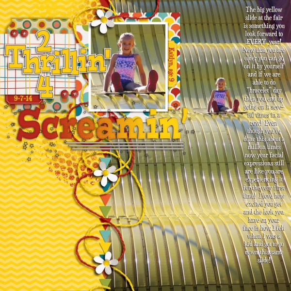
Lisa created this fun layout. She used Roller Coasters and Cotton Candy. Lisa also said that she made two layers of the text, one in white and one in black underneath, and she offset by 1 pixel down and 1 pixel to the left to give a shadowed appearance to make it easier to read.
Jan made a great layout about her trip to California! She used Get Your Grill On, with Gimmie Doubles Vol. 1 by Cluster Queen Creations. She added her journaling right on to her photos, and tried to place it in a location to make it easier to read.
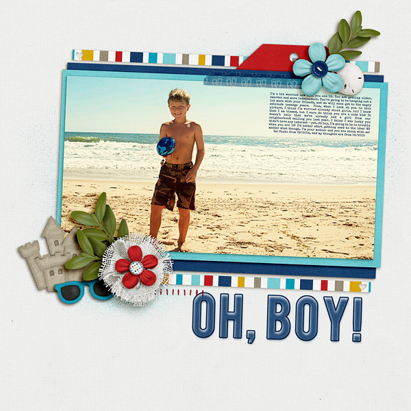
Here is my page – I used Chelle’s At The Beach, and Scrapping with Liz’s 2016 Calendar Templates 2. I had originally had my journaling as a long column, but since there was a lot of dark and light pockets on the sand, I moved it only to the water and sky. Much more legible.
There you go. Stop the Crop and journal on your photos! Have a great week, and thanks for stopping by!





 Hi! I'm Chelle: a 40 something mom of 7. My husband & I live in a rural community in the rocky mountains with our 4 children still at home. In the winters we enjoy sledding & snuggling by the fire. I the cool fall evenings we love relaxing around the campfire & meeting friends at the county fair. Admiring the stars


Pingback: CraftCrave | DigiFree | CraftCrave