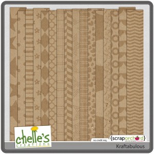
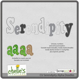
Happy Saturday morning! I can’t believe it’s then end of October and that we are a week away from Digital Scrapbook Day! I’m looking forward to the sales and seeing what Chelle has for us. This week she gave us an a Killer Kraftabulous Kit full of AMAZING set of Kraftabulous papers and for our CU Friends, CU Seredipity Alpha doodles. Check ’em out!
Chelle found a ScanMyPhotos.com – Online Deal! Get your pictures scanned. Make sure you take advantage of this. It’s a greaty savings to keep your digital scrapbook pictures safe. Click on the image for the link.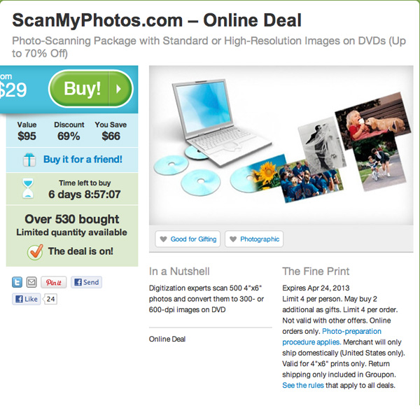
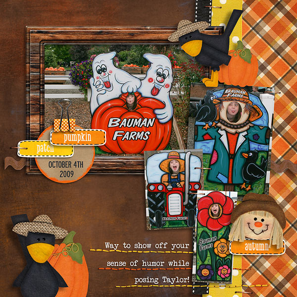
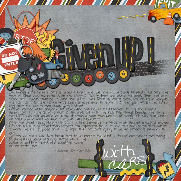
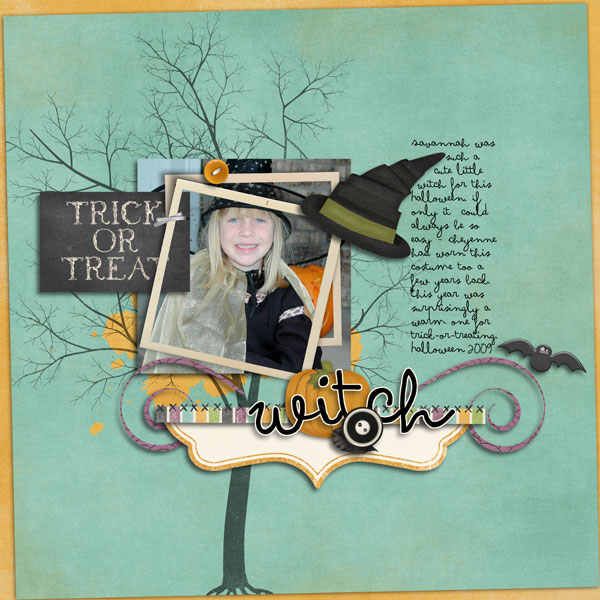
Our Creative Team had so much fun using the Kraftabulous papers with Chelle’s other kits. They are sure to give you some great digital scrapbook ideas. Great diversity since they picked one of chelle’s kits to add to Kraftabulous (obviously). The products they used are linked to the market underneath their LOs.
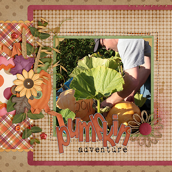
Carol Left (Iowan) She used Indian Summer.
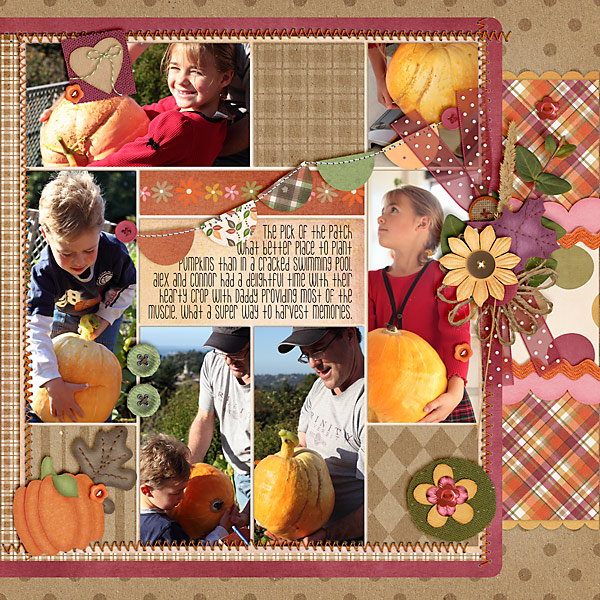
Carol Right (Iowan) She used Indian Summer.
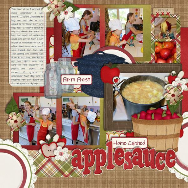
Jan (quiltymom) She used Apple of my Eye and Canning Mini.
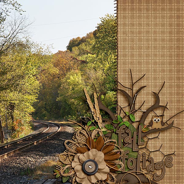
Jenn J (jmljensen) She used Rainbow Collection: Neutrals, Indian Summer and Apple of my Eye
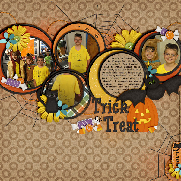
Karen (karen32) She used Eeeek!
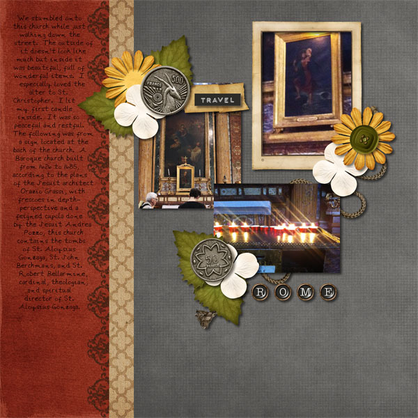
Lynett (lynett_rock) She used Traveler.
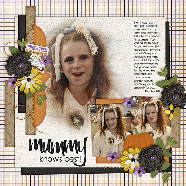
Kayla (keepscrappin) used Marker Alpha & Eeeek!
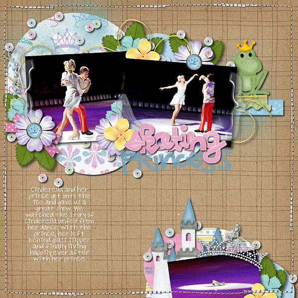
Ophelia (navaja77) She Happily Ever After, Mane Event, Toadally and Fill Me In: Pencil.

Ronnie (Ronnie_Texas) She used Heroes: EMT & CU Serendipity Alpha Doodles to create her own font.
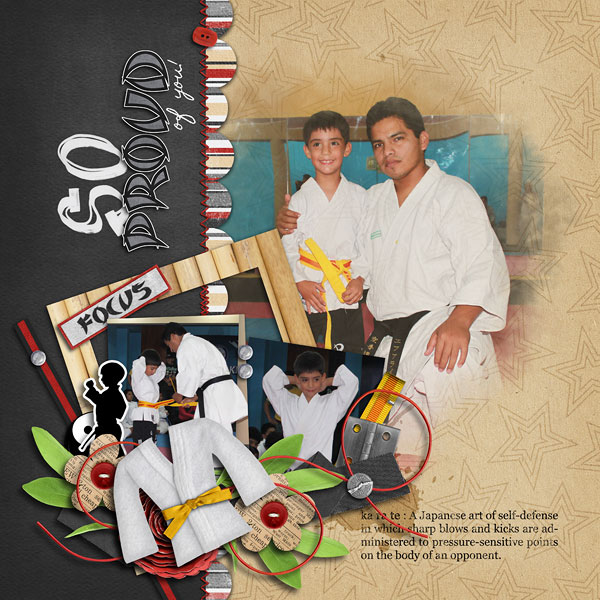
Roxana Left (roxanamdm) She used Black Belt, Letters From Home, & Marker Alpha
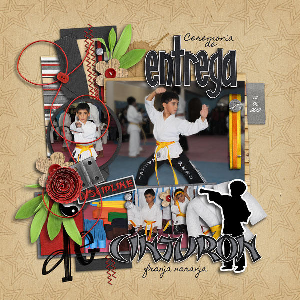
Roxana Right (roxanadmd) She used Black Belt, Letters From Home, & Marker Alpha
Cant wait to see what you post in the gallery! See you next week at DSD! Hugs!




 Hi! I'm Chelle: a 40 something mom of 7. My husband & I live in a rural community in the rocky mountains with our 4 children still at home. In the winters we enjoy sledding & snuggling by the fire. I the cool fall evenings we love relaxing around the campfire & meeting friends at the county fair. Admiring the stars