Gallery Stand Outs

Good day, all! I’ve been taking a stroll through the gallery at Scrap Orchard, picking some of my favorite layouts posted in recent days. Two pages caught my eye that used Chelle’s newest birthday themed kit One Year Older. First, there’s this gorgeous page by larkd (Linda). I love the way she used the banners on the page, and I really like how she added a tight dark shadow to her title words to make them stand out. Did you notice she made a page about the fair with a birthday kit and it works perfectly? I love that.  larkd 
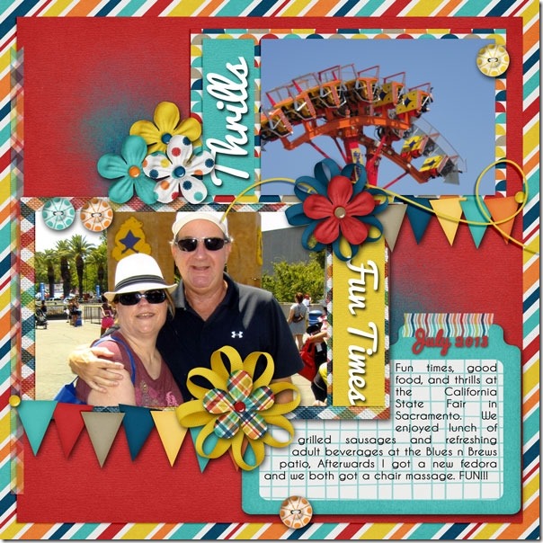
I also love this page by Spudgeon that is about a special birthday celebration using the same kit. I love the yellow paper background, and I love the way she added a semi-transparent paper behind her journaling to allow for easy reading. She also added the names of the children on the photo on top which I love to do in digital scrapbooking. Great memory keeping!spudgeon
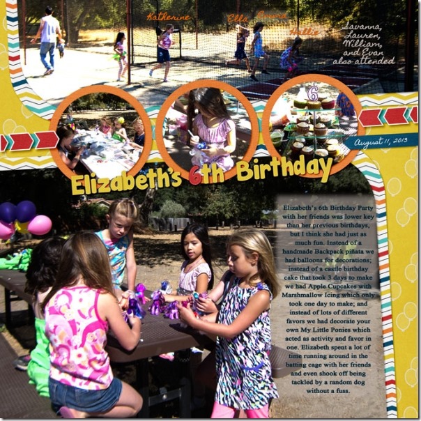
Here’s another page that jumped out at me. Keepscrappin (Kayla) made this one using Chelle’s Taste of Home and her Pizza & Pasta Bundle which coordinate perfectly together. The large photo caught my eye, and the way she layered a few important elements on the corners anchoring the smaller photos really caught my attention, too. I love the small clusters with the ribbons tying everything together. keepscrappin
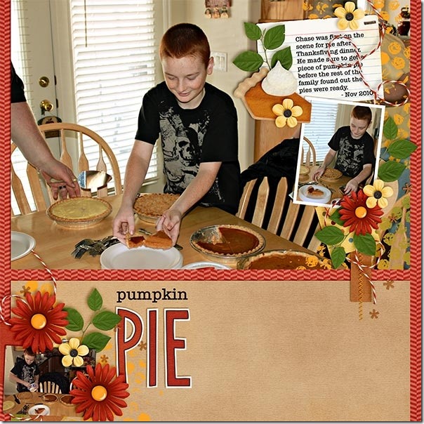
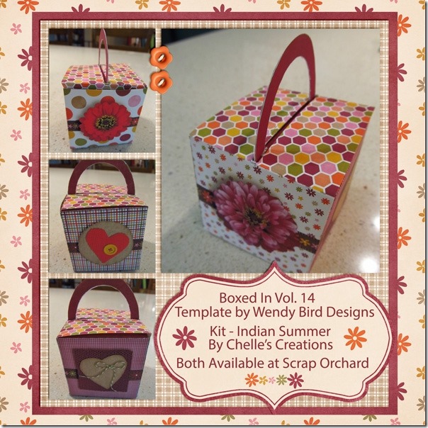
Finally, I found a page by djp332 (Donna) who is a guest on Chelle’s team this month. Look carefully: She has made a digital scrapbooking page about a paper box she made in real life using one of Chelles’s digital scrapbooking kits Indian Summer. I love that it’s a bit recursive to think about! And, I love all aspects of how this looks. The box she made is adorable and will be perfect for a small treat for someone, and the page she made about the box will allow her to save the memory for herself, as well. Perfect!djp332
I hope you are inspired as I am. Take a look in the gallery at Scrap Orchard for more inspiration by searching for #chelle in the search box.

Letters from Home

It’s Tuesday, Chelle’s friends, so let’s look at a classic Chelle’s Creations kit, Letters from Home. It has a vintage feel and a bit of a patriotic look, as well, so it’s perfect for your digital scrapbooking projects of various events from the past or present. Chelle’s Creative Team members have a few pages to show you.
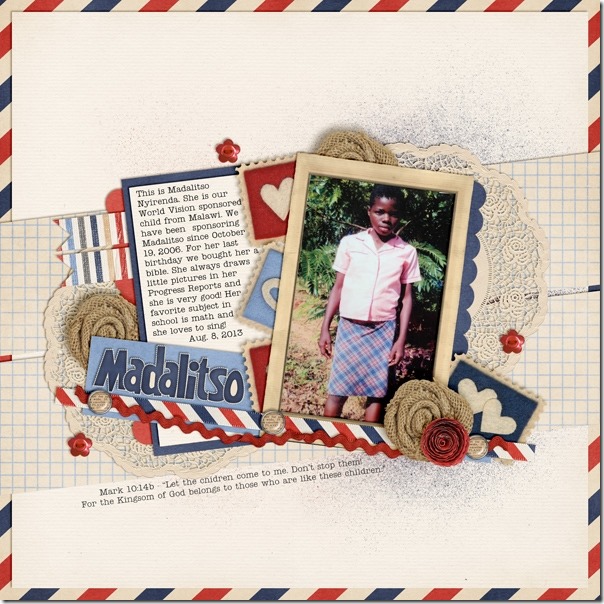
First, Krista has a photo of a young person she supports through World Vision, and she made a page using Chelle’s kit about her personal story and involvement with Madalitso in Malawi.  I love all the angles she used for placement of the photo and all her elements. And, I love the way the little felt stamps are tucked under the framed photo.27312

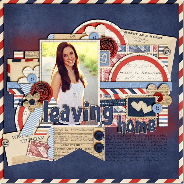
Next, Jenn made a page about her daughter leaving home to go to college. A lot of us, including Chelle, are going through that same experience right now, and what better way to celebrate a young person’s accomplishments and at the same time assuage the pangs of this bittersweet time than by making a scrapbook page as a tribute. Like Krista, Jenn used lots of layered frames and elements behind her photo, and yet the photo is still center stage and the highlight of the page. I love all the buttons Jenn used; it’s so much easier to do this digitally than with real buttons, right? And, yet, Chelle’s elements look like actual, tangible buttons on the page. leavinghome

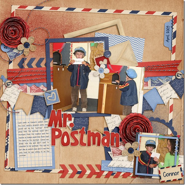
Finally, Tammy has made a page about her cute little guy dressed the part of postman for his speech class. She tells the story of how he was too shy to volunteer to play the part, but on the last day of class, he overcame his hesitancy and did very well. I’m so glad she has the photos for the page! Look how she used the twine in the kit – it looks great wrapped around the banner behind her pictures. Mr-Postman

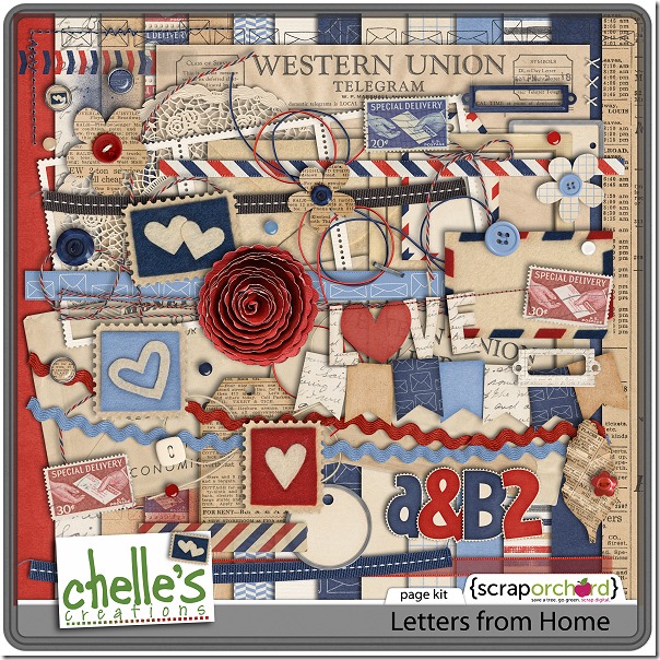
Here’s a closer look at the kit in the market. The preview image is linked to the store, in case this classic kit has escaped your grasp in the past. cc_lettersfromhome_kit

by_Cheryl

Using Frames

In paper scrapbooking, frames are difficult to use because of the thickness, but in digital scrapbooking, anything is possible! Most digital scrapbooking kits come with at least a few frames or mats, and you might think you should always use them as you would in real life. But, Chelle’s team has been playing with stacking frames and using them in unexpected ways, and I have a few of their layouts to show you.

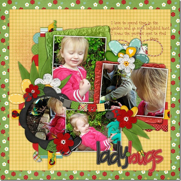
Helen made an adorable page using Chelle’s Ladybug Hugs kit, and she used several frames on her page. The black flower-shaped frame is placed on top of one of her photos as you might expect it to be. But she has layered the other photos on top of the green and red frames on her page to add depth and interest to it. I love the clusters of paper strips she placed behind the green frame to add even more dimension. Helen-ladybug-hugs-frames

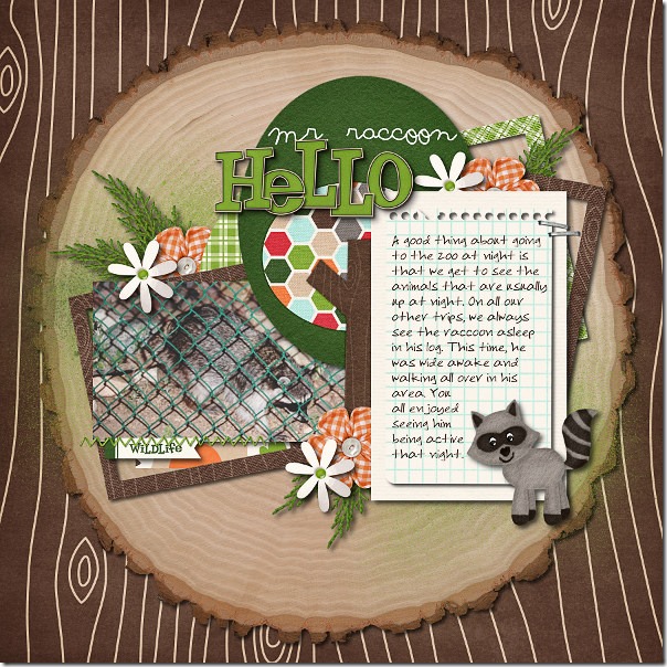
Ophelia used Chelle’s In the Forest kit for her page. I love the wood paper as the background layered with the tree section piece to form the base of her page. She has stacked her journal paper and her photo on top of the paper frames in the kit at wonky angles, and I love that she used the staples and stitches to attach them. 2011-07-15-hellomrraccoon_sm

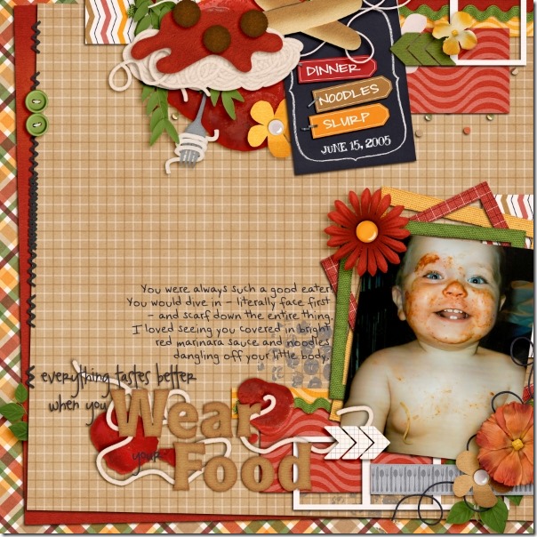
Finally, Jen made a page with Chelle’s newest Pizza & Pasta {bundle}. I love that messy face in the photo, and it is highlighted perfectly by her use of the frames in the kit. She chose to stack the paper frames under the photo at wonky angles like Ophelia did, and they pick up on the color of marinara sauce all over her baby’s face. She has also used some frames on the top of the page in that gorgeous cluster of elements and papers. pastalafeasta

Do you have some creative ways to use frames? I’d love to see them! If you make a page with any of Chelle’s products, pin them to the gallery at Scrap Orchard and use the tag #chelle so I can see it. I am always inspired by Chelle’s fans’ pages!

by_Cheryl

Back 2 School: Fall Semester

Are you ready for the new school year? I’m getting excited! I love to shop for school supplies, and digital scrapbooking school supplies are no exception. Chelle has a great mini kit for scrapping my high school student’s pictures called Back 2 School: Fall Semester, and a couple of members of her CT have been playing with this mini using snapshots from their children’s school days.

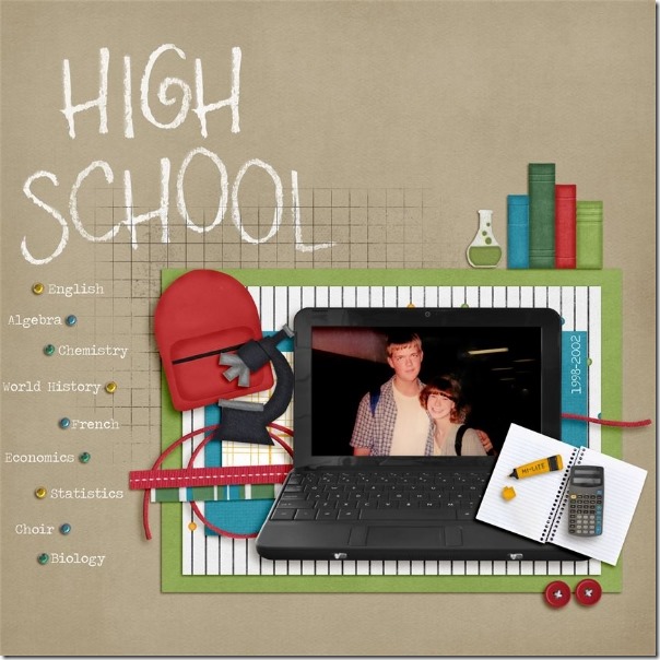
Jen has the perfect formula for a meaningful page for the first day of high school: first, she has the picture of her students inserted into the laptop frame from the mini kit. Next, she listed the courses for the year on the side of the page using the brads as bullets on her list. She added the chalked alpha from the Back 2 School kit and a few other items from that kit, as well. With the clusters of elements from the mini around her photo, it’s the perfect first day of school page for a high school student.btsfallsemester

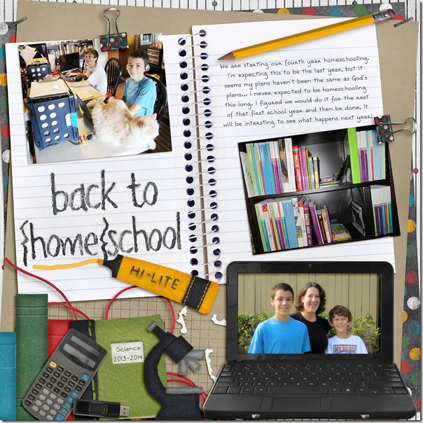
Tammy also used the Back 2 School kit and the Fall Semester Mini kit for her page. She also chose to use the laptop frame – it is perfect for photos of middle school and high school students, isn’t it? I love the spiral notebook she used as a background, and I really love how she changed the chalked alpha to black so that it looks like it was written with a crayon. Back-2-Homeschool

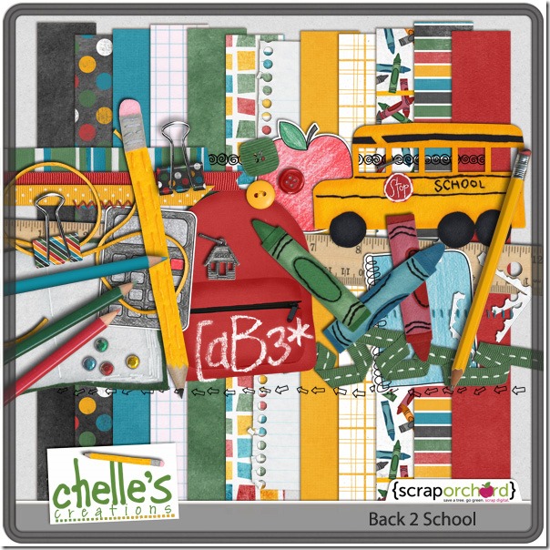
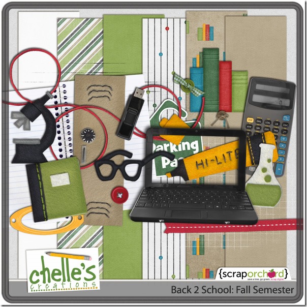
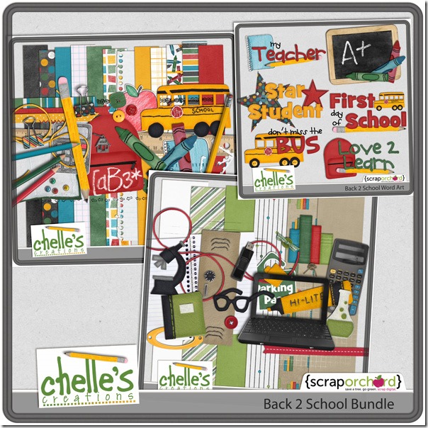
Let me show you the kit and the mini in the market. By the way, if you’re thinking of buying them both, check out the bundle. For the price of the these two kits, the bundle also has some great word art added as a bonus. The images below are linked to the store. cc_back2school_preview_2_postcc_fallsemester preview_2postcc_back2school_bundle_preview2post

by_Cheryl

Using Stitches

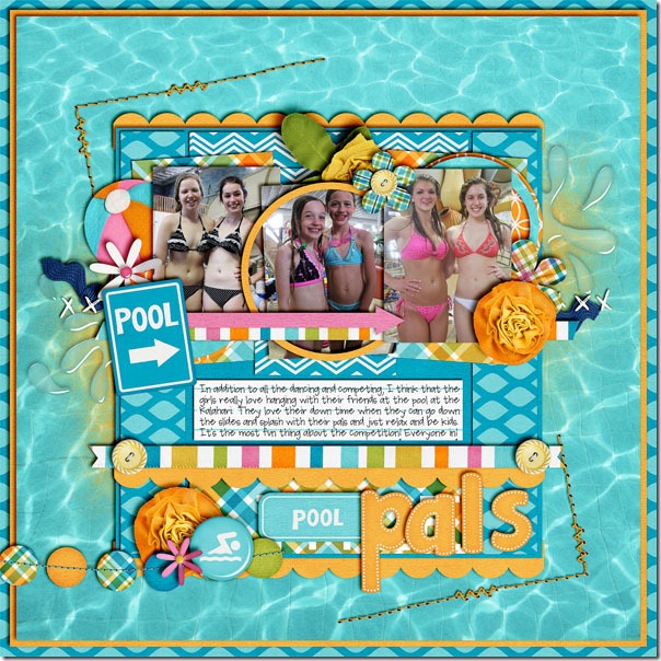
I love using stitches on my digital scrapbooking layouts. I would never have used them on a traditional paper page because I could never get the stitches lined up as I wanted. But, with a digital kit, absolutely anything is possible. Take a look at this layout by Jenn. She used one of Chelle’s newer kits called In the Pool which includes several stitches and stitched elements. I love the corner stitches she used as frames, and one of the coolest things about these is that Chelle includes holes with her stitches as a separate element. Using Chelle’s holes as a separate layer means Jenn could use an appropriate shadow on the thread stitching layer without adding that same shadow to the holes. poollpals

Erica also made a page for us, but she chose to combine several stitched elements from multiple kits. She used Spic-N-Span for her main kit choice, but she made the title from Chelle’s Darling Stitched-A-Bet (available in bold or in Holiday colors in the store) and she created some additional stitched flowers from Chelle’s CU Stitched Blooms. She also used some stitches to attach her photo to the page completing the soft look. I love how her font choice coordinates so well with the stitched title. ZoieeGift

Stitches are a nice addition to any scrapbook page, but they are especially fun in digital scrapbooking. I hope you’ll add some stitching to your next layout!

by_Cheryl

Ready, Aim, Fire! Felties | Digital Scrapbooking Classics

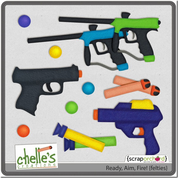
Do your children love water gun fights? Maybe they’re older, and they love paintball or airsoft? I know you have photos, and Chelle has the perfect set of elements to accent your digital scrapbooking pages. The pack is called Ready, Aim, Fire! Felties and it can be found here in the market. I have a couple of creative pages to show you how to use the felties with both a classic kit and with Chelle’s newest Little People.

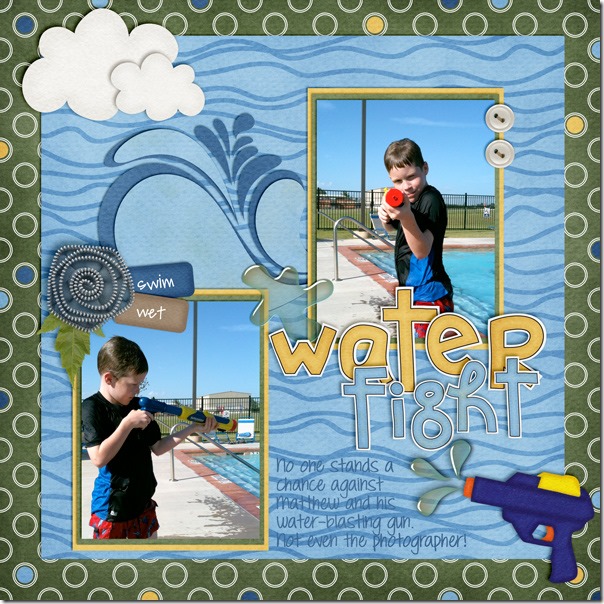
First, Leslie has a page using mostly Chelle’s On the Water and the  Ready, Aim, Fire! Felties. I love how the bright blue color of the feltie gun picks up the color of the toy guns and water shirts in Leslie’s photos. The water burst coming out from the gun tip is the perfect touch, too!2011_summer-fun

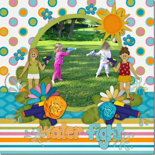
Next, Helen used one of Chelle’s newest kits In the Pool and the coordinating Little People with the Ready, Aim, Fire! Felties for a refreshing look of fun and playfulness. I love the little girls holding the water guns in perfect proportion to their little bodies and the larger guns in the clusters of flowers accenting the large photo. The girls sure look like they had a blast soaking each other, too!Helen-ready-aim-fire-in-the

Here’s a closer look at the felties in the market. Take aim with your camera at the next water fight or paintball match! cc_readyaimfire_felties

by_Cheryl

Using Ribbons | Digital Scrapbooking Skills

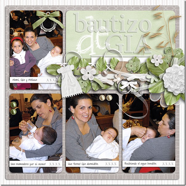
Ribbons are a staple in every digital scrapbooking kit, it seems, so what do you do with them? There must be dozens of uses. Chelle’s talented friends have made a few pages to show us what they do. First, Roxana used Chelle’s Choose the Right {ETERNAL} kit for her baby’s baptism photos, and her page is  full of ribbons as accents. She wanted to showcase the pictures, so she made a big cluster, starting with a quickie (from here) that had 3 ribbons, modified it to match her shadow angle, then added the green and white ribbons behind the cluster and the curly ribbon coming from the big flower to the picture tying them all together. She also has ribbons on the tag and ring elements on the page. The ribbons add to the softness of the page visually, and they add a cohesive element all over. 46-bautizogialeft-web

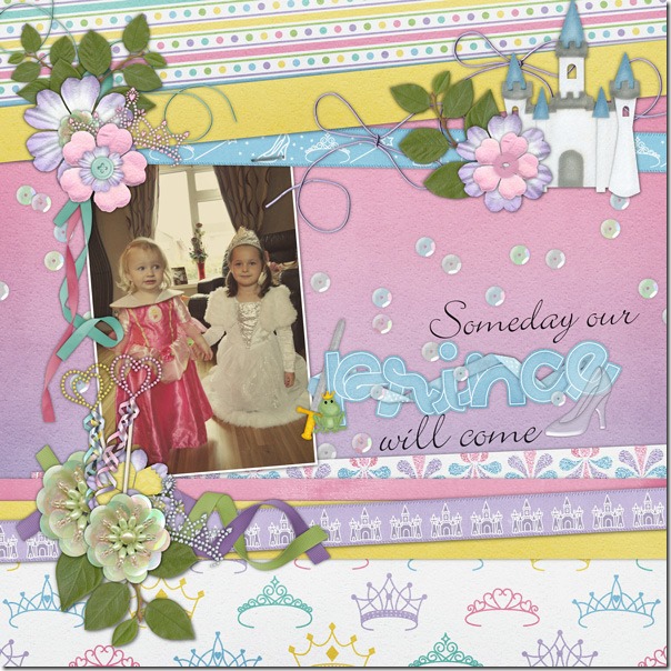
Next, Helen used Happily Ever After to make her page. It’s the perfect kit since the two little ones in the photo are princesses. She has used the ribbons from the kit as horizontal strips on the page, and she has added ribbons and strings stapled to them along with clusters of elements. She also added leaves from In the Backyard, and the curly ribbons are from the CU Curly Ribbons.  I love that felt castle, and the tiaras – perfect. Helen-happily-ever-after

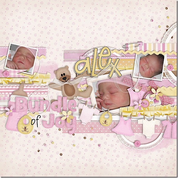
Finally, Carol has some of the first baby pictures of her granddaughter, and she chose to use the perfect kit, Beary  Cute Baby Girl. She used the long ribbons in the kit placed in strips as the background for her photos. Then, she accented the clusters on the page with bows and curly ribbon. I love how she added a bow to the teddy bear’s neck, but the highlight of the page is the photo of that sweet baby touching her nose in her peaceful sleep.CarolJ_BearySweet

What do you do with ribbons? Make a page with Chelle’s kits and show us in the Srappin Gallery. I would love to see it!

Apple of My Eye | Digital Scrapbooking Classics

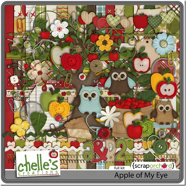
Don’t you just love a good trip to the orchard? I love to take my camera to the orchard near my house and take photos, especially when the apples are in season. Chelle has a lovely digital scrapbooking kit perfect for use with my apple orchard photos called Apple of My Eye, but this kit is also perfect for pictures of the child who is the “apple of my eye.” Chelle’s Creative Team has been playing with the kit to show you its versatility. Check out these pages for some inspiration.

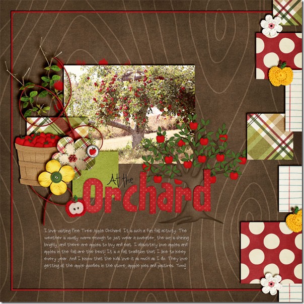
First, Jenn has a layout that matches the theme of the kit. Check out that apple tree in her photo – it is FULL of ripe, red apples, and the apple tree in the kit looks like Chelle designed it just for this page. I love how Jenn used the wood grain paper in the background and the basket of apples in a cluster of elements on the photo. I can’t wait for fall! attheorchard

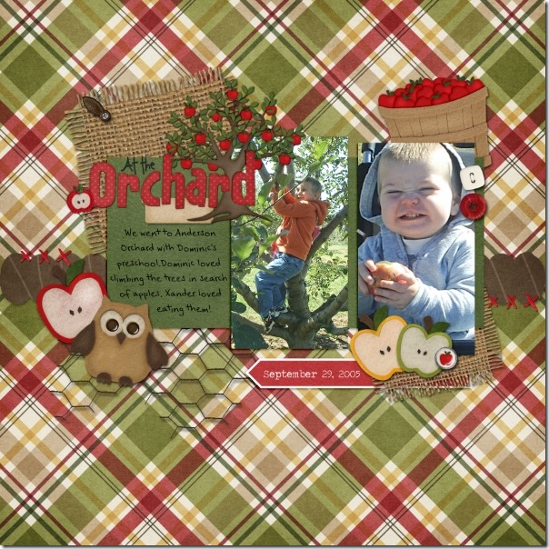
Next, Jen had some photos of her son’s preschool class field trip to an orchard, and this kit was perfect for them, as well. The chicken wire makes a great base, and the burlap pieces are perfect mats. She used one of the matching word arts for her title. Look at those faces! They are precious. 20050929orcharddampx_zps6cc09325

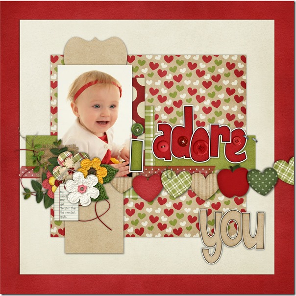
The next page is Helen’s, and she chose to follow the “apple of my eye” theme. Isn’t her baby adorable? The reds in the kit match her little red headband perfectly, and I love that she used the Buttoned Alpha for the title. Helen-apple-of-my-eye

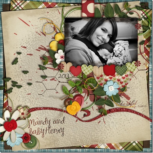
Finally, Leah made a page for us also following the “apple of my eye” idea. Her black and white photo makes a huge impact here, and the blue papers and flowers in the kit really draw us in to the photo. I love the way she stacked the papers in the background, and I love that she chose the blue elements.23127

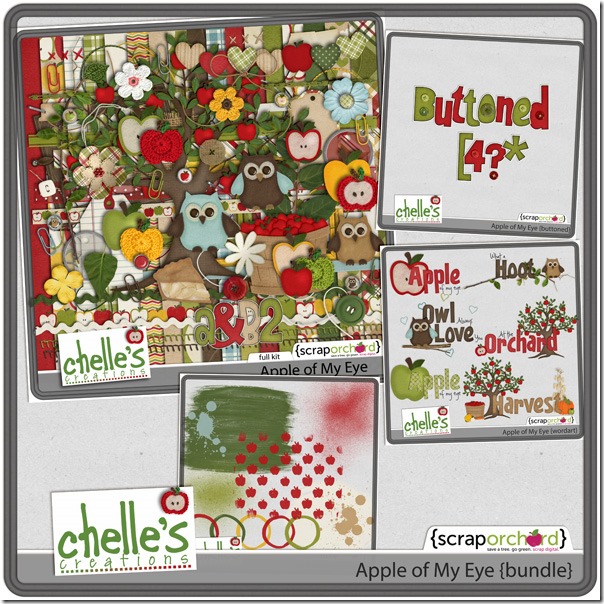
Here’s a closer look at the kit and the bundle in the market. cc_apple_kitcc_applemyeye_bndle

I’m inspired to use more of the blues from this kit. I usually scrap with the reds and greens, but Leah’s use of the blues has really spoken to me. What about you? If you make a page with any of Chelle’s kits, please share them in the Scrappin Gallery at Scrap Orchard and tag them with #chelle . I would love to see your pages!

by_Cheryl

Scrap Skills: Using Black & White Photos

Hi Chelle’s Creations friends! I am really excited about today’s post because I have some really creative digital scrapbooking pages to show you from Chelle’s team. Chelle asked the team members to make pages with black and white photos. There are four very different layouts for us to see, some using old photos and others editing newer ones, so let’s get right to it.

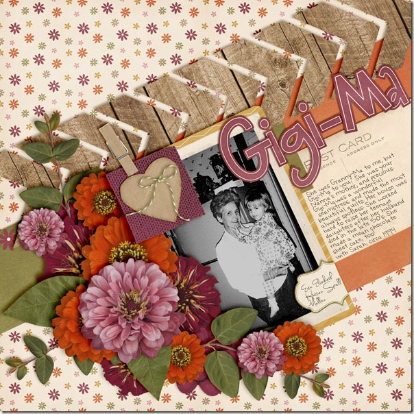
First, Wanda made a page with a photo from 1994, so it was certainly made in an era of color digital photographs. But, look at the expert job she did converting it to black and white. It truly looks like it was shot in film, originally without color. She chose Chelle’s Indian Summer kit for its retro colors and warmth. Her favorite aspect is how the photograph pops against the warm colors in that huge flower cluster. The center of attention is definitely her terrific photo. GigMa_cc_indiansmmrweb

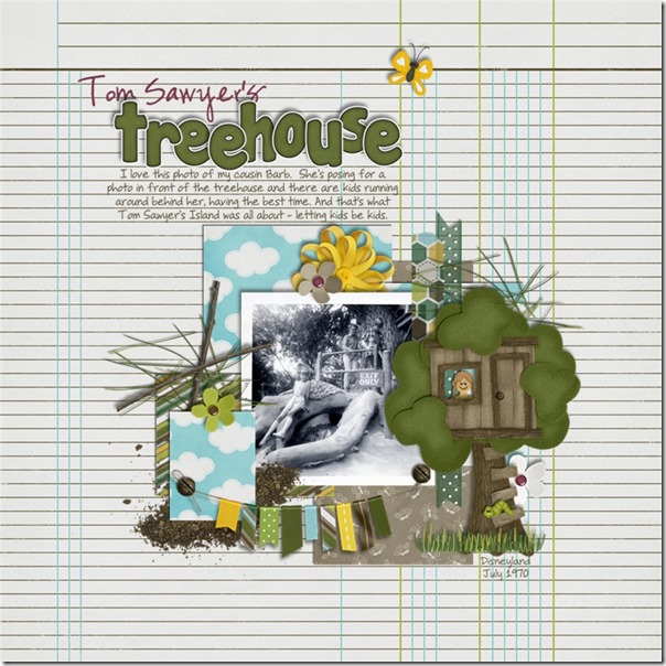
Next, take a look at Jan’s page where she has used an authentic vintage photo, shot with a Brownie camera, no less. She went all the way back to 1970 to grab this one, and it looks fantastic with Chelle’s newest kit, In the Backyard. The photo was taken at Disneyland in Tom Sawyer’s treehouse, and the kit she chose is a perfect match more than 40 years later! I love the Little People face peeking out of the window of the felt tree house – so cute! The colors in the kit give a hint to the colors that would have been seen in the real setting of the photograph, and the kit really helps to set the stage for her story. treehouse

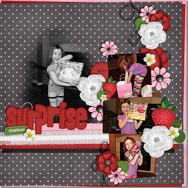
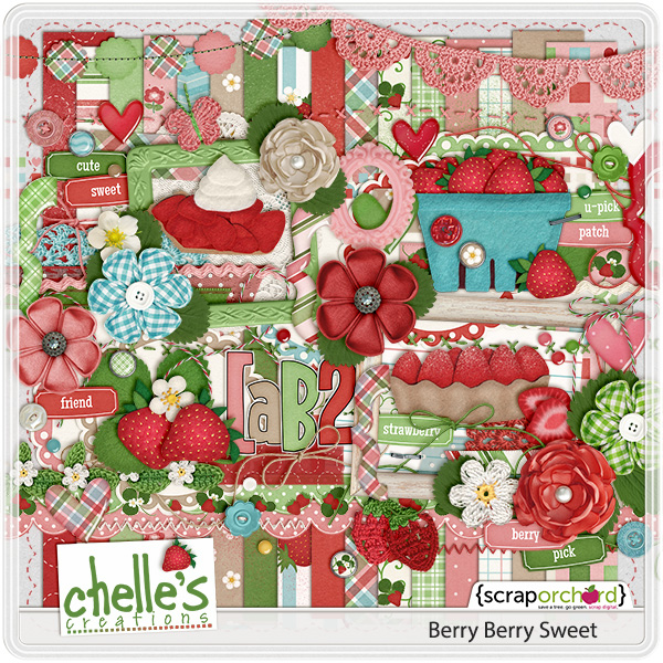
Next, we have Kayla’s page. She had a photo that captured her daughter’s expression perfectly, but the photo was a bit fuzzy. If used in color with the other color photos on her page, its lack of sharp focus would have been a distraction. But, Kayla used the black and white edit to totally transform her photo, and it has become the focal point of her page. It no longer looks fuzzy, and she was able to save that happy memory of her daughter opening that special gift. By the way, she used a couple of kits to complete her page: Tutu Cute and Berry Berry Sweet. StrawberrySurprise_Feb11_we_zps60227e0b

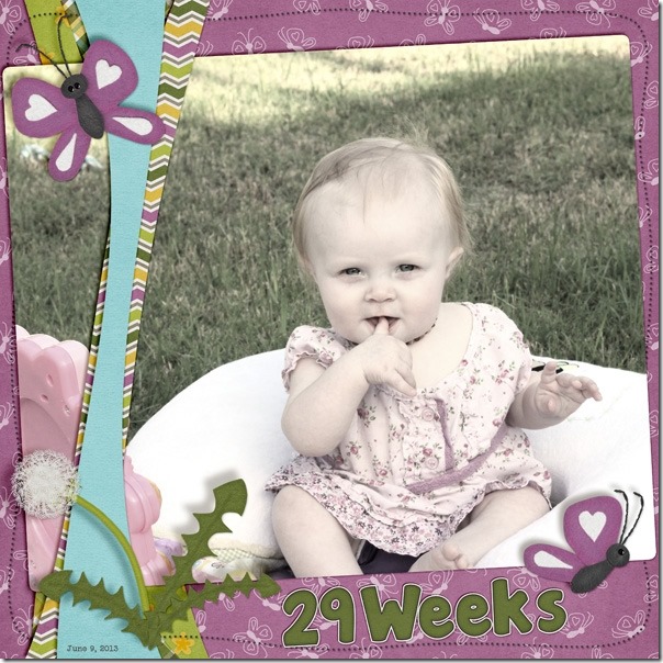
Finally, we have a page by Jen. She has done something I hadn’t thought to do before, but I am certainly planning to do this in the future! She had an adorable picture of her Lottie, and she wanted to highlight it as the only photo on the page. She knew that the purples and greens in Chelle’s In the Backyard kit were a perfect match for her photo, but she wanted to do something a little different. She copied the picture layer and turned it black and white and layered it above the color copy. Then she lowered the opacity of the colorless layer down to 85% to let some color peek through. It allowed just enough purple and green to show through to highlight the colors in the photo without the color being the main focus, and it really helps Lottie’s sweet face be the center of attention. Adorable! 22834

I hope you are inspired to play with black and white photos. You can dig through a box of precious memories or just find the button on your editing software; either way, having a monochromatic photo might just be the start of your next masterpiece.

by_Cheryl

Beat the Heat | Digital Scrapbooking Classics

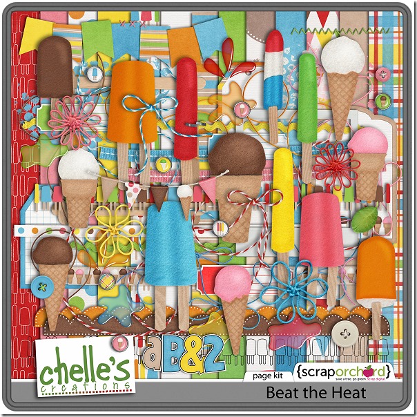
We need a way to beat the heat, right? Hi there, Chelle’s fans! It’s Cheryl, again, taking a look at a classic kit in Chelle’s Creations store called Beat the Heat. With the record-setting highs all over the USA, you might need a way to cool off like I do. Take the kids to the neighborhood park with a few frozen treats, and you can get some lovely photos. Your children will be happy and full of smiles, and then maybe you can steal some scrapbooking time while they nap to get those happy memories recorded. I have a few pages from Chelle’s friends to inspire you.

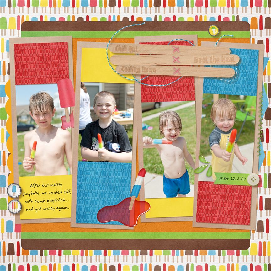
First, take a look at Jen’s page. Those are four of the happiest faces I’ve seen in some time! I love the way she angled the photos to add to the playfulness of the page.
061513messyplaydatepopsicles_zpsa80a2bfd

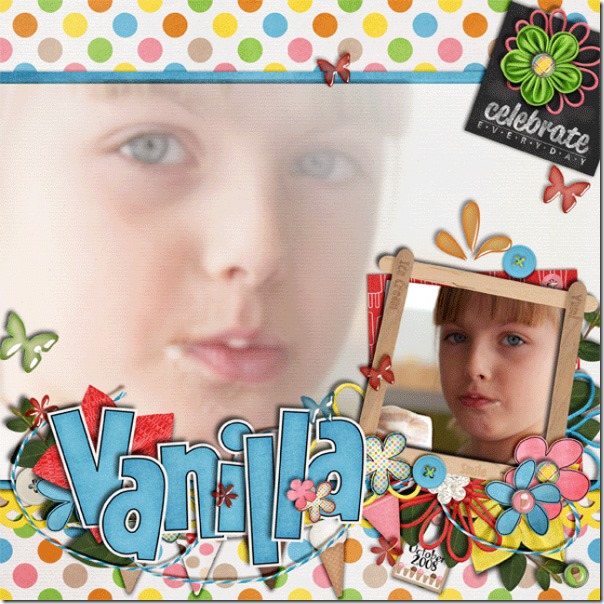
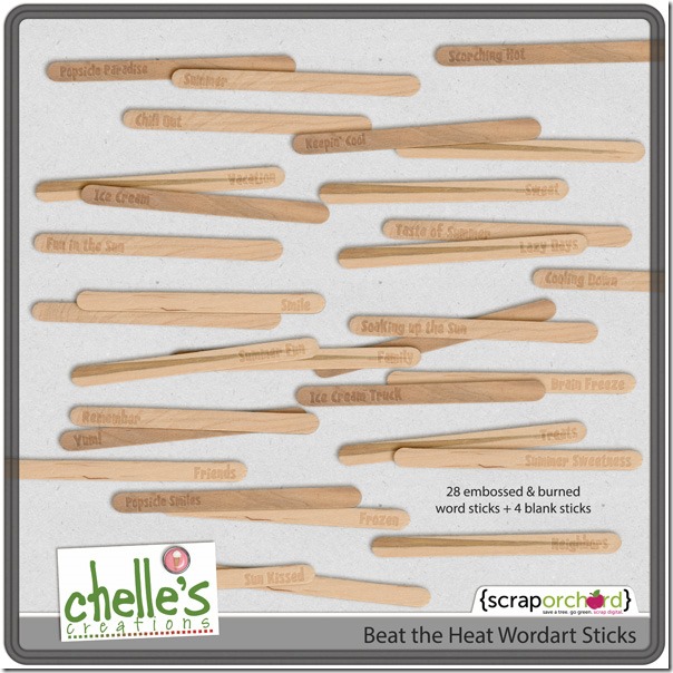
Next, Leah has a delicious page of her sweetie enjoying a vanilla cone. I love the way she blended the large photo into the background, and her cluster of elements from the kit is perfect around her title. Check out that frame on the smaller photo. You can make the same thing using the Beat the Heat Wordart Sticks that coordinate with the kit. And, I personally love the little chalkboard InstaLife card she attached to the top right of the page. It’s from Chelle’s newest release, Chalked InstaLife Cards21768

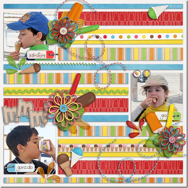
Here’s a real treat for you: Roxana also used the Beat the Heat kit to make a page that is full of inspirational details. Roxana’s pages are always replete with elements that help to tell a story. Her clusters of frozen pops and spills lead your eye down the page from one cute picture to the next. The strips of papers from the kit are the perfect accents to add the feel of movement, and the bright colors leave you licking your lips for the sweetness. I love how each child is so engrossed in the act of consuming the yummy goodies that they don’t even pause to look at the photographer.beattheheatcl-web

Here’s a closer look at the kit and wordart sticks in the market. Now, I’m off to get a bowl of ice cream before it’s all gone! Stay cool! cc_beattheheat_kitcc_beatheat_wordstix

by_Cheryl