Ladybug Hugs | DIgital Scrapbooking Classics

In 2012, Chelle introduced us to a wonderful digital scrapbooking kit called Ladybug Hugs, and I was instantly enamored with it. She tells the personal story of how she was inspired to create it, and  you can find that story  plus a few ideas on how to use the kit on YouTube here. If you haven’t seen it, go ahead and take a few moments to watch it. You won’t be sorry. This week, Chelle’s very talented creative team has been playing with this kit again, and I want to show you their amazing pages.

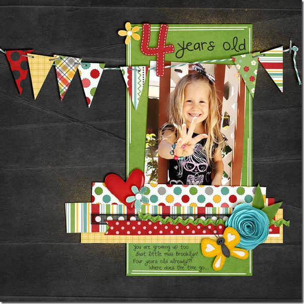
First, Kassie has a most adorable page about her little girl Brooklyn being a proud 4 year old. Look how cute she is holding up her 4 fingers. I love the banner that is stapled across the page, and the hint of paint spatters behind the photo are the perfect highlights on the dark background.4yearsoldKassie
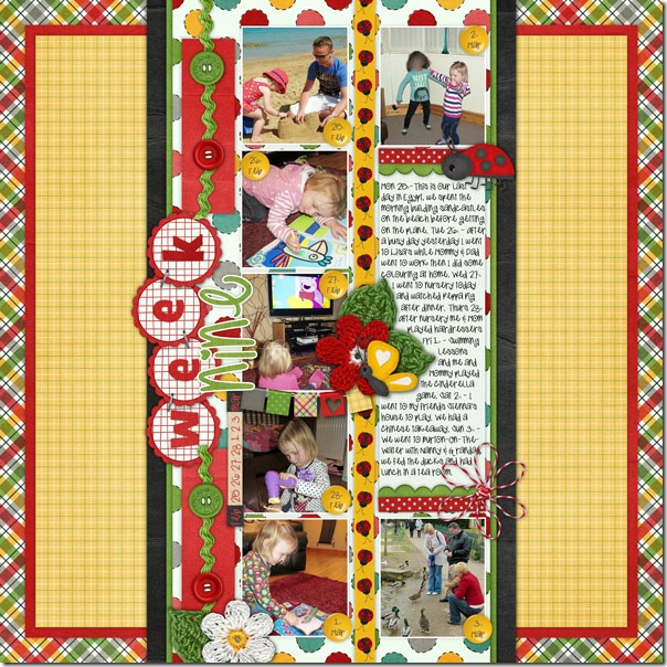
Next, we have a page from a guest team member. Helen has used this kit as the perfect compliment to her 365-day photo project. The bright colors give the page a happy-go-lucky feeling that goes  well with her photos. She also used the coordinating Ladybug Hugs Bonus Alpha, and I love the way she used the little felt ladybug to crawl between her journal space and the top photo.Helen-ladybug-hugs
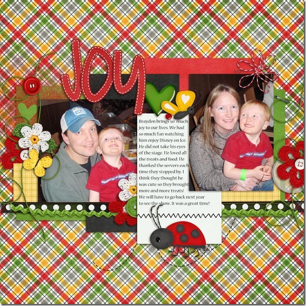
Another of our guests for this month also volunteered a page, and you will love it. Jenny used the same plaid paper as Helen for her background, and she also used the felt ladybug on the edge of her journal paper, but she chose to use him in a slightly larger size than Helen did. That’s a great feature of digital scrapbooking – your embellishments can be any size you need them to be! I love the little hearts Jenny has scattered about on her page – they really convey a feeling of love and joy so very well.So-Much-Joy_WebJenny
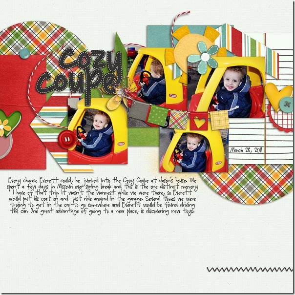
Finally, one of our long-time team members Erica made a page for us with Ladybug Hugs, but she didn’t use any of the ladybugs, and her page is just as perfect as the others. She had pictures of her son enjoying his toy car, and the colors of the kit worked perfectly with them. I love the banner she has used, and the horizontal placement of all the papers and elements really gives the page movement appropriate for a page about a car. Ladybug Hugs- by Chelle's Creations<br />
Perfect Mess Template- by LGFD

Would you like to see more of the kit? Check it out here; the image is linked.cc_ladybughugs_kit
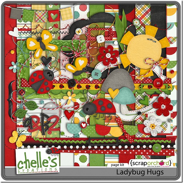
by_Cheryl

Scrap Skills: Shadow Styles

Hello Chelle’s friends! I hope your Easter was wonderful and you’ve got lots of new photos to include in your digital scrapbooking projects. Today, I want to show you a tool that will speed up your scrapbooking process so you can get those photos onto pages for everyone to enjoy. Chelle has a collection of shadow styles for sale in the market that can save tons of time, if you’ve been making custom shadows, and increase the realistic look of your pages, if you’ve been using the standard drop shadow styles in PS or PSE. Me & My Shadow is a collection of styles for all different types of elements in 3 popular shadow directions: Lower Right (LR) (120 degrees), Lower Left (LL) (45 degrees), and Upper Left(UL) (-43 degrees). Start a page with any of Chelle’s quickies, and then use the Upper Left setting for any additional elements on your page to match her pre-shadowed styles. Also, she has a video on her YouTube channel to show you how easy it is to use the shadow styles.

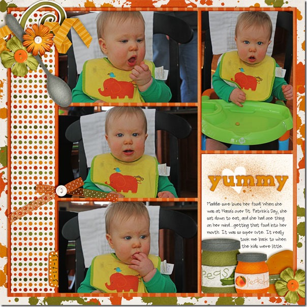
Let me show you some sample pages using Me & My Shadow. First, Jenn made a page for us using Chelle’s First Foods kit and the adorable photos of Maddie easting in her high chair. She used the UL paper shadow style for all the photos and paper mats on the page, the felt/chipboard style for the felt pieces, the small flower for the flowers, and the curly ribbon/string for the ribbon on the left. In addition, she used vellum style for the bow that has a slight transparent appearance.yummy2Jenn

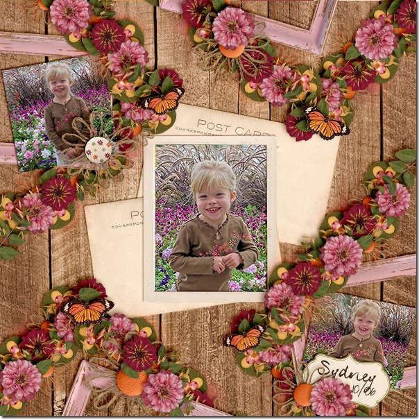
Next, Karen has a page that beautifully illustrates how to do lots of flower clusters to make them look realistic. She used Indian Summer – a perfect kit for her photos. Look closely at how the flower clusters on the page are a perfect match to the flowers on her little girl’s blouse. You can see she has used the thin paper style shadow for her photos and the post card elements from the kit. The flowers, leaves, and butterflies have larger thicker shadows by using the  flower style, while the felt elements on the bottom layer of the clusters have the felt/chipboard style applied. Sydney-flowers_zps81808b3bKaren

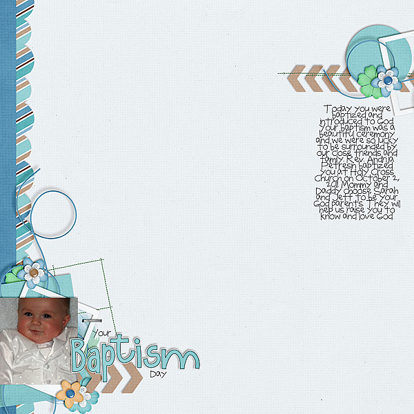
Melissa has made a page with a lot more white space, and yet the shadowing is just as important as a page filled with clusters. Notice how she used the string/ curling ribbon shadow style for her blue strings, and they seem to pop off the page. Also, she has the tiniest stitches perfectly placed on the page, and she has used the staples/ stitching layer style for those as well as for that little staple attaching the frame to the page.
Baptism-Day_zps4043a1d4


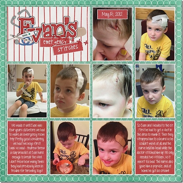
Finally, Brandy has been a guest on Chelle’s team for the past two months, and she has contributed some fabulous pages for us. Today, she has made a page to illustrate how to shadow the plastic pocket layer on one of Chelle’s In the  Pocket {Small} pages.  Here she has documented little Evan’s trip to the emergency room for stitches with lots of photos, and each photo has the paper shadow style applied. She used the acrylic shadow style to give a proper effect to the plastic pocket top layer on the page, and it completes the page with a very realistic look.13177Brandy

Do you own Chelle’s Me & My Shadow? Here’s a closer look at it in the market (the image is linked). Don’t forget, if you’re using any of Chelle’s pre-shadowed quickies, you’ll want to use her Upper Left shadow style from Me & My Shadow. cc_memyshadow_preview

by_Cheryl

Batter Up | DIgital Scrapbooking Classics

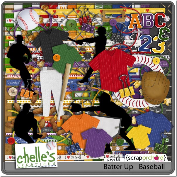
It’s spring, and it’s time to talk about my favorite sport – baseball! Chelle has the perfect digital scrapbooking kit for me to use with my baseball photos, and her creative team has been busy using this kit to remind us how awesome it is. It’s called Batter Up, and it’s great for pictures at professional sporting events and little league games, too.

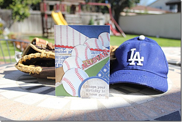
Jen used Batter Up to make a terrific card. Have you thought about using your digital scrapbooking goodies to make a hybrid project? Jen altered a 12×12 Chopped Paper template from Scrapping with Liz to make a birthday card for a special little guy. Look how awesome those baseballs look in the circle spots! I love that she has “All Star” in the title spot of the template. CardBaseball_zpsd3468c5eJen

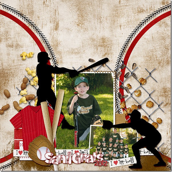
Next, Brandy has made a page for her son’s book with his t-ball pictures. I really love how she has layered the peanuts, sunflower seeds, and popcorn on the chain linked fence. The realistic elements Chelle included in this kit are so helpful in setting the mood, and the “I {heart} t-ball” ribbon is perfect. (There’s also one for baseball in the kit, of course). studio-a-tball-webBrandy

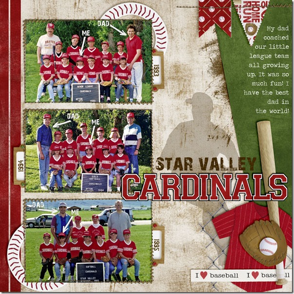
Kassie has made an adorable page for us using pictures of herself when she was a child playing baseball. Her dad was the coach, and I think he is probably beaming looking at this layout. The blend of the silhouette in the background gives a nice aged touch, and I love how she used Mark My Words to show us where she is in each photo.  So cute!littleleague-1Kassie

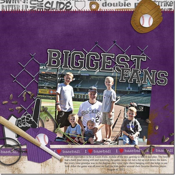
Finally, Erica has a page for us showcasing her dad with his grandchildren at the Colorado Rockies stadium. The Rockies host a Fantasy Camp week in Arizona at their training camp, and the fans who attend get to play ball with the Rockies coaches and some of the retired players. Later on during the regular season, the Fantasy Campers are invited to a game and special tour at Coors Field. Erica’s page is about that special game night where her children got to see their grandpa play ball with the Rockies. What she doesn’t say on her page, but is pretty spectacular to note, is that her sister also sang the National Anthem for the game that night. Wow! Batter Up- by Chelle's Creations
TT March13- by Yaz Bear Designs

Want a closer look at the kit in the market? Here it is! cc_batterup_kit

by_Cheryl

Scrap Skills: Favorite Tips

Today, I’d like to show you some layouts that Chelle’s team members have made to demonstrate using a favorite tip or trick in Photoshop or Photoshop Elements. There are tons of shortcuts and handy tricks in these powerful programs. If you can incorporate a few, you’ll find you are spending less time getting a digital scrapbooking page put together and more time enjoying your memory keeping.

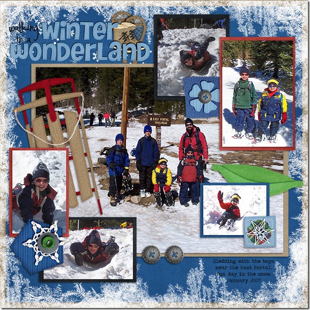
First tip: If you like to mat your photos on a page, Karen has a great tip for you. She makes the perfect mat for a photo by first duplicating the photo (hold down the alt key and drag the photo layer) Then, clip paper to the duplicate on the bottom. Next, select the photo on top and hold alt-shift to constrain proportions and make the picture smaller until just enough of the paper mat is showing on all sides. Center the photo on the mat if necessary. Here’s her page with all her fun pictures matted. Matting the photos is a great way to stack the photos on the page and get more photos included. She used Chelle’s Winter Thrills Bundle. sledding_zps75904596

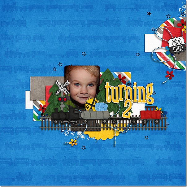
Another great tip is demonstrated by Melissa. She likes to duplicate elements on the page for visual impact. Again, she selects the layer to be duplicated and holds down the alt key while dragging on the layer to create a duplicate. Then she can click on the new element on the page and drag it to a new position. This duplicating action can also be accomplished by selecting the layer and typing the keyboard shortcut <crtl>J.  This is a lot faster than finding the element in the project bin and dragging it onto the page. Here you can see Melissa duplicated the evergreen trees from the Choo Choo Bundle on her page in a fraction of the time it would have taken her to add each tree individually. Turning-2

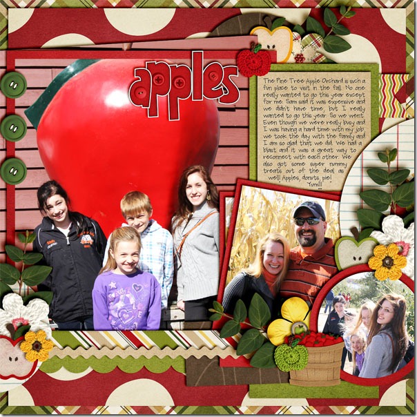
Another great tip after you’ve duplicated elements is to use the align and distribute buttons to locate your duplicates on the page. JennS made a cute page about a family trip to the apple orchard using Chelle’s Apple of My Eye Bundle. She duplicated the green buttons, roughly placed them on the page, and then used the align and distribute button to place them in a vertical line, evenly spaced on the left side of the page. apples

Finally, Jenn (jk703) told me that she has a favorite way to preview fonts on her page. Have the Type Tool selected. Click on your journaling layer, and then highlight the text that you’ve already typed out. Next, click on the Character Menu, and locate the font drop down menu. Click inside, where it says the name of the font. Then use your arrow keys and scroll through your fonts slowly. Your journaling will change every time you press the arrow key up or down. So easy to preview! I LOVE this tip!

I hope you’ve been inspired to try something new. I can’t wait to see your pages in the gallery at Scrap Orchard! Be sure to tag your pages with #chelle if you use any of Chelle’s products – I would love to see them!

by_Cheryl

Carrot Patch | Digital Scrapbooking Classics

Did you “Spring Forward” this week? I’ll tell you, I don’t spring in any direction, and this time change in the spring is particularly difficult for me. But, the one good thing it does for me is remind me that Easter is upon us, and I love Easter. I love remembering Easter celebrations of my childhood with new dresses, a special sunrise service, and egg hunts. My sisters and I hunted hard boiled eggs. Of course, we never found all of them, and weeks after Easter an egg or two would surface in all its grossness. Such great memories! Chelle’s team members have been playing with her classic kit Carrot Patch, which is great for vintage Easter and Spring photos as well as the photos of memories from more recent years.

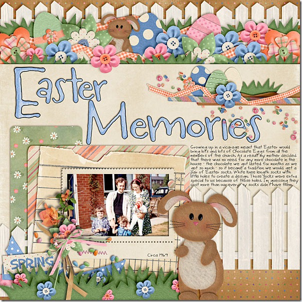
Ronnie had a photo of her family on Easter in 1969 (she’s the cutie in the middle with the curls). She chose to scrap that memory with Chelle’s Carrot Patch kit. The colors in the kit match perfectly with the colors in her older photo. I love the fencing she has used on the top and bottom of her page to frame the large center section. Her clusters of eggs, flowers, and bunnies show off several of the cute elements in this kit.Chelle Creations - Carrot Patch

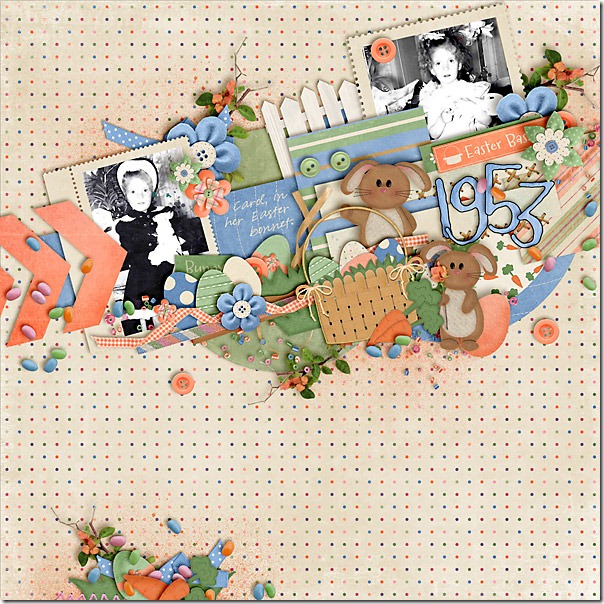
Carol also had some older photos to use, and she had some cute curls, too! Her photos were black and white since they were from 1953, and they also look fantastic with the muted colors of this collection. I love her Easter bonnet, and  I love the angled slant of her photos and elements. That basket full of eggs is perfect here.CarolJ_thecarrot_patch_zps55e39f5a

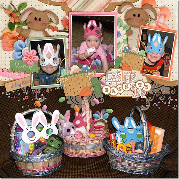
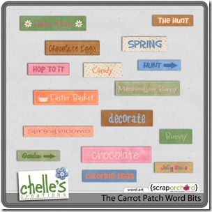
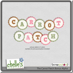
Brandy had some more current photos to scrap. Her photos of her children wearing their bunny masks are too cute for words! And, she has accented them so appropriately with the Carrot Patch Word Bits that coordinate with the kit and are included in the bundle. I love how she used the large photo of the baskets on the bottom of the page, and her title uses one of the Carrot Patch Bonus Alphas.easter-baskets-webB

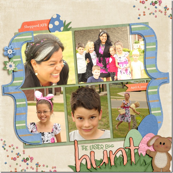
Finally, Leslie also had some modern day photos of an egg hunt that occurred while she was living in Texas. Her neighbor invited the children to hunt eggs, but the eggs were confetti filled. Invariably, these eggs  were smashed on all the kids and the grown-ups’ heads. I love the group photo with the “bunny ears” fingers on some of their heads, and the confetti sprinkles on the corners of her page help to tell the story very well. What a fun day!LABeahm-the-carrot-patch

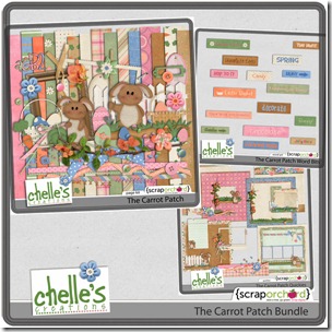
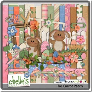
Here’s a closer look at the Carrot Patch bundle and all the pieces in the market. The images are linked. cc_carrotpatch_bundle_previewcc_carrotpatch_kitcc_carrotpatch_wbcc_carrotpatchalphas_preview
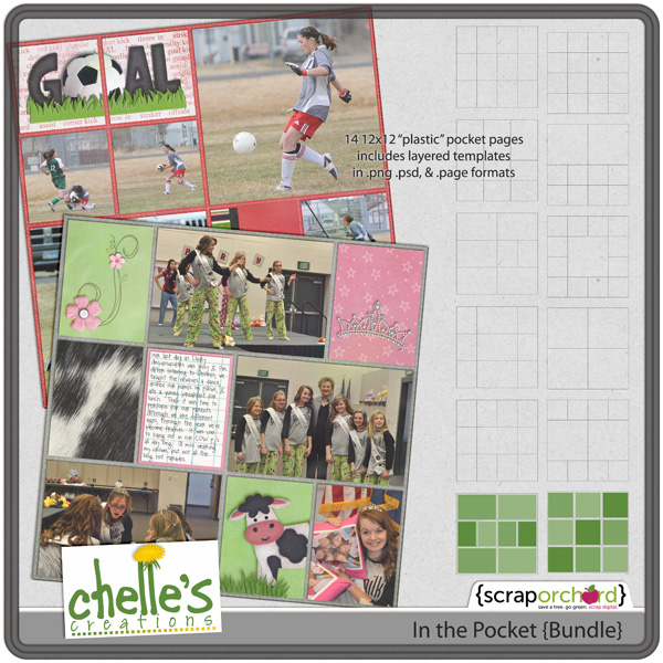
Here’s to hoping you have some spring in your step and are looking forward to a happy Easter celebration!

by_Cheryl

Scrap Skills: Double Pages

Have you ever noticed how some people make digital scrapbooking pages routinely as double page spreads while others stick to single page layouts? Most people have a preference, it seems, for one way or the other. I must admit, I am a single page scrapper, but I like the challenge of creating a double page layout once in a while. Chelle’s talented team members have made some fabulous examples of double page layouts to show us how great it can be.

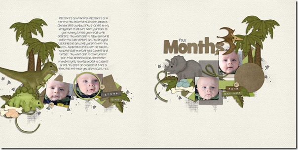
Melissa is a talented scrapper who makes double pages effortlessly, it seems. I’ve seen many of her doubles, and I’ve noticed that she always has a nice flow from the left side to the right. Take a look at this example: Four-Months_zps20806b80 She has a horizontal line of elements and photos flowing from the dinosaurs on the left all the way across to the pterodactyl on the upper right corner of the right page. She also has the title on one side and the journaling balancing out the other side. I love how she framed one of the cute photos of her sweet baby with a circle frame. It really bring attention to his fabulously bright expressive eyes.

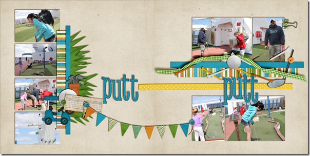
Jenn also has a terrific double page for us. When I can get beyond my extreme jealousy for the fact that her putt-putt golf pictures were taken on a cruise ship, I can see that she has used the banner to literally tie the two pages together. I am naturally drawn to follow the flow of the photos, from the top left down and then across the page following the title and banner to the right side to more great photos. I love the clusters of golf tees and the ribbon on the right, and her photos make me want to find that ship and schedule a trip. It looks like it was tons of fun! puttputtfull

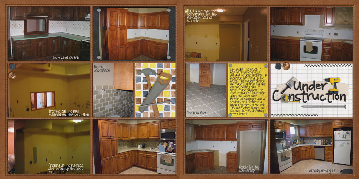
Finally, Leslie has a double page spread of her recent renovation project. I’m sure she could make several more pages to tell the complete story of her kitchen remodel. She used Chelle’s Under Construction kit and her In the Pocket Pages to make this well-designed layout.

kitchen-reno1

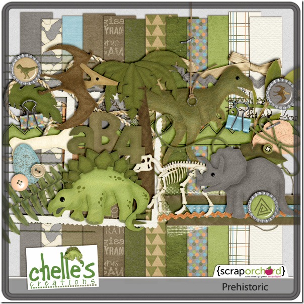
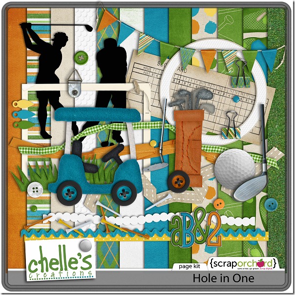
Here’s a closer look at some of the goodies they used to make these fabulous pages. cc_prehistoric_preview_2postcc_holeinone_kitcc_inpocket_bundle-01 cc_underconstruction_preview_2post

by_Cheryl

Gnome Sweet Gnome | Digital Scrapbooking Classics

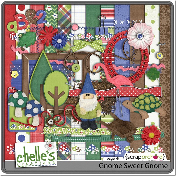
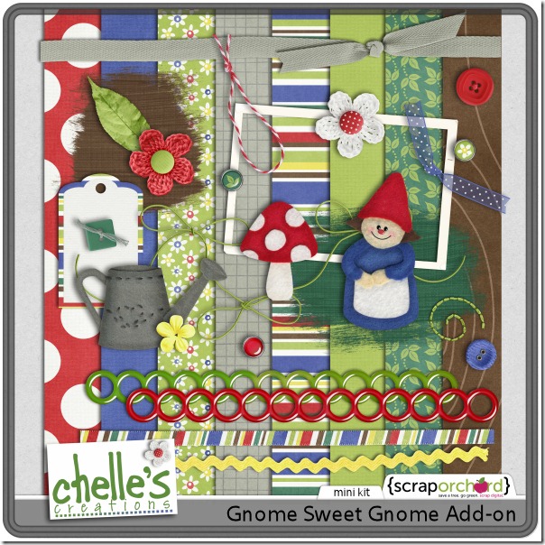
Do you love gardening, or even just playing in the dirt? Chelle has several digital scrapbooking kits that are perfect for photos of your yard or garden projects, but two of my favorites are Gnome Sweet Gnome and the Gnome Sweet Gnome Add-on. The dirt splatters and little felt gnome statues are just two of the many whimsical elements perfect for gardening pages. Chelle’s team members have been playing with these kits and have some terrific layouts for us.

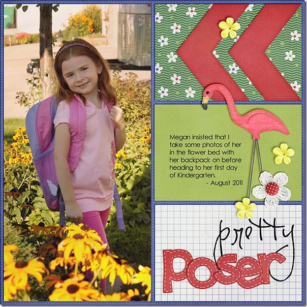
First, Kayla has a gorgeous page with one of Chelle’s new In the Pocket {Strips} templates and the Gnome Sweet Gnome Collection. Her daughter is a poser and insisted on having her picture taken in their flower garden on her first day of Kindergarten. I think it was a very smart idea, don’t you? And, I love that pink flamingo and the crocheted flower accenting one of the rectangular paper shapes. PrettyPoser_Aug11_web_zps795398e3

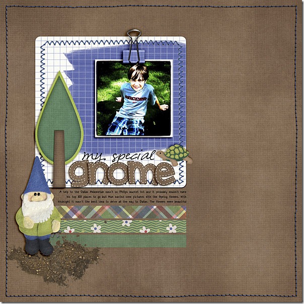
Next, Ronnie has a beautiful layout for us in keeping with the theme of these kits. She visited the Dallas Arboretum, which is a must-see when in Dallas, in my opinion. She saw the gorgeous flowers there and took lots of photos of them, but she captured a really cute picture of her son enjoying the grounds there, too. The brown background and the dirt splat with the gnome are used perfectly here. Chelle Creations - Gnome Sweet Gnome<br />
Template - Simple Scrapper Premium Membership

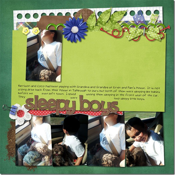
Finally, to show you the versatility of these kits, Lynett used them for a page that is not about gardening. After a day visiting grandparents, her son and his dog fell asleep in the car, and she couldn’t resist snapping some photos of them. They both look so relaxed and peaceful. The cluster of leaves and ribbons across the top, and the dirt splat behind the photos on the bottom are the perfect enhancements to her adorable photos. sleepyboys_zpseece04ab Mel also made a non-themed layout for us. She had a terrific picture of her boys laughing and giggling (yes, boys do that sometimes, and it’s worth catching in a photo!). The angled design of the page and the bright, cheery colors give the whole page a fun and happy look.Laugh-Out-Loud

Here’s a closer look at the two kits in the market. The images are linked. cc_gnomesweetgnome_kitcc_gnomesweetgnomeAO_kit
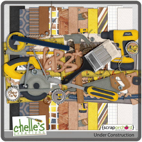
by_Cheryl

Scrap Skills: Blending Photos

One thing I really love about digital scrapbooking is the ability to blend photos. It’s an awesome effect appropriate for many different applications. There are some great tutorials online, if you need some help. One of my favorite tutorials is Chelle’s video on YouTube here. She describes how to make a photo that might not be perfect work perfectly on a layout using blending techniques. Take time to check it out, if you haven’t seen it lately.

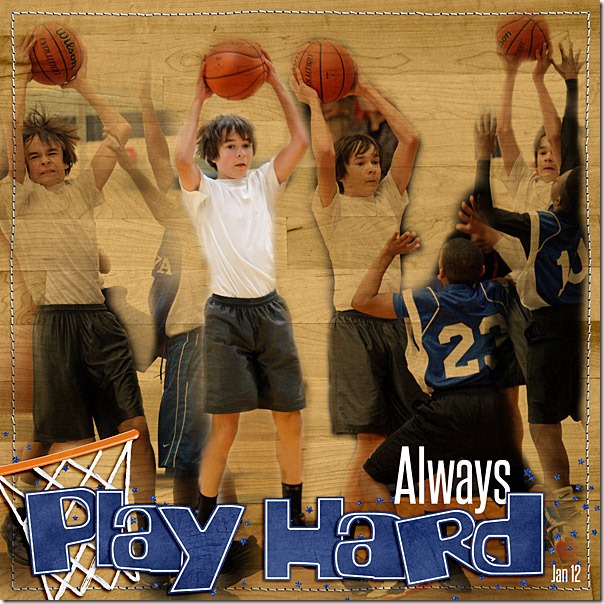
Chelle’s Creative Team members have offered some layouts to inspire us. Ronnie likes to use blended photos for sports layouts. She demonstrates a terrific way to include multiple images on a page without including the distracting backgrounds, and she shows us it is a great way to show action in the layout. I love how she has one extracted image of her son in the true color while the other images are blended into the background paper. Basketball_thegame_600web

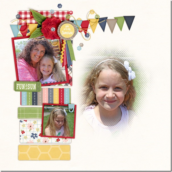
Kairyn, on the other hand, has used a portrait-type image for blending. Again, using the soft edge of a mask or creating one by using the erasing tools, helps to remove any distracting background information while putting the focus on her daughter’s lovely smile. The blended photo is the first one to which my eye is drawn, and it is an excellent focal point to the page. 2011-05-26Summertime-L

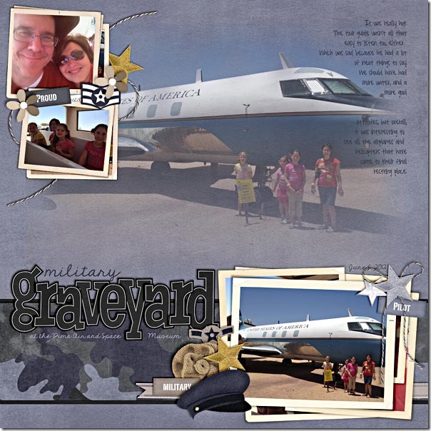
Finally, Shanell had a group photo of her daughters in which the background was also very important, and yet she blended it and successfully gave it the attention it deserves. By using the same photo in the small frame as the one that is blended into the background, she has given emphasis to the subject with a creative repetition. Her page draws me in so much it makes me want to visit this military graveyard. pima-air-and-space-museum

I hope you have a chance to review Chelle’s video, and I hope you’ve been inspired to play with the blending modes of your scrapbooking program. See if you can replicate one of the ideas here on an action photo layout, or a portrait layout, or even a layout with scenery you want to emphasize. If you make a layout with Chelle’s products, please share it with us in her gallery at Scrap Orchard. I would love to see it!

by_Cheryl

Techno Love | Digital Scrapbooking Classics

Whew! I’ve been proofreading a student’s computer science fair project, and as usual, I am also starting to think about Valentine’s Day a little late. With these two things both rambling around in my head, I decided to shop for a digital scrapbooking kit. Can you guess which kit I found? Chelle’s Techno Love kit jumped right out at me. It is the perfect mix of geek and chic, and it was love at first byte with me with all its bold shades of pink and red and those cute little computer elements. Lest you think you need geeky pictures to go with this kit, a couple of Chelle’s team members have made some example layouts to inspire you and show you the kit’s versatility.

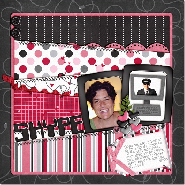
My friend Leslie made the first page I want to show you. Her husband is the qwerty to her keyboard, and she is missing him terribly while he is away with his job. Skype has been their friend, and with a good webcam, she was able to capture her photo and use Chelle’s kit to make a perfect page with respect to the theme of the kit. I love that she put her husband’s picture in the computer monitor felt from the kit and then framed the two photos similarly to give equal weight to each. May your cache of love always be full, Mrs. Leslie!LABeahm-Technolove

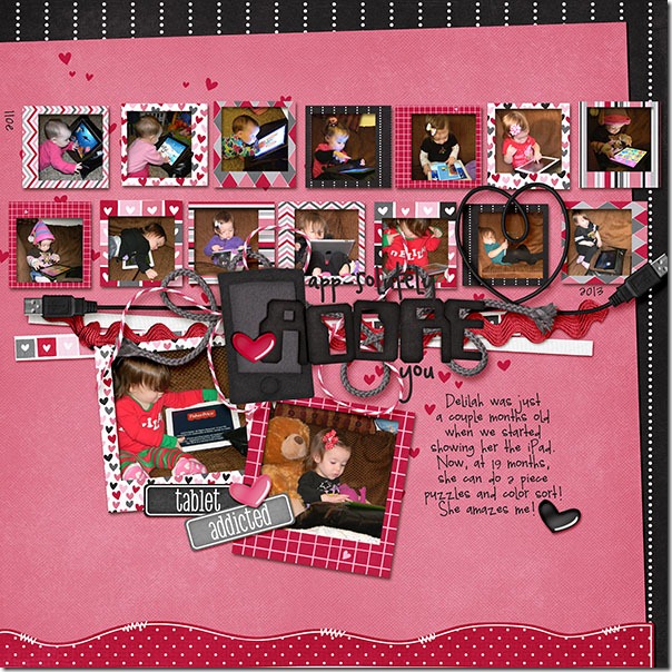
We have a few guests on Chelle’s team this month, and one of them is Brandy. She has generously provided two layouts for this blog post. The first one uses the full theme of the kit, and I love how she clustered the USB heart cable with the ribbons and the title on her page. She began taking pictures of her sweet baby using the iPad when she was very tiny, and she has collected quite a few lovely photos. Now that Delilah is 19 months old, she has had enough experience with the iPad that she can work a piece puzzle and color sort. Amazing! I’m sure she is just a chip off the old silicon block. ipad-web

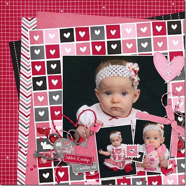
OK, enough of the computer metaphors. Brandy had these older photos of Delilah that she had never scrapped because she just hadn’t found the right kit. Techno Love was PERFECT for them. Look how well the pink and red colors of her outfit match the kit colors. And the heart stitches are the most appropriate complement to the clusters of heart and string elements. I love that she used the blank tags to date and label the layout, too.studio-delilah7mo-web

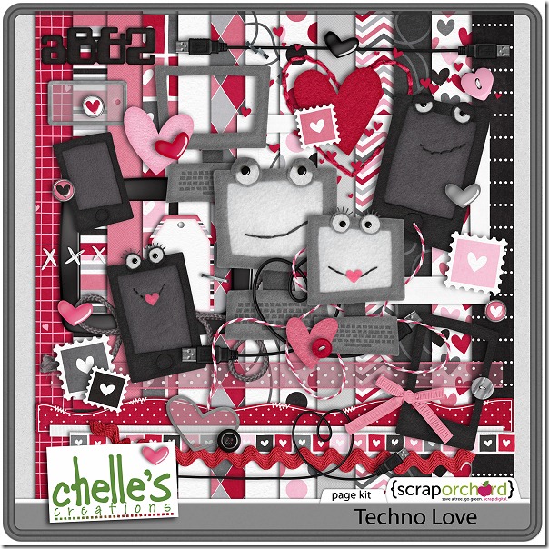
I hope you are inspired to check out this kit. I’ll show you a close-up view of it here. The image is linked to the market. Also, check out the Techno Love Valentines in the market, too. If you’re like me and are shopping a bit late this year, maybe you need these like I do. Just print from home and you’ll save yourself a trip to the store and have some original Valentines to give out this week. It’s a win-win! cc_technolove_kit

by_Cheryl

Using a Large & | Digital Scrapbooking Skills

I love browsing the web for the latest trends, don’t you? Lately, my mojo has taken a vacation, and I was looking for inspiration for digital scrapbooking tips and trends. I saw lots of uses of a giant ampersand on different marketing sites and scrapbooking sites, and Chelle’s talented creative team members have created some fantastic pages using a large “&.” I am really very inspired by them, and I know you will be, also.

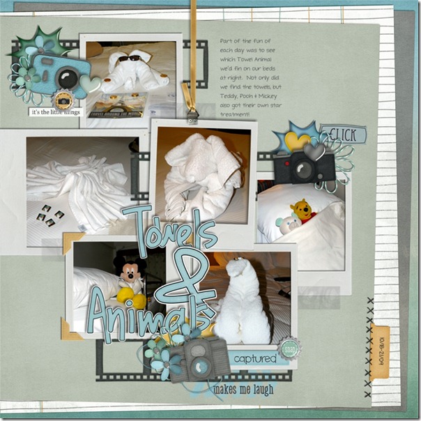
Just look at Jan’s page. She has a page about those adorable towel animals the room steward left in her cabin on a recent cruise. Her steward also took care to tuck in her children’s stuffed animals and give them the star treatment every day. Her photos tell the story, and I love how she used the ampersand to join the two main words in her title! It makes me long to go on another cruise. By the way, she used Oh Snap! for her page.towels_zpseb2da153

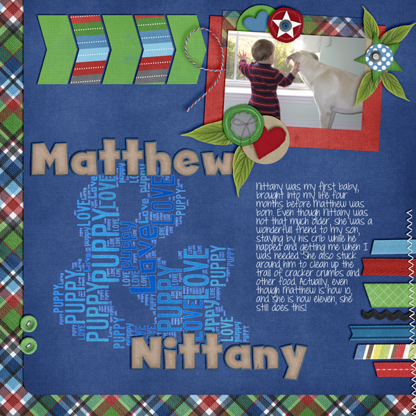
Here’s a layout from Leslie. She had photos of her son Matthew & their dog Nittany and wanted to scrap this page. For her “AND” she filled the letter with color coordinating blue shades using the words, “Puppy Love,” which really made the contrast work. Her use of size in the font also pulled my eyes toward the “&” to see what she had done. Choosing to use Winter Thrills with colors that worked with her photo and the font from Gone Fishin ties in Nittany’s fur, really adds to the charm of this wonderful memory

Matt-and-Nit

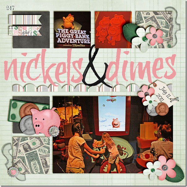
Next, Jenn used the same idea using a large ampersand joining two words in her title. The two words are significant because the page is all about the money in the Great Piggy Bank Adventure. I’m sure this fun game is challenging her children to learn to save their nickels and dimes and invest them wisely. Appropriately, Jenn has used Money, Money and the Marker Alpha for this cute page.

nickelsanddimes

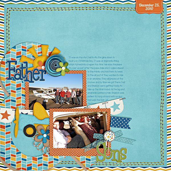
Shanell added this layout about her husband flying her and the kids down to a family Christmas party in 2010. It was a last-minute and they told everyone to meet at the airport if they wanted a ride in an airplane. It took me a minute to find her “&”, but then I saw them, the fun random chevron paper behind the “Fathers. Her composition with the clusters and double row of stitches adds to the fun and excitement of a great day. She used About A Boy.Shanell (happinessis) She used About A Boy

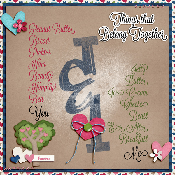
Liz created a page about her and her hubby and how they belong together. Love the “pink” list for her and “green” list for him. Love how that large “&” hooks the lists together. So simple, so elegant. I had to ask her what the font name was that she used. (Lavendaria) She used Chelle’s Love Grows Kit.
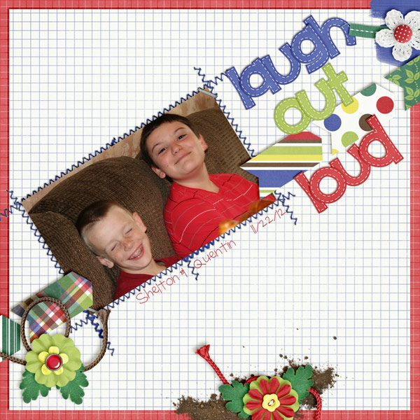
Liz.&layout.

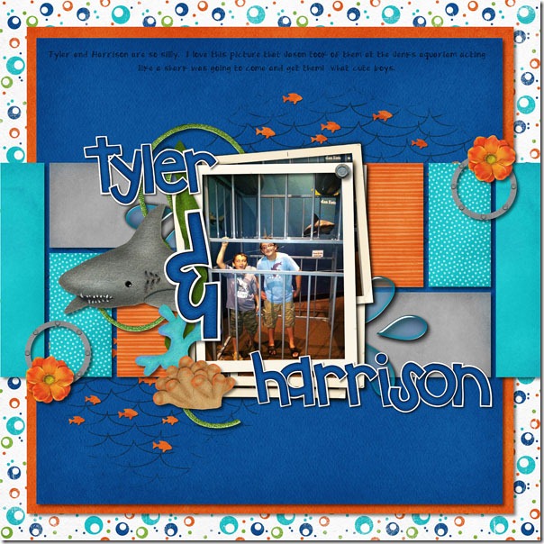
Finally, Lynett has two boys in her photo, and what better way to title a page than with their names joined by the large ampersand. They are certainly the main characters of the story, and it looks like they were having a blast checking out the shark tank. The shark in the photo and Chelle’s cute felt shark both look like they have their aim set for Tyler & Harrison. I hope they got out of the aquarium unscathed! Lynett used a lot of Chelle’s great kits for her page including Photo Stacks, Something Fishy and the Something Fishy Felties.   sharktank_zpsff8fa6d2
I hope you are inspired as I am . This was just the thing to jump start my scrapping for the week!

by_Cheryl