Dry Embossing Tutorial | Digital Scrapbooking Skills

Hi Chelle’s fans! This is Cheryl sitting in for Jenn (jk703).  Unfortunately, Jenn was among those who lost power during Hurricane Sandy.  She is still without power, so she isn’t able to check in with us here, but we do know she is safe. When her power is restored, we know she will be back with us, and until then, the rest of Chelle’s team will try to fill in the gap. Jenn had already given the team the steps for this terrific technique, so I’m going to post Jenn’s words and images here to share it with you. She used Photoshop to make the tutorial, but I and several other team members have tested it in PSE, and it works the same way in that program, as well.

Step 1. Choose a patterned paper – Jenn chose Chelle’s quatrefoil paper from Eeeeek!

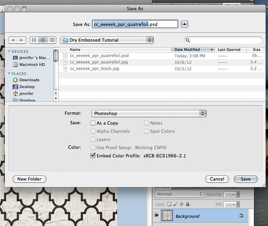
Step 2. Save the paper as a .psd file, and remember where you saved it. Keep the name the same so you can give proper credit to the designer.

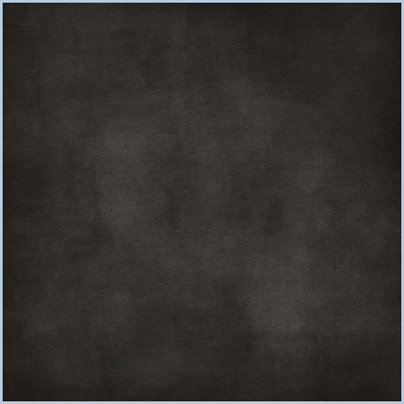
Step 3. Close the quatrefoil papers, and then open a new solid paper. Jenn used the black paper from Eeeeek!

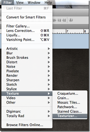
Step 4. Go to the File Menu>Filter>Texture>Texturizer

3i-kGW2Lrt-M

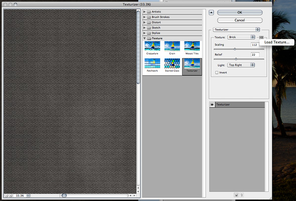
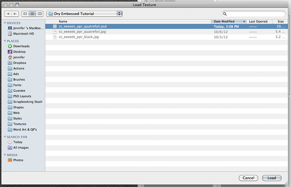
Step 5. The texturizer menu screen will pop up. On the right, under the word Texturizer, click on the little lines near the type of texture, if you’re in Photoshop, or if you have PSE, look for the circle with an arrow in it. A new pop up menu will open, and you’ll choose “Load Texture.” A new window will open in which you will navigate to the paper you saved as a .psd file in Step 2.

Step 6. Once you load that .psd file,

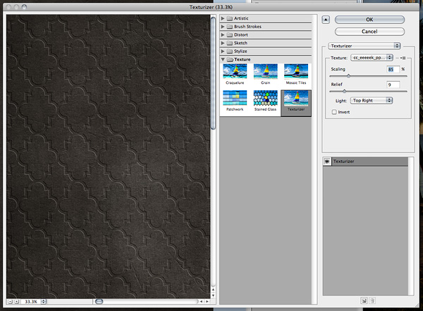
it will show your paper as “dry embossed,”

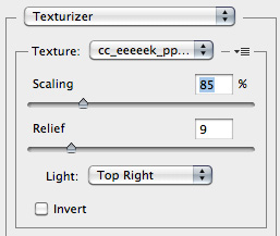
and you can play with the sliders to change the scaling and relief. You can also choose the direction of the light source,

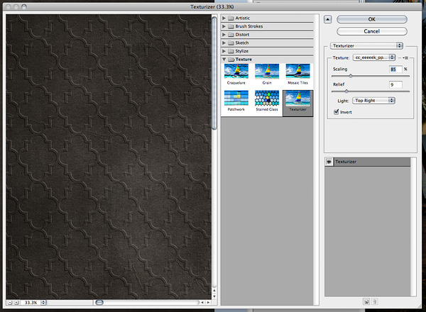
and you can invert the pattern by checking the “Invert” box.

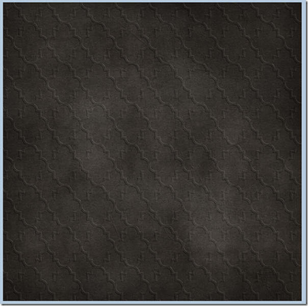
Here’s her final paper:

9i-J4qjdMT-M

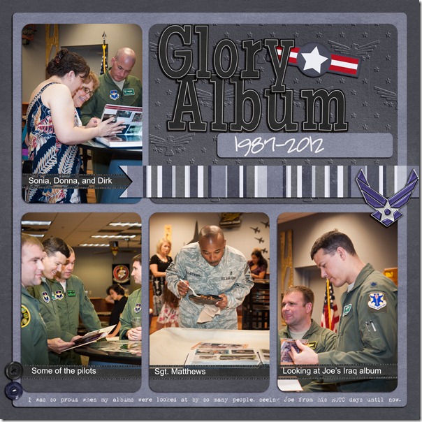
Several of the team have made pages using Jenn’s instructions for embossing papers. Leslie embossed the eagle paper pattern from the Military Bundle onto a solid to use for her title block. Joe-retirement
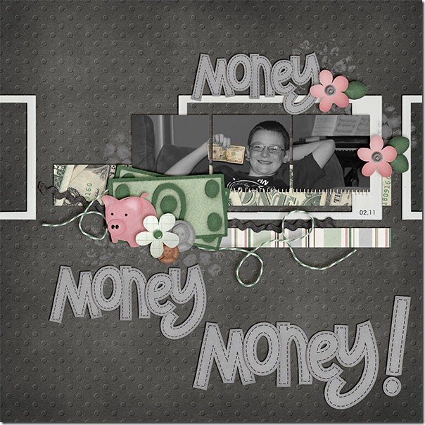
Kayla used a dot paper from the Rainbow Collection to make her background embossed. She also used Money Money and the Photo Stacks on her page.MoneyMoney_Feb11_web
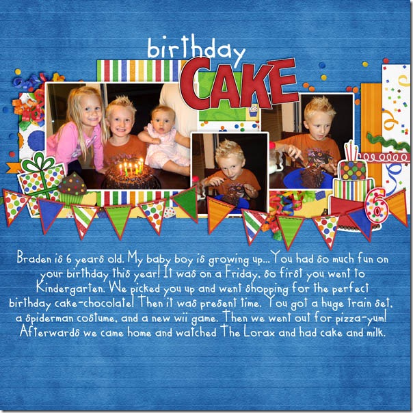
And, Kassie used a striped paper to make her background paper embossed, and she used Celebrate! Bold.birthdaycake
I hope you’ll try this technique. It is super easy, thanks to Jenn. Be sure to let her know you appreciate it, next time you see her around the forum.

In the Pocket | Digital Scrapbooking Classics

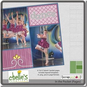
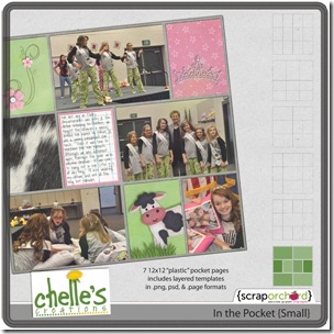
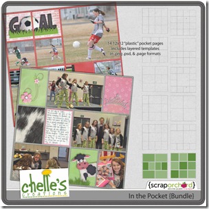
Do you like the pocket pages trend? I love it for my pages of daily pictures, and Chelle has the perfect digital scrapbooking kits for getting the traditional pocket pages look in a digital format. She calls them In the Pocket, and they are some of the most versatile page products in existence. They can be used for a daily photo project to show all 7 photos for the week on one page, or they can be used to show multiple photos from one event on a page. The individual pockets that Chelle gave away as freebies in an previous blog post here can be used to highlight specific elements on a page. Let me show you what I mean.

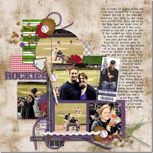
Erica used Chelle’s freebie pocket to hold a ticket stub from the game she attended that is the subject of her page. It gives a 3D look that enhances her page, especially the way she has the ticket slanted at an angle inside the pocket and sticking out of the top of it just a bit.Batter Up, Summer Lovin' and In the Pocket- by Chelle's Creations<br /><br /><br />
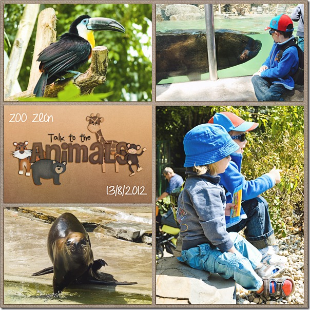
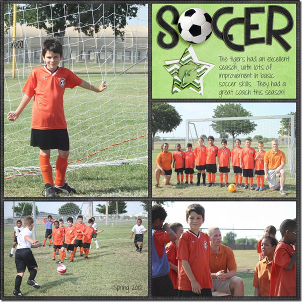
Will 'o the Wisp template- by Little Green Frog Designs Next, Dagi made a page of her trip to the Zoo using the whole pocket page look. It’s perfect for a set of photos like this. Don’t you just love her title? It looks like all the little animals are separate pieces carefully stuffed into the pocket with the title letters. Dagicc_inpocket_pages_06_1 Mel also made a page to showcase multiple photos from one event, and she used some of the extra photo spots for papers and elements she liked in the kit she was using. Finally, Leslie has made a page about a her son’s soccer season with an In the Pocket page. These are perfect for a recap of a sports season with spots for several photos.2012_05-Nathan-Soccer-

There are many ways to use these templates, with and without the plastic cover. Here’s a closer look at what’s in the market. The images are linked.

cc_inpocket_pages-01cc_inpocket_small-01cc_inpocket_bundle-01

Tweaking Templates | Digital Scrapbooking Skills

Hi Chelle’s fans! Do you use templates for making digital scrapbooking pages? I don’t think I can scrap without them. I have become quite accustomed to the time saving of using templates, but sometimes I can’t find the perfect template, and I need to tweak a template to make it perfect for a particular layout. Some of Chelle’s team members have done that and have some example layouts to show you what they do when they want to make a template “new.”

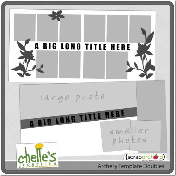
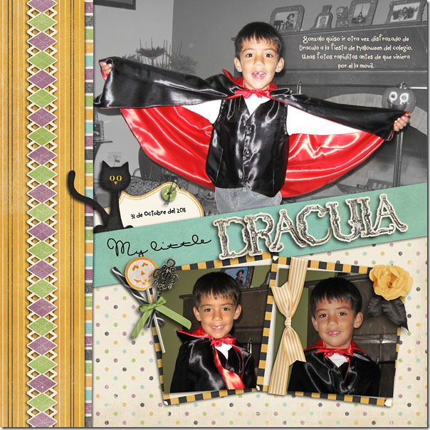
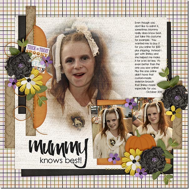
Roxana chose to use one of Chelle’s Archery templates given as a prize for a challenge during the NSD events in May, shown in this image here.cc_archery_doubletemps She took the double template and cut it down to a single 12×12 template and did a bit of arranging of the photos and flipped a layer or two. It made a terrific single page with her adorable large photo taking center stage. I love how she added her journal notes on top of the photo. Here’s her page: 23-draculaagain-web_roxana Kayla has an example to show how you can combine 2 templates to make a brand new one. She used templates from Bracket Love and Boo-tiful Blends, which are her own creations, by the way.  She combined the two templates by moving 2 of the photo spots in Bracket Love down and to the corner and replaced the 3rd photo spot with the photo blending mask from the Boo-tiful Blends template. MummyKnowsBest_Oct11_webKayla I love that large photo in a blended photo spot, and her perfect clusters are made from the Eeeeek Bundle and Kraftabulous. Her title is very fitting for her story, and it’s made from Chelle’s Wet Paint Alpha.

Tweaking templates is a great way to stretch your stash. Try experimenting with a template or two and see what gorgeousness you can make. If you use any of her products, post your layouts to Chelle’s Gallery at Scrap Orchard. I would love to see them!

Taste of Home | Digital Scrapbooking Classics

Hi Chelle’s fans! It’s Cheryl, again, and I have a confession to make: I love food and pictures of food. When I was a very little girl, I got in big trouble when I glued food pictures from a magazine onto my bedroom wall. I started making scrapbooks soon after that; now that I think about it, I’m pretty sure my mom bought me a scrapbook to keep me from ruining the walls. I think my history of getting in trouble with glue was one of the things that made me fall in love with digital scrapbooking, and with kits like Chelle’s Taste of Home, I can have the best of both worlds without the mess or the trouble! I love this kit! I’m sure you can see why. Just take a close look at those pie ellies! YUM!

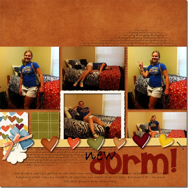
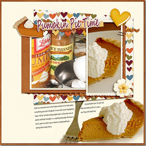
Chelle’s Creative Team members have been playing with this kit because it is perfect for scrapbooking everything from childhood pictures of family mealtimes to current Fall activities that don’t even center around food. Lynett has an example of the latter. She has a daughter who moved into a new dorm this year, and her page is about documenting that milestone event. The papers and hearts in the kit are perfect to coordinate with her photos and portray the sentiment of the occasion. newdormLynett Next, Ronnie tells a story on her page of her love of pumpkin since moving to the USA. Look how yummy that felt pie slice looks in the title of her page. Her photos are so good, I’m sure I would have glued them to my wall if I had seen them as a child. pumpkinpietime_600web-1Ronnie

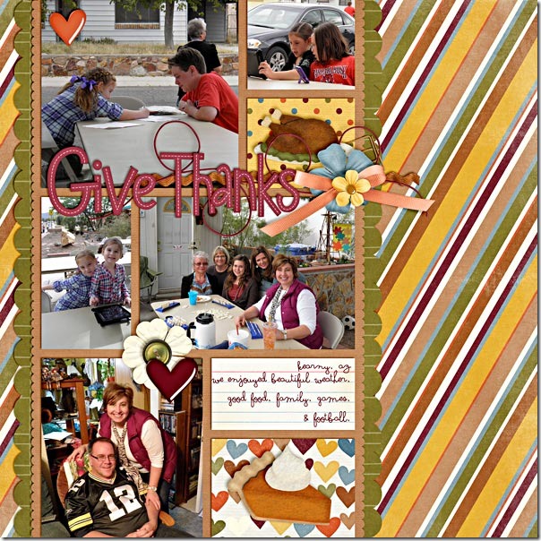
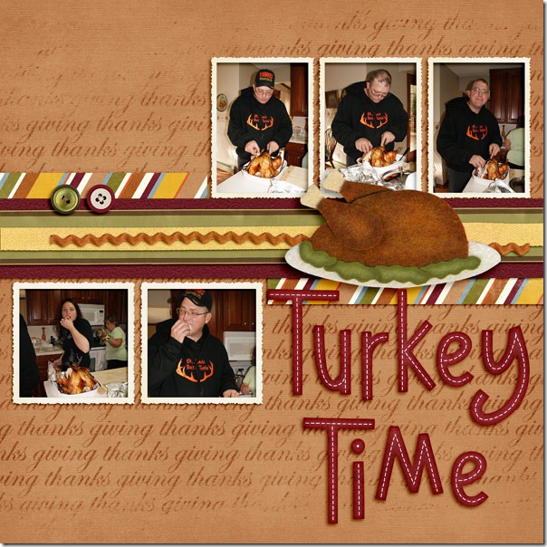
The next two layouts are Thanksgiving themed, and this mini-kit is perfect for these holiday pages. If you aren’t like me, and you don’t get your camera out during the meal and take pictures, you can still use this kit for your photos of the family gathering like Shanell did. She used the kit with her photos of various family activities on Thanksgiving instead of photos taken at the meal, and she used the turkey and pie elements to add the definite association with Thanksgiving. I think it’s a really smart way to scrap, and it probably kept her camera cleaner than mine is.  thanksgiving-20111Shanell Finally, Jennifer’s pictures are all about the turkey, so the kit was perfect for her photos. That large felt turkey in the center lets you know for certain that the bird is of primary importance to the holiday at her home. I love what she did with the “giving thanks” word element in the background. She changed the color of that element in the kit and made it larger to fill the same space as the paper in the background making it look like it’s part of the  paper itself. I think it’s very creative!web_turkey-timeJennifer

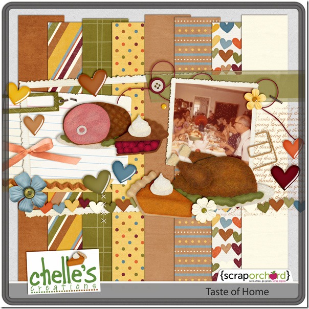
Here’s a closer look at this versatile mini-kit in the market. The image is linked. cc_tasteofhome_preview So, take a word of advice from me. Keep taking those food photos, but don’t use them for wallpaper. Add them to your digital scrapbooking layouts. Or, if you want to keep your camera safely away from the food, you can shop for the kits like Taste of Home that have the great looking food in them, all ready for you to use without the mess but great for adding the remembrance of  the comforts of home.

Shadows | Digital Scrapbooking Skills

Ever notice how some digital scrapbooking layouts in the  galleries look so real you have to study them to see if they were made from paper supplies or digital? One of the things that can make or break a layout is shadowing. Realistic shadowing is not too difficult, but there are a lot of details to get right. I like to use Chelle’s Creations shadow styles called Me and My Shadow, and her Creative Team likes her shadow styles, too. But, they are going to show us today how to take shadowing just one step further to enhance our layouts.

First, let’s look at Erica’s layout. She has a title on her page made from the alpha in the Prehistoric kit, and she merged the letters together before shadowing to make the title have a more solid look. Prehistoric- by Chelle's Creations<br /><br />
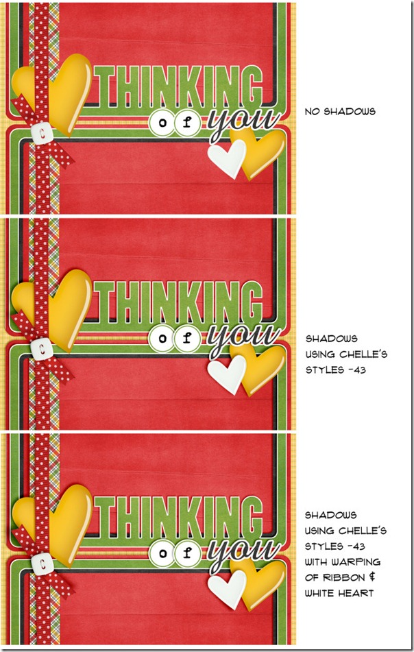
Template- by Britt-ish Designs Next, Ronnie made a card with examples of shadowing and an explanation off to the right of each card. Notice how tweaking the shadow on the ribbon helps the card to have a more realistic 3D look. shadows_Samples1 By the way, the angle she mentions (-43) corresponds to the Upper Left shadow style in Me and My Shadow.

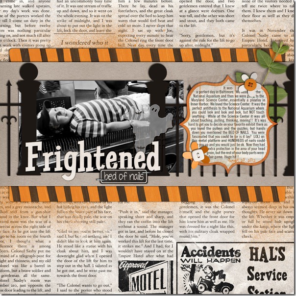
Next, Jenn has a layout and an explanation for what she does with shadows in general. She said, “I use Chelle’s -43 shadows for most of my shadowing needs. Depending on the layout, I sometimes adjust a layer’s shadow or add a shadow on the opposite side for extra definition. I do this by separating the shadow layer (in Photoshop go to Layer->Layer Style->Create Layer). I will then nudge the shadow layer just created up or down depending on how I want it to look.” In her layout below, she nudged the Upper Left (-43) shadow on the fence posts up a little – just so they would look like they were sticking out a bit more. Also on this layout, she added a slight definition shadow on the opposite edge (shadow angle of 120) of her two paper layers and the bed of nails journaling strip.17_2012_BedofNails_600w_zpse346880bJenn

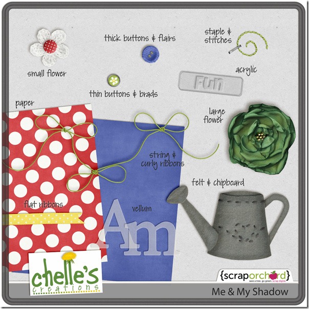
Here’s a closer look at the shadow style in the market. The image is linked. cc_memyshadow_preview

Good luck tweaking your shadows!

All Hallows Eve | Digital Scrapbooking Classics

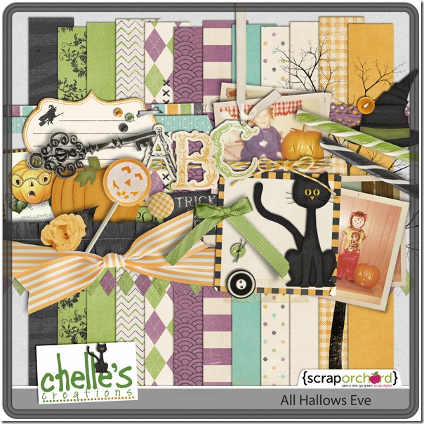
It’s October, and all over America store shelves are full of decorations for Halloween. In just a few short weeks, children will be dressing as characters and asking for treats while their proud parents snap photos of their cute little guys and girls. Chelle’s Creations has the perfect kit for those photos. It’s a Halloween kit with a trendy, vintage feel called All Hallows Eve, and her team of creative layout artists have made some digital scrapbooking pages to show you the range of  layouts that can be made with her kit.

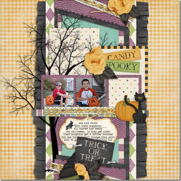
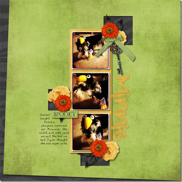
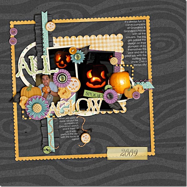
First, Karen had a photograph of her boys proudly showing off their pumpkins they had carved. She used a multitude of the colors and papers in the kit, and the tree she used as an accent is one of my favorite pieces. Look at that crepe paper that is gathered and stitched – Karen’s shadowing of it is perfect. It literally pops off the page.halloweenKaren Next, Lynett had some pictures of her dog Minnie dressed as a penguin that she scrapped. Since her dog refused to walk with the penguin hat on, it was an easy task to get the dog to pose, and she used the green and black papers in the kit to make the perfect page. I love the square holes cut in the green paper that allow the black to show through, and that key is another one of my favorite elements in this kit. Lynett also used Chelle’s newest alpha to make the title.minnieasapenguinLynett Finally, Shanell used multiple colors of the kit on her page about the pumpkin carving traditions in her family. The title is made from two of the three colors of alphas included in the kit. I love how the angles of all the elements on the page give it a whimsical feeling overall. And, I like how she used the buttons in various colors to fasten the pumpkin, flower, and ribbon elements to her page.pumpkins-2009Shanell

This is a classic kit you can find in Chelle’s store at Scrap Orchard, and here’s a closer look. The image is linked.cc_allhallowseve_preview_2post

Scrap Skills: Using Paint

Hi all! It’s Cheryl again with another Scrap Skills post for you. Today, we are going to look at using paints  or spritzes on our digital scrapbooking pages. Paint splatters can add a significant amount of texture to a page, and they certainly add interest and depth. But, a paint splatter added poorly can ruin a page, just like a paint splatter in real life, right? Once again, Chelle’s video tutorials can save the day. She has a tutorial here entitled Tweaking the Marker Alpha, and it is certainly perfect for her Marker Alpha. She describes how to achieve the effect of the marker “skipping” over the edge of a paper slightly as it would if you were to write with marker on your page. But watch it again, and this time keep in mind how you could apply the same techniques to a paint splatter because the same things happen to both in real life.

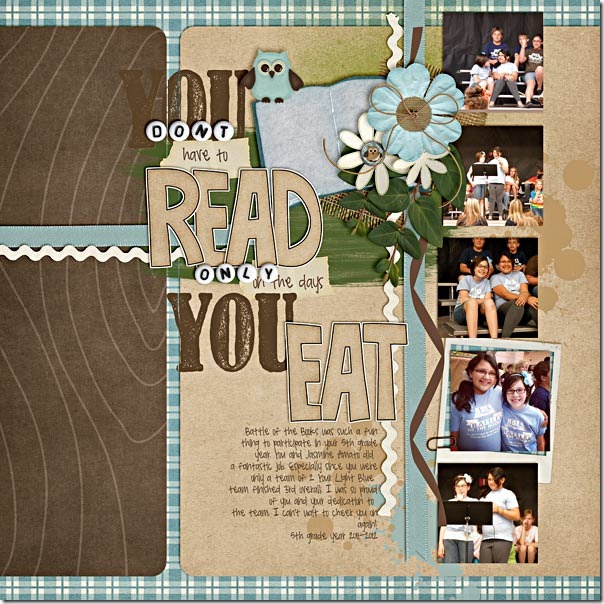
Here are some examples of pages created by members of Chelle’s Creative Team to highlight the use of paints and spritzes on a page. Melissa’s page has the paint spritzed behind the photo, so she didn’t need to worry about the effect of the paint crossing a paper boundary. She used the paint to add depth and color to the solid background and to highlight the blue colors on the page. It gives her page much more texture than it would have without the paint. 7-Months-Old-RS_zpsd9655034MelissaNext, Roxana used the paint similarly to Melissa, but in this case, she recolored some of the paints and she used them on a patterned paper background. This keeps the area adjacent to the photo from being too busy and distracting for the photos. She also adjusted the blending mode to allow some of the paper pattern to peek through the paint.22-halldecor-web_zps0d88ab9dRoxanaFinally, Shanell made a page for us, and she really went crazy with the paints. She used both the techniques shown above and the technique in the video tutorial. See if you can find all the paints on her page! But, notice how the green paint smear behind the title has a slight gap in it at the place where it crosses the brown paper edge. Notice also that she erased a thin stripe through the “Y” in the stamped word “You” where it was stamped on the edge of a digital paper. It is this attention to detail that makes her page seem like you could reach through your computer screen and feel its many textures. battle-books-round-3_zpsbbe01f66Shanell

I hope you’ve been inspired to try to add this touch of realism to your layouts. Here’s a closer look at some of the items in the market so you can give this technique a try on your own pages. cc_applemyeye_paintedcc_wetpaintcc_marker_alpha_preview

Play the Game | Digital Scrapbooking Classics

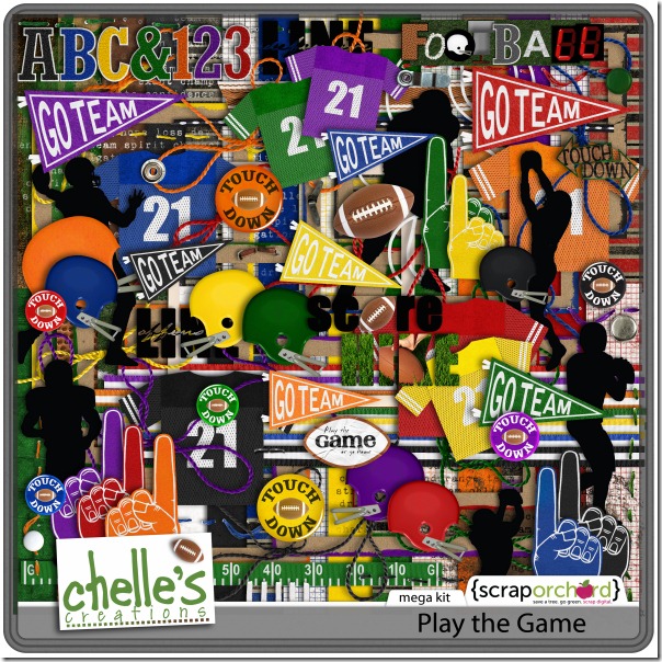
I’ve just spent the weekend visiting one of my children at college (hint: it’s an SEC school, and I now own a cowbell). When I was given tickets to the football game, my child said, “Mom, the tickets are on the 50 yard line – you’ll love it!”  So, I dressed in school colors and my husband I traveled to enjoy this experience with our child. What I wasn’t told was that the seats were a few rows down from the very top of the stadium. I could barely see the players on the field, and my ears are still ringing from cowbells, but I have the sweetest memories and some awesome photos of my child enjoying college football. And, since Chelle has this terrific football themed kit called Play the Game, I am going to have a digital scrapbooking page finished with my precious memories before this day ends.
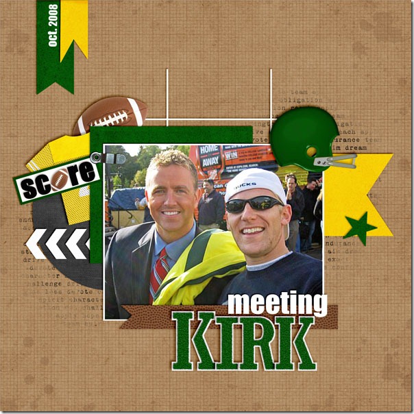
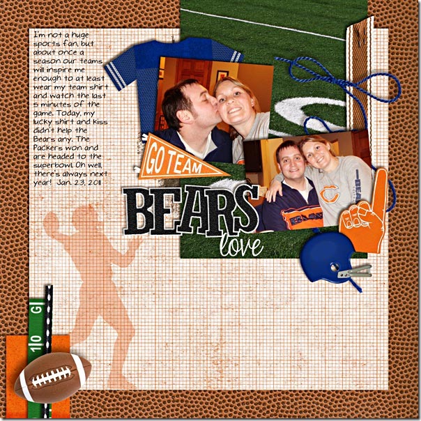
Some of Chelle’s friends have been enjoying this season, as well, and have been busy with this kit. Kassie’s loved one had a special encounter at an ESPN event and met Kirk Herbstreit. How exciting that must have been! Here is her page using Chelle’s Play the Game kit with the green and yellow team elements: meetingkirk-2KassieMary used her pictures of her supporting the Bears to make a great page with Chelle’s kit. I love how this huge kit has multiple team colors in it, and Mary has used the blue and orange elements together on her page, matching her team’s colors.bearsloveMary

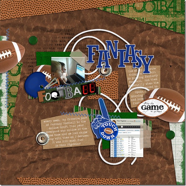
Fantasy football is really a lot of fun, and Karen loves the online draft. She captured some pictures of her children watching the draft and using Skype to communicate with other fantasy players. She made a great page using the blue and green elements and papers with the footballs.fantasty-footballKaren Here’s a closer look at the kit in the market along with the Game Day Bundle because football always means food, too.cc_playthegame_kit cc_gameday_bundle

I’m off to scrap my game day pictures. Working with this kit might just be as much fun as going to the game. I get to relive the experience all over again through my pictures!

Scrap Skills: Weaving | Digital Scrapbooking Skills

Maybe you’ll remember back in June, I wrote a post here about weaving elements on a digital scrapbooking page. Have you had a chance to try it? Do you need to see Chelle’s excellent videos again? There is one about linking charms here and one teaching you how to weave a string through grommets on a banner piece here. They are short, easy to watch during a coffee break, and very helpful for making a woven element look 3-D and realistic.

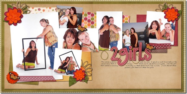
Maybe you just need a bit more inspiration? Chelle’s fabulously talented team members have been playing with these techniques again. First, Lynett made a double page and chose to weave a string around the alpha on her title. The string really helps to anchor her title to the photos, doesn’t it?2girlsLynett Just like Lynett, Erica also took a string and wove it around the title elements. Notice how this helps your eye go across the page following those adorable photos. Look at how well they each did the technique with the string going over and under the letters and shadowing the alphas that are covered just a bit.Mint Tea Template- by Little Green Designs
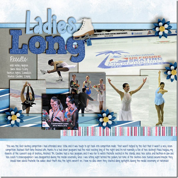
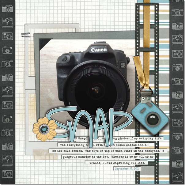
Lady Bug Hugs and E-I-E-I-O- by Chelle's CreationsNext, Jan wove strings all over her page. Take notice of that gorgeous black and white photo, but look also how the strings woven around the flower on the left and the two strings woven together on the right help to give a very realistic texture to the page. fr2Jan Next, Heather followed more of the Linking Charms video technique as she wove a string through the ice skate and tag in her mixed element title. It is very similar to the way Chelle described hanging a charm on the tassel in her video; very subtle, but oh so effective. mkfhof_ladieslp600cHeatherFinally, Jenn made a page using Chelle’s Oh Snap! kit, and she wove the honey ribbon hanger in and out of the negative strip element. Her shadowing is perfect on the ribbon, and her page truly looks 3-dimensional in every aspect. 7_2012_snap_600JennI hope this post has inspired you to hone your weaving skills to give your pages an enhanced, realistic feel. If you try this technique using Chelle’s kits, post your pages to Chelle’s Gallery at Scrap Orchard and let us know. We would love to see your pages and leave you some love!

Midnight Crow | Digital Scrapbooking Classics

The first breeze of cool air blew into my neighborhood this week, and it really made me excited for Fall and all that is special about this season. I love going to pumpkin patches and picking out a special one to carve, and I love getting lost in a good corn field maze. Chelle’s classic kit Midnight Crow is all about these good things of the season, and her creative team members have been playing with this kit this week to show you its possibilities for your digital scrapbooking layouts.

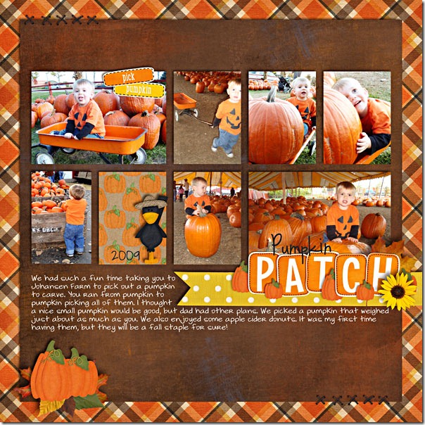
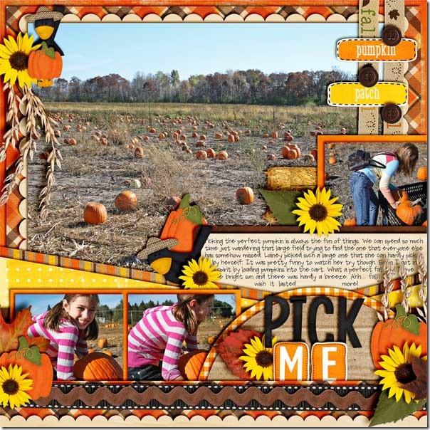
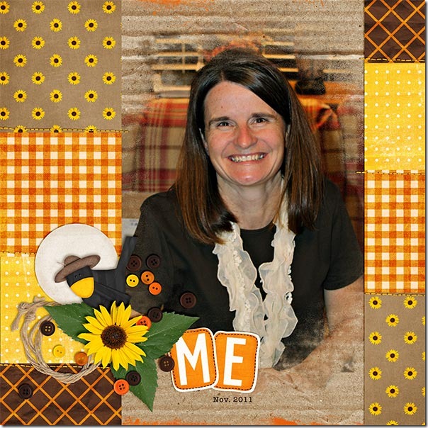
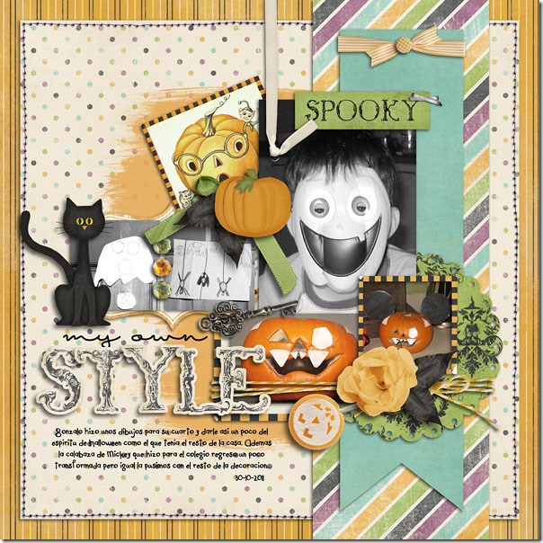
Mary and Jenn love to go to the pumpkin patch like I do, and they each made new pages about their experiences in different pumpkin hunting episodes. First, Mary’s page tells a story about her little guy picking a pumpkin as large as himself! Look at that photo of the pumpkin in the wagon with him. There’s barely room for him! And, apple cider donuts sound like a fantastic idea for a treat. I love the blocked layout pattern she used and the word art for the title.pumpkinpatch2009MaryJenn’s page tells a similar story to Mary’s. Her daughter also wanted to pick one too large to carry. I think all children must do this as I’ve seen the same thing happen with mine. Look at that gorgeous, large photo with all those pumpkins begging to be picked, and her clusters of pumpkins, flowers, and hay around the page really accent her photos well.pickmeJennSFinally, Kayla took a little different approach. She had a lovely photo of herself that she used to make a page, and the Midnight Crow kit was the perfect choice. The colors in the photo and the kit match perfectly, and I love the way she made the page have a quilt-type feel. I also like the way she used the cardboard paper behind her photo and blended the photo into it so that some of the cardboard texture would show. Me_Nov11_webKayla
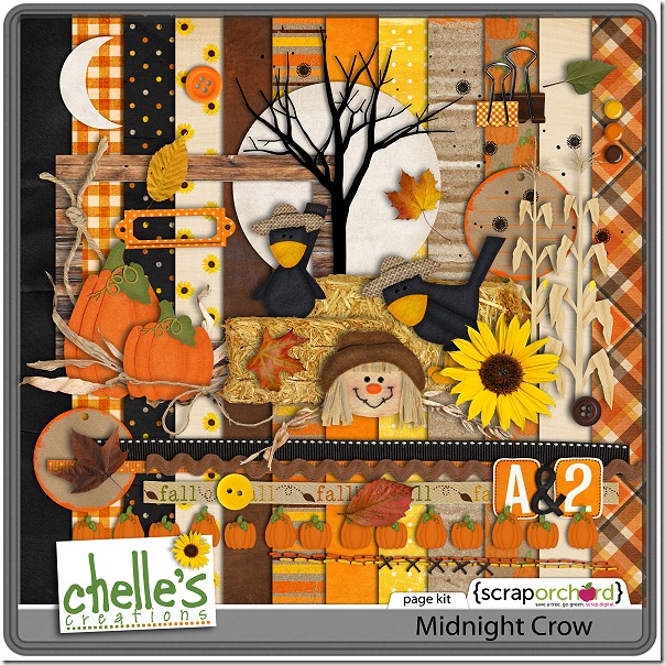
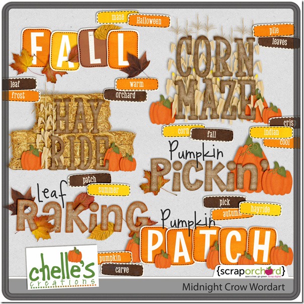
I’m sure you will have some photos of activities soon that will be begging for this kit, so let’s take another look at it in the market. Here’s the kit and the Word Art. The images are linked.cc_midnightcrow_kitcc_midnightcrow_wordart_preview2post