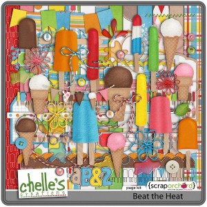
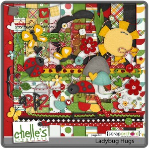
Let’s Eat! Pizza & Pasta Yumminess

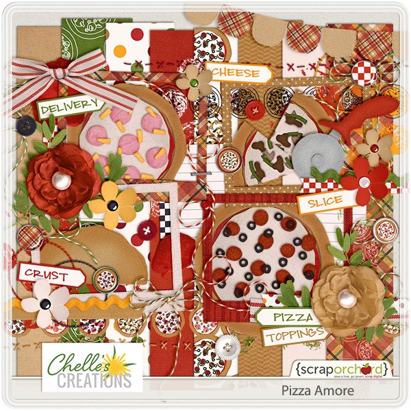
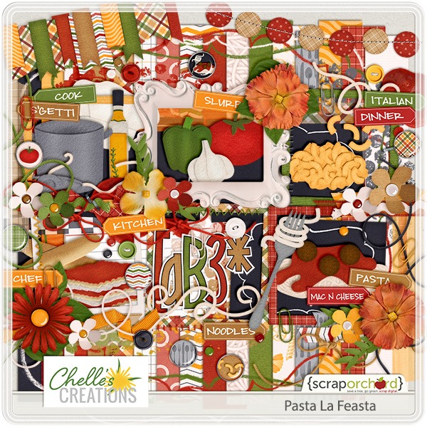
You are in for a real treat today, Chelle’s Creations fans. Not only will you see inspirational digital scrapbooking pages using two of Chelle’s great kits, but you’ll have a couple of recipes to try from one of Chelle’s CT members. We’ve got the perfect pair of kits to use today: Pizza Amore and Pasta La Feasta.

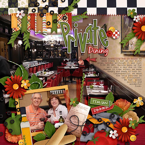
First, let’s look at a page by Carol. She’s a world traveler, trying to keep up with her kids all over, and she tells us about a recent trip to Europe. She and her husband arrived in London after 15 hours of traveling and were starved. They found an Italian restaurant where they were the only patrons and enjoyed private dining. Her large photo on the page tells the story perfectly, and Chelle’s embellishments of olive oil and breadsticks are the perfect accents to her smaller featured photo. private-dinning-_zps4a02dbe4
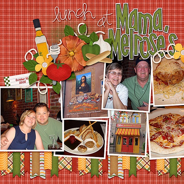
Next, Karen had some photos of a special dining experience at Mama Melrose’s. She used the left side of Chelle’s Lay it On Me Double template combined with the two featured kits (which, by the way, are also sold as a bundle here). I love the way she used the banners as a background accent for all her photos. mamamelrose_600
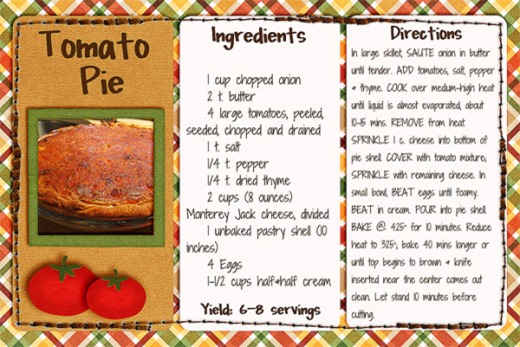
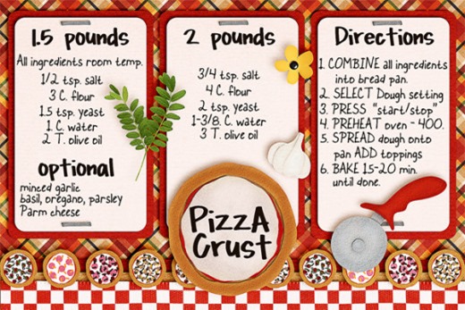
Finally, Donna tells me when she finds a recipe she likes or a family recipe she doesn’t want to lose, she makes a lovely digital recipe card and prints it. The following two recipe cards started with a template from Shabby Princess, and Donna used Chelle’s Pizza Amore and Pasta La Feasta to decorate them. The tomato pie recipe is a combination of a family favorite and one she found on Pinterest while the Pizza Crust recipe was included with her bread machine.

tomatopierecipepizzarecipe

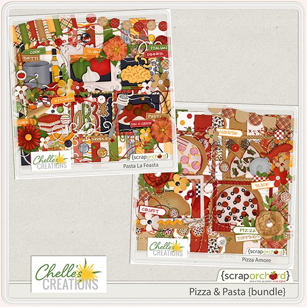
Need a closer look at the kits used? The images below are linked to the store. cc_pizzanpasta_bundlecc_pizzaamorecc_pastalafeasta
by_Cheryl

Touching on Texture

One of the easiest ways to add interest to your digital scrapbooking page projects is to add texture. Put simply, that means adding anything that makes a reader want to reach out and touch the page. It can be achieved by adding a textured paper like a wood grain or a plaid weave or by stacking elements of varying thickness and feel. Chelle’s very talented team members have a few pages to show you as examples.

First, Jennifer made a page with a wood grain as a background paper. It fits the theme of her page perfectly and makes me want to feel the page. She also stacked elements of varying thicknesses and surface textures, and she used Get Your Grill On and Get Your Grill on Fire {Alpha}. (If you don’t have these two items and want to shop, you might want to look at the bundle in the market; it includes a few more items for just a few pennies more).


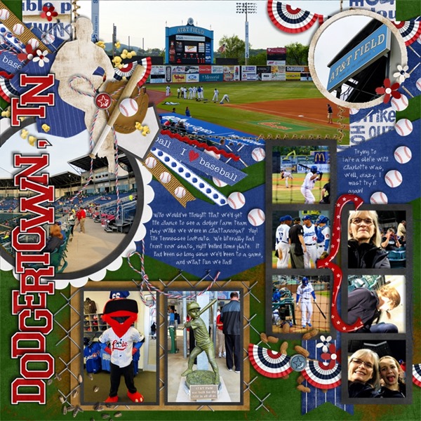
Next, Jan took a trip to my home town, Chattanooga, TN, and she went to a Lookouts baseball game. She used several of Chelle’s kits to mix and match and make a very tactile layout of her photos from the game that is full of various textured items. Included on her page, you’ll see items from Batter Up: Baseball, Rock the Vote, Summertime, and Liberty. dodgertowntn

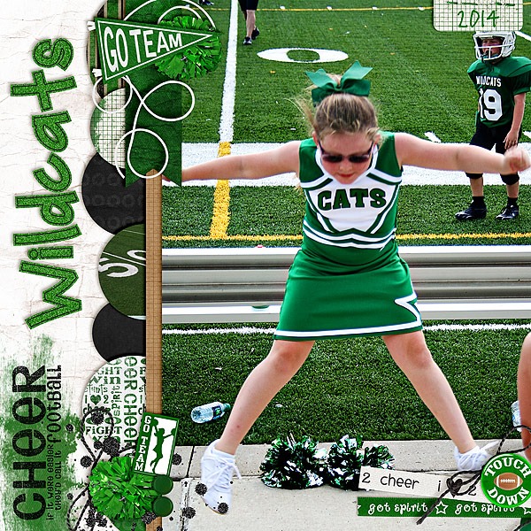
Finally, Melissa also had some sports photos. She scrapped a page about her daughter’s cheerleading experience using Go! Fight! Win!, Play the Game, Delightful Alpha Doodles, and Holly Jolly Holiday (retired). Melissa says about her page, “The crinkly paper, the glitter, the poms, even the turf scream texture to me,” and I must say I agree. I love the textured elements with that turf in her photo.  Wildcats-Cheer-copy


by_Cheryl

Classics: Toil & Trouble

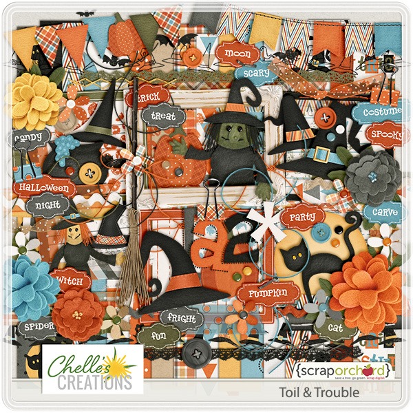
Hi Chelle’s Creations friends! It’s almost October, and that means it’s time for costume parties, carving pumpkins, and cauldrons brewing up fun! If you’re in the market for a great digital scrapbooking kit with a Halloween feel, check out Toil & Trouble. It’s full of all the spooky papers and elements you need to tell your fall & Halloween stories. Chelle’s talented team members have a couple of ideas to inspire you.

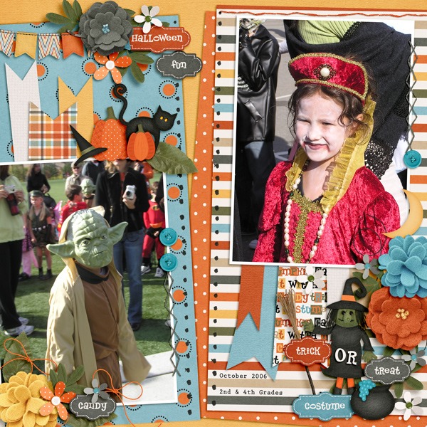
First, check out Kimberly’s digital scrapbooking page. She used a template by Fiddle-Dee-Dee Designs and Chelle’s Toil & Trouble to make this adorable page about her children dressed up and trick or treating. I love the cluster of word art with the cute witch and her broom on the lower right. It’s just too cute to be scary.  2006_10_31_fdd_ffPennants7_tp4_zps0a071350

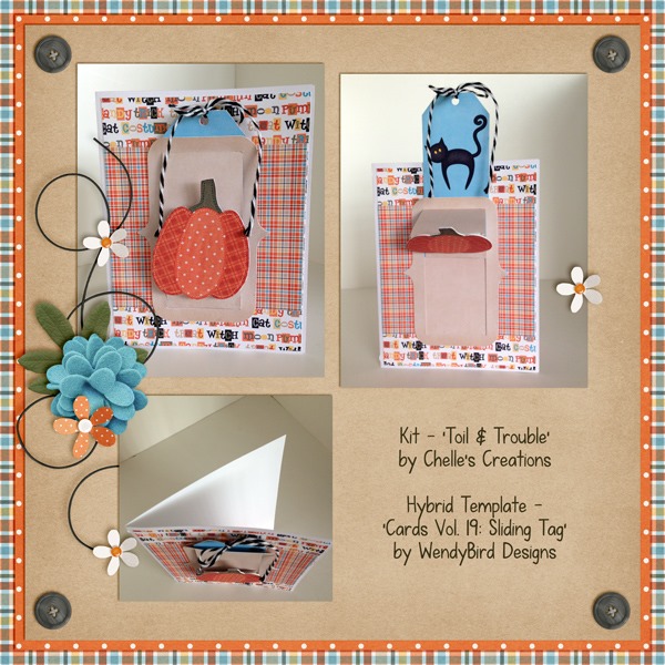
Krista used the kit to make a card with a tag that actually slides on the card. The template is by WendyBird Designs. I love the way she hid the black cat behind the tag so that he is revealed when the tag is pulled upward. And, then she made a beautiful page to showcase her wonderful card creation.  SlidingTagCardPreview_

Here’s a closer look at the kit in the market. The image is linked.  cc_toilntroubleby_Cheryl


Using Digital Stamps

Digital stamps come in all shapes and varieties and can add an extra dimension to your digital scrapbooking pages. The textures add to the 3D effect and help make the page look like it was created the traditional way. Chelle’s Creations has several stamps in the market. The CT have a couple of pages to show you using some of her Commercial Use products. Don’t be afraid to shop in the CU side of the store; the designs there have special licenses for digital designers to be able to use for commercial products, but they can certainly be used for personal projects just as well.

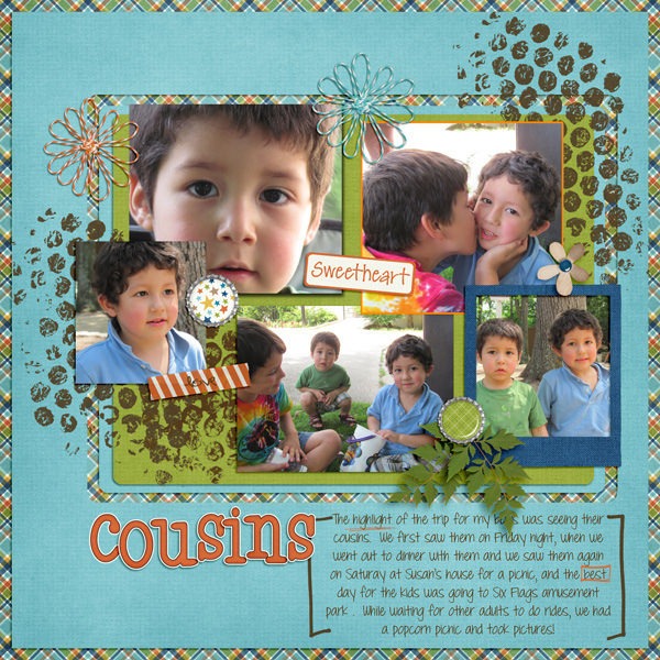
First, Leslie used Chelle’s About A Boy kit along with Mark My Words and Me and My Shadow Styles on her page of cousins.  She has added Chelle’s CU Bubble Wrap Brushes to look like the bubble wrap was stamped onto the background layers giving added texture to her page. Bubble wrap is a great addition to any page since we ALL love to play with it in real life. 15056044347_1067a97c0d_z

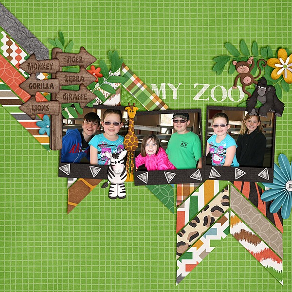
Mel created a really colorful page with a Fiddle Dee Dee Designs template and she used Zoo Crew {jungle}, Zoo Crew {safari}, and Zoo Crew {Animal Prints}. With all those bright colors, she decided to use white “paint” to accent the photo frames using CU Hand Carved Stamps {Arrows}, and she used a font for her title that looks stamped. It’s called Stamp Act Jumbled, and it can be found here. It’s a perfect font choice for her page.My-Zoo-copy

I hope this blog post has your stamp of approval. Sorry. I just couldn’t resist!

Enjoy adding stamps to your next project, and I can’t wait to see what you create in the gallery.

by_Cheryl

Classics: Midnight Crow

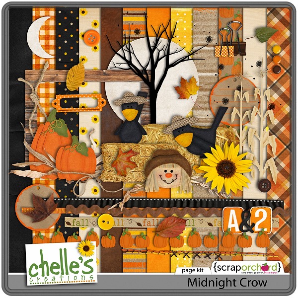
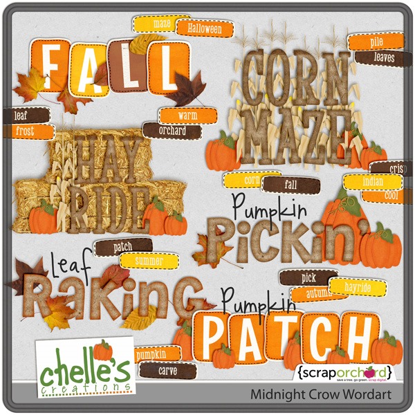
Do you love Fall and all the gorgeous colors? Pumpkins, corn fields, mazes, and all things Fall thrill me. Chelle’s Creations has a classic digital scrapbooking kit that gives me that warm, comfy Fall feeling every time I pull it to my desktop. It’s called Midnight Crow Reloaded (because it was recently given an overhaul and it’s better than ever) and there is a coordinating Word Art that is perfect for creativity when time is short. Need inspiration? Chelle’s friends have a couple of pages to show you.

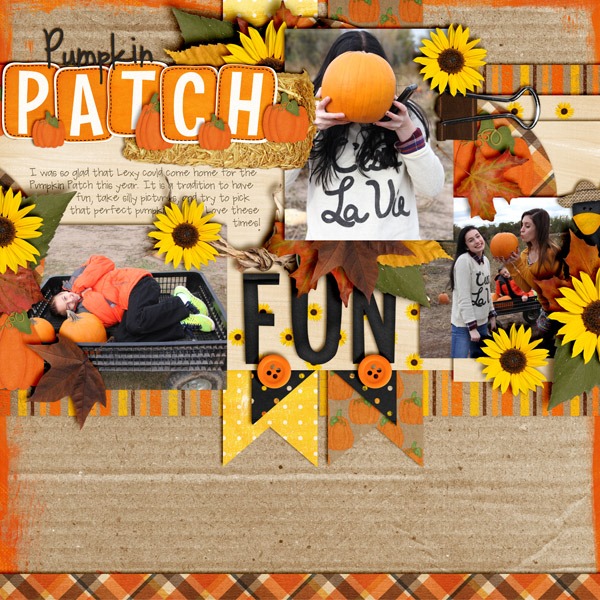
First Jenn loves Fall as much as I do, and her girls have not outgrown going to the Pumpkin Patch, thankfully. I love the photos she took of their silliness. The sunflowers and buttons are bright accents that compliment that cheerful feeling conveyed in her images. pumpkinpatchfun

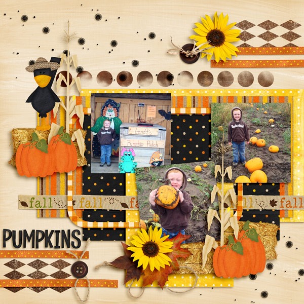
Jenny also had photos with pumpkins. Her little one was really proud to pick out his favorite and show her the mud all over it. It was a messy day on the farm, but there’s nothing messy about the way she captured the memories. I love the way she used the ribbons in horizontal rows across the page, and the hay bales look like real hay bound on the page. Pumpkin-Patch-2013-5_web

Here’s a closer look at the kit and the word art in the market. The images are linked.

cc_midnightcrow_kitcc_midnightcrow_wordart_preview2postby_Cheryl


Movement & Flow

A good idea to keep in mind when designing your digital scrapbooking page is the ease of reading the page. Our memories are important, and the movement of elements on the page can either add to the flow and enhance the reading or it can sabotage it. There are lots of ways to achieve a good flow: the use of arrows and wavy lines can help visual flow. Also, there are several ideas listed on this article about web design, but the same principles apply to a scrapbooking page. Chelle’s CT has a couple of example pages to show you in which they used a strong diagonal line to guide the eye from the lower left to the upper right of their pages.

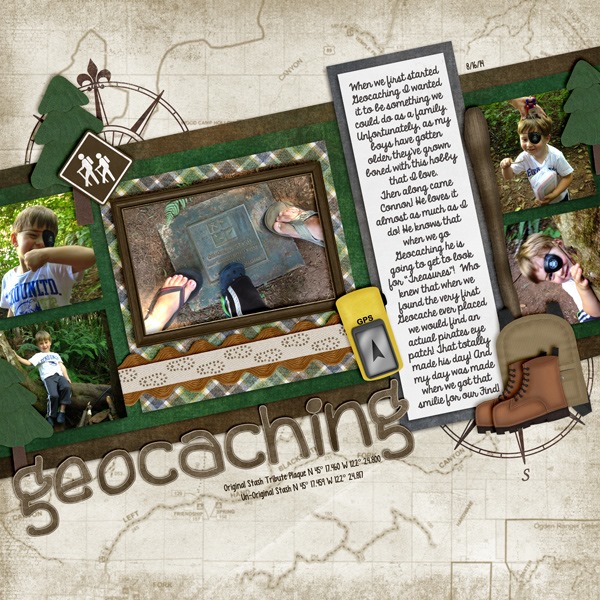
First, Krista chose to capture her memories about a geocaching experience, and she used Chelle’s On the Trail for her page. There is a great deal of movement in the photos on the page, but the strong diagonal background mat leaves no doubt which way we should read the information. As we move from left to right, we won’t miss the box of journaling telling about their awesome adventure, and even though the words are perpendicular to the flow of the page, it doesn’t stop the movement. At the bottom of the story, our eyes seem to flow naturally to the final two photos on the page.  Geocaching_

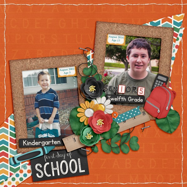
Kimberly used Teacher’s Pet to demonstrate movement and flow with her son’s first day of school photos from kindergarten and his senior year. She anchored the layout with the title in the bottom left corner and your eye moves upward to the older photo. The blue crayon also points the way. She used PSE’s check mark shape in the Custom Shape Tool (Shortcut U) to create her own clipping masks. The curved line meets the straight edge of the shape where it points towards her son’s bright future. The first day of school journal card and the Instalife cards tucked into the frame will be in the market on September 4th, 2014. ME and MY Shadows Shadow Styles made this template-less page come together in a snap by using the different options for stitches, large and small flowers, buttons, strings, and heavy embellishments. 2014_08_FirstDaySchool_zps4cf09db3

Are you moving yet? It’s good for the body, soul, and digital scrapbooking page.

by_Cheryl

Classics: Little People

I was one of those children who LOVED to play with paper dolls. (Did I just date myself? ooops!). But, then when sticker books came along and I could stick clothes on the paper people, I was in heaven. But, I could only use each sticker one time. Now, I have Chelle’s Little People and tons of clothes, and I can dress them up in hundreds of ways to accent my digital scrapbooking pages. Chelle has created clothes for school, the pool, the beach, playtime at the park or in the backyard, and of course costumes for dress up or Halloween. Chelle’s Creative Team members have been using the Little People on their layouts, and I want to share them with you.

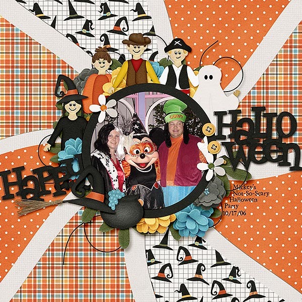
First, Karen used a Scrapping with Liz template and Chelle’s Toil & Trouble to make her page featuring a photo from a Disney trip during Halloween.  She used Little People, Little People {Costumes} and Little People {Halloween} to decorate her page. I love how she clustered the dolls around the frame of her photo.   SwL_WavyTemplate4_web

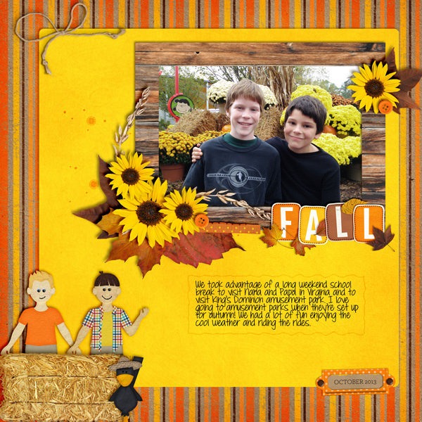
Next, Leslie used Midnight Crow Reloaded and the Little People to scrap a favorite photo of her boys taken while on a trip to King’s Dominion in the Fall. I love the way she used the Little People to mimic her own boys in the photo. 14799057197_8a0577d79f_z

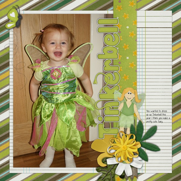
Finally, Helen used Chelle’s In the Backyard for her page. She created a paper doll to match her sweet little girl, and she did it with elements from the Little People and Little People {Costumes}. I love how she placed her paper Tinkerbell peeking out from behind the letters in the title of her page.  assignment-littlepeople


I hope you’re inspired to make you own digital paper dolls from Chelle’s creative kits of dolls and their clothes. They are incredibly fun to use and make great accents on your digital scrapbook pages.

by_Cheryl

Skills: Rule of Thirds

Have you ever struggled with where to put your photos on a digital scrapbooking page? I tend to scrap with a lot of templates, so I struggle when I need to make a page from scratch. That’s when the Rule of Thirds is most helpful to me. You’ve probably read about it with regard to photography, but the same principle can apply to design of a good scrapbook page. Basically, you imagine placing a “tic-tac-toe” grid on your page, dividing it into 9 equal sections. Then, place the main focal point of your layout design on one of the crossing points. SusyQScraps wrote a terrific article about this a few few years back, and you can read it here if you want to know more.
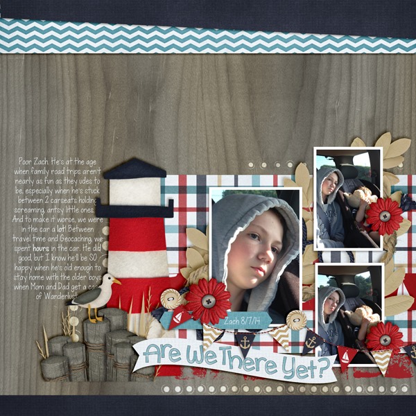
Let me show you a page from Krista, one of our Creative Team Members. She used Chelle’s Anchor’s Away and Anchor’s Away {alpha} to make her page. She also took some help from a template freebie from Fiddle-Dee-Dee Designs and shifted the elements a bit to follow the design principle in the Rule of Thirds. The focal point is clearly the large photo in the group of three. It is placed on the imaginary cross point on the bottom right of the tic-tac-toe grid, and my eye is immediately drawn to it. Then, for further emphasis, Krista has placed the title banner directly below the large image, and she has repeated the image in the smaller two photo spots.AreWeThereYet2_

Likewise, Jennifer used the same lower corner spot to place her focal point, but she used a single photo on her page. She used Chelle’s Choose the Right {TREK} for her page. I love the wooden letters in that included alpha.

10441141_10203507184734594_234897355574560773_n

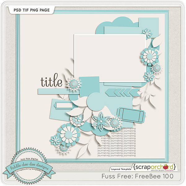
Would you like some help making your page? Fiddle-Dee-Dee Designs has a freebie on the Scrap Orchard blog that follows the Rule of Thirds perfectly. Her focal point is a single photo, and she has placed it in the top right cross of the imaginary grid. Here’s a look at that template; the image in linked to the Scrap Orchard blog where you can grab the template as a free download. fdd_ffFreeBee100_pvw

I hope you’re inspired to make a page using this design principle and preserve some of those precious memories you are making with your family.

by_Cheryl

In the Forest

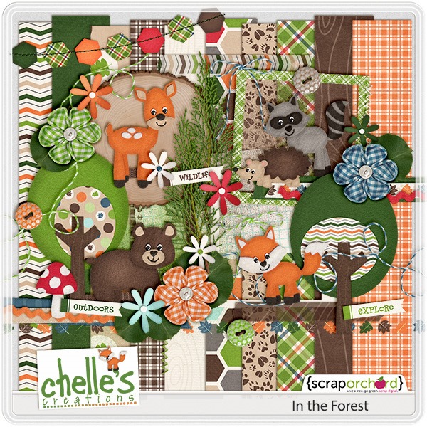
We’re visiting a classic kit today at Chelle’s Creations. It’s called In the Forest, and it’s perfect for your digital scrapbooking projects about all things outdoorsy like a walk in the woods, a hike on a favorite nature trail, or even a day at the Zoo. But with the greens, oranges, and browns, it’s perfect for other types of layouts, as well. Take a look at a couple of examples from Chelle’s Creative Team.

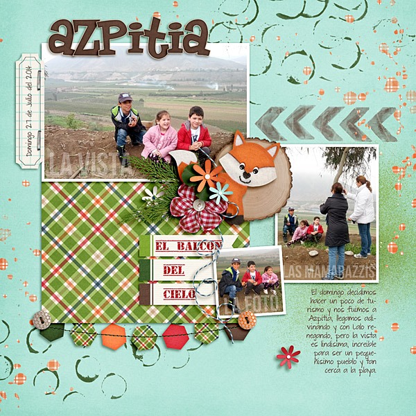
First, Roxana shows us how to use this classic kit with her photos from Azpitia, a gorgeous area with breathtaking views near Lima, Peru. The greens and browns in the kit highlight the colors of nature in her photos. I love the way she clustered the tree trunk slice with the flowers, greenery, and that cute fox peeking out. ccassignmaug1-web

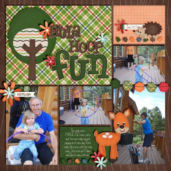
Heather used the kit for a pocket scrapping page of her children enjoying a hula hoop with their grandparents. What fun! The whimsical animals in the kit definitely set a playful tone for the fun photos here.  14848061342_cbcefc0731_o
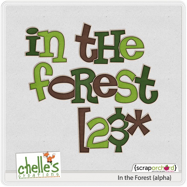
Both these creative ladies used In the Forest and the coordinating alpha. Here’s a closer look at each.

cc_intheforestcc_intheforest_ap

Take some photos outdoors today and see if this kit isn’t the perfect match for them.

by_Cheryl

Shaped Photos and Papers

Time to think outside the box and the circle, digital scrapbooking fans. Today we’re going to take a look at some pages from Chelle’s Creations Creative Team that should inspire you to do just that. A few of Chelle’s Creative Cuties made pages using shapes to help tell the stories on their pages. Sometimes the shapes are used to help convey the message, and other times the shapes help your eye flow from one object to the next around the page. Let’s take a look.
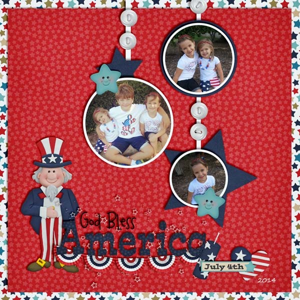
First, let’s look at a page by Heather. She used star shapes on her page to match the theme – a July 4th patriotic celebration. The stars in the papers and elements and photo mats all help to tell the story of the event from which her photos came, paying homage to the Stars and Stripes. I love the title she used from Liberty {Word Art} and of course the Liberty kit itself is THE perfect kit choice.  14842931083_c4e8019425_o

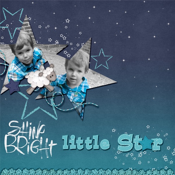
Next, Christine also used star shapes to help tell her story, but hers is all about her son Logan being a star. Since he is the focus of the page, she put his picture into the star shapes on the page. These special shapes are all over her page, as well, in the papers and elements, but there is no doubt who the star of the show is. She used a template by WM[squared] and Chelle’s Good Night Teddy kit. 5osaq0

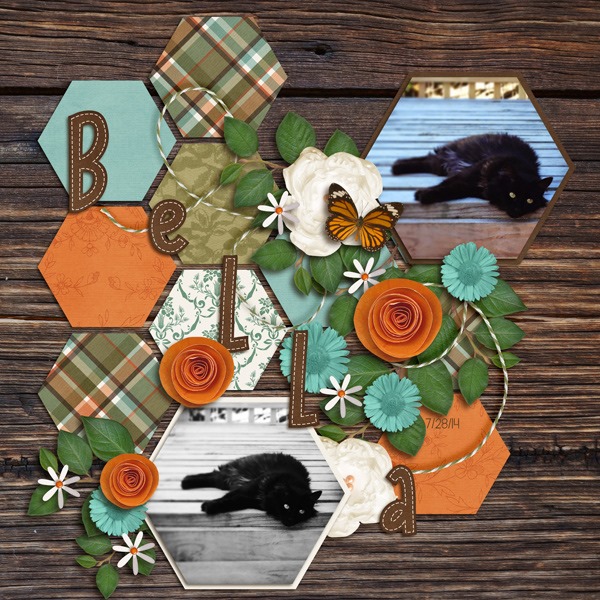
Next, Krista shows us how to use shape to lead the reader’s eye around the page. The hexagon shapes on her page make perfect spots for photos or papers, and she has used them for both. But the interlocking shapes naturally lead one’s eyes to follow the patterns around the page and not miss any details. She mixed a couple of Chelle’s kits – Family Tree and Zoo Crew {Arctic}. Bella_

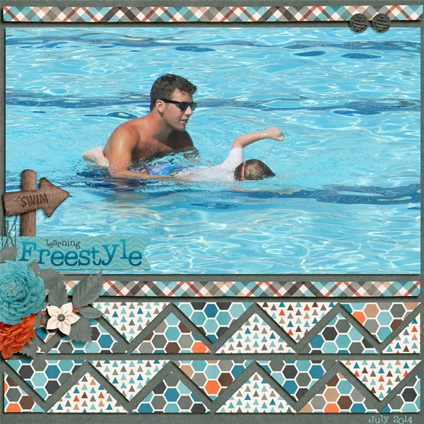
Finally, Christine has given us a second page for inspiration on paper shapes. She also used Zoo Crew {Arctic} because the colors were perfect for her photos of Logan’s swim lessons. This time, her featured shapes are triangles. She used a template from Scrapping with Liz and she filled the triangles with various patterned papers from Zoo Crew {Arctic}. The waves created by the triangles point to Logan in the water with his instructor and they give a definite sense of movement to the page that complements the swimming motion.   2ajx1mw

I hope you’re inspired to shape up! See what special shapes you can find in your digital scrapbooking program and try shaping photos or special papers on your pages. I know you’ll love it.

by_Cheryl