Classics: Toadally

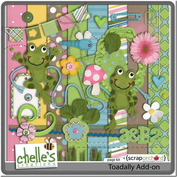
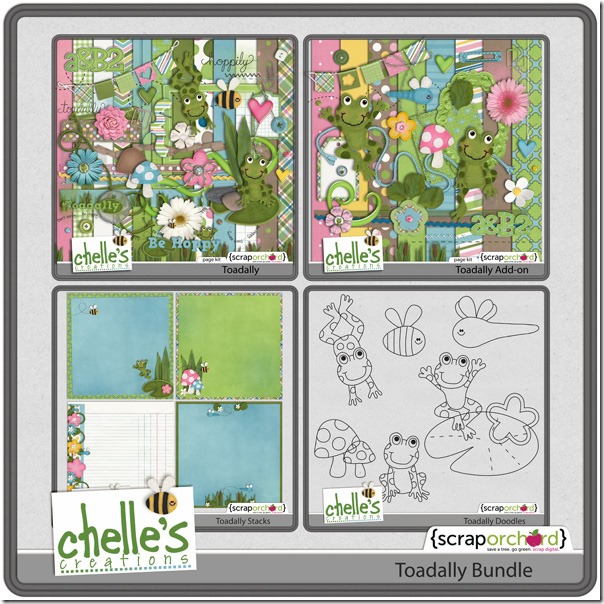
I’m toadally into spring weather right now, and Chelle’s Creations has the perfect digital scrapbooking kit for my pictures! It’s called Toadally, of course. But, it’s a great kit for anything and everything – hobbies, friends, family – you’re toadally into. Winking smile  Chelle’s talented friends have been playing with Toadally and the coordinating Add-on (which are combined with the doodles in the Bundle – don’t miss that bargain!). Let’s see what they’ve made for us.

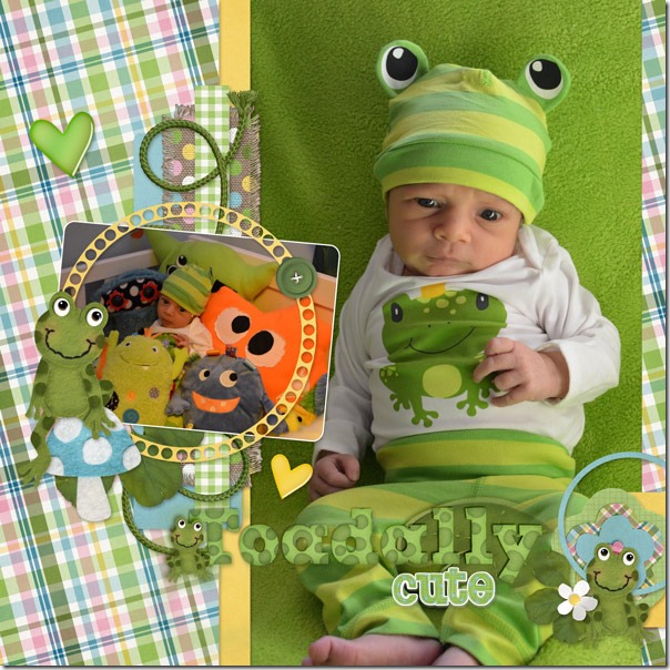
First, Donna has a nephew who is toadally cute in his little frog outfit that toadally matches Chelle’s kit! Look at the frog eyes on that little hat – so cute! I love the little frog on the toadstool accenting her smaller photo, too.DonnaToadally
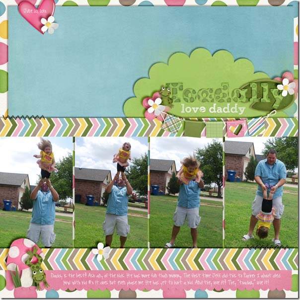
Next, Heather had a sequence of photos of her little girl being tossed about playfully by her daddy and loving it.  I love the way she used the banner to mark the title, and the little frog jumping off the pink toadstool is a perfect match for the theme of her photos. HeatherToadally
Finally, Krista had more calm pictures for her page. Her title says it all, and the cute grins on the little felt frogs are an adorable pairing for her perfectly peaceful baby photos. Toadally_Krista

Take a closer look at the kits in the store. They will be a wonderful addition to your stash if you don’t have them already. cc_toadally_kitcc_toadally_ao_kitcc_toadally_ddlcc_toadally_bundle_preview
by_Cheryl

Using Banners

It’s a banner day at Chelle’s Creations! The Creative Team members have been using Chelle’s kits to make digital scrapbooking pages with banners on them. Banners can be any shape or size and are the perfect digital embellishment to add to any page. Let’s see what they have to show us.

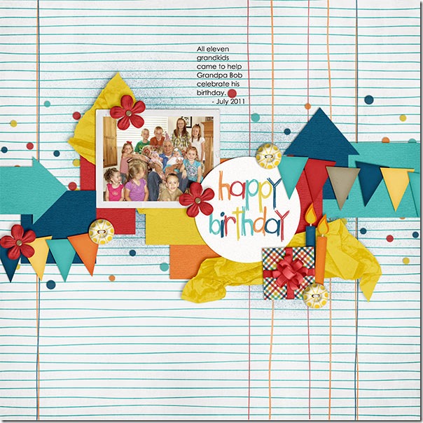
First, Kayla used One Year Older to make a page about Grandpa Bob’s birthday. She used the banners to create movement from left to right and give a festive feel to her page. HappyBday_July11_web_zps5756c6f4
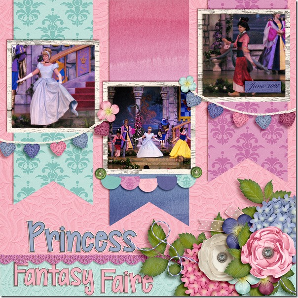
Next, Tammy used the crocheted heart banners from  Fleur de Violette to create this gorgeous page about the Princess Fantasy Faire. She also has large banner ribbons as mats behind her photos, which are perfect accents. Princess-Fantasy-Faire1_zpsdd0d7722

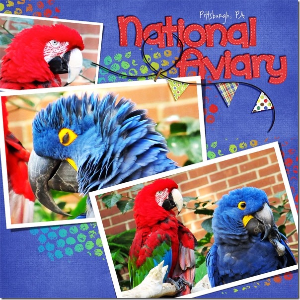
Donna used Beat the Heat and Gnome Sweet Gnome to create her bright page about the gorgeous birds at the National Aviary in Pittsburgh. She used a banner from a Scrapping with Liz calendar template and filled the pennants on the string with papers from Chelle’s kits. Donna

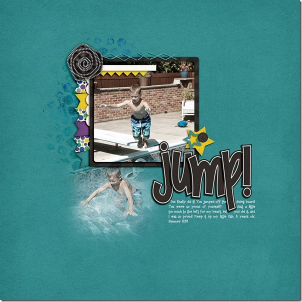
Next, Jenn used a banner a bit differently. She tucked the banner under the matted photo on her page to accentuate the photo and give more texture and depth to the page. The colors in the banner pieces coordinate perfectly with her little guy’s swimsuit in the photo.  jenn

Helen used Snowlandia to  make this gorgeous page. I love the mitten banner she used as part of the title work at the top. It’s the perfect treatment for it.Helen-snowlandia

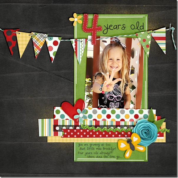
Finally, Kassie has used Lady Bug Hugs to make this sweet page about her daughter proudly turning four. Isn’t she precious? The banner really ties the page together and gives a fun feel to it. 4yearsold_zps3e3acd4a

I hope you’re inspired to use banners on your next page, maybe in ways you hadn’t before.

by_Cheryl

Classics: Leafy Treetops

Let’s take a look back at a classic digital scrapbooking kit from Chelle’s Creations called Leafy Treetops. It’s perfect for spring photos you’re taking right now. With its trees, fountains, birds, butterflies, & flowers, this kit is a great match for lots of outdoor photos this time of year. The CT members have been playing with this kit and have some outstanding layouts to show us.

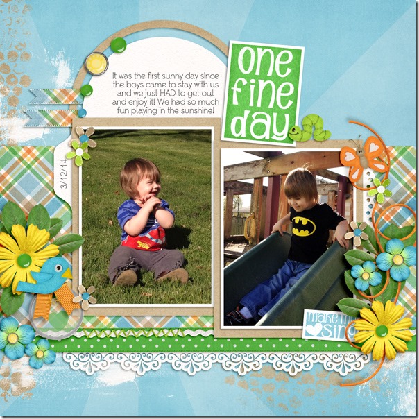
First, Krista has made a page with the theme of One Fine Day in celebration of the first sunny day, and I love that word art from the kit. I also love the shadowing she has on her fabulous clusters of flowers. OneFineDay_Krista

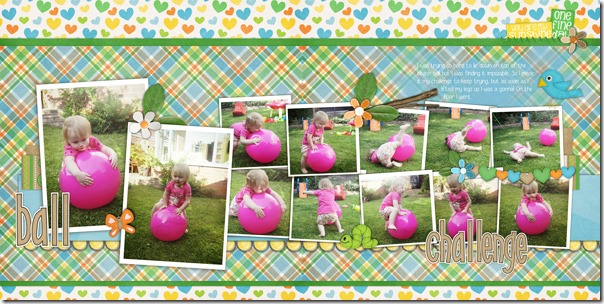
Next, Helen has made a double page spread using Leafy Treetops and Chelle’s Curled Frames. I love the sequence of photos she shows – what a cutie!Helen-leafy-treetops

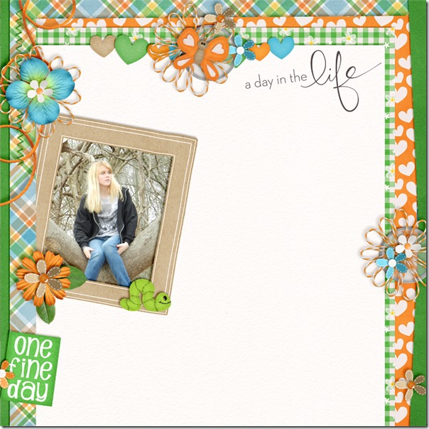
Finally, Christine has made a page using the Leafy Treetops Quickies along with elements from the kit. The quickies are a huge time-saver and can really be useful in jumpstarting your scrapbook layout process. Can you see which quickies she chose? Take a look in the market to see a closer look of the product. eupk3k

Want a closer look? Here ya go! cc_leafytreetops_kitcc_leafytreetops_quickies

by_Cheryl

Tweaking Templates

I don’t know about you, but I almost NEVER start a digital scrapbooking page without a template. Even if I make significant changes to it, I still prefer starting with a template, and tweaking templates is a great way to stretch your stash. That’s what we’re looking at today: tweaking templates. A few of Chelle’s CTMs have made layouts with templates and purposely modified them.

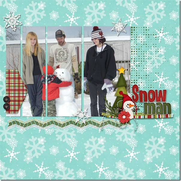
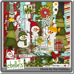
Christine started with one of the Scrapping with Liz Long Blocks Templates. She flipped it and removed a lot of the elements. She also moved the title from the top to the bottom of the page and used Chelle’s Home for the Holidays kit. I love how she chose to put one photo across the series of long block photo spots in the template. Christine

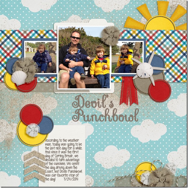
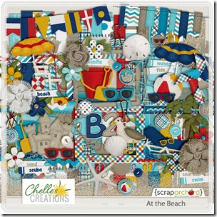
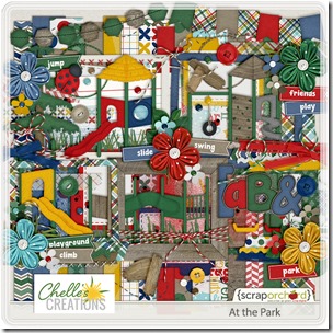
Next, Krista combined two kits of Chelle’s, At the Park and At the Beach, for a perfect page about their visit to Devil’s Punchbowl on their first day of Spring Break. She started with a template from Fuss Free: Stitched Together by Fiddle Dee Dee Designs  and changed it up quite a bit. I really love how she has placed the sun peeking from behind the strip of plaid paper.DevilsPunchbowl_Krista

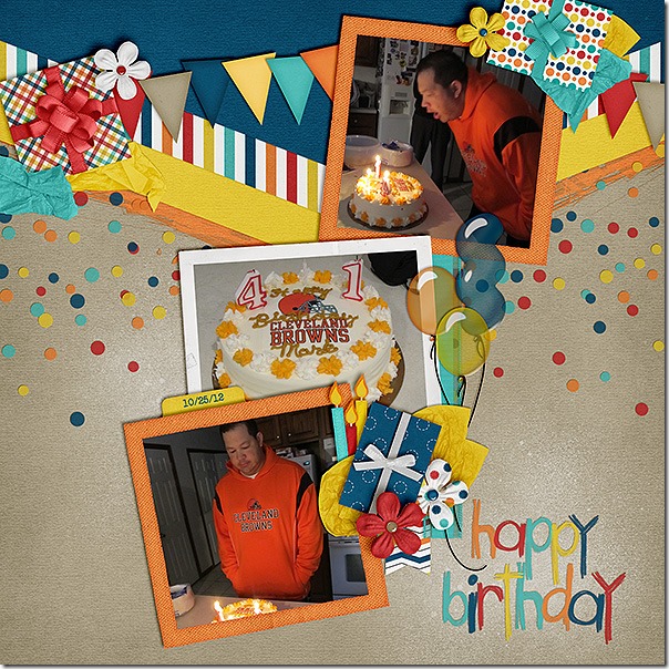
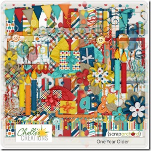
Finally, Karen made a birthday page using One Year Older, the perfect kit choice. She started with a template from Scrapping with Liz Inspired by Jenn Templates, rotated it, and then switched out a journal spot for a third photo on her page. I love her clusters of presents and tissue paper. oneyearolder600x600Karen

I hope you’re inspired to tweak those templates and stretch your stash! Here’s a closer look at the kits the ladies have used.

cc_atthebeachcc_attheparkcc_home4holidays_kit_previewcc_oneyearolder

by_Cheryl

Girl Power

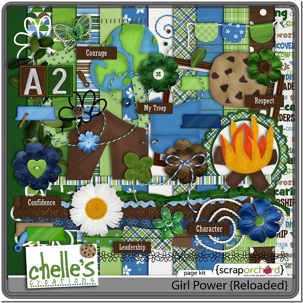
Today we’re looking at the perfect digital scrapbooking kit for highlighting your Girl’s achievements from earning merit badges to simply entertaining the family with a dance. Of course, with the cheerful greens and blues, it’s a great choice for your outdoor photos, too. Let’s see what the CTMs have done with Girl Power.

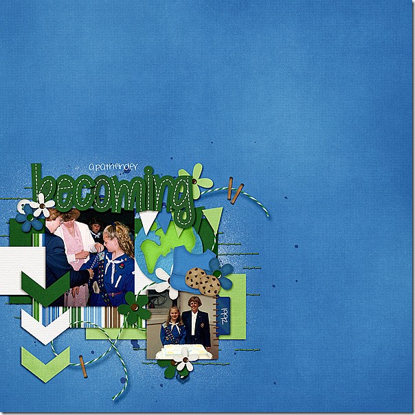
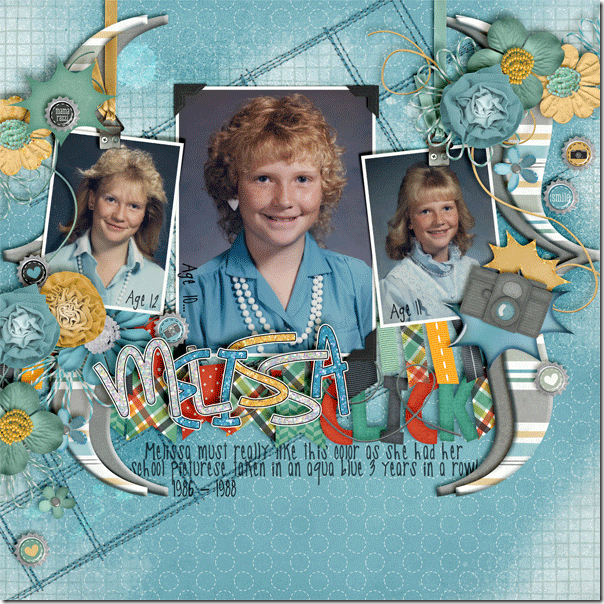
First, Melissa chose to use it for her photos of her Pathfinder ceremony when she was just a cute, young girl. I love the way she has clustered the various elements around her two photos and stapled the string to the paper in several places.

cc_grlpwr_ppr_bluesolid_zps448b023f

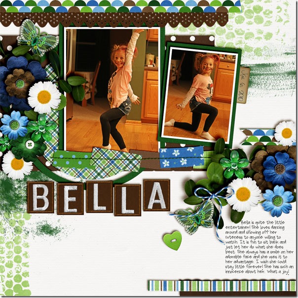
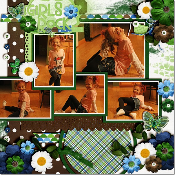
Next, Jenn made two pages for us of her little girl dancing for the family. Her little cutie loves to perform, and Jenn captured the memory beautifully using Girl Power. I love the little butterfly in this kit. bella-1girlsrock

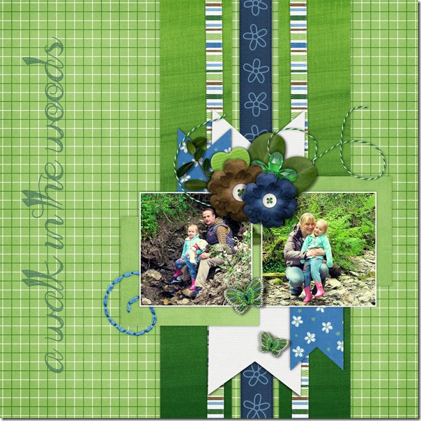
Finally, Helen had some great outdoor photos of a walk in the woods, and she used Girl Power to make a gorgeous page to show them off. I love the plaid paper background, and I love the way she has the butterflies floating up to the pictures.  Helen-girl-power

Let’s take a closer look at this kit in the market. The preview image is linked. cc_girlpower_kit

by_Cheryl

Scrap Skills: Using a Large & or Letter

I LOVE using large characters on a digital scrapbooking page, don’t you? Chelle’s Creative Team members have been making pages with such features to inspire us. Let’s take a look!

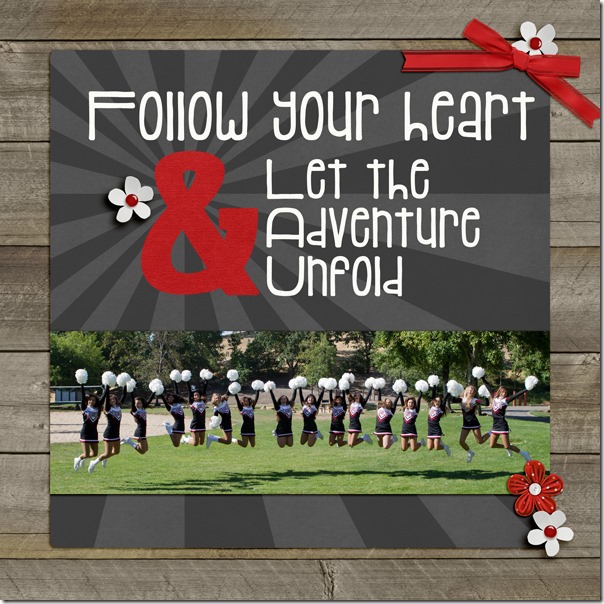
First, Kimberly used a font on her computer for her “&”. She sized the font up to around 200, simplified the layer, and then adjusted size with the aspect ratio turned OFF to make the letter a little more customized. She also recolored the sunburst paper using a hue/saturation adjustment layer. She used Chelle’s At the Park kit for her page. 2013_08_Cheer-Jump_zps77e56e29

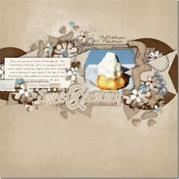
Next, Jan used a large “&” in her title. She used Chelle’s Lovin’ from the Oven and the matching {stripes & plaids} for her page about a delicious treat at a very magical place. I love the way she made the “&” stand out by making it larger than the other letters in the title. sweetampyummy

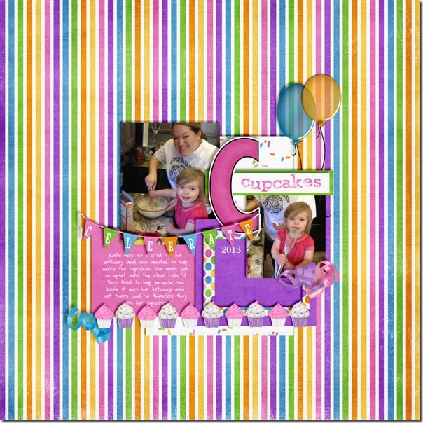
Heather used a large “C” for emphasis on her page since the page was about making cupcakes with her daughter. I love the fun feel of her page and the way the elements seem to pop off the page.heatherC

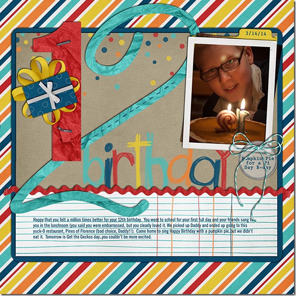
Finally, Jenn wasted no time in making a page about her son’s pi day birthday this year. You know, it was ONLY last week – way to go Jenn! She used Chelle’s One Year Older to make her page, and she used her son’s age as the large numbers on the page. I absolutely adore the way the numbers look like tissue paper stapled and stitched to the page.  32_2014_12BDAY_600_zpsc3554584

Feeling inspired? If you make a page with Chelle’s kits and this technique, be sure to post it to the gallery at Scrap Orchard and tag your page with #chelle. I would love to see it and leave you some love.

by_Cheryl

Classics: Hole in One Bundle

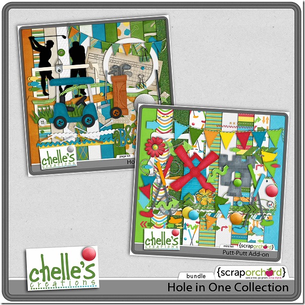
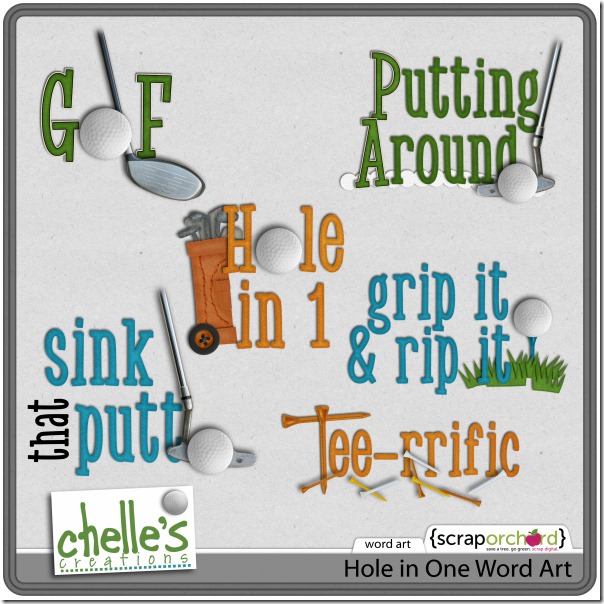
Spring has almost arrived where I live, and that always makes me think of getting outdoors. My boys love to play golf, so I plan to have lots of golf pictures to scrap soon, and that means I can use Chelle’s Hole In One Bundle – perfect for golf or putt-putt outings or any other bright, spring moment you want to scrap. Chelle’s CT members have been playing with this bundle and the associated word art to inspire you.

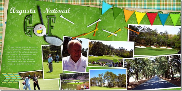
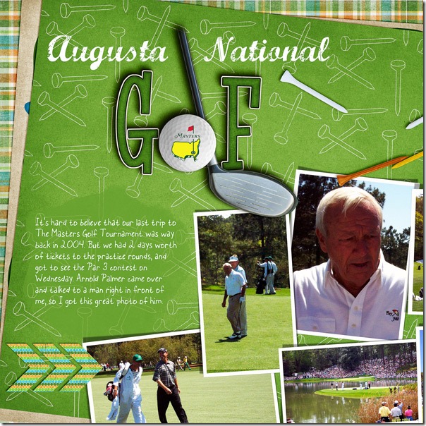
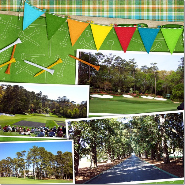
First, Donna has made a double page spread with photos of her trip to Augusta to the Masters Golf Tournament. What an opportunity! She has made an outstanding page using pieces from both kits in the bundle and the word art. Here’s the double page first, and then a closer look at the left and right sides. web_djp332_double

web_djp332_left

web_djp332_right

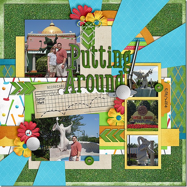
Karen had photos of her putt putt adventures at Fantasia Gardens. She also used elements from the bundle and the word art. I love that she put their names on the score card. puttputt600

Christine had a cute picture of Logan’s adorable smile, and she used the bundle for the perfect color matching with the photo. I love the stitching and the frame on the photo. w2zus

Here’s a closer look at the bundle and the word art. The images are linked. cc_holeinone_bundlecc_holeinone_wa

by_Cheryl

In Stitches

I’ve been thinking about the various ways to use stitches on a digital scrapbooking page. Chelle’s Creations Creative Team members have played with her stitches and have some great pages to share with us.

Check out what Jenny did with stitching. She used Chelle’s Gone Fishin’ Kit, and she used the included stitches to anchor her papers to the page and frame the main section. I love the way she mixed straight and zigzag stitching, too. 39922

Did you know Chelle has some stitched creations in the market separate from kits? Leah used Chelle’s Stitch Me Up Grids with lots of Chelle’s other products. Added to the Oh Snap kit were some banners, and flowers, and she used the Stitch Me up Grids as a backdrop for all the goodies on the page. 40051

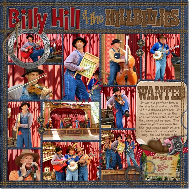
Finally, Jan made some custom stitching for her page using Chelle’s stitches included in the Yeehaw Bundle. She took the small length of tan stitches and made them into one long seam, then made it into double rows of stitching to frame her page. It’s a creative way to mimic the stitching on jeans, so it’s an adorable addition to the denim paper background. Way to go, Jan!billyhill

Stitches are included in most kits, but if you want to add that extra sewn emphasis, you could also use Chelle’s Stitch Me Up Grids like Leah did or the Stitch Me Up Frames, also in the market. Do you have a creative way to use Chelle’s stitches? Upload you page to the gallery at Scrap Orchard and tag your page with #chelle. I would love to see what you’ve done.

by_Cheryl

Street Smarts & Make a Monster

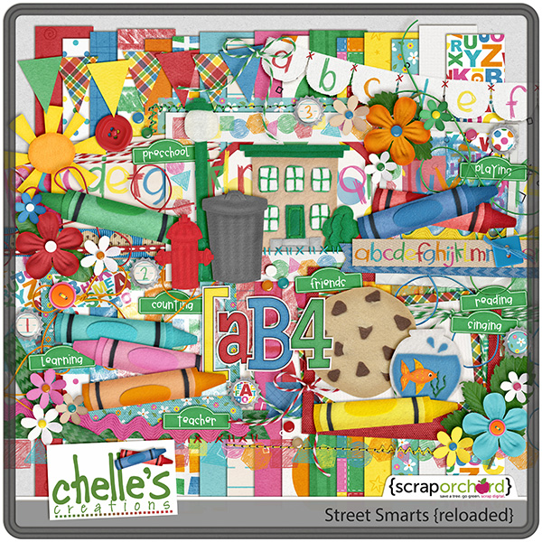
Somebody come and play! Chelle’s Creative Team did just that this week with her Street Smarts and Make a Monster. The combination of these two kits makes for an adorable digital scrapbooking page about playing, reading or coloring or any of your memories of a child’s preschool years. Let’s see what they did with it.

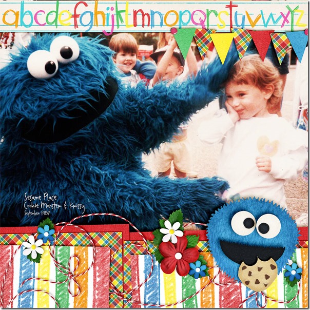
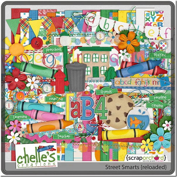
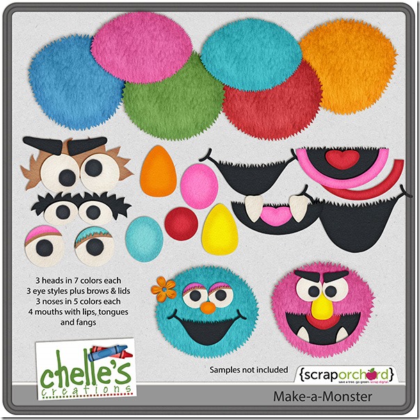
First, Donna created a digital felt monster to look just like the one in her large photo she took when her daughter Krissy visited Sesame Place. She used the Street Smarts {bundle}, which is a great deal since it includes the Street Smarts kit, Make a Monster, Word Art quickies, and the Crayon alpha.  web_djp332_cc_streetsmarts

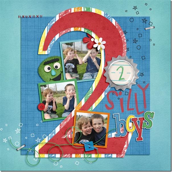
Next, Christine used some photos of her son and his friend having a silly time. The green monster she created is the perfect whimsical touch for the playful page. ol4ow

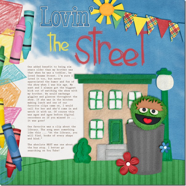
Finally, Kimberly had fun playing with the fun monster face pieces to build Oscar the Grouch. She used Chelle’s Me & My Shadow Styles to perfectly match the shadows in the felties and pre-made crayon border. She used a textured brush in PSE 11 to make a blended sky out of the solid blue paper with the white paper peeking through to highlight the journaling and make the sun look like it was chasing the clouds away. She clipped the green paper to oval shapes she made in PSE to give a ground to the felties.LovinTheStreet_zps9cf9f728

Like what you see? You can check it out more closely in the market. The images below are linked.cc_streetsmartscc_makeamonstercc_streetsmarts_bundle

by_Cheryl

Using Paint Splats

Here’s a fun thing to do on your digital scrapbooking pages: use paint splats! Lots of kits and collections come with paint splats and splatters. Chelle’s Creations even has some CU paint splats in the market. Last week, Jenn wrote a blog post about using paint to highlight a title, and today Chelle’s creative team has been playing with different ways to use them on pages.

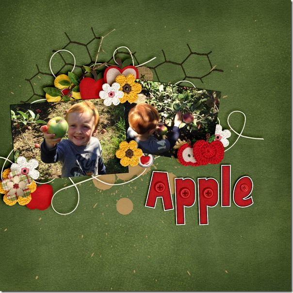
Jenny used the Apple of My Eye bundle to make her page. She used the paint splats as part of a large cluster of elements highlighting her adorable photos. (I absolutely LOVE that buttoned alpha in the bundle). Apple-Orchard-2013---1_web

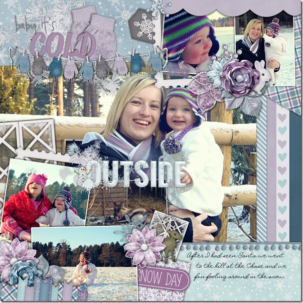
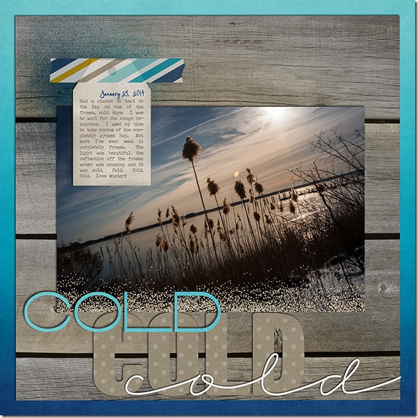
Jenn was feeling creative and headed to the bay to take photos on a really cold day. I like that idea! She used At the Beach, and she used the paint splat as a base for her journal tag. 14_2014_cold_600_zps8cf29e6d

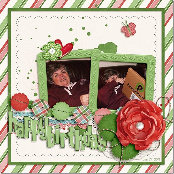
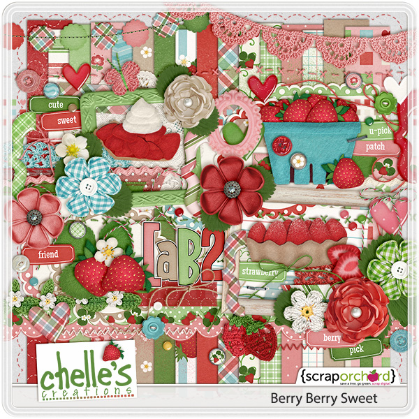
Finally, Jennifer used Berry Berry Sweet to make a birthday page, and she used Chelle’s CU Paint Splats to show you how to add them to a page. They are very versatile being easily recolored to match any kit. 39456

Digital paint – so much less messy than the real stuff, and yet it still feels like playing with paint when I add it to my page! Have you tried it? I think you’ll agree with me, if you do.

by_Cheryl