Hello! I’m happy to be here today chatting with you about some fun and exciting ways that you can use ribbons on your pages. I know that it’s easy to get stuck in a rut and always use things in predictable ways. So I’m here to share some pages and some ideas for ways to get out of that rut and make your pages stand out! Let’s take a look at some pages from Chelle’s awesome CT:
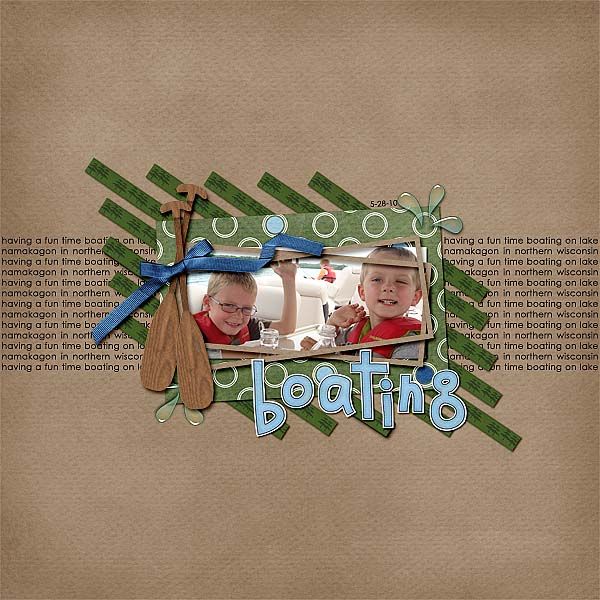
Jennifer used ribbons on this layout using Gone Fishin as a striking focal point. She placed rows of them at a slant framing her photo.
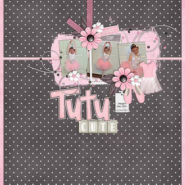
Kayla used ribbons in this layout using Tutu Cute as a way to hang her photo cluster. It’s definitely too cute!
And Roxana used ribbons in this one with Kick It and Play the Game to fill up an empty corner. Sometimes you just don’t want all that extra space in a layout, so you can fill it up with some slanted ribbons.

So here are some ideas for using ribbons on pages:
use them as framing
hang things off them
fill up those corners
use them in clusters
split up your pages with them
having them peeking out from the edges
line your journaling with them
And there are so many more ways you can use them! See what you can come up with! We love to see those layouts in the gallery!








 Hi! I'm Chelle: a 40 something mom of 7. My husband & I live in a rural community in the rocky mountains with our 4 children still at home. In the winters we enjoy sledding & snuggling by the fire. I the cool fall evenings we love relaxing around the campfire & meeting friends at the county fair. Admiring the stars
