Gallery Standouts | Digital Scrapbooking Inspiration

Hello!! Roxana here with the Gallery Standouts this week! The decision was hard, as there were many amazing LOs in Chelle’s gallery, but finally these are the three pages I chose:

First Little Builders by superscrappingmom.  The composition of this page is great with the patterned paper as a frame, love the elements in her title and the journaling in the paint smear looks fantastic!

Next is Boxing Day by Angiepangie. This page just caught my eye in the gallery, the ants in the border are just too cute, and her clustered title is so amazing!

And last but not least Angry Birds Invite by Green mother. This invite is just awesome,  love the birds and the fabulous way she used the paper strips and tags! Great job!

All images are linked so you can leave some love, and remember to upload your layouts to Chelle’s gallery, you could be one of the next Gallery Standouts!

Have a great day!!!

Gallery Standouts!

Hello! Roxana here with the gallery standouts this week. I was supposed to choose just 3 layouts from Chelle’s gallery but it was really difficult as there were awesome pages this week and I had a hard time picking just 3, so I picked 4 LOL!

The first one is  Out like a Light by jmljensen. I love the simplicity of this page, the great blocking  and  fantastic title; the doodles framing the page and the b/w pics are perfect touches to this LO.

Wild Thing by Sagediva2. Again, loving the blocking and her fantastic journaling, and I really like that she added that cute hippo to the title, looks fabulous and perfect to the theme!

Third My Car by WendyW. The papers chosen for the background are just perfect. Love her amazing clustering, and that there are so many details to look at in this layout.

And last but not least Touque Therapy, a beautiful page by Jaye.  Great clustering on the corner and I just love how she journaled her story, definitely something worth to be remembered.

All images are linked so you can leave some love. And keep uploading your layouts to Chelle’s gallery, you could be the next Gallery Standouts!

Gallery Standouts | DIgital Scrapbooking Inspiration

Gallery Standouts | DIgital Scrapbooking Inspiration

Hello! Roxana here with the Gallery Standouts this week. It was very difficult for me to pick just three layouts as Chelle’s gallery was full of awesomeness this week! Hope you agree with my choices!

First this layout,  “Supermarket Princess” by Newfiemountiewife, the negative space is an eye catcher here and I love her clustering, as well as the shadowing that is perfect! A very neat title and a short journaling the final touches for a beautiful page!

Next  “Gout” by  Lynnirene. I love that she put everything in the middle of the page and balanced the layout with that amazing vertical journaling! Great clustering and the splat on the background is fabulous!

And last but not least this great layout by Mrsburgess, “Why…me”. The blended pic on the background is fantastic and her clustering and layering are just awesome. I loved the stitched title as well! Fabulous layout!

All images are linked so you can leave some love. Don’t forget to upload your pages to Chelle’s gallery, you could be one of the Standouts next week!

Have a great day!

Gallery Standouts | Digital Scrapbooking Inspiration

Gallery Standouts | Digital Scrapbooking Inspiration

Hi everyone! Roxana here with another editon of the Gallery Standouts.

First an amazing layout by kirstiegai, Monkeying Around. I love the composition of her page, the clustering is beautiful and the wire holding everything is just perfect! Awesome layout!

Then this beautiful page by Karen32, Cascade- Hike. The map, compass and all the nature elements  give the outdoorsy feel to this LO, and the big pines and title as part of the pics  are a great touch! Fabulous journaling as well!

And last but not least this amazing page by Hey Jude, The Grand Kitchen Remodel. Everything in her LO is fantastic, the blended photo in the BG is just awesome and the drawer with all the tools  just so creative! Love it!!!

All these gorgeous pages are linked so you can leave some love. And remember to keep uploading your layouts to Chelle’s Gallery, you might be one of our Gallery Standouts next week!

Change Up!

Change Up!

Hello! Roxana here! Do you have kits, that you bought for some specific pics and then never used again? I guess for most of us the answer is yes, but there are some ways to get the most of our kits. In every kit you can always find generic stuff, like ribbons, flowers, buttons or even non themed patterned papers. Having that in mind and the palette of the pics you want to scrap, choose a themed kit, you’ll see that using most of the generic elements you’ll be able to get a great page. And remember some extra tools that might help you as well, clipping papers or using blending modes and  styles with the themed elements.

Here a couple of examples I made to inspire you to use a themed kit with non related pics.

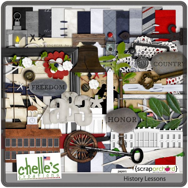
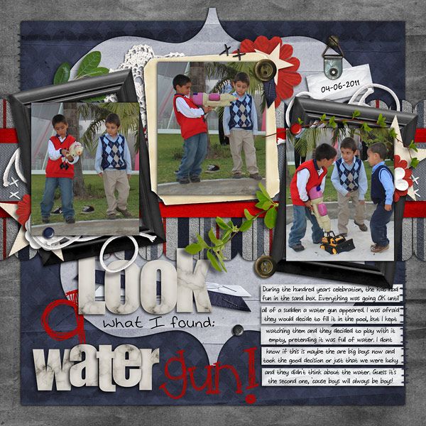
First this page I scrapped using History Lessons. See how I used most of the generic elements and papers in the kit. And I even used one themed element as a mat for the center pic.


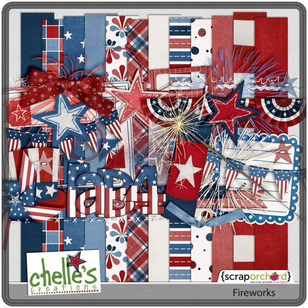
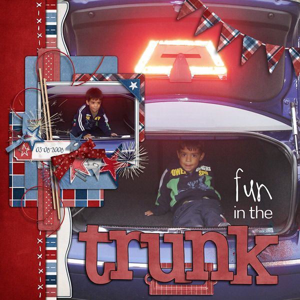
The next page was made using Fireworks,  I decided to use all the stars and fireworks as the main elements in my clustering, as I had a big light on my BG pic. And I really love banners, but this one was themed, so I clipped a patterned paper to it. In this kit the alpha is themed too, so I clipped a paper and added a stroke.

Hope these tips are helpful and you can re-use your themed kits again and again! Happy scrapping!!