Chelle Scraps 12.4.11

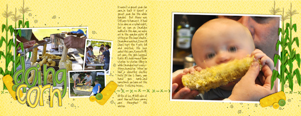
I debated not posting this layout.  I hate layouts with messed up faces…but DH doesn’t want our little guy’s face all over the internet, so it is what it is.  And he’s in nearly every layout I make anymore.

I used the FREE Autumn Potpourri Alpha (recolored) & Vrooom!  (I my new RADLAB plugin.  It makes ALL my photos look FABULOUS.)

What did you scrap this week?

Chelle Scraps

(If you are here for the DSA Blog train, scroll down to yesterday’s post.)
I didn’t get to scrap as much as I’d’ve liked to, but I did get to enjoy DSD. Here’s the two layouts I finished:

Credits: On the Water

Credits: Papers, ricrac, ribbons : Prehistoric by Chelle’s Creations
Tutu Cute by Chelle’s Creations
Alpha: Autumn Potpourri Alpha Free on my blog see post below
white flowers:
zoopendous by Chelle’s Creations
Bear: On the Trail by Chelle’s Creations
Enjoy the rest of your DSD weekend. Remember 30% off ends tonight at midnight EST. That is also the deadline for entering to win
SIX MONTHS of my new releases.

Chelle Scraps

Not much scrappin’ happening around here. :(

This one uses Make a Splash…and no my baby’s face doesn’t really look like that. But DH says no pics of the baby on the internet :(
I did this one for a MIS (Make it Snappy — Speed Scrap @ ScrapOrchard. I’m so rusty on speed scraps I didn’t have time to finish the other side.

This one uses all sorts of things. Mostly a re-colored burst paper from On the Water, every stitched white circle in my entire stash…and I made up those silly word strips. It fit the speed scrap, but I’ll likely change up the title/font to make it more readable. I do like how it turned out (except for the readability of the title)
Hope you found some time to create this week also!

Chelle Scraps 9.4

Chelle Scraps 9.4

It’s true, these last few layouts were pushed to the end because they have SO MANY PHOTOS! But the YIN templates are still helping me conquer. After these 3 I only have ONE MORE LAYOUT to go…and a cover…Yikes!
Here’s my latest scraps:

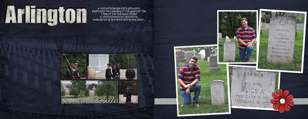
It took us forever to find that headstone…they all look alike!

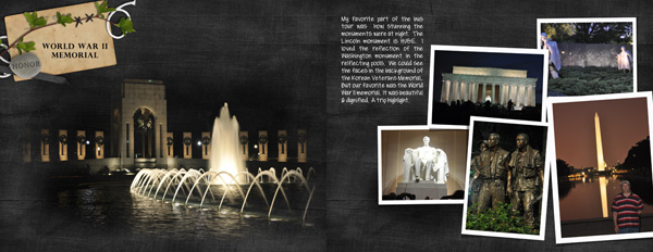
The WWII memorial is GORGEOUS at night! Definitely our favorite. Both of these first two use History Lessons.

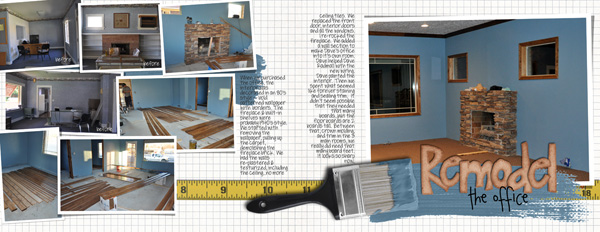
I LOVED getting to play with Under Construction…those paint elements are so FUN! The paint on the paintbrush is grey…you can recolor it by adding a fill layer of color above it…then clip it to the paint…change the blending mode to color. If it’s too dark or too light, then select the paint layer and adjust the levels ’til it matches the paint color you want. Same thing for the swishes. Give it a try — I’d love to see your results!

Chelle Scraps 8.28

I had intended on making a small vacation album for the trip DH & I took summer of 2009, but I have a few extra spots left in my 2009 album (maximum 130 pages), so I decided to add the trip layouts there.


Just a few more left…pics from the day we spent in DC and two other layouts.

Chelle Scraps 8.21.11 Saved the Best for Last…NOT

The end of a yearbook is NOT my favorite part. The only layouts left to be done are…well…there is a reason they haven’t already been done. Maybe because there are “too many” photos…maybe because I don’t have the perfect kit yet…maybe because I don’t know what to do for the journaling… Whatever the reason, I’m down to my last few layouts for 2009 and most of the remaining ones have TONS of photos from our vacation. I decided to use some of Yin’s Templates. WOWSERS! That was easy & quick. They don’t have a lot of “decorations” and they are pretty boring, but her templates made quick work of multiphoto layouts. (Her templates come in 12×24…I had to adjust them to fit my odd page size) For the record, I think her shadows are a bit harsh, but they were WAY faster than making them myself, so they’ll have to do. LOL!
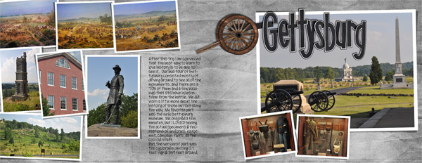
Gettysbury uses Yin’s Template 29 and my History Lessons kit.
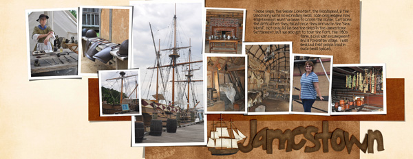
Jamestown uses Yin’s Template 69 and my History Lessons kit & Grandpa’s Garden
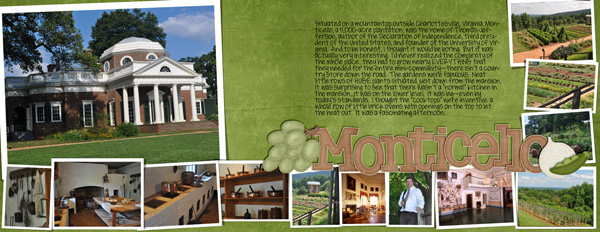
Monticello uses Yin’s Template 70 and History Lessons, Grandpa’s Veggies & Grandma’s Fruit
Two hours & 3 double page layouts later…I would DEFINITELY recommend Yin’s templates for those “tons of photos” layouts. Almost there…only a few more to go.

Chelle Scraps 8.14

Chelle Scraps 8.14

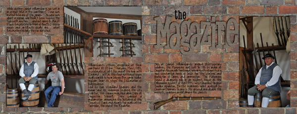
ACK!  Vacations…family visiting…it’s been a busy month.  I’m still trying to finish that 2009 album.  Here’s the only layout I’ve finished in the past two weeks:

I had a hard time with this one.  I wanted to use that FABULOUS brick…I loved it so much I took 4 or 5 photos of the brick wall outside the magazine.  LOL!   But my words weren’t readable.  If you look super closely, I added a fill layer behind each block of text.  Here’s how I did it:
With the marquee tool (the square selection tool) make a box that extends about a half an inch outside your text.  Under selection choose feather and pick a number around 200.  Then choose add fill layer.  It’ll add a box with fuzzy edges behind your text.  Pick a color that is prominent in your background.  I just clicked around with the color picker until the color seemed to blend in.  Then lower the opacity ’til it is barely noticeable, but helps your text be readable.  I use this trick whenever my text is on patterned paper.
Another journaling tip I used on this page — use someone else’s words.  I copied the text from the Colonial Willamsburg website info about this building and used that for some of my text.
Hopefully next time I’ll have several more layouts to share –the LAST of the 2009 yearbook.