Gallery Standouts | Digital Scrapbooking Inspiration

Now that Thanksgiving has passed, Christmas will be sneaking up on us.  I know this is a busy time of year, so while you are running here and there to get everything done take time to check out the awesome layouts in Chelle’s Gallery at Scrap Orchard.  I spent some time there recently and have picked three layouts to share with you.

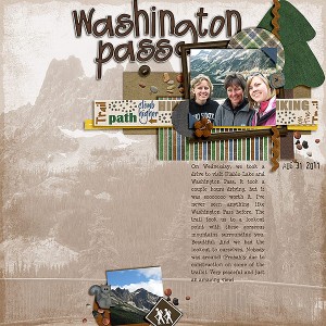
First Washington Pass by zippyoh

I love large blend photos and this layout does it perfectly.  She also added two great clusters.

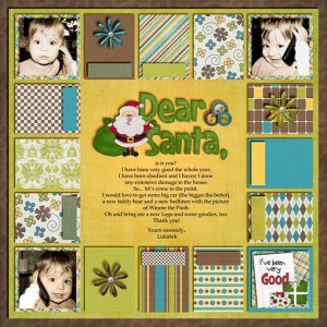
Next, Letter to Santa by Lenushenka

Great blocking, super cute pictures, and great use of word art brought this layout to my attention.

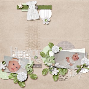
And last, but not least, Blessing Day by britaneejean

Amazing shadows, and I just love how she tucked those photos into floral clusters.

If you would like to see your creations, made with Chelle’s wonderful products, showcased here be sure to load them into Chelle’s gallery at Scrap Orchard.  Hope each and every one of you have a wonderful holiday season.

Gallery Standouts | Digital Scrapbooking Inspiration

Here in the US we are busily gearing up for Thanksgiving. I am making cranberry relish this afternoon but first I need to share some great layouts with you.
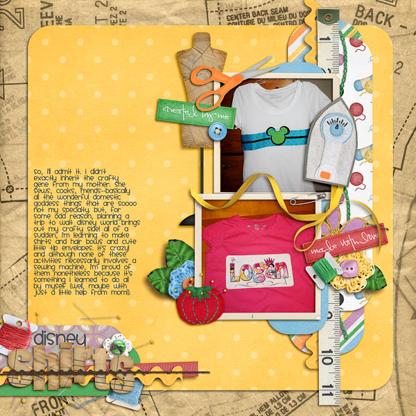
Disney Shirts by kendallt

I couldn’t help but just grin at her journaling. How fun, she has documented this event so thoughtfully.

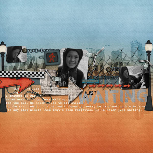
Waiting for the Bus by  HeatherPouch
This page is so cool! What a wonderful job of capturing an everyday type event. Perfect photo and perfect title.

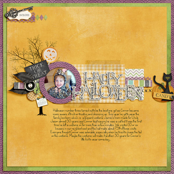
Happy Halloween by meejay
I love love love the colors in this page! That photo is so totally fun and her use of accents is perfect.Please check out Chelle’s Gallery for more inspiration. I’m just amazed each time I visit.  All images are linked so feel free to leave these gals some digi love!!
Have a great week.
Carol

Gallery Standouts | Digital Scrapbooking Inspiration

Hi…it’s Jenn.  It’s my first time posting here and I’m excited to be highlighting the Gallery Standouts for the week.  I had a ton of fun checking out the gallery to find my favorite pages…and it  was hard to pick just 3!!  So here is what I LOVED.

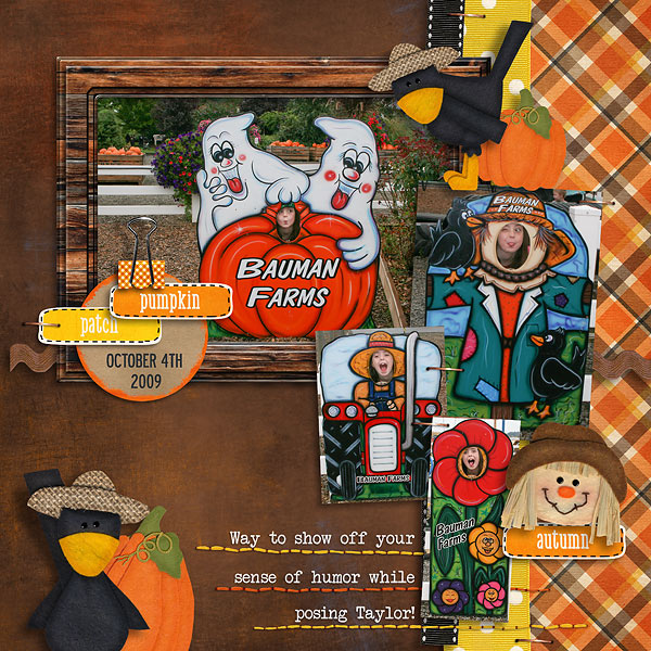
This layout title Pumpkin Patch Poses by Tracey Monette immediately caught my attention.  I have LOTS of these great photos and I love how she included them all on her layout.

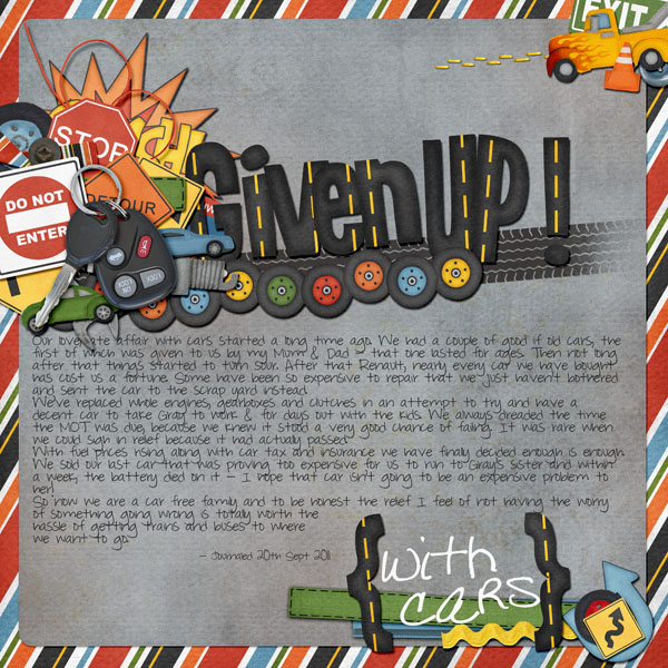
Another big favorite was this photo less layout titled Given Up by Ellie80.  The title work and cluster surrounding it is just genius….WOW.  I absolutely love everything about this page.

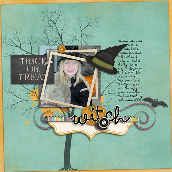
This layout by Tiffany scraps made me smile…..as the photo is just plain adorable and I love how she clustered it with the frames!!  My favorite part was how she used that awesome tree outline and the paint splat…the little details here are all just perfect.


All images are linked so please go leave some love for these fantastic layouts.  Also, don’t forget to upload your pages to Chelle’s gallery, you could be one of the Standouts next week!

Gallery Standouts | Digital Scrapbooking Inspiration

Gallery Standouts | Digital Scrapbooking Inspiration


Jami here, I took a stroll through the gallery at ScrapOrchard and I found these gems showcasing Chelle’s kits……….

I love the simplicity and the bold green/yellow just makes you stop and look!

Team Sheppard by becks177

I love the bold statement of faith in this page!

Prayer by DigiCheryl

Love the clever date element and the fun showcase of photos!

S’mores 2010 by McBDesigns

See you in the gallery soon I hope!

Gallery Standouts | DIgital Scrapbooking Inspiration

Gallery Standouts | DIgital Scrapbooking Inspiration

Hello! Roxana here with the Gallery Standouts this week. It was very difficult for me to pick just three layouts as Chelle’s gallery was full of awesomeness this week! Hope you agree with my choices!

First this layout,  “Supermarket Princess” by Newfiemountiewife, the negative space is an eye catcher here and I love her clustering, as well as the shadowing that is perfect! A very neat title and a short journaling the final touches for a beautiful page!

Next  “Gout” by  Lynnirene. I love that she put everything in the middle of the page and balanced the layout with that amazing vertical journaling! Great clustering and the splat on the background is fabulous!

And last but not least this great layout by Mrsburgess, “Why…me”. The blended pic on the background is fantastic and her clustering and layering are just awesome. I loved the stitched title as well! Fabulous layout!

All images are linked so you can leave some love. Don’t forget to upload your pages to Chelle’s gallery, you could be one of the Standouts next week!

Have a great day!

Gallery Standouts | Digtal Scrapbooking Inspiration

Gallery Standouts | Digtal Scrapbooking Inspiration

Hey Everyone!  It’s Jenn, aka jk703 here to bring you this edition of Chelle’s Gallery Standouts!  There are tons of layouts in Chelle’s gallery but i get to peruse them, and choose a couple that rock her designs!  Let’s go!

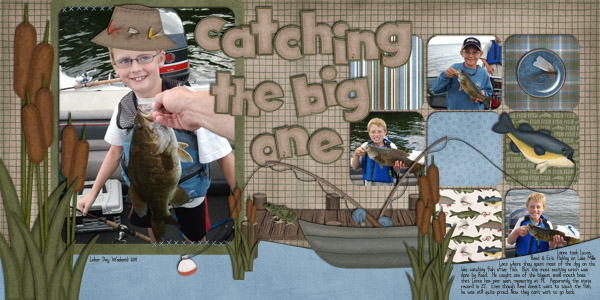
Catching the Big One by jmljensen

A double page layout is one of my favorite ways to scrap!  I try to do this as much as possible – so to see someone else doing it too, makes me happy!  Look at those pictures and fantastic title work!  Great mix of papers and patterns too!

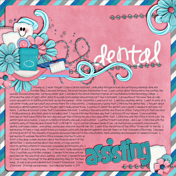
Next up is Dental Assisting by Britaneejean.

First, it is a photless layout!  Then, it is so fun with the toothpaste and painted title!  They look perfect together!  All the little ellies and scatters look perfectly placed!  Plus, reading about her and what she does is interesting – we all need to scrap about ourselves more often!

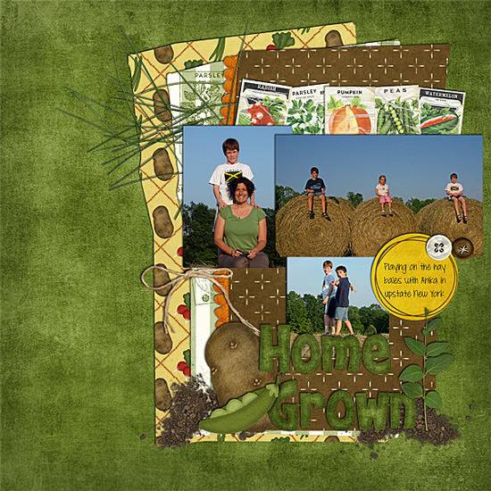
Here we have Hay by lab130… look at those photos!  Those are so interesting… and tall hay too!  :)  I love the mix of papers, design of the page and it looks like everyone had a great time!
Don’t forget to upload your layouts to Chelle’s Gallery over at Scrap Orchard, you never know – we might have to show off your page right here!

Thanks for visiting and be sure to come back!


Gallery Standouts | DIgital Scrapbooking Inspiration

Gallery Standouts | DIgital Scrapbooking Inspiration

How did it get to be August 29th? WOWSERS! This month has really flown by. I SO enjoyed browsing the gallery today. I really miss being able to do that each week. (Gotta get everything re-packaged and moved…THEN I can browse again) There were lots of fabulous layouts, but here’s a few that stuck out to me today:
by Mel…it never occurred to me that EIEIO was a Toy Story kit..

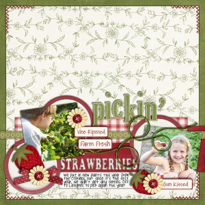
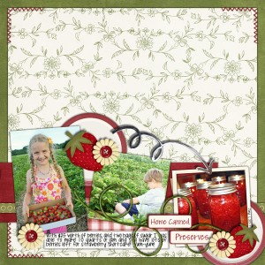
by Kairyn…I want these layouts in my album…wonder if I could find a pick-your-own strawberry field?

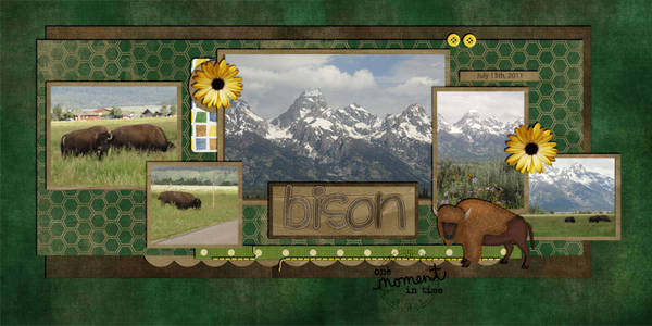
by Karen…I like how the large photo spans the page.

and by Mary Kate…love the Black & White…effectively stirs emotions

If you use Chelle’s Creations products, please upload them to the Chelle’s Creations Gallery at ScrapOrchard. We’d love to see your work!

Gallery Standouts | Digital Scrapbooking Inspiration

Gallery Standouts | Digital Scrapbooking Inspiration

Hi everyone! Roxana here with another editon of the Gallery Standouts.

First an amazing layout by kirstiegai, Monkeying Around. I love the composition of her page, the clustering is beautiful and the wire holding everything is just perfect! Awesome layout!

Then this beautiful page by Karen32, Cascade- Hike. The map, compass and all the nature elements  give the outdoorsy feel to this LO, and the big pines and title as part of the pics  are a great touch! Fabulous journaling as well!

And last but not least this amazing page by Hey Jude, The Grand Kitchen Remodel. Everything in her LO is fantastic, the blended photo in the BG is just awesome and the drawer with all the tools  just so creative! Love it!!!

All these gorgeous pages are linked so you can leave some love. And remember to keep uploading your layouts to Chelle’s Gallery, you might be one of our Gallery Standouts next week!

Gallery Standouts | Digital Scrapbooking Inspiration

Hey Everyone!  It is Monday…. yes, another Monday… but it’s that fun time here on Chelle’s Creations Blog!  The time to show off some awesome layouts and Gallery Standouts!  WOOT!

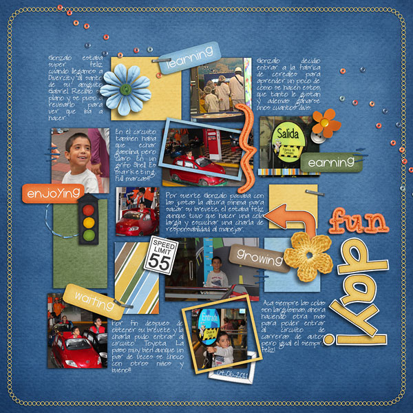
OK… let’s get going.  I really love perusing the gallery and checking out pages that show-off kits in fun way.  Many times, I use a themed kit, but not in the themed way as it was intended for… so my first choice is Fun Day by Roxanamdm! A great, and perfectly titled fun layout that showcases a fun day, but also steps away from the kits themes that were used!  Love that!

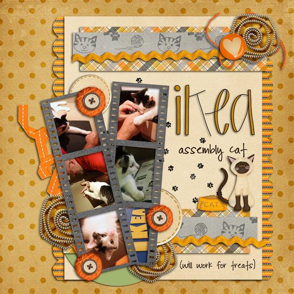
Next up, I’ve chosen IKEA Cat by Hey Jude.  This was so cute to me, especially because the family pet wanted in on the action!  My grandmother’s cat *had* to be involved with unpacking every time something new arrived to the house!  It brought back some funny memories! Plus, check out the fun mix of patterns on the page.  Looks fantastic!

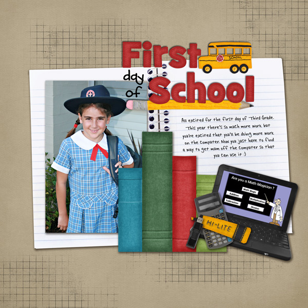
One last layout… especially since school is starting!  I love to take the first day of school pictures and this layout, First Day of School by Kirstiegai is a great layout showing the excitement of going back to school!  But the cute computer and fun journaling and an awesome picture make a wonderful layout! 

There you go… so wonderful layouts chosen from Chelle’s gallery over as Scrap Orchard.  Remember, to upload your laouts there – you might find your layout chosen for the GSO post!  Just upload them HERE!

Enjoy your day – and Thanks for visiting!

Jenn (jk703/The Typative Scrapper)


Gallery Standouts | Digital Scrapbooking Inspiration

Gallery Standouts | Digital Scrapbooking Inspiration

Happy Monday to you from Chelle and the Chelle’s Creative Team!  Guest Andrea here to show you a couple of fantastic layouts that have been uploaded this week.  It’s been just about a month since July 4th but I think I am still feeling extra patriotic as both of these layouts use Chelle’s fantastic Fireworks!  kit.

The first is by amber565.  I love how she highlighted the black and white picture with the bold white frame in the center and balanced out the outer portions of her layout with the angled papers and stitching.  The combination of the awesome Fireworks Alpha and the classic white typewriter font she used for the date is perfection.  And who can resist that sweet little 4th of July baby?!?

Next we have chocochoco’s amazing page called Feeling Free.  Her photo treatment and blend is just stunning, and it’s angled placement and shape is so eye catching.  Paired with her lovely clusters that have a great sense of motion – you’ve got one fabulous page!


I’m sure you can agree these two are true patriotic gallery standouts!