Hello Friends!
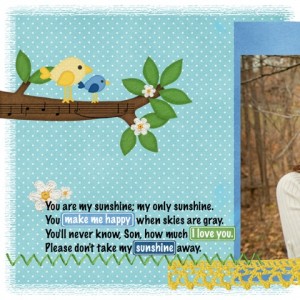
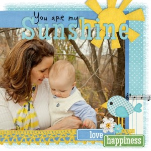
This is Jessica’s first layout ever. I especially love how she’s used the word bits…even making her own from the blank ones to fit her journaling. The title is a perfect fit to this gorgeous photos. Way to go Jessica!
Hugs!

Hello Friends. I was wondering if you have seen these great digital scrapbooking layouts from the Scrap Orchard Pin Gallery? I found some that I wanted to share with you.
First up is McB Designs. She made this layout when there were only 2 boys in her family. She used About A Boy.
Nest up, is tsukushi82, who did her layout on their toprical fresh water aquarium. She used In The Pocket {freebie}
Meagan34 used Street Smarts {Reloaded} to create this banner for her local elementary school.
Hugs!

Hi Ladies! I”ve been over looking in the Scrap Orchard gallery at some really great digital scrapbooking layouts that I wanted to share with you. I think I must be into the square shapes lately because I just noticed that each of the layouts I’ve chosen this week have something in common. LOL
Smurfie created this layout using a FREE template she found on the Chelle’s Creation’s Blog. (Hint! Go check ’em out.) She used the same picture throughout the layout in a triangular pattern. Doesn’t that face just make you smile also?
Next Jan (GrahamLikeTheCracker) used “Love Grows” to do her delightful layout about a little 14 month old. Love that big bow and her hair. I like the clustering and the journaling turned on it’s side. Really really cute!
Hey Jude takes on a journey with her to Italy. She used “In The Pocket {Strips}. Love all the dynamic photos and the list of places they visited. This layout is one to remember
Hope that you have some great ideas for your digital scrapbooking pages. I’ll be watching. Maybe you’ll be in our next Gallery Stand Out post. Thanks to all our digi friends for happiness we enjoy when we share our memories together.
Hugs!

Hello Friends! I have some great digital scrapbooking layouts to share with you from the Gallery at Scrap Orchard. Let’s start with DigiCheryl. T really like this look at the Fall season. She used Chelle’s Indian Summer and Through The Year designs. The pictures of the gourds and fall vegetables add to the background. The corn stalks tied together really make you thing of Fall. A lovely reminder of Fall.

Next we have jk703. This is such a “pull you in” photo. I want to jump into the photos and play in that pool. Great photos. I really like the use of her own font, Typative Tall, it’s the perfect color to add to this layouts. Both kids look like their pool time is their favorite time of the year.
![Hole in One Collection (http://scraporchard.com/market/Hole-in-One-Digital-Scrapbook-Bundle.html), Toadally Add On by Chelle's Creations #chelle cc_holeinone_bundle cc_toadally_ao Mix and Match 2 by Scrapping with Liz #swl SWL_MNMDT2 (http://scraporchard.com/market/Mix-Match-Double-2-Digital-Scrapbook-Templates.html), Typative Tall (my handwriting) by wm[squared] (http://scraporchard.com/market/wm2-typative-scrapper-tall-font-digital-scrapbook.html) #wm2](http://scraporchard.com/scrappin/pics/t/11585.jpg)
She used two of Chelle’s Bundle products: Hole In One & Toadally (Add-on).
Nest we have a great hybrid idea. LoriJ created a pillow box and invitation that could be used over and over again for other ideas. She used an idea by WendyBird Designs.

Lorij used Chelle’s Street Smarts Bundle. There’s so much to be creative about. I’m sure you’ll have other ideas.
I hope i’ve shared some layouts you haven’t seen and that you’ll be able to use them as a jumping board into your own creations.
Hugs! Talk to you soon.

Have you seen the new pin gallery? It’s amazing! I love to look at all the layouts and add a quick comment. Of course, I get distracted looking at all the amazing digital scrapbooking layouts.
I love this idea. Who would have thought of angry bird shaped pizza? Very creative! This layout was created by Teri (ta_merkins) using Primarily Mini, Master of Disguise; Fly Little Birdie; & Mad Mad Alpha:

This digital scrapbooking layout is really awesome. While the large photo is dominant, I really love the mini pics of different photos of the Lincoln Memorial. Chelle’s History Lesson provides the alpha which creates impact and establishes importance of viewing a monument to the 14th President of the United States. This layout was created by djp332.

Is there anything more fun that Winnie the Pooh? Meejay created the fun-loving digital scrapbooking layout using Chelle’s Summer Lovin‘ collection. It almost makes we want a honeypot! Great use of a collection in an off-themed way.

Toucanscraps used Chelle’s Toadally Bundle to create her layout entitled Belgium. Love how all the bright and sunny elements help us envision her trip.

Check out these collections! They will spark your imagination and have you reaching for you computer to look through your unscrapped pictures. I look forward to seeing what you create.
Hugs!

Hello Ladies! Got some great new digital scrapbooking layouts to share with you and give you ideas for layouts you might want to create. I’m getting better and going through the SO pin-style gallery. Hope you are too.
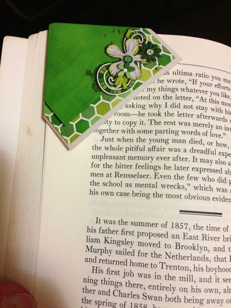
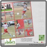
Let me start by sharing Wendy Bird’s Hybrid Bookmark. She used Chelle’s In the pocket and Rainbow Greens. Isn’t this a great idea? It’s not to soon to be thinking of teacher presents. School ends in just 3-4 months. I absolutely love the clustering. It gives such dimension, but as we know in the digi world, it’s actually completely flat.
She used
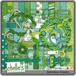
She used:
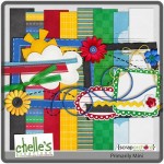
I think it must be time for a snack, look at this great layoutsw/recipe card. Next up is Lively’s Summer Berry Preserves. I don’t know about you, but I still have snow outside and summer fruit sure looks good to me. 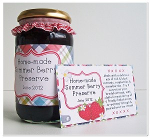
She used Summer Lovin.
Last I have tpbuffy’s layout about a Water Fight. Love the use of the water splashes and the frames. Cute little clusters. 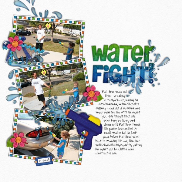
She used Ready Aim Fire Felties, Make A Splash & Make A Splash Word Art.

Hello Everyone! I’ve been exploring on the new pin gallery at Scrap Orchard and I have some layouts to share. I hope these digital scrapbooking layouts give you some great inspiration.
First Up is ChocoChoco. She did some pretty intricate clustering and it really made you focus on her cat. The kitty kibble and embroidery are a great addition. She used “Here Kitty Kitty.”

Shazabess provided this creative layout. Love that big orange arrow. A fun idea for showing a child through a period of time. Awesome clustering and I adore the title, “Hatties.” She used About A Boy.

Carrie1977 used some lovely papers to create this LO about her wedding. Love the Tag. I really like the way she added the elements in. They all work well together to make this LO a lovely reflection of her special day. She used Love Grows.

Thought I’d show you the previews to the product(s) used in these layouts. I also hooked you up with links to the market. Just click on the image.
Can’t wait to see what you create! I’ll be watching the gallery to see what you post.
Hugs!

Hello Everyone! Wow, do you love the new pin-style gallery at Scrap Orchard? At first I was a little timid because I’d never used a “pin,” but I quickly got the hang of it and I have a few new favorite to share. I’m excited about the GSO’s now, I see so many more layouts in the pin format. It’s sure to give us many ideas for our digital scrapbooking layouts. Let’s get started.
I absolutely adore this layout. My Kitchenaid mixer is actually the metallic (hot pink) pink one, so this really grabbed my attention.
Let me show you Chelle’s Lovin from the Oven, so you can see what a great job enjoyyourpix did. Imagine the fun you could have matching Lovin from the Oven to your kitchen decor.
Next let’s look at Wendy W’s layout, “Pink Pancakes.” Love this fun idea for a princess birthday breakfast. This LO just makes me smile all over. I can see pink adorned little girls giggling through this meal.
Here are the products Wendy used from Chelle’s designs.
Next up, Karen, jogs our memories as we view her layout, “Cross Country.”
She used the following products that Chelle has created. Kickit, Batter Up, Game Day, Penalty Box & Girl Power. Can you find the ellies that came from each kit below?
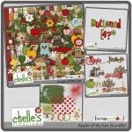
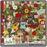
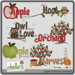
Last we have Jaye, who used Chelle’s Apple of my Eye bundle to show her favorite apples. Gala & Empire.
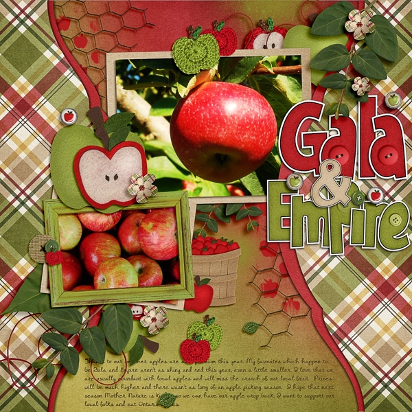
Here’s the links to the Apple of my Eye products Chelle created.

Hope I’ve given you some great ideas. Hugs!

Hello Ladies! Today I’ve been looking through the gallery at Scrap Orchard. I found some amazing layouts to share with you. It’s such a joy to look through all the digital scrapbooking layouts and pick out a few to show you.
Here’s meagan34’s layout entitled “YUM.” Is there anything better than chocolate at Disneyland? Love the clustering on this layout. meagan34 used Chelle’s “Chocolate Lovers” kit. Cluster work really adds to the overall vision of the layout.
Next up is enjoy.your.pictures lovely hexagon shaped layout. She used Chelle’s “Love Grows” kit. The Love Grows Rub-ons, delightful cluster work, & ribbon across the bottom, sure emphasize the stitch work in the LO. 
I was watching a special on TV this weekend about gymnatics and skating, so I was also thinking about Chelle’s Gymnastics Bundle with MLE Card. Penguin Momma created this lovely lavender layout about about her little girl’s gymnastics experience. Love that we have the protection provided by the men inher life.

Next up is WhitneyT. Love the muted tones. They emphasize the historical effects of the LO. I took the time to look and see what all the elements were. She used Chelle’s History Lessons kit.

With the Superbowl next week, I couldn’t resist a layout showing the fun of that exciting event. Brittaneejean gives us her version of how her family enjoyed it. Love the grass ribbon and the touchdown button. The clusters and use of string really add to the overall vision. She used “Play the Game” kit. Looking for some food images to add to your Superbowl LO this year? Check out Food 4 Fans.

These layouts are sure to give you some ideas for new layouts that you can create.
See you soon. Hugs!

Hey Everyone! Aunt Sari here again with some amazing digital scrapbooking layouts to show you. As I perused the SO Gallery, these were some of my favorites. I think you’ll agree that they are worth looking at.
 Holly Berry did this fun Halloween LO. Isn’t nice that Superman had Spiderman with him as the tricked and treated their way around town. It never hurts to have a;Rock Star along to entertain the crowd while the super heroes do their thing! She used Fireworks! by Chelle’s Creations.


