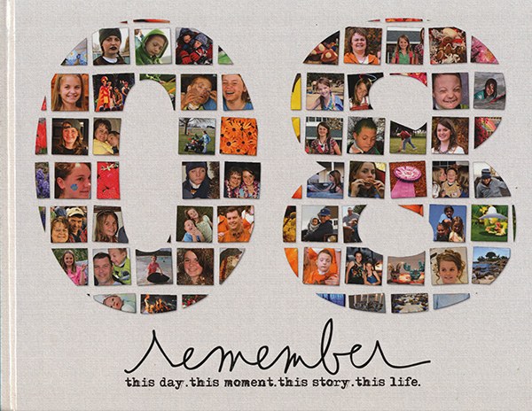
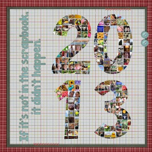
Happy New Year! Are you scrapping a year in review layout? A few years back I was working on my 2008 album…but I needed a cover. We didn’t have a family portrait taken that year, so I decided I wanted something that represented the entire year. And so I came up with this:
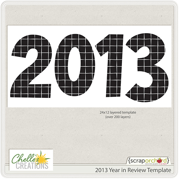
Since that time I’ve often shared a yearly multi-photo template at the end of the year. So here is a 24×12 template for 2013:
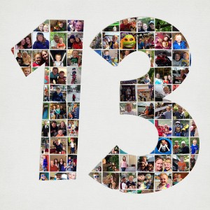
You can use it as is for a double page spread, or just use the right hand side for a cover, or a combination (see the CT examples below)
A few tips:
* if you are just using the 13, delete the other layers and then move the “13” so it is more centered on the page.
* Combine squares as necessary to fit your photos. Technically you could fill all of the spots with just half a dozen photos.
* What do you do with those slivers? I filled mine with brightly colored pieces of photos I was already using.
I’d LOVE to see what you do with the template. Send me an email linking me up to your 2013 review.
Here are some examples from our Creative Team.
Jenny (jenn18)
Tammy (Craftytam)
Donna (djp332)
We hope you have a wonderful 2014.
Hugs!

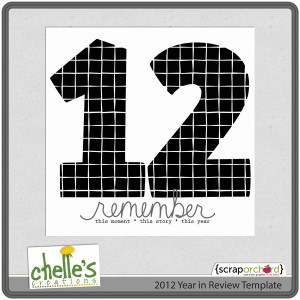
ps. 2012? It’s here.





 Hi! I'm Chelle: a 40 something mom of 7. My husband & I live in a rural community in the rocky mountains with our 4 children still at home. In the winters we enjoy sledding & snuggling by the fire. I the cool fall evenings we love relaxing around the campfire & meeting friends at the county fair. Admiring the stars
