Using Stitches

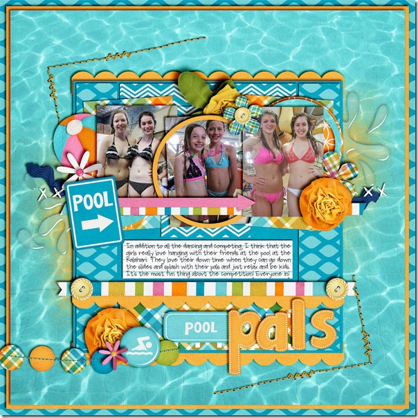
I love using stitches on my digital scrapbooking layouts. I would never have used them on a traditional paper page because I could never get the stitches lined up as I wanted. But, with a digital kit, absolutely anything is possible. Take a look at this layout by Jenn. She used one of Chelle’s newer kits called In the Pool which includes several stitches and stitched elements. I love the corner stitches she used as frames, and one of the coolest things about these is that Chelle includes holes with her stitches as a separate element. Using Chelle’s holes as a separate layer means Jenn could use an appropriate shadow on the thread stitching layer without adding that same shadow to the holes. poollpals

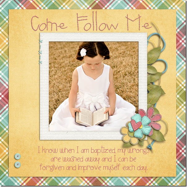
Erica also made a page for us, but she chose to combine several stitched elements from multiple kits. She used Spic-N-Span for her main kit choice, but she made the title from Chelle’s Darling Stitched-A-Bet (available in bold or in Holiday colors in the store) and she created some additional stitched flowers from Chelle’s CU Stitched Blooms. She also used some stitches to attach her photo to the page completing the soft look. I love how her font choice coordinates so well with the stitched title. ZoieeGift

Stitches are a nice addition to any scrapbook page, but they are especially fun in digital scrapbooking. I hope you’ll add some stitching to your next layout!

by_Cheryl

Using Ribbons | Digital Scrapbooking Skills

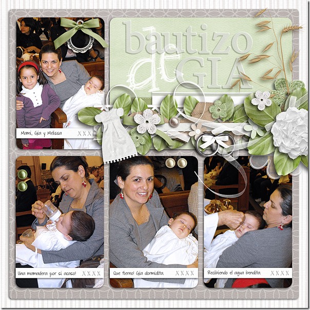
Ribbons are a staple in every digital scrapbooking kit, it seems, so what do you do with them? There must be dozens of uses. Chelle’s talented friends have made a few pages to show us what they do. First, Roxana used Chelle’s Choose the Right {ETERNAL} kit for her baby’s baptism photos, and her page is  full of ribbons as accents. She wanted to showcase the pictures, so she made a big cluster, starting with a quickie (from here) that had 3 ribbons, modified it to match her shadow angle, then added the green and white ribbons behind the cluster and the curly ribbon coming from the big flower to the picture tying them all together. She also has ribbons on the tag and ring elements on the page. The ribbons add to the softness of the page visually, and they add a cohesive element all over. 46-bautizogialeft-web

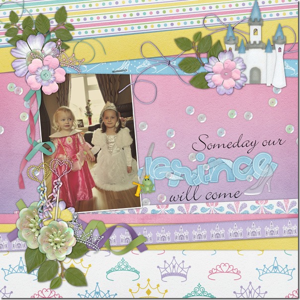
Next, Helen used Happily Ever After to make her page. It’s the perfect kit since the two little ones in the photo are princesses. She has used the ribbons from the kit as horizontal strips on the page, and she has added ribbons and strings stapled to them along with clusters of elements. She also added leaves from In the Backyard, and the curly ribbons are from the CU Curly Ribbons.  I love that felt castle, and the tiaras – perfect. Helen-happily-ever-after

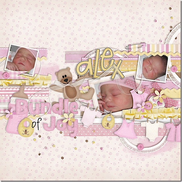
Finally, Carol has some of the first baby pictures of her granddaughter, and she chose to use the perfect kit, Beary  Cute Baby Girl. She used the long ribbons in the kit placed in strips as the background for her photos. Then, she accented the clusters on the page with bows and curly ribbon. I love how she added a bow to the teddy bear’s neck, but the highlight of the page is the photo of that sweet baby touching her nose in her peaceful sleep.CarolJ_BearySweet

What do you do with ribbons? Make a page with Chelle’s kits and show us in the Srappin Gallery. I would love to see it!

Scrap Skills: Using Black & White Photos

Hi Chelle’s Creations friends! I am really excited about today’s post because I have some really creative digital scrapbooking pages to show you from Chelle’s team. Chelle asked the team members to make pages with black and white photos. There are four very different layouts for us to see, some using old photos and others editing newer ones, so let’s get right to it.

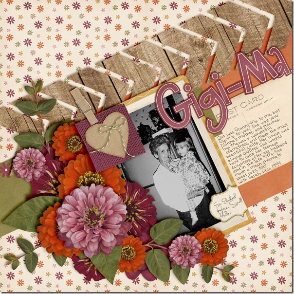
First, Wanda made a page with a photo from 1994, so it was certainly made in an era of color digital photographs. But, look at the expert job she did converting it to black and white. It truly looks like it was shot in film, originally without color. She chose Chelle’s Indian Summer kit for its retro colors and warmth. Her favorite aspect is how the photograph pops against the warm colors in that huge flower cluster. The center of attention is definitely her terrific photo. GigMa_cc_indiansmmrweb

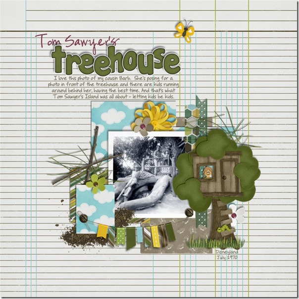
Next, take a look at Jan’s page where she has used an authentic vintage photo, shot with a Brownie camera, no less. She went all the way back to 1970 to grab this one, and it looks fantastic with Chelle’s newest kit, In the Backyard. The photo was taken at Disneyland in Tom Sawyer’s treehouse, and the kit she chose is a perfect match more than 40 years later! I love the Little People face peeking out of the window of the felt tree house – so cute! The colors in the kit give a hint to the colors that would have been seen in the real setting of the photograph, and the kit really helps to set the stage for her story. treehouse

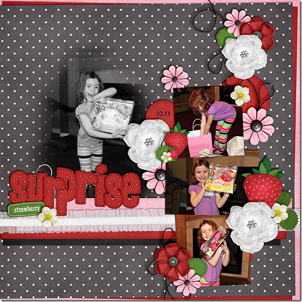
Next, we have Kayla’s page. She had a photo that captured her daughter’s expression perfectly, but the photo was a bit fuzzy. If used in color with the other color photos on her page, its lack of sharp focus would have been a distraction. But, Kayla used the black and white edit to totally transform her photo, and it has become the focal point of her page. It no longer looks fuzzy, and she was able to save that happy memory of her daughter opening that special gift. By the way, she used a couple of kits to complete her page: Tutu Cute and Berry Berry Sweet. StrawberrySurprise_Feb11_we_zps60227e0b

Finally, we have a page by Jen. She has done something I hadn’t thought to do before, but I am certainly planning to do this in the future! She had an adorable picture of her Lottie, and she wanted to highlight it as the only photo on the page. She knew that the purples and greens in Chelle’s In the Backyard kit were a perfect match for her photo, but she wanted to do something a little different. She copied the picture layer and turned it black and white and layered it above the color copy. Then she lowered the opacity of the colorless layer down to 85% to let some color peek through. It allowed just enough purple and green to show through to highlight the colors in the photo without the color being the main focus, and it really helps Lottie’s sweet face be the center of attention. Adorable! 22834

I hope you are inspired to play with black and white photos. You can dig through a box of precious memories or just find the button on your editing software; either way, having a monochromatic photo might just be the start of your next masterpiece.

by_Cheryl

Scrap Skills: Using Borders

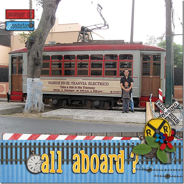
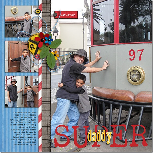
Hello, digital scrapbook loving friends! Our subject today is borders, and it is my hope that you will be inspired to use borders in a way that maybe you hadn’t thought about before reading this post. Borders on scrapbook pages are great for guiding the reader’s eye in the direction the creator wants or for separating photos. Take a look at the pages Roxana made. She has used Chelle’s Choo! Choo! kit to make two pages with borders on each, but the borders have slightly different uses. On the first page, the border forms the bottom of her page and gave her a place for the title of her page. On the next page, her border separates the small photos from the large photo and helps the eye travel down the small photos first before moving to the large one. I love how she has accented her paper borders with small clusters of elements from the kit, and the title of her second page is perfect! Looks like someone has seen the Superman movies, right? 2013-2-28-tranvialeft-web2013-2-29-tranviaright-web

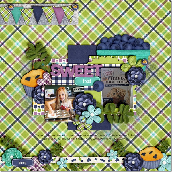
Jenn used a border on her page, but she made it from elements in the kit instead of paper. She used Chelle’s Berry Berry Blue kit and the matching alpha for her page. Her border is made from a ribbon as the main piece, and it is accented with other elements in the kit. I love that blueberry muffin tucked behind a flower, and I like that she attached a word art piece to the other end to balance it visually. The whole border makes a great anchor for her page about her daughter making a delicious treat. This page is seriously making me hungry, it is so yummy!sweettreat

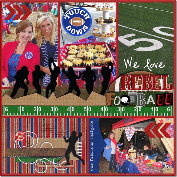
Finally, Wanda has a great example of using a border as its own decoration on the page. She used Chelle’s Play the Game and In the Pocket {strips} . She likes to make pocket-style pages with stuff in the pockets as well as on top of the pockets. Since she is digitally making pages, this works out easily! She used one of the Play the Game Quickies as a decorative accent inside the pocket on the lower left, and then she added another of the quickies as the border across the middle of her page making the perfect spot for her title. And, now I’m starving because she also has yummy treats on her page! RebelFball_InPckt7_PlayTheGame

I hope you are inspired to scrapbook like I am after viewing the team’s creative use of borders. I think I’ll help myself to a snack and use some of their great ideas. Why don’t you?

by_Cheryl

Scrap Skills: Using Hexagons

Hello to all Chelle’s friends and fans! It’s Cheryl, again, ready to look at some hexagons. I remember when  I bought my first hexagon template for a paper scrapbook project. I had to be oh so very careful tracing the pattern onto my page or the pattern would slip, and then my hexagon patterns wouldn’t line up evenly. Digital scrapbooking hexagon patterns are SO much more user friendly! Chelle’s Creative Team members have been playing with hexagon shapes and have some awesome pages to show you.

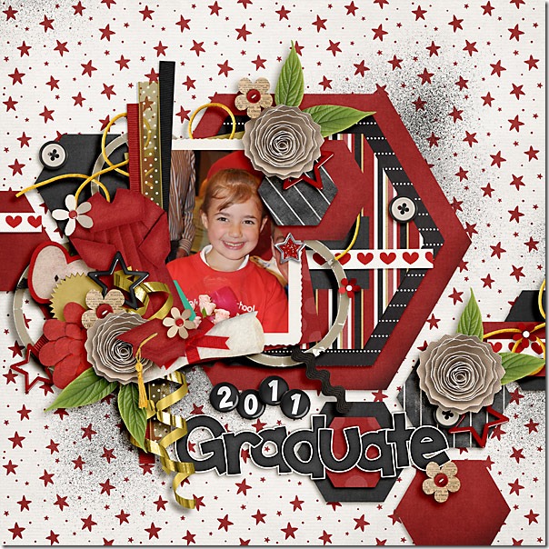
First, Carol used some really large hexagon shapes stacked as mats for her very special photo, then she used some smaller ones as paper accents around the page. This is a great way to add the various patterns and textures of the papers in a kit without using the old standard rectangular shapes. I love how she anchored some of them with little buttons and clusters around the page.Graduation2011

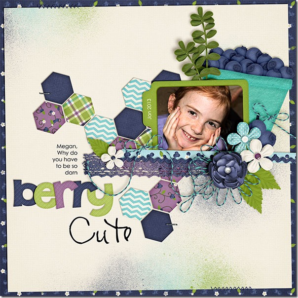
Kayla also used hexagons filled with the paper textures and patterns from the kit she was using (which happens to be Chelle’s latest Berry Berry Blue kit). Kayla has her hexagons in an interlocking pattern that seems to anchor all the pieces of her page together. BerryCute_Jan13_web_zps373a5cd9

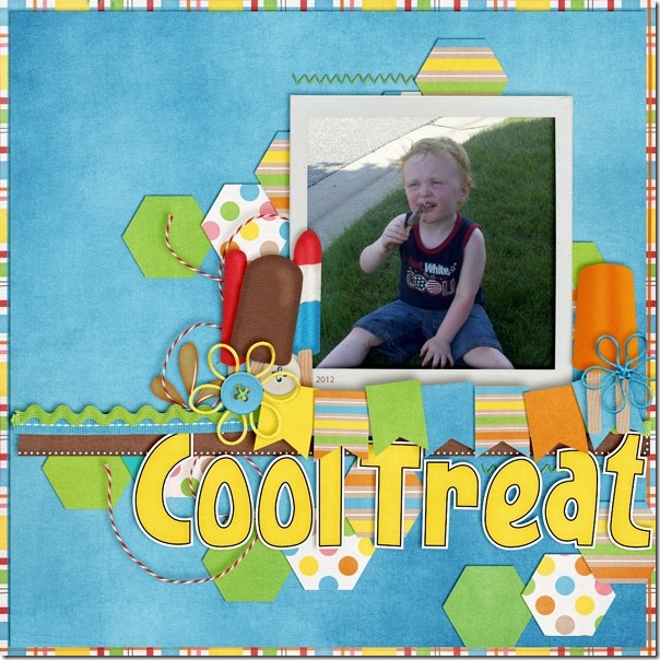
Chelle has a product called CU Hexagon Layered Patterns that are the most versatile and easy to use, if you want a super quick way to get lots of hexagon shapes on a page. Jenny has made a page with some of these layers to show you one of the hundreds of possibilities of uses for them. I love how she slightly overlapped the layers of hexagons filled with paper. It’s a unique way to make a background for her clusters of flowers and frozen treats from the Beat the Heat kit. 20832

Finally, Erica used just a couple of hexagons to accent her page. She stitched the shapes to her page and put the date on one. I love how she mixed the pattern papers from Love Grows on her page.Love Grows and Hexagon Layer Patterns- by Chelle's Creations

Feel like using some hexagons with Chelle’s kits? I hope you’ll share your pages in the gallery at Scrap Orchard. If you use any of Chelle’s products, tag your pages with #chelle or #cc. I’d love to see them and leave you some love!

by_Cheryl

Scrap Skills: Using Quickies

Have you ever wished you could get your favorite designer to make a digital scrapbooking page for you? Or, have you ever needed to scrap to save your sanity but not had enough time to sort through your stash, cluster, and then shadow everything to make a perfect page? Chelle’s Creations has the perfect tool to help you. She makes quickies for many of her digital scrapbooking kits, and they save tons of time in scrapbooking, plus using them is like having Chelle make a scrapbook page for you! Chelle’s talented friends have made some pages to show you how to use some of her quickies to get your memories recorded quickly and beautifully.

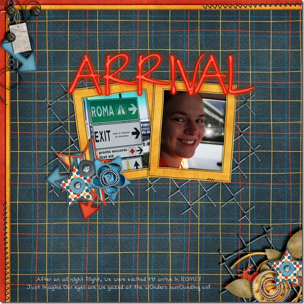
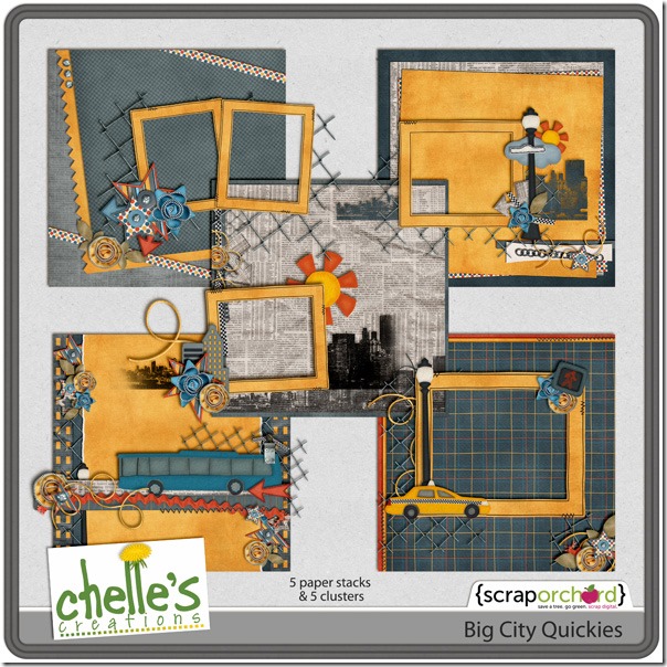
Take a close look at the page Lynett made with the Big City Quickies, and then look at the preview of the quickies in the market. Do you see how she used one of the paper stacks for the background and a frame cluster for her photos? If you can imagine looking at this page in Lynett’s scrapbooking program, you would see only a few layers: the paper stack on bottom, then the 2 photos, then the frame cluster above that, and finally her journal layer and her title layer on top. It was super fast for her to build the page, and it looks fantastic. I love how she chose a photo of a road sign for one of the photo spots. arrival_zps2f1e078bLynettcc_bigcity_quickies_preview

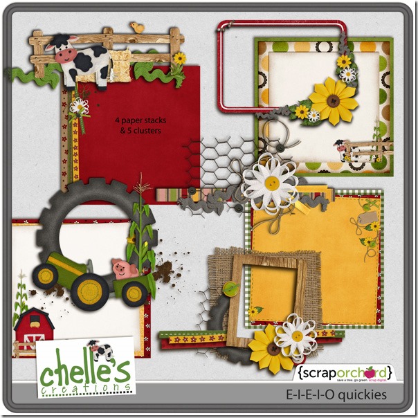
Next, Jenny used the E-I-E-I-O Quickies to build her page. Again, she started with a paper stack, then added her photo, then the frame cluster, and finally the title. Notice, she also added a date onto the tag that was already included on the paper stack. Pretty convenient, right? It couldn’t be more simple. 19843Jennycc_eieio_quickies_preview_2_post

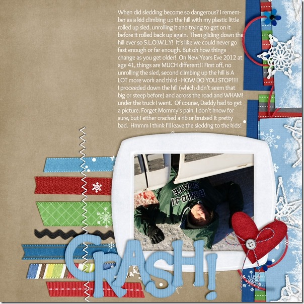
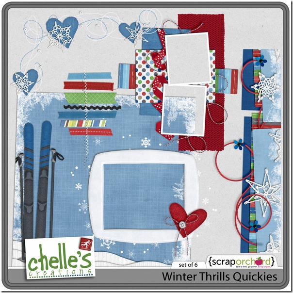
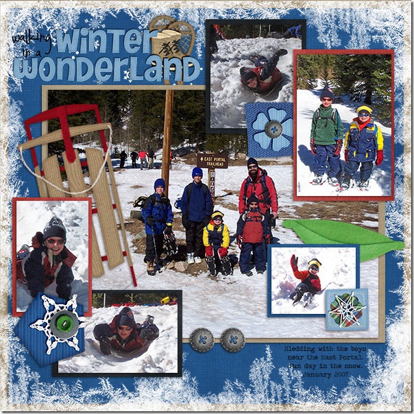
Finally, Jennifer used Winter Thrills Quickies for her page. Using the paper stacks and frame cluster left her time to journal her story about her sledding mishap. Don’t worry; she’s ok, but it sure makes a great story for the kids to tell their children later. Notice how she used the stitched ribbons quickie and the border cluster to frame the journal area. With her photo and the frame cluster she needed only the title to make the page complete. 19852Jennifercc_winterthrills_quickies

Chelle’s Quickies are always a great value. Be sure to look for them in the market. They are great items to have in your stash.

by_Cheryl

Scrap Skills: Using Spritzers

Spray paints and spritzers are all the rage in card making and traditional scrapbooking right now, and they are super easy to use in digital scrapbooking. In fact, they are far less messy in digital, and they look the same or better than traditional materials because they are easier to control. Chelle’s Creative team has been busy making some pages  that include spritzer elements, and I know you’ll be inspired by them.

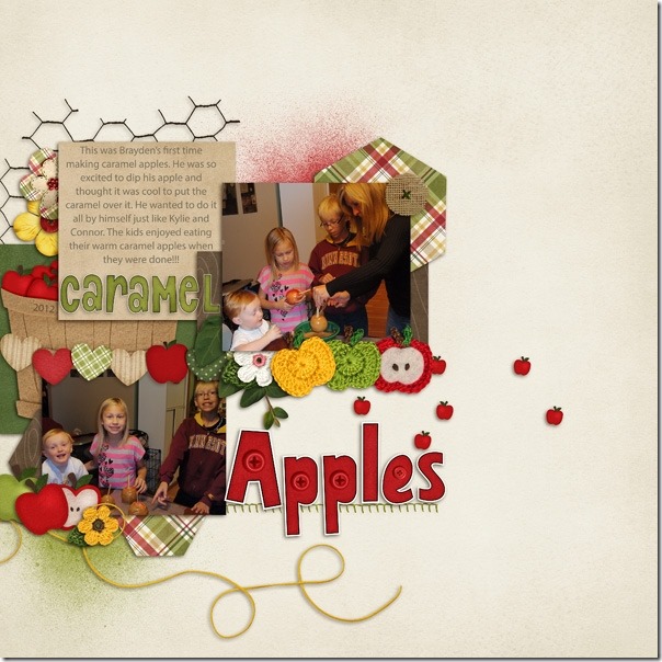
First, Jenny has made a page with her photos of her children making caramel apples. She used the Apple of My Eye {bundle} which includes the spritzers and that cute buttoned alpha on her page. The spritzers give a hint of the fun mess involved with the caramel apple making without actually making more mess. It’s the best of both worlds! 19171Jenny

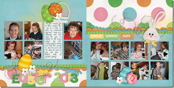
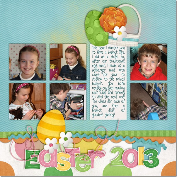
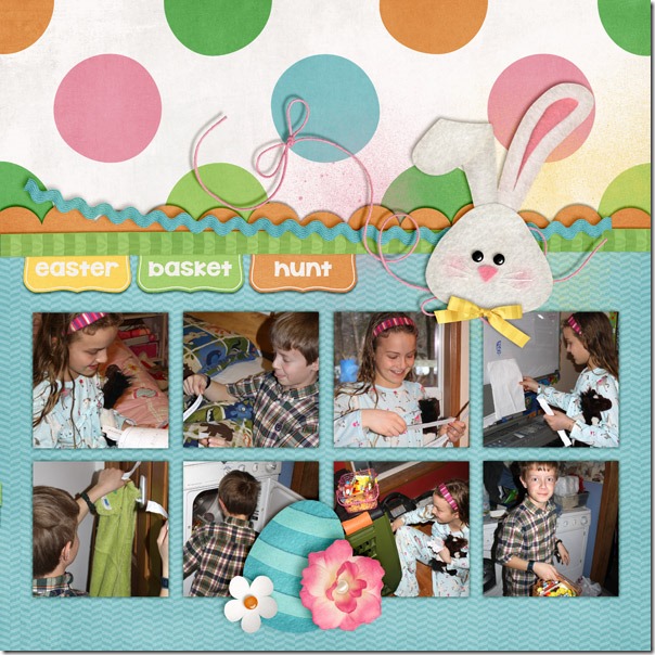
Next, Kairyn has made a double page spread of her Easter photos, and she has used Chelle’s newest Easter kit Hippity Hop Hop. It doesn’t include spritzers, so she has used Chelle’s CU Spritzers with the kit. The CU spritzers are a great value as they can be used with every kit you own, and they are a great way to stretch your stash. I’ll show you Kairyn’s double page first, and then you’ll see each side separately so you can better appreciate the details. 2013-03-31BasketHunt-2pg_zps29d7d1842013-03-31BasketHunt-L2013-03-31BasketHunt-R

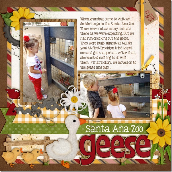
Kassie also used Chelle’s CU Spritzers to stretch her stash. She used them with E-I-E-I-O. The spritzers add dimension and texture to that white background paper without the mess of actual paint. santaanazoogeese_zps9ccf7804

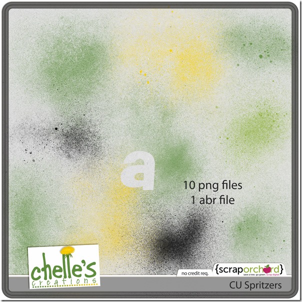
I hope you are inspired to grab some digital paint and start spritzing your layouts. If you don’t own Chelle’s CU Spritzers, you can pick them up in the market and use them to stretch any kit you already own to make it have a whole new look. The download includes 10 different png files and 1 abr file. cc_CU_spritzers_preview 2 post

by_Cheryl

Scrap Skills: Black & White Photos

One of the greatest things about most digital scrapbooking programs is the fact that photos can be edited within the programs in a host of ways. One of my favorite ways to edit a photograph before using it on a page is to convert the picture to black and white. I do it for dramatic effect, but I also do it to eliminate distracting colors in the photo. Changing a color photo to black and white also allows me to choose any scrapbooking kit I want, regardless of color scheme, and my photos will look great with it. Chelle’s Creative Team members have made a few pages as examples to show you.

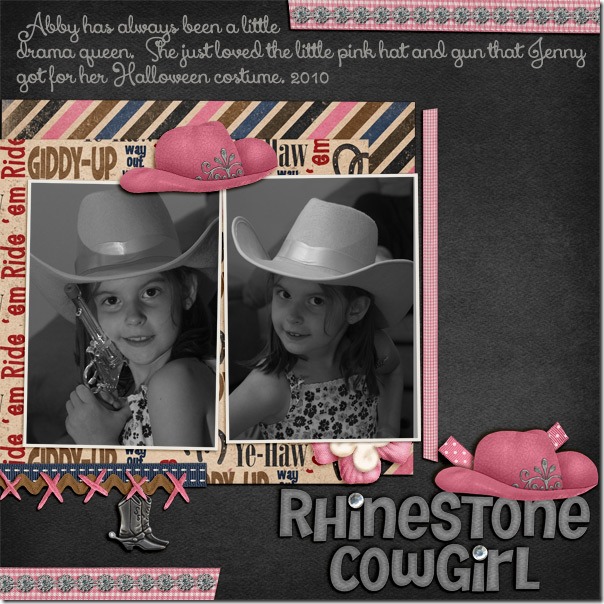
First, we have a page by a guest member Debbie. She has some adorable photos of her daughter in a Halloween outfit that would be complimented perfectly with Chelle’s Cowgirl Up kit. Removing the color of the photos allows the focus to be on her sweet face, and it allowed Debbie to use the kit full of pinks, browns, and black without clashing with any colors in that flowered shirt she is wearing.Abby---Rhinestone-CowgirlDebbie

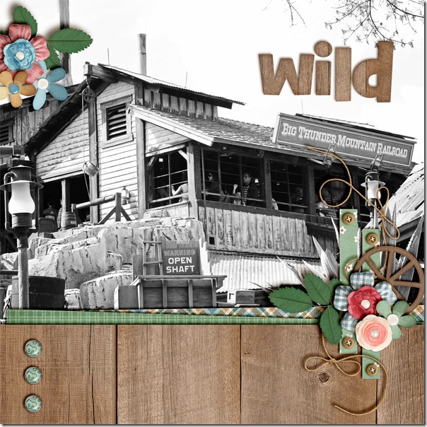
Next, Jenn wanted to use one of Chelle’s newest kits, Choose the Right {TREK}, but she was making a page about a trip to Disney. Even though the theme of the kit is different than the theme of her photo, they are a perfect match with the wooden paper and elements and the rustic feel of the photo. I really like how she made that photo very large on the page and used the kit elements to compliment it, not overwhelm it.wildbigthunderJenn

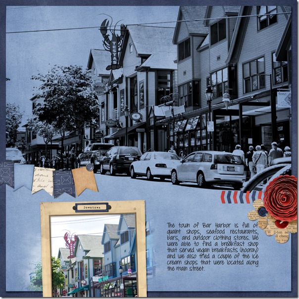
Finally, Leslie has done something a bit different with her black and white photo. She also used the color change to enable her to pick a kit at will, but she went a step further. Her photo of a street at Bar Harbor has been changed to black and white, but she changed the blending mode to Darken which cased the blue paper below the photo to show through and replace the white parts of the photo. It’s a perfect technique for a page about a seaside town, I think. By the way, she used Chelle’s Letters from Home kit for her page.2012-07-Acadia-Bar-Harbor2

I hope you’ve been inspired to scrap with a favorite kit regardless of the colors in your photos. You’ll still have a perfect page capturing your memories if the photos are black and white than you would if the photos were in color, and you’ll have tons of fun using that kit!

by_Cheryl

Scrap Skills: Shadow Styles

Hello Chelle’s friends! I hope your Easter was wonderful and you’ve got lots of new photos to include in your digital scrapbooking projects. Today, I want to show you a tool that will speed up your scrapbooking process so you can get those photos onto pages for everyone to enjoy. Chelle has a collection of shadow styles for sale in the market that can save tons of time, if you’ve been making custom shadows, and increase the realistic look of your pages, if you’ve been using the standard drop shadow styles in PS or PSE. Me & My Shadow is a collection of styles for all different types of elements in 3 popular shadow directions: Lower Right (LR) (120 degrees), Lower Left (LL) (45 degrees), and Upper Left(UL) (-43 degrees). Start a page with any of Chelle’s quickies, and then use the Upper Left setting for any additional elements on your page to match her pre-shadowed styles. Also, she has a video on her YouTube channel to show you how easy it is to use the shadow styles.

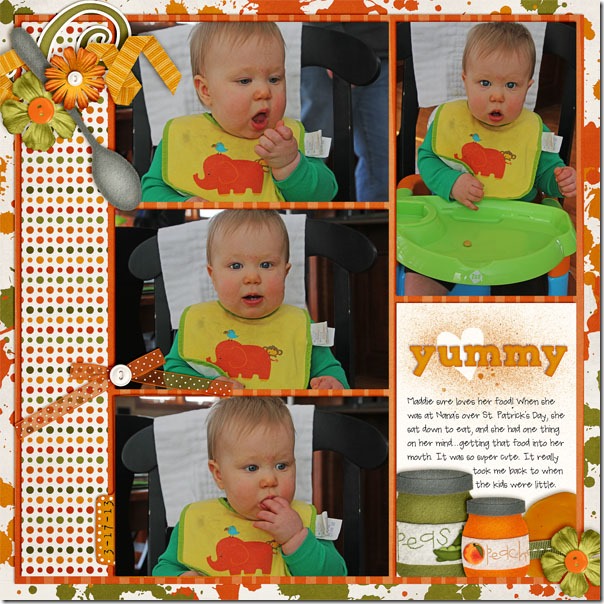
Let me show you some sample pages using Me & My Shadow. First, Jenn made a page for us using Chelle’s First Foods kit and the adorable photos of Maddie easting in her high chair. She used the UL paper shadow style for all the photos and paper mats on the page, the felt/chipboard style for the felt pieces, the small flower for the flowers, and the curly ribbon/string for the ribbon on the left. In addition, she used vellum style for the bow that has a slight transparent appearance.yummy2Jenn
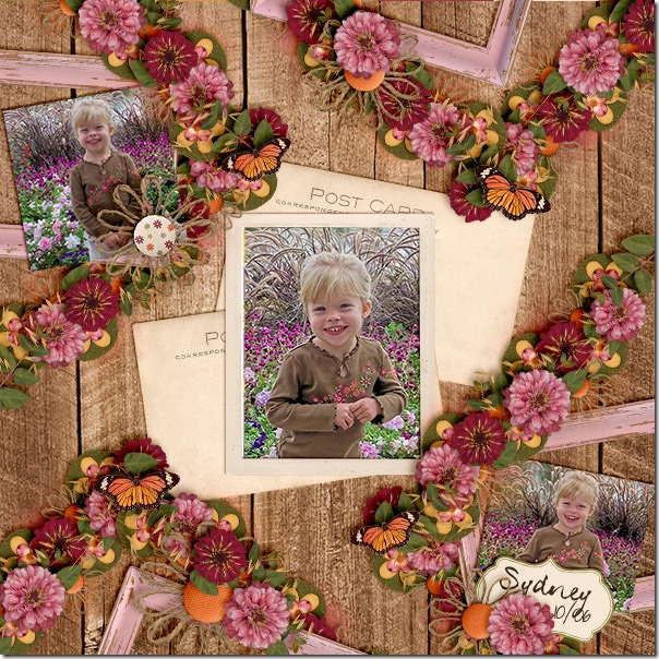
Next, Karen has a page that beautifully illustrates how to do lots of flower clusters to make them look realistic. She used Indian Summer – a perfect kit for her photos. Look closely at how the flower clusters on the page are a perfect match to the flowers on her little girl’s blouse. You can see she has used the thin paper style shadow for her photos and the post card elements from the kit. The flowers, leaves, and butterflies have larger thicker shadows by using the  flower style, while the felt elements on the bottom layer of the clusters have the felt/chipboard style applied. Sydney-flowers_zps81808b3bKaren
Melissa has made a page with a lot more white space, and yet the shadowing is just as important as a page filled with clusters. Notice how she used the string/ curling ribbon shadow style for her blue strings, and they seem to pop off the page. Also, she has the tiniest stitches perfectly placed on the page, and she has used the staples/ stitching layer style for those as well as for that little staple attaching the frame to the page.
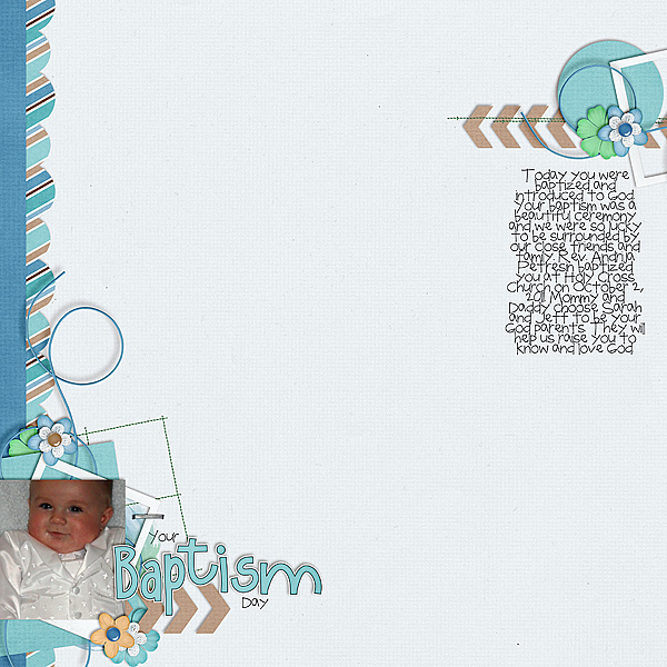
Baptism-Day_zps4043a1d4


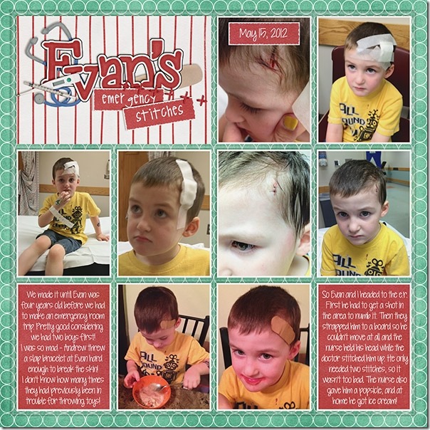
Finally, Brandy has been a guest on Chelle’s team for the past two months, and she has contributed some fabulous pages for us. Today, she has made a page to illustrate how to shadow the plastic pocket layer on one of Chelle’s In the  Pocket {Small} pages.  Here she has documented little Evan’s trip to the emergency room for stitches with lots of photos, and each photo has the paper shadow style applied. She used the acrylic shadow style to give a proper effect to the plastic pocket top layer on the page, and it completes the page with a very realistic look.13177Brandy
Do you own Chelle’s Me & My Shadow? Here’s a closer look at it in the market (the image is linked). Don’t forget, if you’re using any of Chelle’s pre-shadowed quickies, you’ll want to use her Upper Left shadow style from Me & My Shadow. cc_memyshadow_preview

by_Cheryl

Scrap Skills: Favorite Tips

Today, I’d like to show you some layouts that Chelle’s team members have made to demonstrate using a favorite tip or trick in Photoshop or Photoshop Elements. There are tons of shortcuts and handy tricks in these powerful programs. If you can incorporate a few, you’ll find you are spending less time getting a digital scrapbooking page put together and more time enjoying your memory keeping.

First tip: If you like to mat your photos on a page, Karen has a great tip for you. She makes the perfect mat for a photo by first duplicating the photo (hold down the alt key and drag the photo layer) Then, clip paper to the duplicate on the bottom. Next, select the photo on top and hold alt-shift to constrain proportions and make the picture smaller until just enough of the paper mat is showing on all sides. Center the photo on the mat if necessary. Here’s her page with all her fun pictures matted. Matting the photos is a great way to stack the photos on the page and get more photos included. She used Chelle’s Winter Thrills Bundle. sledding_zps75904596

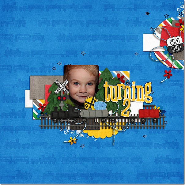
Another great tip is demonstrated by Melissa. She likes to duplicate elements on the page for visual impact. Again, she selects the layer to be duplicated and holds down the alt key while dragging on the layer to create a duplicate. Then she can click on the new element on the page and drag it to a new position. This duplicating action can also be accomplished by selecting the layer and typing the keyboard shortcut <crtl>J.  This is a lot faster than finding the element in the project bin and dragging it onto the page. Here you can see Melissa duplicated the evergreen trees from the Choo Choo Bundle on her page in a fraction of the time it would have taken her to add each tree individually. Turning-2

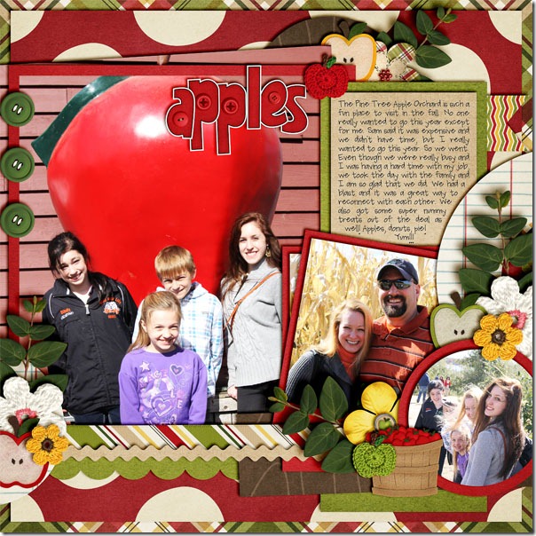
Another great tip after you’ve duplicated elements is to use the align and distribute buttons to locate your duplicates on the page. JennS made a cute page about a family trip to the apple orchard using Chelle’s Apple of My Eye Bundle. She duplicated the green buttons, roughly placed them on the page, and then used the align and distribute button to place them in a vertical line, evenly spaced on the left side of the page. apples

Finally, Jenn (jk703) told me that she has a favorite way to preview fonts on her page. Have the Type Tool selected. Click on your journaling layer, and then highlight the text that you’ve already typed out. Next, click on the Character Menu, and locate the font drop down menu. Click inside, where it says the name of the font. Then use your arrow keys and scroll through your fonts slowly. Your journaling will change every time you press the arrow key up or down. So easy to preview! I LOVE this tip!

I hope you’ve been inspired to try something new. I can’t wait to see your pages in the gallery at Scrap Orchard! Be sure to tag your pages with #chelle if you use any of Chelle’s products – I would love to see them!
by_Cheryl