Have you seen all the hexagons everywhere? I did a quick search for hexagons on Pinterest because I had noticed in the digital scrapbooking community that I was seeing a lot of them. They’re everywhere! My Pinterest search turned up hundreds of pins in everything from home décor to board games to quilting, and of course, there were dozens of scrapbook pages that used them. Chelle’s Creations has a great CU item in the market that has lots of hexagon patterns that are extremely versatile. 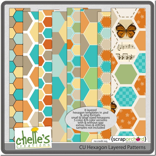 The kit has 8 layered templates, with small and large sized hexagons, some with spaces, and some without. It even includes the lines and stitches that can be used to enhance the patterns. In addition to the PSD files, it includes PNG files of each pattern, which makes it easy for users of SBC+ to add to their pages. It truly should be a staple for your stash of supplies, especially considering how popular hexagons are right now. If there isn’t a hexagon in the kits you are using, you can clip your papers to the templates in Chelle’s CU Hexagon Layered Patterns. Chelle’s Creative Team has been playing with this item so that you can see what I mean.
Patty made a page to showcase her photos she took at a zoo recently. She used some of the layers of the hexagons and clipped papers from the Zoopendous kit to the layers. It makes a perfect background for her photos.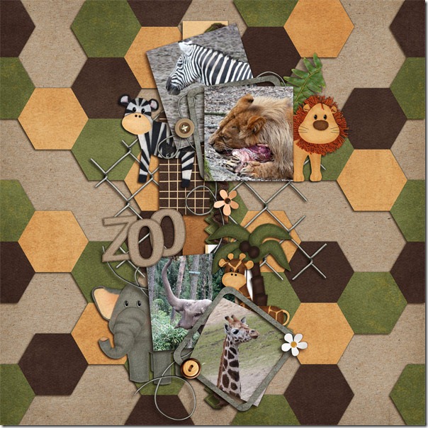
Ronnie also used the Hexagon patterns, but she took it a few steps further making a very intricate and interesting pattern. She made a patterned paper with the Hexagons. To have even more hexagons, she used a template with hexagons which cut the Big City kit papers into hexagons thus having hexagons within hexagons. 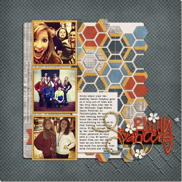
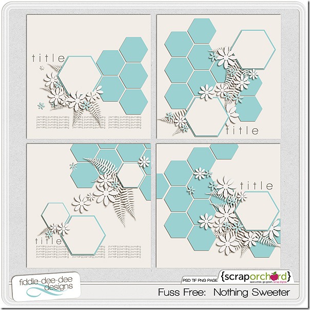
Another CT member, Ophelia, used a template from Fiddle-Dee-Dee Designs to make her page that has a building theme. Hexagon shapes are perfect for this page, and she has filled some of the shapes with papers and some with her photos. Look at how well the road signs blend in with the geometric shapes on the page. 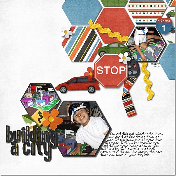 Cheryl of Fiddle-Dee-DeeDesigns originally made this set of templates for her Facebook fans, but if you missed it on Facebook, you can find it in the market at Scrap Orchard. The image is linked.
  I hope you’ve found your inspiration here for getting your memories and precious photos preserved for future generations. Try using the popular hexagons, and see how easily they can be used to make a big visual impact.



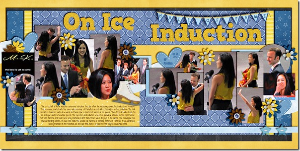
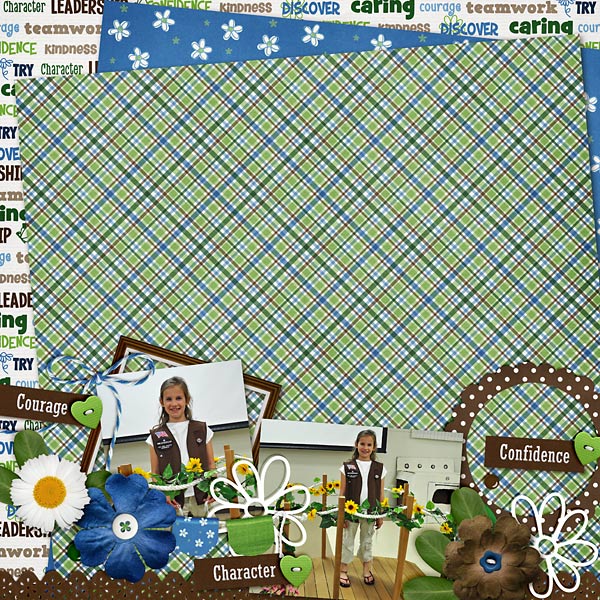
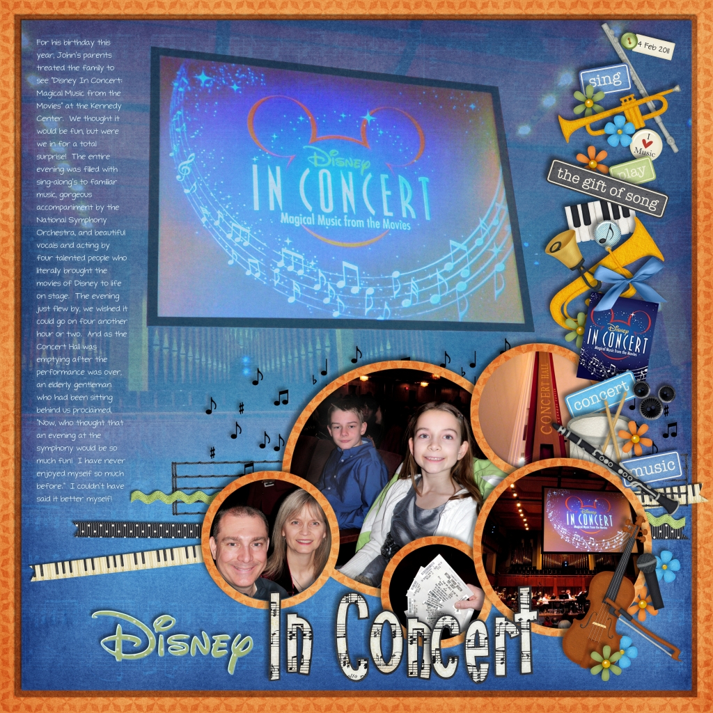
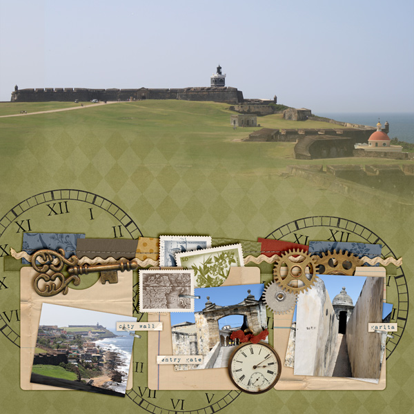
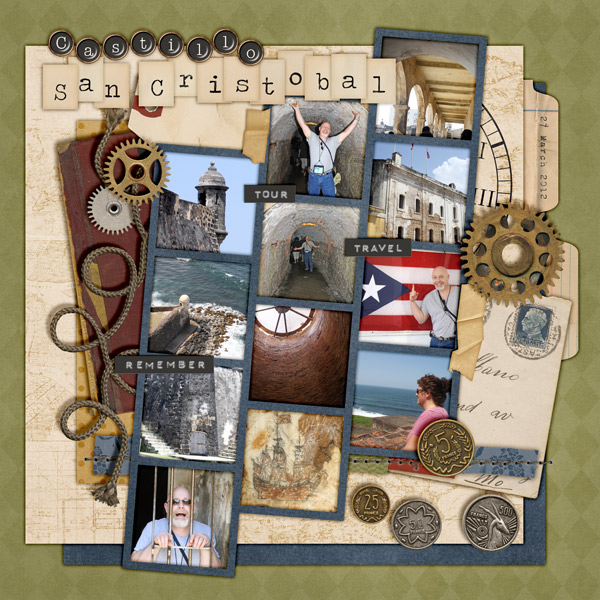

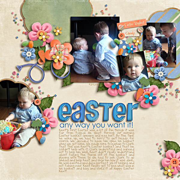
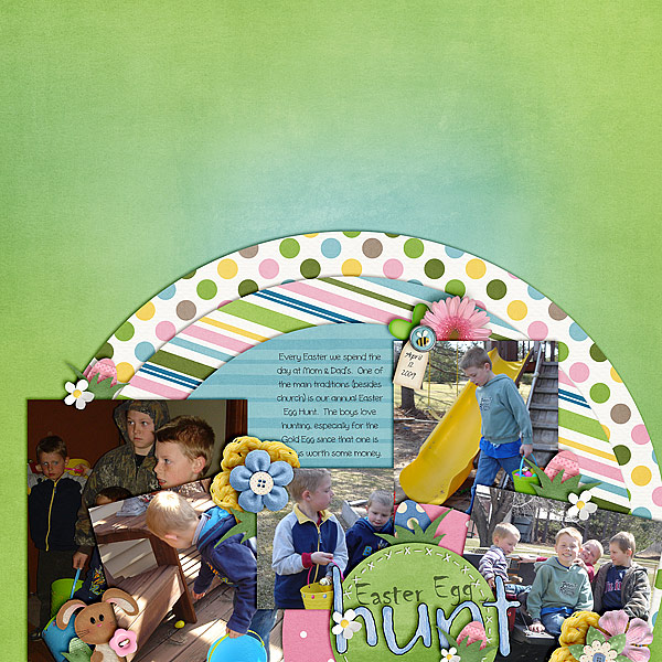
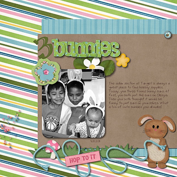
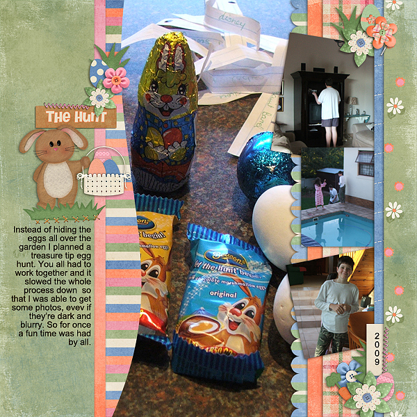
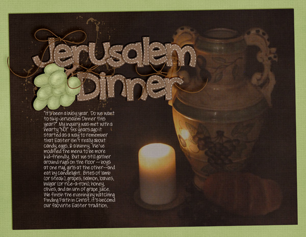

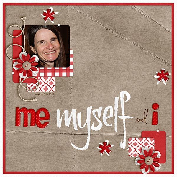 This is a double layout from Jenn. She used parts from Ho Ho Ho, Chocolover, and the Rainbow Collection and a fabric overlay from Happy Scrap Girl for the BG. She says of stitching, : “I used stitching to hold paper down, photos and items like that.”
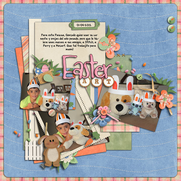
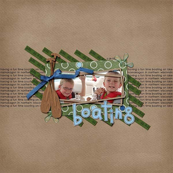
 This cute layout from Karen uses stitching in a mostly decorative way. She writes, “I used stitching in a bunch of different ways, around the circles, holding down the paper strip, and then I used a swirl stitch to make leaves. ” Credits: blue and orange flowers from The Carrot Patch, white flower from Blessings, green stitches from Something Fishy, orange stitching from Sunny Side Up, green swirl stitching from Holly Jolly, all by Chelle’s Creations
 How have you used stitches in your layouts? Do these layouts give you any new ideas? Get going and use those ideas, experiment! Don’t forget to upload to Chelle’s Scrap Orchard Gallery so that we can see how you use stitches and so that we can show you some love for your hard work! Have a wonderful day!




 Hi! I'm Chelle: a 40 something mom of 7. My husband & I live in a rural community in the rocky mountains with our 4 children still at home. In the winters we enjoy sledding & snuggling by the fire. I the cool fall evenings we love relaxing around the campfire & meeting friends at the county fair. Admiring the stars
