8.15.2013 Using Tagxedo

8.15.2013 Using Tagxedo

Hi!  Leslie here and I want to show you a website that can add something different to your pages—make fun groups of words using Wordle or Tagxedo.  For purposes of this tutorial, I’m going to demonstrate Tagxedo and give you some handy tips to use it on your upcoming scrapbook pages.

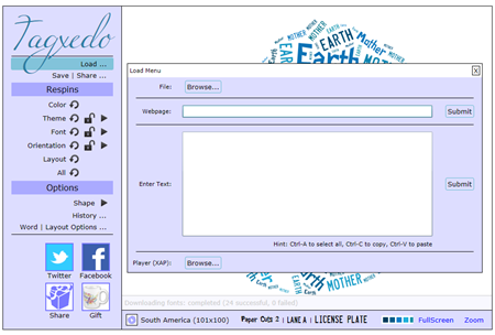
First things first, go to http://www.tagxedo.com.  You may need to download Silverlight for this to work.  That’s ok, and it works on a Mac and a PC.  Next, select ‘Create’ and then ‘Load’.
image

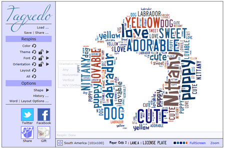
Here, you can choose to enter in your own text (type it in here, or copy and paste it from another document), or load text from a Webpage.  I typed in, “Nittany puppy cute love Nittany Nittany puppy dog adorable Labrador Nittany Nittany cute love Nittany yellow sweet lovable”. Using the default shape, I now have this:
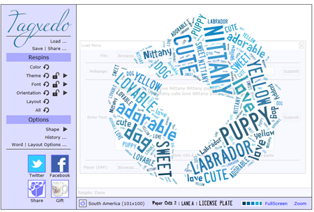
image
The words ‘Nittany’ and ‘cute’ appear a bit bigger because I repeated those words in the text string.  So, if you want certain words to be bigger, use them more often in what you type in. If you want words to remain grouped together, like ‘super cute’, you need to enter it like this ‘super~cute’.

Ok, so let’s say that I didn’t quite like how that turned out.  I could simply respin it and it will fill the shape another way.  But let’s say I want different colors and a different shape.  Let’s do that.  To adjust color, font, orientation, layout, go to the menu under ‘respins’ on the left.
To change the theme, font, or orientation of the text you may click the ‘redo’ arrow image next to the appropriate menu choice or click the right arrow image to view the theme menu.

So now, I’ve modified the colors, selecting a theme that has the colors I want.  I’ve modified the amount of fonts that the program will use, and I’ve chosen to use only horizontal and vertical text.

image

But I want a different shape.  Let’s select the ‘shape’ menu, under Options.
I’ll choose a dog from the default shapes (you can load your own, too). And now I have this.
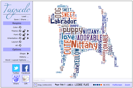
image

Cute, right?
Have a play!  You can’t hurt anything.  Try playing with the ‘Word | Layout Options’  to change how many times words appear, color variation, how tight you want the words to be, etc.  If you don’t like what you see, reset it!

To save, select ‘Save | Share’. Save it as a *.png file. I saved it as a 16 megapixel image. I can now bring it into PSE and use it how I want.  I use the magic wand to remove all the white background. To make sure all of the little bits of white inside the letters gets deleted all at once, make sure you have the ‘contiguous’ option unselected. And if I have a color that doesn’t quite match what I want, I can use the color replace tool in PSE/PS to get it just how I want it!

For ideas and inspiration for what you can do with it, check out the Tagxedo Gallery: http://www.tagxedo.com/gallery.html

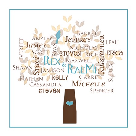
Here, Erica (stanworth) uses Through the Years  to create this lovely printable as a Christmas gift for her in-laws.

StanworthTree2

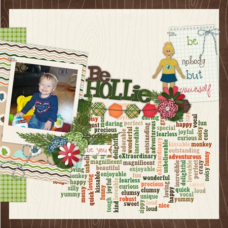
Here, Helen (winipeg1) uses In the Forest & In the Backyard Little People to make this cute layout! I love how the words define all of these superlatives about her child.  Every kid should have a page like this!

Helen-in-the-forest-tagxedo

I hope you learned something and might give this a try.  If you do, let us know and link in the blog comments to your gallery post.

Until next time!
leslie

8.1 Tutorial: Cartoon Posterizing

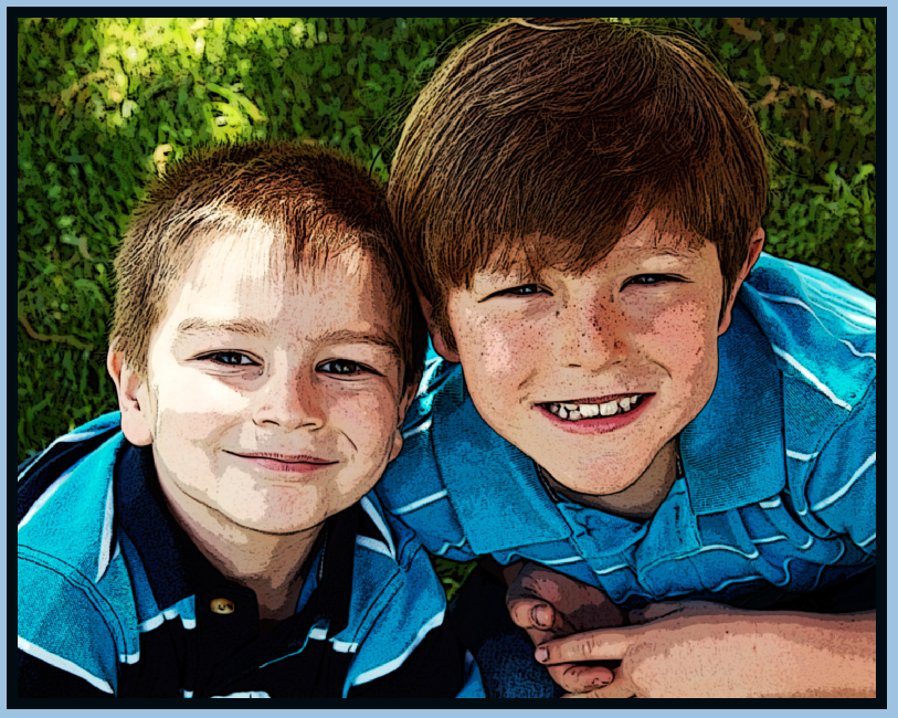
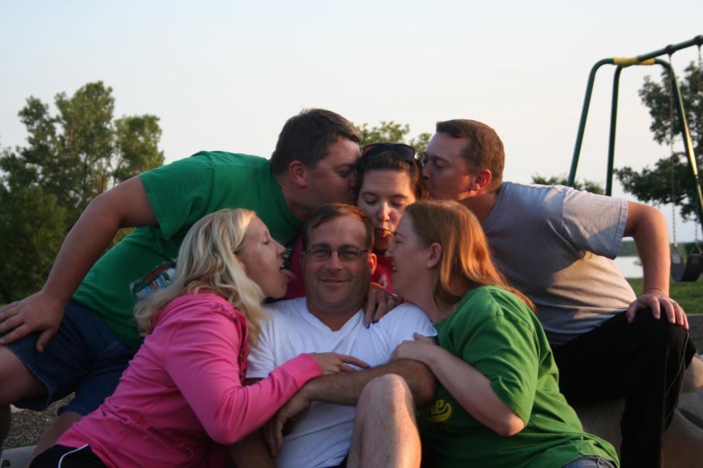
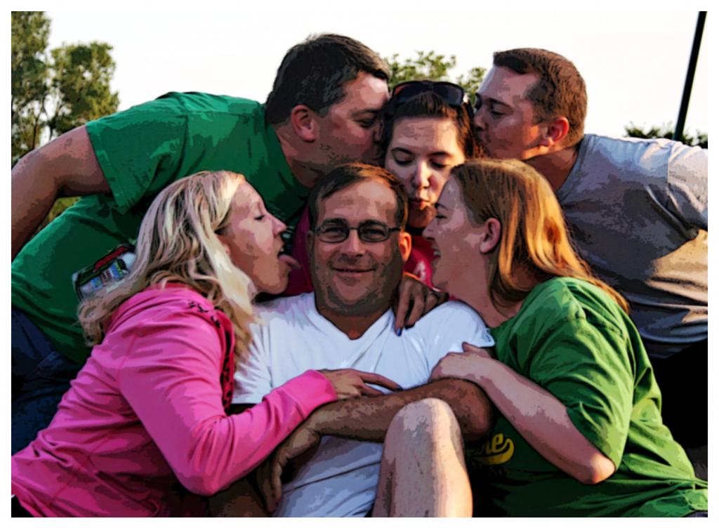
Hi Everyone! Happy August 1st!  Can you believe this month has already started!?   It’s Jenn, aka jk703, here for today’s Tutorial. A fun and different technique that you can use on your layouts! Sometimes learning a new technique gets you to play with tools and other options that you didn’t know were available to you in Photoshop or Photoshop Elements. Today, we are going to look at a mix of cartoon posterizing! Like all of the skills that you learn, remember to play with the options and all the sliders. You never know what might happen!

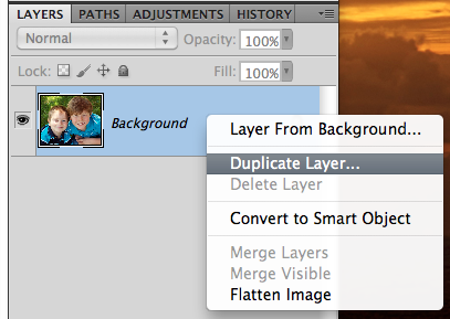
OK. First step is to right click on your image and duplicate it. Remember, use a copy of your image to start with every time, just in case you need to go back to the original!

Cartoon3

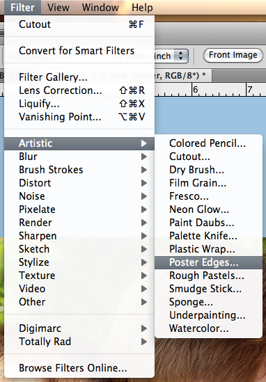
With the duplicate layer selected in the Layers Palette, click on Filter > Artistic > Poster Edges.

Cartoon4

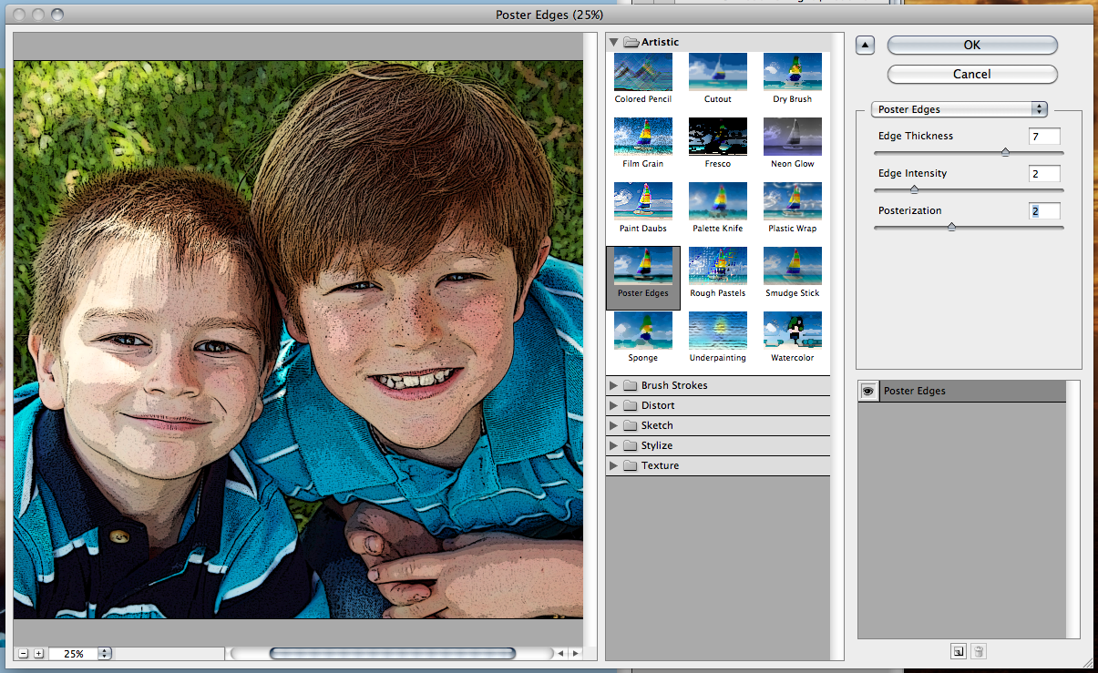
A pop up will appear… I have my settings at 7 Thickness, 2 Intensity, and 2 for Posterization. Play with these to see what you like.

Cartoon7

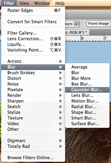
Next, with that same layer selected, choose Filter > Blur > Gaussian Blur.

Cartoon6

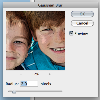
Another pop up will appear, and I’ve moved the cursor to 2.0. Next, duplicate your Blurry Poster Layer in the Layers Palette. Choose this layer if not already chosen.

Cartoon8

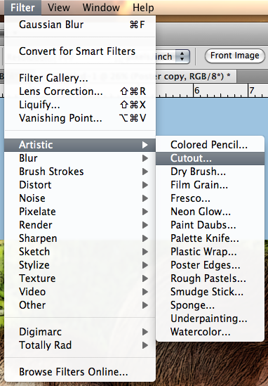
On the Menu Bar, choose Filter > Artistic > Cutout.

Cartoon9

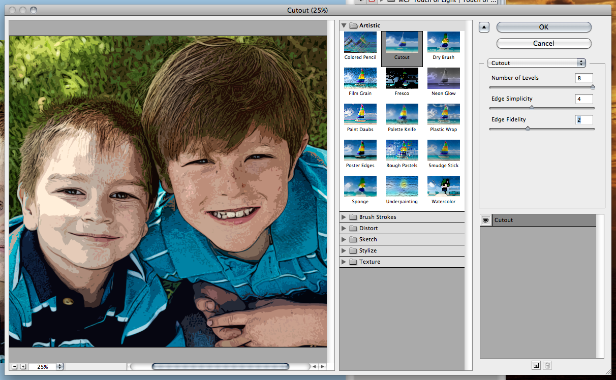
The pop up menu will show, and you can make adjustments to the settings. I have mine at 8 for the # of Levels, 4 for the Edge SImplicity, and 2 for my Edge Fidelity. Click ok.

Cartoon9a

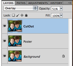
I’ve decided to change the blend mode, and lower the opacity of this Cutout layer – only because my sons face is super light, and I want it to look a bit better. I have it set to Overlay, and 51% Opacity.

Cartoon9b

Next, use the folded corner box to create a new layer. Move it above the Cutout layer. Double click on the thumbnail of the Cutout Layer to get the marching ants. Then click back to your new layer.

Cartoon9c

With the new layer selected, click on Edit > Stroke.

Cartoon9d

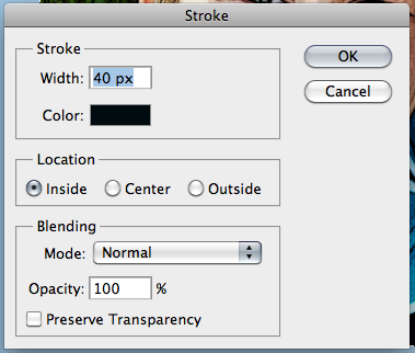
When the pop up appears, I used a black stroke, 40 pixels and it comes from the inside.

Cartoon9e

Example

Cartoon9f

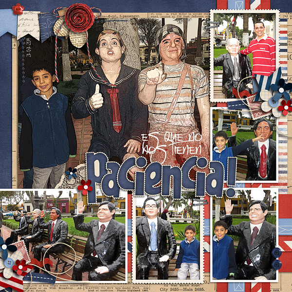
Now, let me show you what the CT made… Roxana changed her main image… and I think it looks awesome!  Such a fun photo to try it out on too – since they are statues! She used Letters From Home and Rock the Vote57-estatuas-web

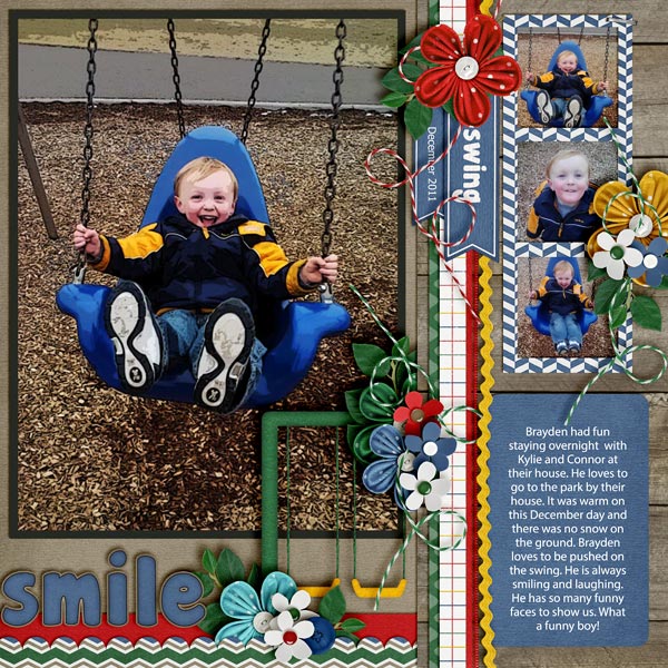
Jenny created this super cute layout using At The Park and a template by Little Green Frog Designs.

Carton-Park_web

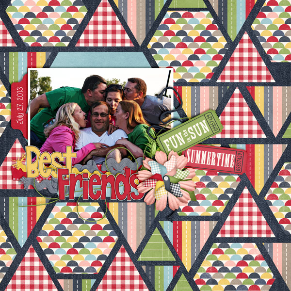
Mel used Summer Lovin’ for her layout and even showed the before and after pics for her image!

Summer Lovin' by Chelle's Creations Template by Megans Creations

Before

IMG_9683

After

IMG_9683-toonish2

There you go. A new idea, and you can play with it to make it a fun one for one of your layouts!  See you later in the month! Thanks for stopping by today!

by Jenn

Tips and Tutorials: Template Downloads

Tips and Tutorials: Template Downloads

Hi, everyone.  This is Leslie and I’m going to talk to you about what it is you’re downloading when you buy templates and what you need to keep and what you can discard depending on your scrapping system.  I’ll talk a little about the pros and cons of *.tif files vs *.pngs and some of my fellow CT members will chime in about what system works for them.

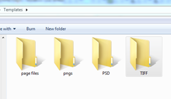
When you download a template bundle from a designer, you may see this inside.image
Do you need all those folders taking up space on your hard drive? NO!  Let’s clean up house.
Let’s knock out the first two.  If you’re using Creative Memories Storybook Creator software (SBC) or Panastoria’s Artisan software (Panstoria developed SBC and it is compatible with page format files and is essentially the exact same program only cheaper and will continue to be supported after CM stops supporting SBC),  you’ll want the page files.  You can delete the rest of the files in the downloads folder.  If there happens to be SBC4.0 compatible files, you may choose those; though I wouldn’t, as Artisan doesn’t support those.

OK, next: png files.  If PAGE format files are provided to you as part of the download, and you use SBC or Artistan, you don’t need these. If there are no page files, SBC users can use the png files to make their own template. Refer to my blog post here for how to use them. My workflow has changed a bit since writing that post, but it will get you mostly there. If you’re using another brand of software that is not Adobe or Creative memories, you may be able to use the PNG files in your program to make your own template. If you’re using an Adobe product to scrap (Photoshop Elements (PSE) or Photoshop (PS)), you don’t need these files!  Delete them! But take a look inside to see if there are any cool shapes you want to harvest!

So next are PSD and TIFF files.  Both of these file types work in a layered format within PSE and PS. Which should you keep?  It’s up to you.  Let me talk a little bit about them.

PSD files are the native format for Adobe PS and PSE files. As such, they load quickly and they save quickly. If time and RAM are your limiting factors, you may want to choose the PSD format.

The TIFF format was also developed by Adobe, but isn’t the default file type for PS and PSE files. If saved properly by the template designer, these files can be a little smaller than are PSD files.  So if hard drive space is a limiting factor for you, you may want to consider using TIFF files. Make sure though, that they actually ARE smaller than the PSD files first.  If the designer hasn’t saved them with ZIP compression, they could be bigger.
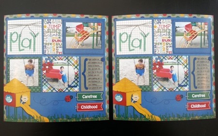
So what about quality?  Is there a difference in quality between PSD and TIFF files.  Well, there might be.  But I uploaded a page using Chelle’s At the Park kit to Persnickety Prints that had been saved to jpg both from the PSD and the TIFF formats and they printed it for me and looked at it under a microscope and could not discern a difference in the printing quality.  Thanks Persnickety Prints for helping me with my experiment!!

20130717_130733

Me, personally?  I keep TIFF files.  I have thousands of templates because I convert templates to PAGE files for a number of designers and they all add up in space on my hard drive. Thanks to a tip from our Scrap Orchard forums, while working on a project, I’ll save it in PSD format while I’m working on it to get the benefit of that speed, and once it’s done, I’ll save it to TIFF format and delete the original PSD file to get the benefit of storage space.

This is what some of our CT do:
Wanda said:  I am no computer expert, and use the .psd files because I am using Photoshop Elements and they are Photoshop files. One of the complaints about the .psd’s is that you can’t see previews of the files. [editors note: you can with an add-on program] When I am browsing files I can’t see them, but once I am already in Photoshop, I just choose File>Open and navigate to the folder containing the templates I want to use. Then I click each template, and a preview shows up in the bottom of the box…..no problem. I have used .tif files without any problems with either use or printing, but I always go back to the .psd’s and delete everything else. Storage space is not an issue for me, probably because I don’t have a lot of “stuff” and because I don’t save my completed pages as layered files. I flatten them and save them as 8 x 8 (2400 x 2400). I print them either 8 x 8 or 12 x 12 and they look great either way.

Jenn said: I use Photoshop and use .tif files for templates. The .tif files do not take up as much space as the .psd files, which helps with space issues.

Summary:
SBC or Artisan: keep PAGE files or PNG files
Adobe: keep TIF files or PSD files.

So there you go!  Go forth and clean up your files and get some space back.

leslie

Bending Shadows | Digital Scrapbooking Tutorials

Bending Shadows | Digital Scrapbooking Tutorials

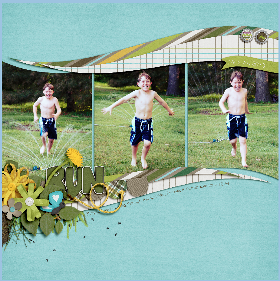
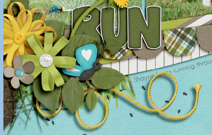
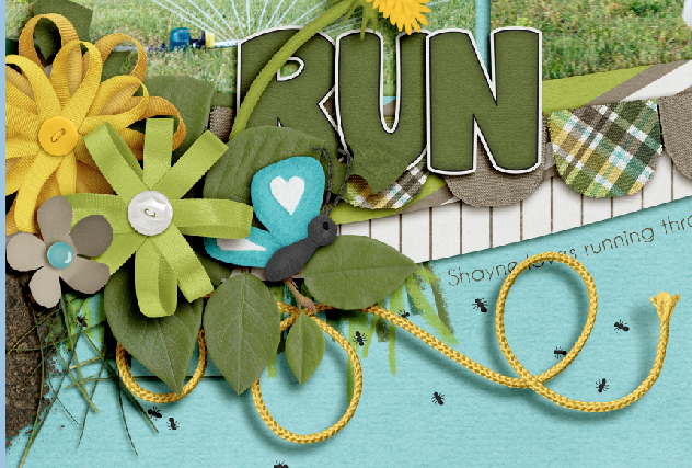
Hi Everyone… It’s Jenn, aka jk703 here to share some tidbits with you in our Tutorial: Bending Shadows. These are what I have learned over the last few years, and I will try to make them as simple as possible. First, you may want to work on a layout that you have already created, and resave to practice on the elements. Here is a page that I’ve created using Chelle’s In The Backyard. See the yellow String – that will be what I use to show how I bend shadows. I don’t know if all of these options are available in PSE or SBC; I am working in PS.

Sdw1

I’ve moved the string to another part of the layout so you can view more of the actual string and shadow.

Sdw2

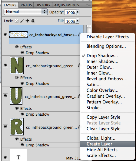
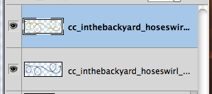
Right click on the string’s layer in the Layers Palette, and choose to Create Layer. This will put the strings shadow on it’s own layer separated from the actual string. This really helps in being able to bend the shadow.

Sdw3

Sdw4

Next, choose the Smudge Tool from the Tools Menu. Here are the settings I have for the Smudge Tool – Size 160, Normal, and 25% strength.

Sdw5

Sdw5a

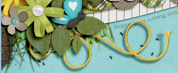
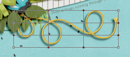
Once you have the smudge tool selected, and all the setting as you like, make sure you have the shadow (of the string) selected in the Layers Palette. Start to “smudge” or move the SHADOW of the string away from the end of the string. It will appear as if it is lifting off the page some. Try to take the lighting into account.
After you have smudged enough and like your look, we have one more step. Choose the Eraser Tool from the Tools Menu. Here is the settings that I will use for the Eraser Tool. For the area that is lifted, I’ve erased some of the shadow – to make it lighter and less defined. As some shadows get further from the paper, they usually become less defined and not as dark as the others that are closer to the paper.
Sdw6

Sdw7

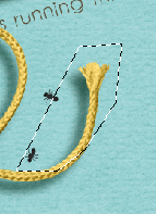
Another way to bend shadows is to use the Polygonal Lasso Tool. With your shadow on a different layer (as done above), create a shape by clicking and leaving anchor points. Click them around the “end” of the string. You will want to make sure be careful and choose your spacing wisely. Here is where I chose to move my string shadow.

Sdw8

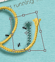
As you look at my image above, you can see that there is an edge where it doesn’t appear to be a shadow and then I surround all of the other shadow and give some space. Once you have connected the shape, you should see the marching ants. Now, you will choose the Move Tool. You will see 8 points around your shape. If you press on the Command (Control on Windows), you get a triangle cursor when hovering over one of the four cursor points. Click on a corner and move the shadow as you like. Continue to do this until you have your string shadow as you want it to look.

Sdw9

Next, same as above, use the Eraser Tool to make your shadow layer appear less detailed and lighter.

Sdw10

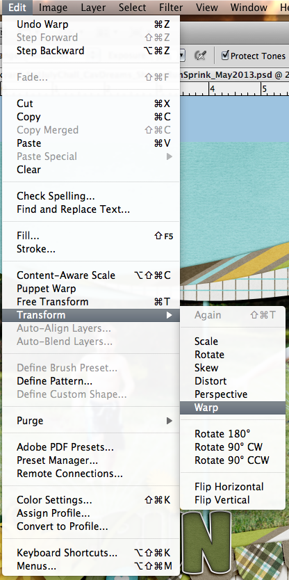
One last way to bend your shadows (that I know) is to Warp them. Here’s a basic how to:

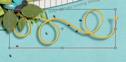
From the Top Menu Bar, choose Edit > Transform > Warp. You will see a square with 9 parts appear.

Sdw10a

Sdw10b

Click anywhere in the box, and slightly move the shadow. Be careful – the whole layer will move. Remember, there is an Undo Button! This takes some practice and getting used to. This is useful when you want to move more than just an end, plus you can move different parts together.

Sdw10c

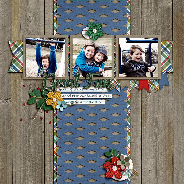
Here it is in action. My layout using At The Park by Chelle, and a freebie template that I got today (7/17) on the scrap Orchard blog from Scrapping with Liz. I used the Polygonal Lasso Tool for my page. I actually lifted both ends of the string.

SO_AtThePark_SwlBlogFree_ParkDayGoodFun_LDLittPiggy_Apr2013_WEB

Screen shot 2013-07-17 at 9.14.28 PM

Here is another layout from Leslie (lab130) that she created using On The Water by Chelle. She smudged the banner and word bits.

24583

Those are the three ways that I’ve come to rely on – there are so many ways to do things in Photoshop, so play with these, and give it a try!  Have a great day!

Jenn (jk703)

by_Jenn

Tutorial: Adding Warmth to Photos

Tutorial: Adding Warmth to Photos

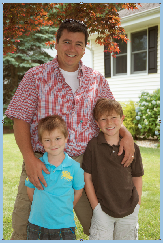
Happy 4th of July to all those who celebrate! Hi Everyone – it’s Jenn, aka jk703 here with a quick tutorial!  So much is going on, so I won’t keep you for long. Adding warmth to photos are super easy to do… and can really make a cooler photo look nice and warm with a sunny feel. Sometimes shadows, clouds, and skin tone will look a bit blue… so this will help you change it a little. This little tutorial can also be done for many other color changes for photos.

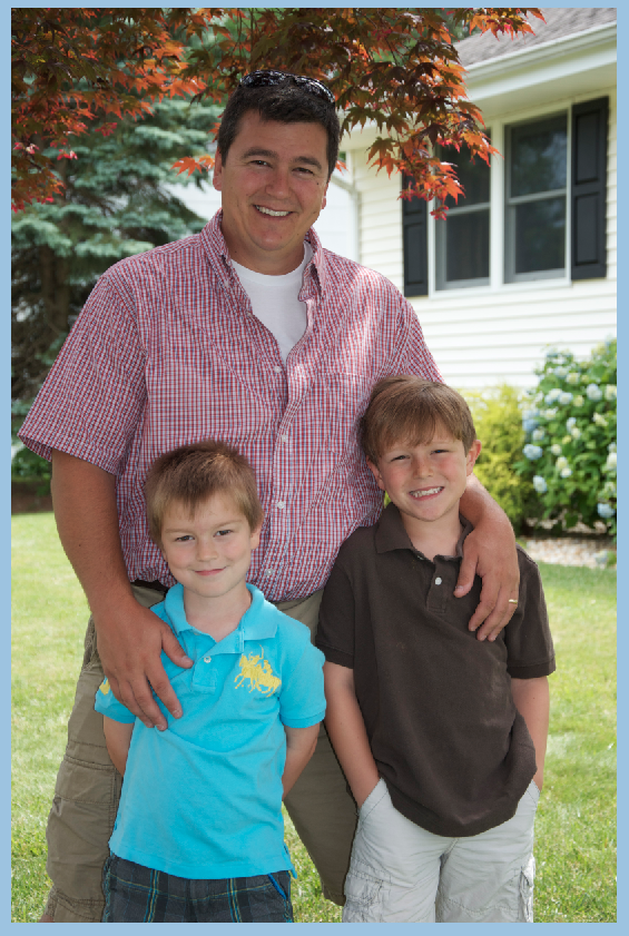
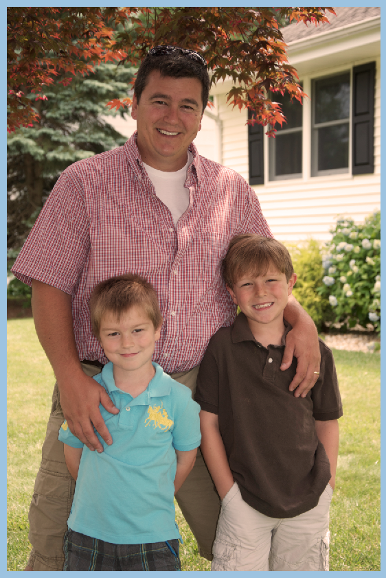
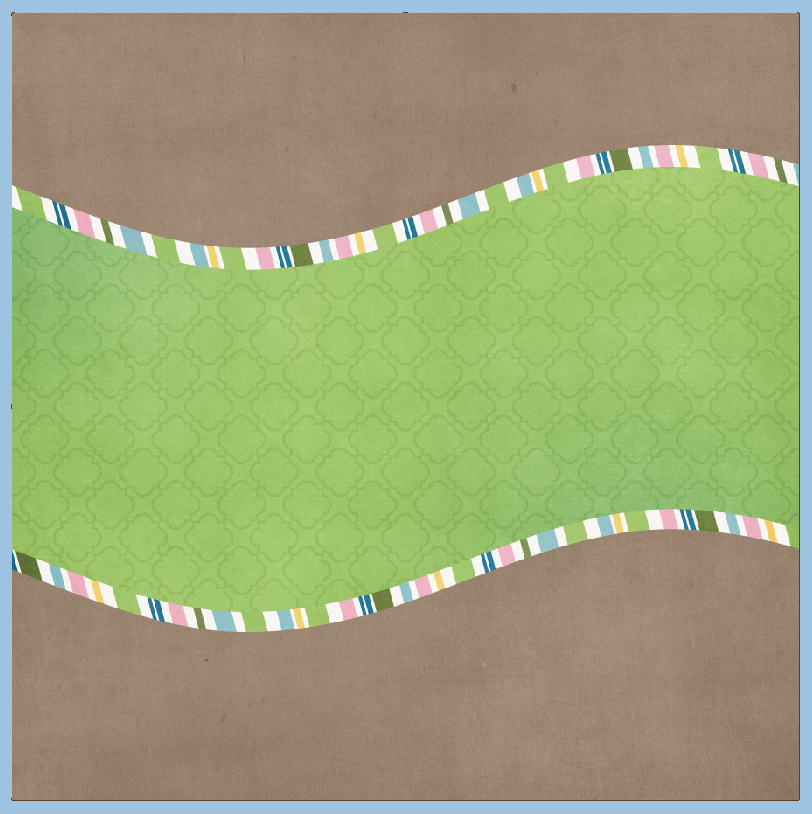
Open your image and re-save it. This was you will have your original available if you need it later. Here is mine of my boys on Father’s Day this year. Not a bad picture, but I like my images a little warmer most of the time.

Warm 1
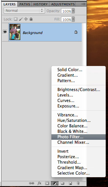
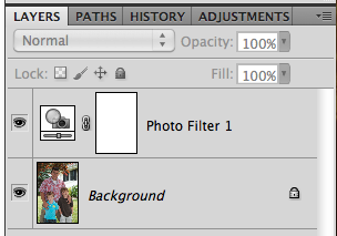
Next, on the bottom of your Layers Palette, there is a black and white filled circle. Click on that and the Adjustment Layer options will pop up. Choose Photo Filers.

Warm 2
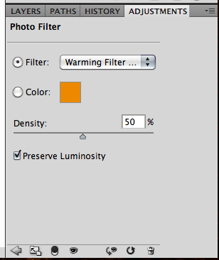
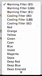
You will automatically be looking at the Adjustment Palette. you can click drop down menu next to “Filter.” There are so many options available to you to enhance your photo. You can also use a specific color by clicking on Color. You will then get an option to change the color by double clicking on the color box.

Warm 3
Warm 4

I’ve chosen the first warming filter, and have moved the opacity to 50%. Then you are done!
Here is my image… and my Layer’s Palette so you can see what yours should resemble.

Warm 6

Warm 5
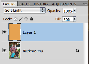
Another easy way to add warmth (or any color) to your photo is to add a layer above your photo. Click on your background color in the Tools Menu. Use the color picker to get a color that you want to add to your photo. I used an orangey color for mine – similar to the one available in the previous adjustment layer. Press Command + Delete to fill the layer with the background color.

Warm 7

Next, change the blend mode to Soft Light, and play with the opacity of the color layer. You can use any blend mode and opacity combination that you like for your photo. Here is mine – Soft Light and an opacity of 30%.

Warm 8

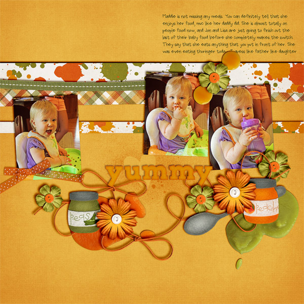
Here are layouts using these techniques from the CT. Here, Jenn (jennschultz) created this layout using First Foods.

yummy-2

Here is her original picture:

IMG_0176

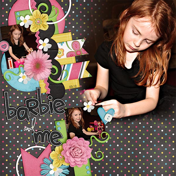
Next, Kayla (keepscrappin) made this layout using Girlfriend, Toadally, and Toadally Add-On (and a Little Green Frog Template too!)

BarbieNme_Mar12_web_zps3ec1b8ab

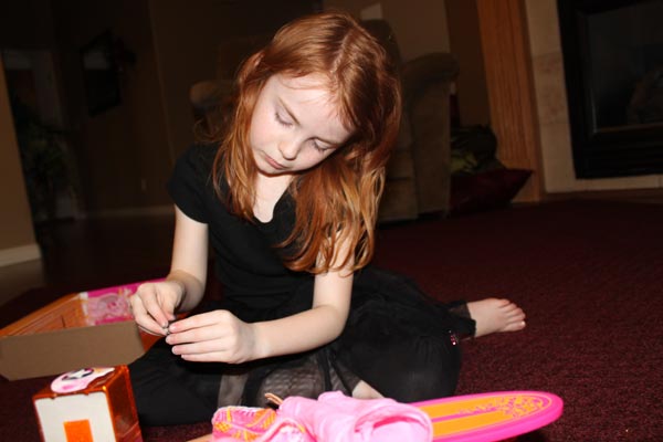
And Kayla’s original image:

IMG_3609_before_zps9837b5a1

There you go!  Simple and super fast too! Thanks for stopping by today, be sure to keep checking everyday for Chelle’s freebies for the month of July! Have a great week!

by_Jenn

Text on and in a shape in PSE

Text on and in a shape in PSE

Hello Scrappers!  Leslie (lab130) here and I have a tutorial for you! Last month Jenn (aka JK703) did a great tutorial that taught PS users how to make text go around or in a shape. This month I want to let PSE users in on the action.   This tutorial uses PSE 11, but PSE 10 can do these things, too; though the selection of shapes it can put text within is more limited.

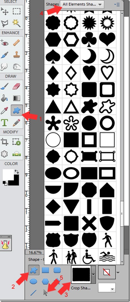
Ok, so let’s go!  Refer to the image below for reference!

Text-on-Shap-tutorial-PSE-11

Text around a shape
PSE only has the ability to write text inside a few of its default shapes, so I’m going to select a few of the simpler ones.
Get your project ready and go to the shape tool. In PSE 11, it’s in the ‘DRAW’ section of tools to the right of the eye dropper (1) .   Here, I’ve selected a custom shape, which looks a bit like a blob (2). Once you select it, select your crop shape (3).   I have “All Elements Shapes” selected (4).  Did you know you had all those shapes at your disposal? PSE only has the ability to write text inside a few of its default shapes, so I’m going to select a few of the simpler ones.
Draw your shape. When drawing your shapes, if you want to keep the aspect ratio the same as in the example (keep a circle circular, for example), hold down the shift key as you draw.  Don’t simplify your shape yet!  If you have, just undo!
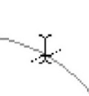
Make sure your shape is selected in the Layers panel. Now, select the Text tool. Take your mouse and over over the edge. Did you see the icon change? It looks like an I-beam with a wavy line going through it.
Text9
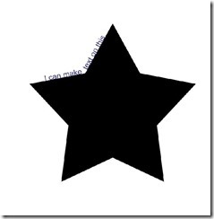
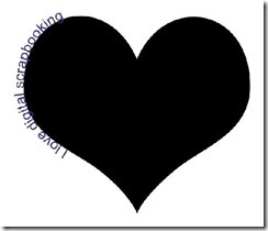
If you click on the shape, you can now type around the shape!  If you don’t like where the text starts or stops, or if you want the text on the outside of your shape, go and select the Shape Selection tool (4). Drag your text to the outside of the shape, or drag the little circle that was created at the beginning of your text path to get the text where you want it.  Give it a try!


Text on a shape #2 Text on a shape #1

Text within a Shape
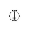
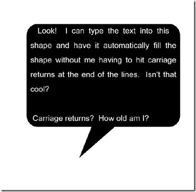
Again, draw a shape, or use the same one you used previously. Again, don’t simplify the shape. Select your text tool and drag the cursor inside the shape.  It should change to an I-beam with a dotted circle around it.

Click in the shape and start typing your text!  (HINT: If you don’t want your text to quite come as close to the edge as it does by default, select your text layer after having committed the text. Then hold down the ALT key while dragging one of the corner grips in.  That will resize the text box from the center and make sure that it stays nice and centered within your shape!).

Text on a shape #3
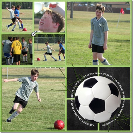
2011-Spring-Soccer-Matthew


image

image

I hope you find lots of fun and creative uses for text in and on a shape on your scrapbook pages!

leslie

Tutorial: Stickerizing!

Tutorial: Stickerizing!

Hi Everyone!  It’s Jenn, aka jk703, here to get to to Stickerize!!! Stickers were a part of my scrapping when I was a paper scrapper. Even lifting them with pop dots or adding them behind photos – they seemed to always be on my pages! BUT, once they were down, you couldn’t move them around! Well, that isn’t the case in digital scrapping! Yay! Here are a few ways to stickerize your layouts! For my layouts, I’ve used Chelle’s Girlfriend kit.

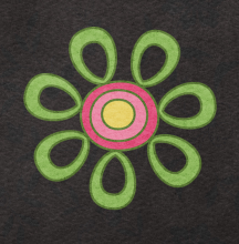
Adding a stroke to a font, or doodle is easy and makes it look stickerized. First up, doodles.

Stick01

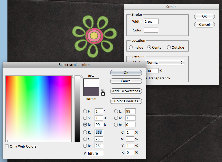
1. With the doodle selected in the Layer’s Palette, choose Edit > Stroke.
Stick02

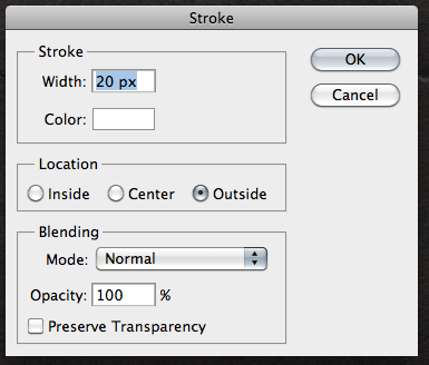
2. A new menu will pop up, and you will want to choose white as the border for your doodle. Once white is chosen, you can also choose where the stroke’s location will be from – center, inside or outside. You can also indicate how thick of a stroke you want by noting the number of pixels. Keep the blend mode normal, and the opacity 100%.

Stick03

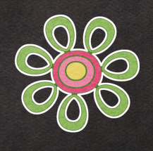
Here is my doodle with the location set to center and it is 10 pixels:

Stick04

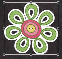
Here is my doodle with an outer location, and 20 pixels. These options are totally customizable for the look that you want to create.


Stick04a


So simple and pretty easy to add a sticker to you page. Right?! Next up, adding a sticker look to felt. Sometimes when I was paper scrapping, many stickers were “realistic” or appeared to be on stickers, but they were flat. Here is how:

1. With your felt ellie selected in the Layer’s Palette, double click on the image’s thumbnail. You will see marching ants around the object.

Stick05

2. Press D on your keyboard to set your default foreground and background colors.
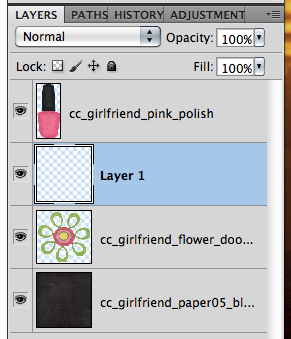
3. Insert a new layer under your felt ellie. You can do this by pressing Command + the New Layer icon (Control for Windows) and it will be under your selected layer.

Stick06

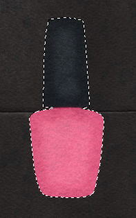
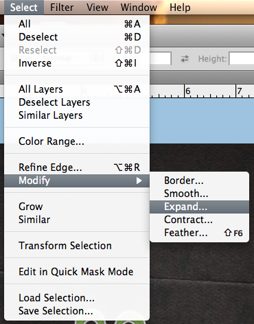
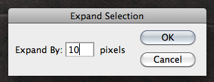
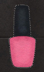
4. With your new layer selected, and your marching ants still marching, choose Select > Expand from the menu. You can enter eny number… I have 10 pixels.

Stick07
Stick08

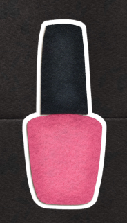
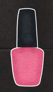
5. You will see the marching ants expand from the original selection by 10 pixels. Press Command + Delete to fill the marching ants on your new layer. Here is what the before and after looks like, and then another with a 20 pixels expansion and a shadow on the felt layer.

Stick09

tick011Stick010


That was another easy way to add stickers to felt!

One last way to stickerize…. fonts.

1. With the type tool selected and you’ve chosen your font, size and color — type what you would like stickerized. I’ve written the word sticker, and my font is Futura.

Stick012pre

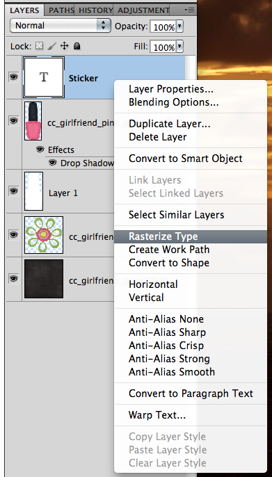
2. With your Type selected in the Layer’s Palette, right click and choose > Rasterize Layer.

Sticker012

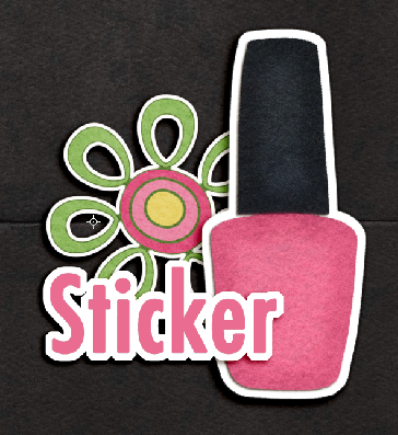
3. With the type layer still selected, choose Edit > Stroke. For this part of the tutorial, I have 20 pixels, outside location, 100% , and Normal. Here is my Type with the stroke added.

Stick013

Sticker014

Layer them up and you can cluster with the best stickers. You can be creative with what you make stickers out of, and you can always use that undo feature! Stickers can be fun because you can layer and layer…. so, get to stickerizing!

Sticker015


Here is what a couple of my fellow CT members came up with the Tutorial: Stickerizing!

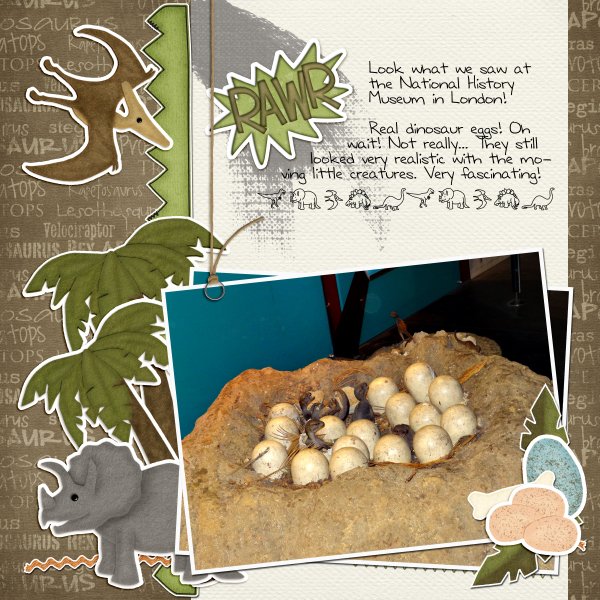
By Samantha, using Prehistoric:

Dino

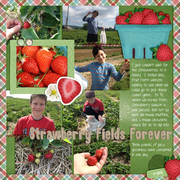
By Leslie, using Berry Berry Sweet, and DJB Britanny Print.

2013-06-Strawberry-Picking

Have a great day! Thanks for visiting!

by_Jenn


Tutorial: Adding A Paper Overlay to a Photo

Tutorial: Adding A Paper Overlay to a Photo

Hi Everyone!  Happy Thursday!  It’s Jenn, aka jk703 here to share a super fun technique with you today! Ninety percent of the time, I have photos on my layouts. I’m sure you like to include them from time to time, no?! lol!  Well, what if we add a paper overlay to your photo, and gave it a little pattern or texture. Here’s how:

Open a copy of an image up in Photoshop. Then open up a couple of papers and fun patters to try out! Make sure your are using copies of the images and papers so that you don’t ruin the original versions.

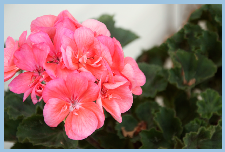
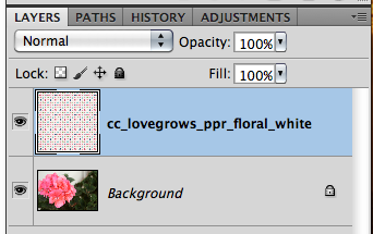
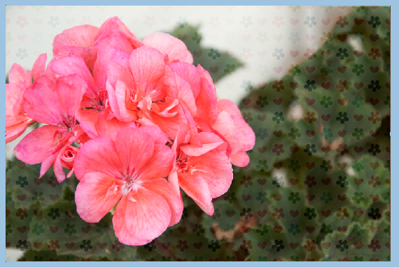
Here is my image and then a picture of my paper layer on top. I am using Chelle’s Love Grows papers.
pattern1

Pattern2

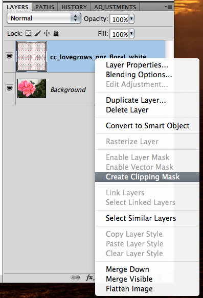
Next, you will clip the paper to the photo. Right click and choose Create Clipping Mask. Pattern3

After you’ve clipped your paper, you will play with the Blend Modes. Make sure you have the paper layer highlighted. Instead of clicking each time to see a new blend, just use a shortcut. To scroll through the blend modes, press Command (Control) and the + symbol. To go the opposite scroll, use the – symbol.

Pattern4

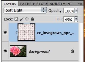
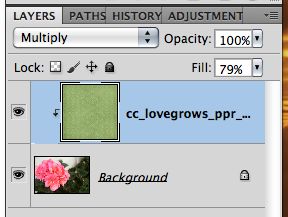
Once you have found the blend mode that you like, you will want to play with the opacity of the paper layer. You can also use numbers as shortcuts to opacity percentages. 9 would be 90%, 6 would be 60% etc. Give it a try. Here is my layers palette and my image at this point. I used the Soft Light blend mode and an opacity of 49%.

Pattern5

Pattern6

Next, you will choose the brush tool from the Tools. With your paper layer selected, change the brush settings to a round soft brush, with a low opacity for strength. Here is what my eraser tool menu looks like.

Pattern7

Now, slowly go over the part of the image that you want to highlight, to remove the pattern overlay. Since I am using a flower pattern paper, I am going to erase the flowers on the flower. (lol) Here is what I have… some flowers are visible on the edges, but not so many in the center. This paper was white with a colored pattern.

Pattern8

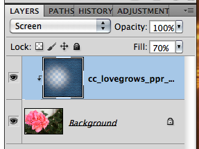
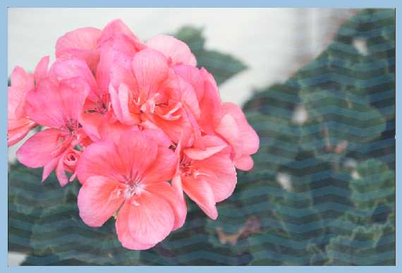
We will see what we get when using other colors and patters now. First up, A dark blue pattern. I used a Screen blend mode, and changed the opacity to 70%  What’s interesting about this pattern, is that it gave my photo a cooler appearance. So, you can always use a colored paper to get a closer color to the kit you are working with. Pattern9

Pattern9a

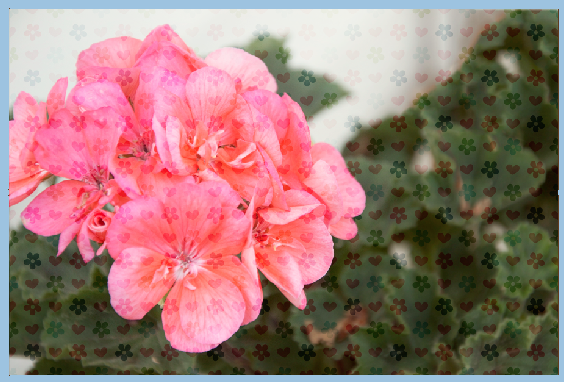
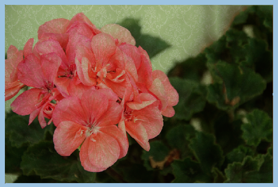
After the blue, I decided on a green paper. Check out this change – I love it. It sort of gave my image a little bit of an antique, grungy feel. I think the pattern looks cool on the flower, so I didn’t even erase it. It adds a dramatic tone without much effort.

Pattern9b

Pattern9c

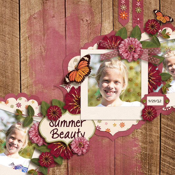
I shared this technique with the CT, and Karen (karen32) came up with such a pretty page… She used Chelle’s Indian Summer and it just looks wonderful. Can you see the flowers on the pictures? So subtle, yet it adds a little fun to the page.

Indian_zps7c05dbb8
Adding a paper overlay to a photo is really easy, creative and lots of fun. I know I would love to see some pages in Chelle’s gallery with this technique!  I hope this was a lot of fun, and super easy. Thanks for visiting!
by_Jenn
Jenn/jk703

Tutorial: Text On/In a Shape

Hi Everyone!  Happy Thursday… I’m so glad it’s almost Friday!  It’s starting to get warmer here, though we’ve seemed to skip Spring a little – we jumped from 60’s to 80’s in days… and I’m already tempted to turn on my air conditioning! That’s early for me in the Northeast!

Ok… onto the tutorial! Text On/In a Shape is fun! I love being able to write within a shape or around a shape in Photoshop. It’s one of my favorite features. I’m going to show you how to do this… easily. Here goes… For my layout , I used Chelle’s Toadally Add On kit – it is a fun one, and much more versatile than you might think! Here is what I’m starting with. I’ve used the shape tool to make  my paper layers.

Text1

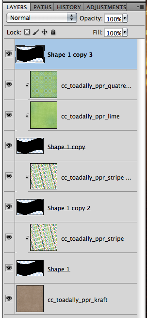
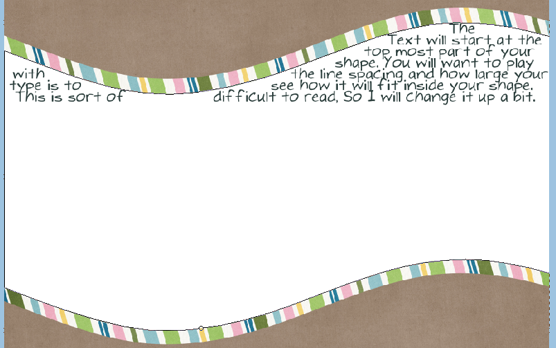
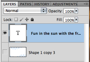
Now, I’m going to duplicate one of my shape layers and use that as a basis for making a path for text. You can duplicate a layer by right clicking on it, and choosing Duplicate Layer. Here is what my Layer’s Palette looks like.

Text2

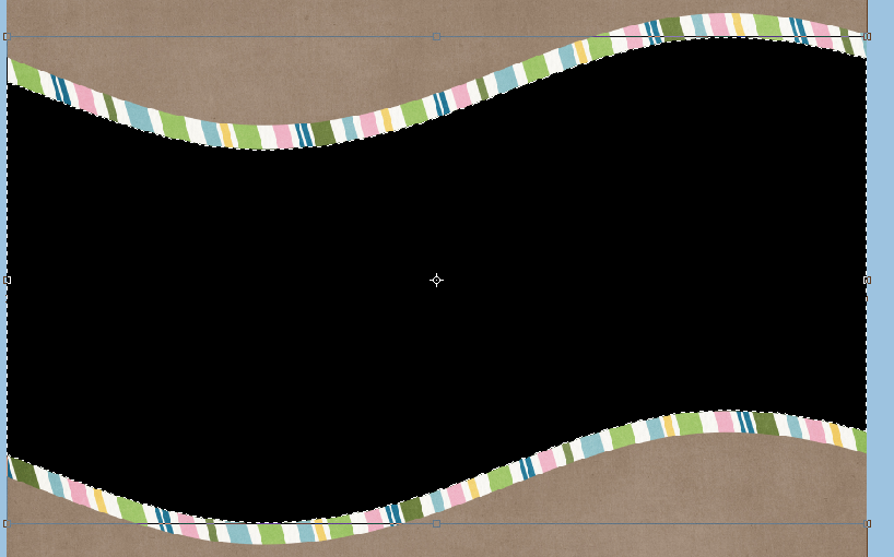
Once I have my shape in my Layers Palette, I chose that layer and double click on it. You should get the marching ants around your shape.

Text3

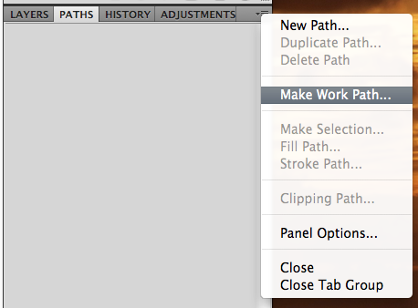
At this point, you will want to pull up your Paths. You can find this in the menu bar under Window > Paths. Mine is set to be open with my Layers Palette, like this:

Text4

Click on the small lines and triangle in the top right corner, and choose “Make Work Path.”

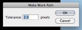
Next pop up with be about Tolerance. A lower tolerance number will create a path with many fixed points, and the path will be very precise to the shape that is sele.cted (your marching ants). The bad side of a lower tolerance can cause too many problems with your text fitting into the shape evenly, and may look a bit garbled. A higher tolerance number will create a path with fewer fixed points, and the path will be smoother.
Text5
Text6
Choose the Type Tool.  Text7

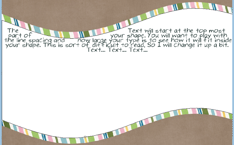
If you click within the shape a cursor will appear, and look as if two parenthesis are surrounding it. This just means that the text will be INSIDE the shape. Depending on your shape, this might take a little playtime figuring the size and spacing of your text.

Text8
Text8b
Text8a

If you click on the shapes edges, you will see a cursor with almost a tilda going through it. One tip when working on the edges with text. Take a peek at your setting in the Paragraph Tab, so that you know if you are typing centered, left edge or right edge. Click at the point where you want to start typing, and the text will go around the whole outside of the shape.

Text9
Text9a
Once you have entered your text, and clicked the checkmark, you will want to find the shape in your Layers Palette. Click on the little eye and turn off that layer’s visibility. Now your text is stand alone.

Text11

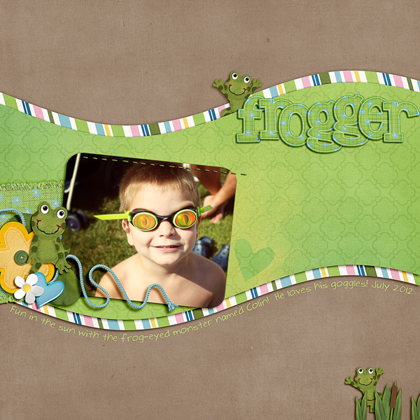
You can use the move shape to move it around a bit, or to even make it larger or smaller a little. Here is my final layout:

SO_CC_ToadallyAO_WMTypativeTall_Frogger_ColJuly2012_WEB
I hope that was super easy, and simple to follow!  Have a great weekend!
by Jenn
Tutorial: Making a Quick Page

Tutorial: Making a Quick Page

Hi everyone…it’s Jenn, aka jk703 here for today’s tutorial! I’ve made many layouts and I’ve printed and framed some. They get attention from my family, friends and other visitors to my home. One closes friend of mine really loved a layout of my boys, and wanted make one with the different kids in her family. Since she had her pictures, and was able to use Photoshop, I decided to send her a Quick Page.  She could then insert the kids for her sister’s family, save, and make another copy for her brother’s family. It worked perfectly. Anytime you create something for another person, be sure you read the designer’s TOU to see if acceptable. If you are not allowed to send a Quick Page, then you can finish for yourself. Then ask for your friends pictures, add to your saved Quick Page, and send the flattened jpg file for printing and framing. So, today I thought you might like to learn the steps for making a quick page!

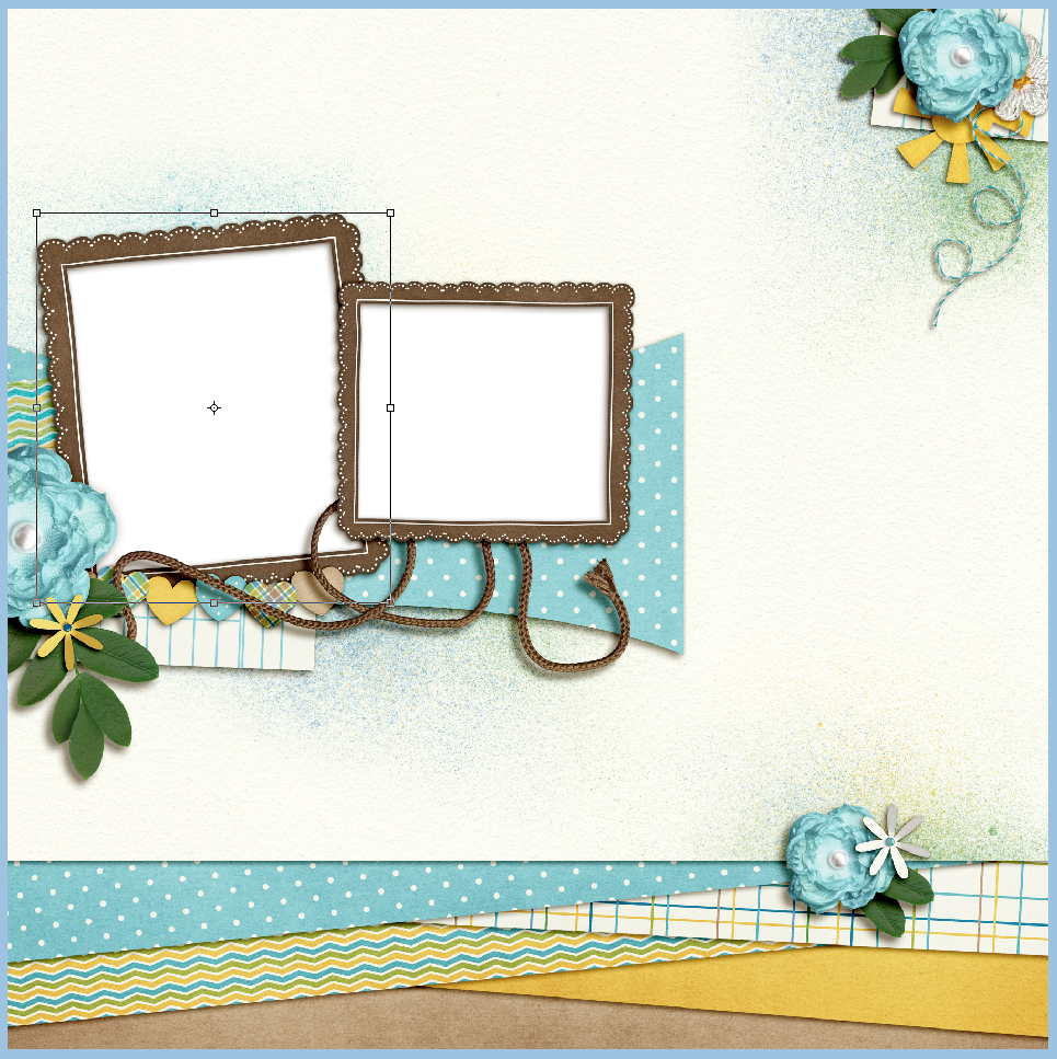
Once you’ve completed your layout, save it in it’s layered form. Here is mine, using Bluebirds by Chelle, that was recently available at The Daily Digi.

Screen shot 2013-05-08 at 10.04.40 PM

When you are working on making a Quick Page, you want to remove all personal details – such as any text, the photos, and the title. Here is mine a bit more bare.

Screen shot 2013-05-08 at 10.05.35 PM

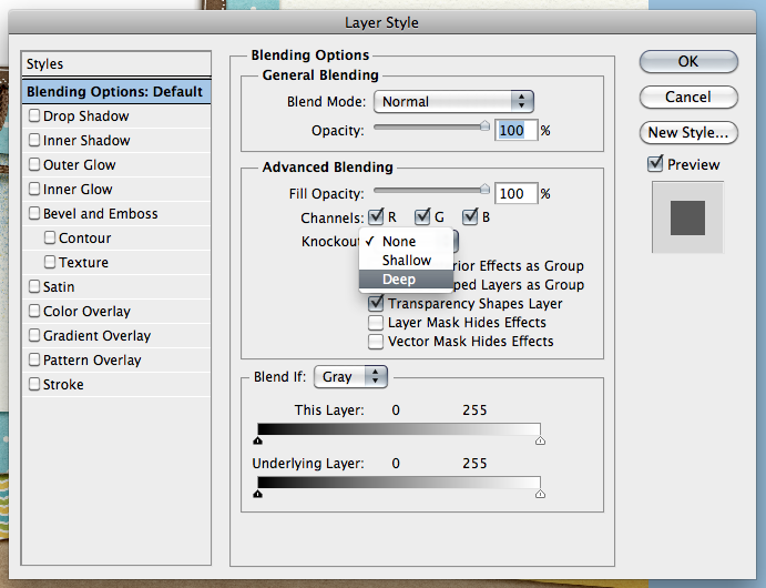
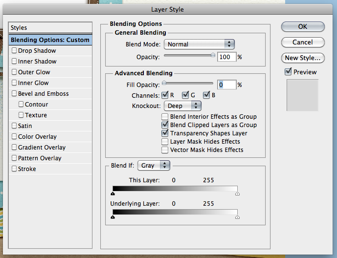
We need to make the filled frame masks transparent so that other people’s images would be able to be seen. Find one of the photo’s clipping masks and double click on it in the layers. The Style Menu will pop up. Once it does, there are two things that need to be changed. On the first screen, click on the Knockout. Choose Deep. Next, on the Fill Opacity, slide that arrow to 0%. If you have Preview clicked, you will see that the clipping mask will instantly become transparent. Here are the screens up close:

Screen shot 2013-05-08 at 10.06.25 PM

Screen shot 2013-05-08 at 10.06.37 PM

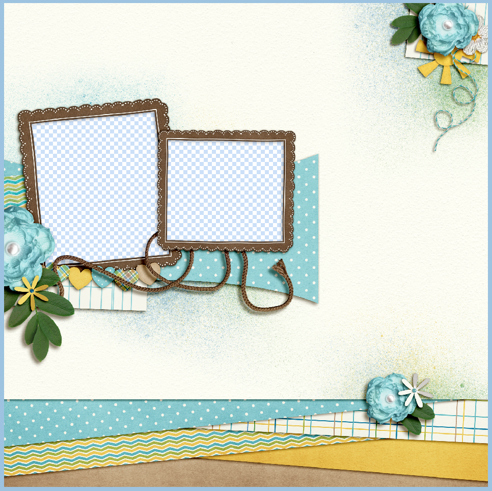
And what my layout looks like, open in Photoshop.

Screen shot 2013-05-08 at 10.07.05 PM

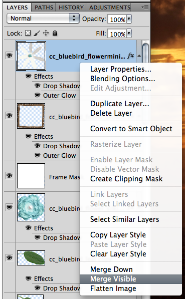
Next, you will go to the topmost layer in your Layers Palette. Right click on the layer, and choose, Merge Visible. Here is that menu:

Screen shot 2013-05-08 at 10.07.32 PM

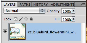
 Once you have merged the visible layers, here is what my Layers Palette looks like:

Screen shot 2013-05-08 at 10.07.49 PM

After you have completed this, you can then save your new Quick Page. Be sure to save it as a PNG image so the picture boxes will remain transparent. That’s it! Here are some layouts the CT made just to inspire you today!  :)

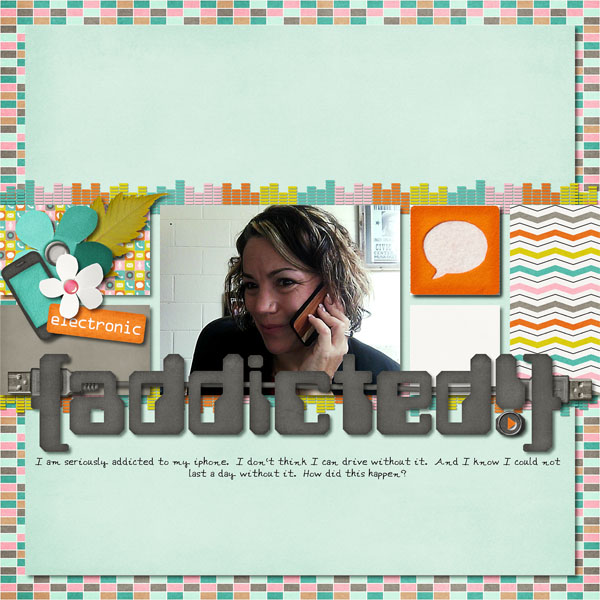
Lynette made this page using Chelle’s Technogeek Mini   and the Collage Templates (Long).

addicted_zps97e2ab96

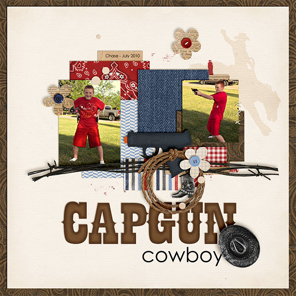
Kayla used Yee Haw Bundle, Ready Aim, Fire Felties, and Letters from Home for her creative layout.

CapgunCowboy_July10_web_zps597f57e2

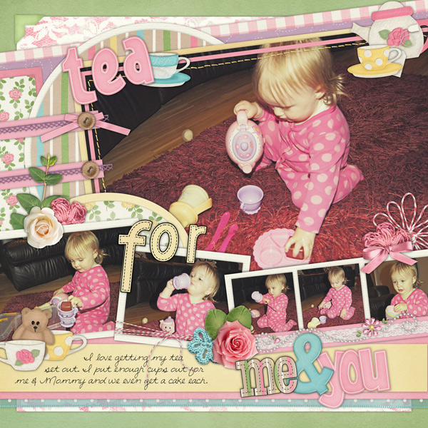
Lastly, Helen made this precious layout – she used  Tea for Two, Boing Boing Alpha Doodles (CU), & Dots and Dashes Alpha Doodles (CU).

Helen-tea-for-two

There you have it… a quick way to make Quick Pages… and some lovely layout inspiration!  Be sure to come back later in the month to see what else you can do with Quick Pages!

Thanks for visiting!

by Jenn