Illustrator Pattern Maker | Digital Scrapbooking Tips & Tutorials

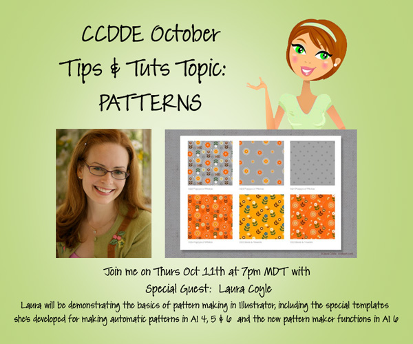
I’m so excited about the Tips & Tutorials Webinar coming up next week!  We’ll be checking all of the ways to create patterns in Illustrator, including templates that make “pattern maker” functions work in AI4, 5, & 6 and the new pattern maker functions in AI 6.  Come join Guest Speaker Laura Coyle & I on Thursday Oct 11th at 7pm MDT.

Designer Tips & Tutorials Webinars are one of the features of my Designer Edition club.  Join the Club!

Fonts! Fonts! & More Fonts! \ Digital Scrapbooking Resources

Hi Gals! Fonts make me giddy with excitement. They make me want to jump up and down. I don’t know exactly why, but I love ’em.  I’m that person at Staples who buys the CD’s of fonts. I download them whenever I run across any new fonts. It’s hopeless I know! I’m a font-a-holic! If there were a 12-stop program, I would never get past step 1. LOL My personal favorite font is Janie HMK and a new one I found this year, St. Nicholas.

  • Katie at The Daily Digi offered this list of great fonts for scrapbooking. She also had a posting for great fonts from the previous year, you can check them out here.

Our CT Ladies not only gave us inspiration LOs, they also gave us information about their fonts. Let me share them with you now.JennV (jennv): I have several favorite fonts to journal….I’ll admit I like a good somewhat plain font that is easy to read as I usually write LOTS of journaling. The font is I use the most often is SlimSans Serif (what I used here for the journaling). I also love the bold version of it that I used here as my subtitle. Two other fonts I use often are Pea Alisha…use this especially for journaling my dates, locations, etc. And I always love a good typewriter font and my current fave is L.C. Smith 5 Typewriter that I used here on the label. Here are the links for them if you need them.

Jenn V (jennv)


Moving on to Mel B (prettypeaches) and her favorites. I absolutely LOVE the font sf Natalie.. It was a freebie font that I found a few years ago.. Sadly its no longer available to download anymore, as the blog that I downloaded on, is no longer around :( I  used Toadally Bundle and Toadally Add-On for this LO.


Mary (plumdumpling) blogged

  • I love Slim Sans Serif like jennv. It’s such a great font to fit in a lot of journaling without looking too crowded.
  • Some of my go to fonts are default fonts that come with many programs. I love Century Gothic for a simple, uncluttered look. For layouts that require a serif font, I usually go to Perpetua or Georgia.
  • My favorite typewriter font is Rough Typewriter. http://www.dafont.com/rough-typewriter.font. It has an uneven baseline and if you double up on a letter, it has two options of the letter. Does that make sense? Like if I write look. The second o is filled in and looks different from the first one. Very fun.
  • For kid layouts where my journaling is written from the child’s perspective, I like to use a childlike font. One favorite is WM2_NowWeAreSix. Link here: http://scraporchard.com/market/wm2-n…scrapbook.html

Hope you all enjoyed the LO’s and the fonts.

Until next time, Hugs!


Scrap Skills: Using Paint

Hi all! It’s Cheryl again with another Scrap Skills post for you. Today, we are going to look at using paints  or spritzes on our digital scrapbooking pages. Paint splatters can add a significant amount of texture to a page, and they certainly add interest and depth. But, a paint splatter added poorly can ruin a page, just like a paint splatter in real life, right? Once again, Chelle’s video tutorials can save the day. She has a tutorial here entitled Tweaking the Marker Alpha, and it is certainly perfect for her Marker Alpha. She describes how to achieve the effect of the marker “skipping” over the edge of a paper slightly as it would if you were to write with marker on your page. But watch it again, and this time keep in mind how you could apply the same techniques to a paint splatter because the same things happen to both in real life.

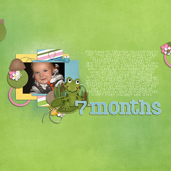
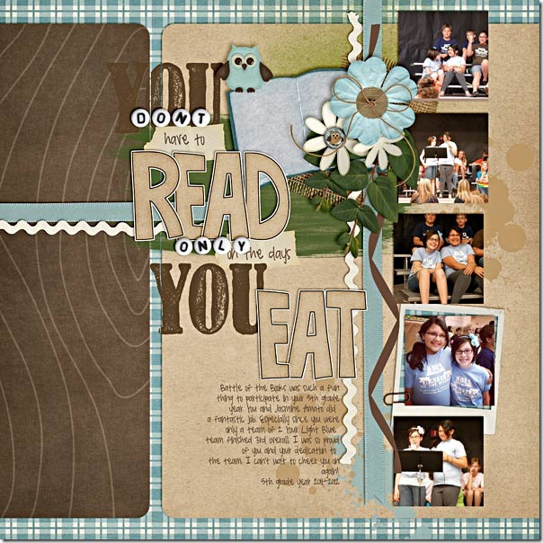
Here are some examples of pages created by members of Chelle’s Creative Team to highlight the use of paints and spritzes on a page. Melissa’s page has the paint spritzed behind the photo, so she didn’t need to worry about the effect of the paint crossing a paper boundary. She used the paint to add depth and color to the solid background and to highlight the blue colors on the page. It gives her page much more texture than it would have without the paint. 7-Months-Old-RS_zpsd9655034MelissaNext, Roxana used the paint similarly to Melissa, but in this case, she recolored some of the paints and she used them on a patterned paper background. This keeps the area adjacent to the photo from being too busy and distracting for the photos. She also adjusted the blending mode to allow some of the paper pattern to peek through the paint.22-halldecor-web_zps0d88ab9dRoxanaFinally, Shanell made a page for us, and she really went crazy with the paints. She used both the techniques shown above and the technique in the video tutorial. See if you can find all the paints on her page! But, notice how the green paint smear behind the title has a slight gap in it at the place where it crosses the brown paper edge. Notice also that she erased a thin stripe through the “Y” in the stamped word “You” where it was stamped on the edge of a digital paper. It is this attention to detail that makes her page seem like you could reach through your computer screen and feel its many textures. battle-books-round-3_zpsbbe01f66Shanell

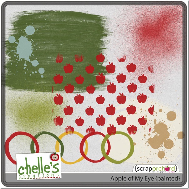
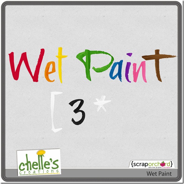
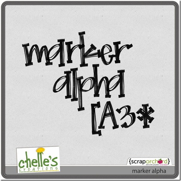
I hope you’ve been inspired to try to add this touch of realism to your layouts. Here’s a closer look at some of the items in the market so you can give this technique a try on your own pages. cc_applemyeye_paintedcc_wetpaintcc_marker_alpha_preview

Unlikely Pairs: Ladybug Hugs & Apple Of My Eye | Digital Scrapbooking Kit Combinations

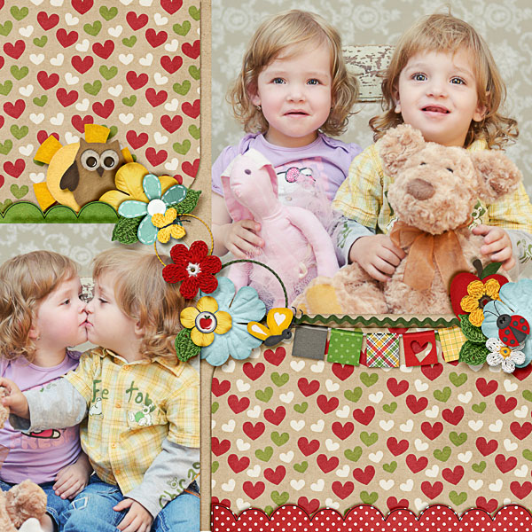
Hello Everyone! Today we are looking at some LOs comparing two of Chelle’s recent kits: Ladybug Hugs & Apple Of My Eye. These two kits are so cute together. Dagmar (dagi) one of our guest CT members created this delightful LO using them. The top picture shows their beautiful eye’s and isn’t the kiss just adorable? Love the banner and clusters.

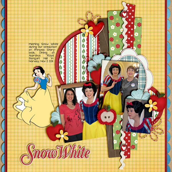
Heather (snowdrop) created this Disney delight with Snow White. Love the clustering, the use of the flower paper, ric rac and the circle full of multi prints, scallop-shadowing on the edges, but my absolute favorite is the mirror in the background reminding us we are all the fairest of them all.

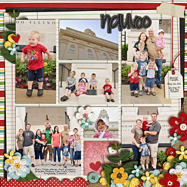
Mary (plumdumpling) show us her visit to Nauvoo, Illinois. Love the sunbonnet on the little girl. What a cutie! The cluster on the bottom right where she combines all the elements from both kits. A lovely family LO to match the tag inviting us to join them them as they “love to see the temple.”

These layouts will surely give you many ideas for ways you can combine Chelle’s Creations. Just click on the image of Chelle’s products. I’ve linked them up for you.


Hugs!


2013 Calendar Playdate | Digital Scrapbooking Inspiration

Hello Ladies! Calendars…. I love ’em. I hang 1 in my bedroom, 1 in my kitchen, 1 in the office, and I use 2 for work. I love to put stickers on my calendars to mark the passage of time until the next payday. I use the “event planner” in Hallmark Card Studio 2012 to enter all the birthdays and anniversaries in my extended family. It keeps track of that information for me and I can print any calendar in the past and future and it updates all the information. I could print the month I was born. So… I’m going to be figuring out how to use that calendar and use Chelle’s toppers. A goal for me.

It’s the Orginal Scrapbook Expo this weekend and the first Digi Scrapapalooza: Utah 2012. So we’ve had a light week. We weren’t able to send out a newsletter this week (9/27).

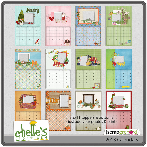
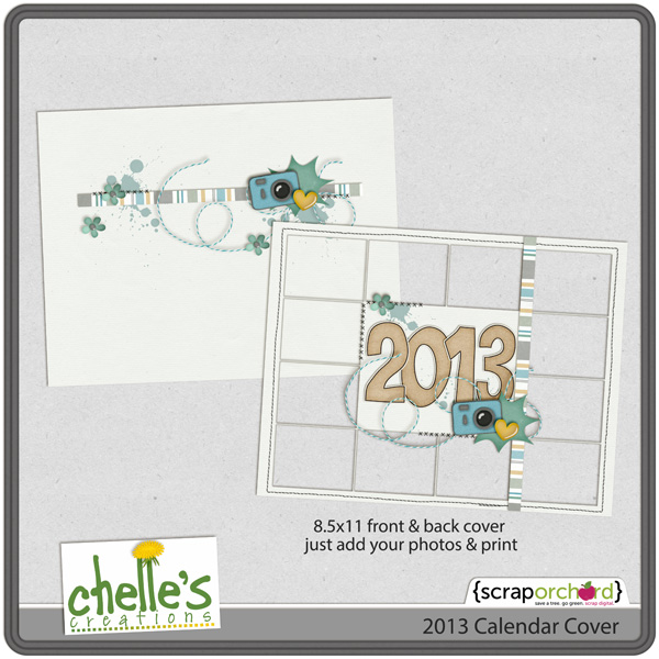
Let me show you Chelle’s 2013 calendar’s that you can add your images to. 

For our CU Friends, we have CU Retro Alpha Doodles.

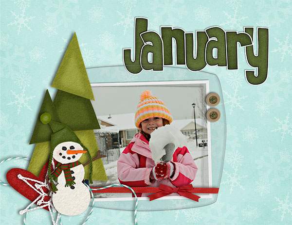
Kayla (keepscrappin) made a calendar front & back freebie for us. Just click on the image to download it.

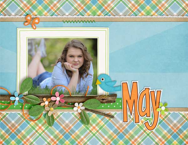
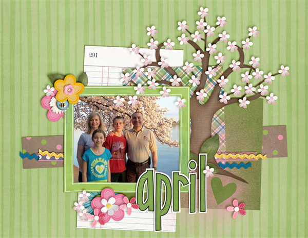
Topper Inspiration:

Kayla (keepscrappin)

Ronnie (Ronnie_Texas)

Jan (QuiltyMom)

Erica (stanworth)

Heather (snowdrop)

Ophelia (navaja77)

Hugs!

October 2012 Desktop Freebie! | Digital Scrapbooking Freebies

Wahoo! I just love fall… the fresh, crisp air; the warm days and cool nights; the colors – oh my! We went to the apple orchard today and came home with a 1/2 bushel of apples. I made apple crisp – a favorite fall treat around here!

Of course, that inspired October’s desktop:

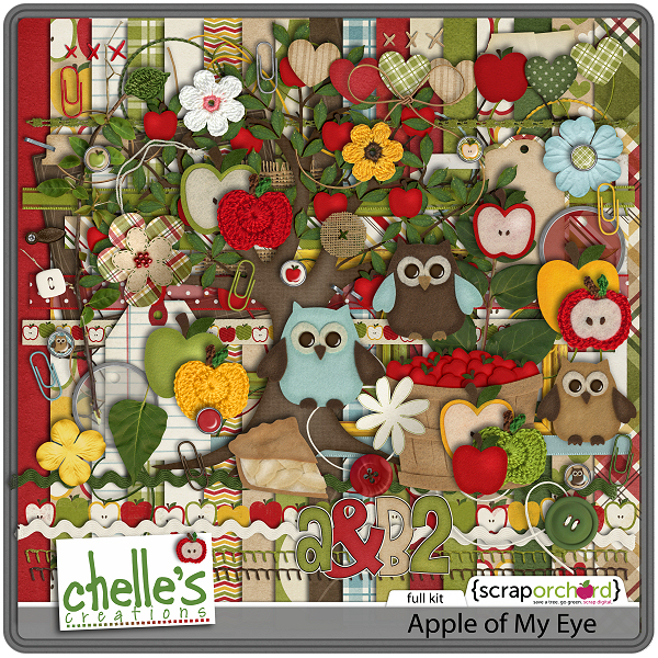
It was created with Chelle’s latest kit: Apple of My Eye – one of my favorite topics and sure to be my favorite kit! You can grab it in Chelle’s ScrapOrchard shop. Just in case you haven’t see it yet, here’s a preview:


Download a zip file with three sizes here.

Hope you’re autumn is as lovely as mine!

Tips for Cell Phone Photos | Digital Scrapbooking Tips

Hey Everyone – hope you are having a great week!  I’m Jenn, aka jk703, here for some Cell Phone Photo Tips.  Many people nowadays have phones that have a multitude of functions, and one of them is taking pictures. While taking pictures with your phone is a great idea, it made me wonder about the picture quality and if I could use them on my layouts. The short answer – YES!  We can use our cell phone pictures for our layouts, but should watch the sizing/quality of the photo if you will be printing your pages. This will be pretty straight forward, and easy to follow.

Here are my Top 5 Tips of taking photos with your cell phones…

1. Good Light
2. Get Close and Closer
3. Don’t Zoom
4. Take Lots of Pictures, Keep Them All, and Edit Later
5. Stay Still

Go Toward the Light!

Get as much light as you can when taking pictures with your cell phones. The sensors on our phones are smaller than regular cameras so the more light the better. Natural light is better, and most times you want the light in back of you or from the side. If your phone has optional flash, give both a try on and off. Sometimes when using my phone, I find that my editing can help a little with the lighting. I also usually tend to avoid direct sunlight, as the camera cannot focus well. Another feature that some phones come with is Adjustable White Balance. If your phone has this, experiment with it. It allows for changing or modifying the color balance.

Up Close and Personal

I’ve taken pictures and then looked at them, and thought I was a lot closer than the image portrayed. Phone cameras don’t blur backgrounds, and that can be done later on. So, with that in mind, you may want to fill your frame with your subject, and get closer than you normally would or think you should.

No Zoom, Zoom

Right now there is a feature on most phone cameras that allows you to zoom in closer, without you being physically closer. Digital Zoom.  Avoid this option. Basically, your images will lose quality, and become increasingly pixelated if you use this function. If you take your picture, you can zoom in later on when editing. If your camera is newer, or has the Optical Zoom feature, then you can zoom – as Optical Zoom doesn’t enlarge your image by enlarging the pixels.

Mistakes?! Keep Them!

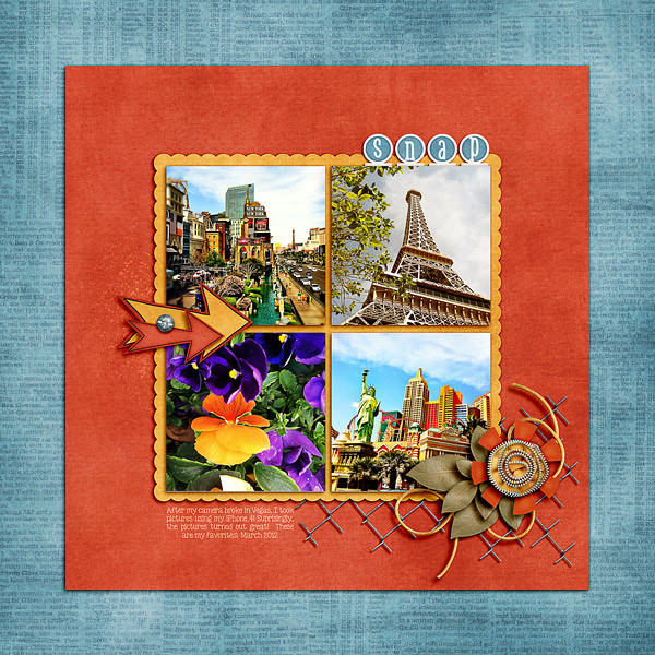
Take lots and lots of pictures and keep them all. You never know when a mistake will be salvagable or fixed with a little editing. Plus, you’re looking at your images on an extra small screen, so wait to check them out on your computer later on. There have been times that I’ve taken pictures and I know it looks horrible on my screen, but when looking at the bigger picture, it is workable. Case in point is one of the photos in my layout below – the Statue of Liberty had a paper blocking the lens. Keep any and all photos until you’ve seen them on your computer. With this in mind, also make sure that your phone isn’t too stuffed with apps, and other things and there is room for your pictures.

The Hard Part – Stay Still!  

Cell phones have slow shutter speeds, mostly. So, try to have a steady hand when taking your photos to prevent blurriness. While you want to have the highest setting for resolution set on your phone, a lot of times, you can improve the shot by just staying still. As much as possible…. this is especially important in low light settings. A quick and handy tip is to rest your hand taking the shot against a non-moving solid item. By this, I mean a wall, tree, table, anything that is solid, and still. Also, when taking a photo, let the camera finish before you move your hand. You wouldn’t want the blurry shot of the ground because you moved your hand too early. The slow shutter speed causes a lag, so let the camera finish it’s work.

Now… I have an iPhone 4, which has a 5 MP camera. Excellent quality for a printed photo is 300 dpi, while 200 dpi is ok, but you would never want to go lower. With my specific phone, I could have  prints made up to 8.5 x 6.5 approx! That is perfect for scrapping. Yes, I might not be able to cover a whole 12×12 page with my cell photo, but that is a pretty large size of space it could cover.

To test out your phone and print qualities before printing layouts, try getting separate orders of phone image prints made and naming your image with the size and dpi. Most places put the image name on the back of your photo when printing. Depending on your phone’s megapixels – here is a approximate reference:

2 MP – 300 dpi size 5 x 4, 200 dpi size 8 x 6

3.2MP – 300 dpi size 6.5 x 5, 200 dpi size 10 x 7.5

5MP – 300 dpi size 8.5 x 6.5, 200 dpi size 12.75 x 9.5

8MP – 300 dpi size 10.5 x 8, 200 dpi size 16 x 12


Now… onto the good parts… Layouts using cell phone photos.  First, is my layout from Vegas last March. My dSLR camera fell and my lens broke on the last day. I subsituted my cell phone to take pictures and was quite surprised with the great pictures I got after I uploaded and did a little editing. The statue of liberty was greyed out some in the corner. For this layout, I used Chelle’s Big City kit.
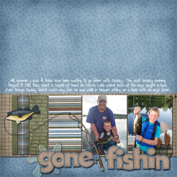
Jennifer (jmljensen) made this fun outdoor page using her cell pictures! Gone Fishin’ was used for her layout.
 Kassie made this wonderful layout with a cell phone photo – and it turned out beautifully. She scrapped using the  Apple of My Eye kit.
Lastly, Kairyn made this fun layout using a lot of her cell phone photos!  So many things to see! She used the Primarily Mini Kit and Build It for her layout.
 There you have it… some easy to follow tips for cell phone photos! So… go get started and give it a try! Thanks for visiting and we hope you come back again soon!

Lists | Digital Scrapbooking Words on Wednesday

Hello Everyone. Today is the first day of my vacation. Tomorrow is the last day. I’m in Rexburg, Idaho, at my brother’s house with his 6 kids. My sister Barb is here also. My brother and his wife are on a adult sleepover in Spokane. So I get to play with my “Little’s.” I also played with them last Saturday. Amazingly enough, my sweet little 3 year-old boy, Zion” managed to give me a fat lip. I was catching him as he came down the slide, and I misjudged. His little head smacked into my face and I bit down really hard on my lip & nearly bit through it. I look like I have a big raspberry shaped stain above my lip, although it’s now draining into my lip.  My list isn’t all that exact, but it is what I think of when I consider my fat lip experience. So, let’s talk lists:

  • owie/ouchie
  • pain
  • ice bag
  • talking out of the left side of my mouth
  • making it difficult to spend all day on the phone at work
  • pain medication

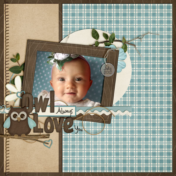
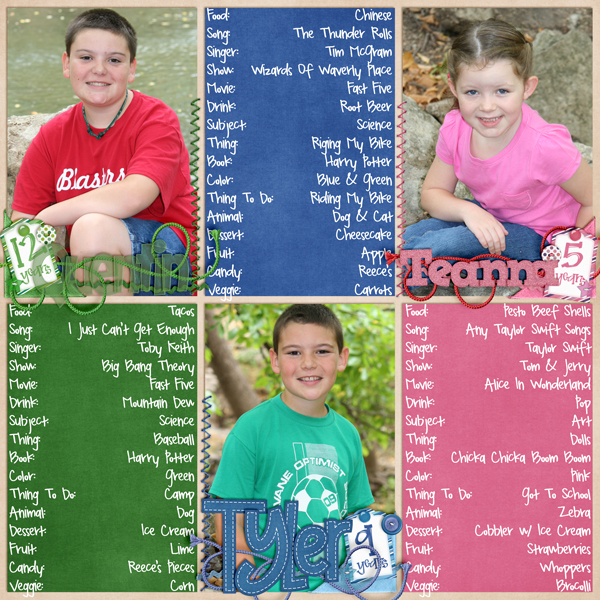
Let me show you the list ideas from the Creative Team. Mel N used an interview format to create lists of her children’s favorite things.

Mel N (KSCroppyChick)

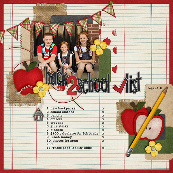
Kayla used a list of what her kid’s needed for back 2 school. Leading is a good thing to use when you want to make your list line up on a lined paper. She altered the letter Q to become a check mark!

Kayla (keepscrappin’)

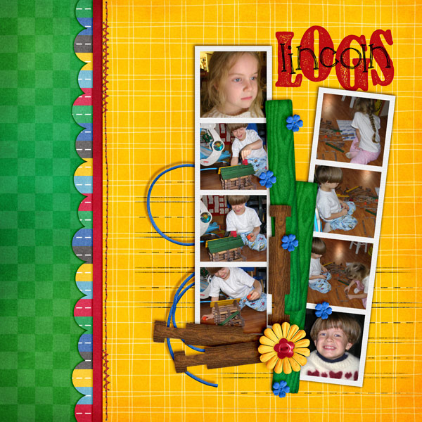
Jenn V used different shapes to create her “list.”

Jenn V

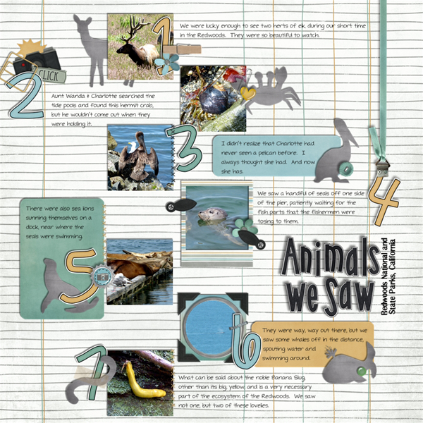
Last up we have Jan who used #’s in her list to identify the different animals they saw on a vacation.Jan (Quilty Mom)
Chelle provided the following ideas about lists for your consideration.
  • Sometimes
your
journaling
doesn’t
fit
in
a
tidy
paragraph.
  • Sometimes
your
journaling
isn’t
complete
sentences.
  • Sometimes
your
journaling is just a few words or phrases.
  • It’s
time
for
a
list.

Remember, when using a list for your journaling, the format of the items is important. In general you want the items in your list to be consistent. For example:

  • Spinning
  • Twirling
  • Swaying
  • Run←See?  It doesn’t belong.

I look forward to seeing the designs you create using lists.

Hugs!

Play the Game | Digital Scrapbooking Classics

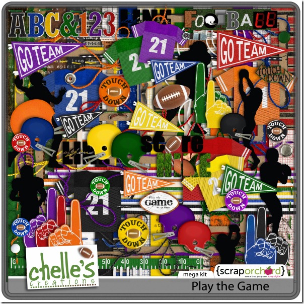
I’ve just spent the weekend visiting one of my children at college (hint: it’s an SEC school, and I now own a cowbell). When I was given tickets to the football game, my child said, “Mom, the tickets are on the 50 yard line – you’ll love it!”  So, I dressed in school colors and my husband I traveled to enjoy this experience with our child. What I wasn’t told was that the seats were a few rows down from the very top of the stadium. I could barely see the players on the field, and my ears are still ringing from cowbells, but I have the sweetest memories and some awesome photos of my child enjoying college football. And, since Chelle has this terrific football themed kit called Play the Game, I am going to have a digital scrapbooking page finished with my precious memories before this day ends.

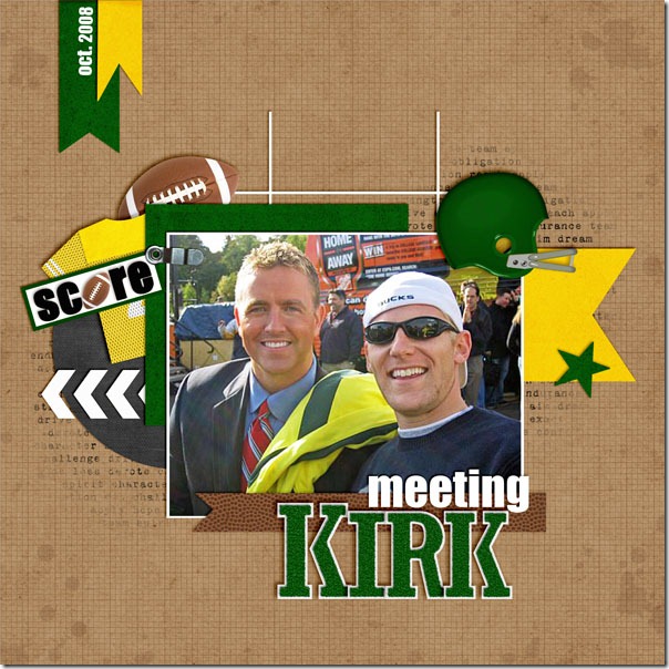
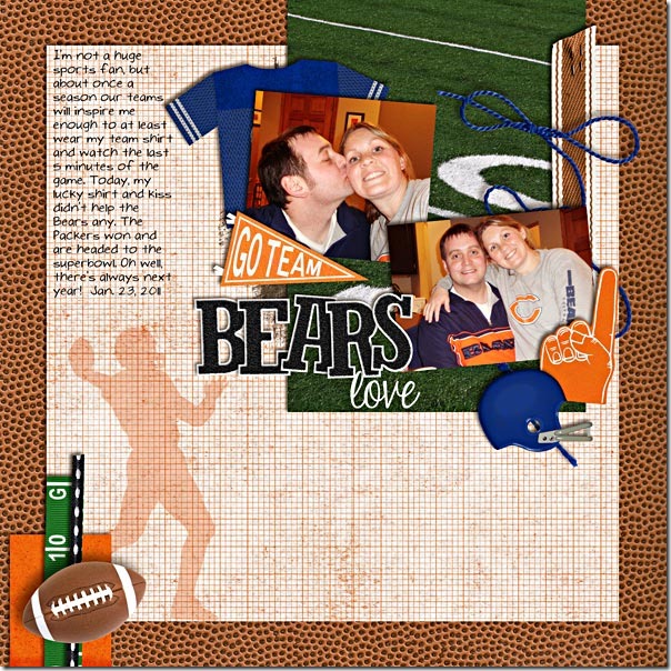
Some of Chelle’s friends have been enjoying this season, as well, and have been busy with this kit. Kassie’s loved one had a special encounter at an ESPN event and met Kirk Herbstreit. How exciting that must have been! Here is her page using Chelle’s Play the Game kit with the green and yellow team elements: meetingkirk-2KassieMary used her pictures of her supporting the Bears to make a great page with Chelle’s kit. I love how this huge kit has multiple team colors in it, and Mary has used the blue and orange elements together on her page, matching her team’s colors.bearsloveMary

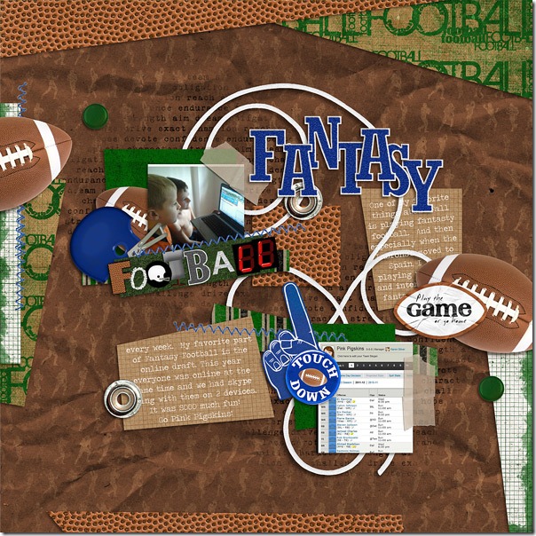
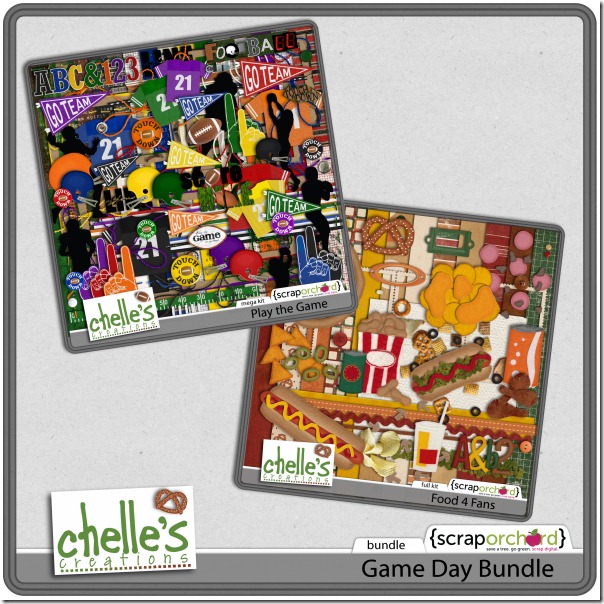
Fantasy football is really a lot of fun, and Karen loves the online draft. She captured some pictures of her children watching the draft and using Skype to communicate with other fantasy players. She made a great page using the blue and green elements and papers with the footballs.fantasty-footballKaren Here’s a closer look at the kit in the market along with the Game Day Bundle because football always means food, too.cc_playthegame_kit cc_gameday_bundle

I’m off to scrap my game day pictures. Working with this kit might just be as much fun as going to the game. I get to relive the experience all over again through my pictures!

Gallery Standouts | Digital Scrapbooking Inspiration

Hey ladies. I’ve just been looking through all the LO’s that have been submitted to the Chelle’s Creations Gallery at Scrap Orchard. If you are looking for inspiration, look no further. First Up is this precious little face that came in contact with her brother’s hockey puck!  HTEW’s “He Shoots, he scores?” used Chelle’s Penalty Box {& Penalty Box Quickies} to make very expressive LO.

Amber565 made a LO using Chelle’s Oh Snap! products {Oh Snap!, Oh Snap! Words Bits, & Oh Snap! Quickies} that I’m sure is the opinion of many little people who have had their pictures taken over and over and over again. Her “Mom’s Gonna Snap!” gives us a perhaps a truthful look at our inner photobug.
Jac gives us a hybrid idea. She used Chelle’s Midnight Crow Reloaded & Midnight Crow Word Art to make this mulling spice drink.
Vanilla Designz used Chelle’s Bloomin’ Kit to create this delightful LO. Bloomin is available to those who’ve registered for Chelle’s Newsletter. It’s a free birthday download.
Shari used 3 of Chelle’s products to create this “moving” LO.  Fly Little Birdie, Leafy Treetops {& Leafy Treetops Quickies} & Vrooom! Bundle {& Vrooom Word Art} Isn’t it fun?

I hope I gave you some inspiration! I really enjoy looking at the galleries. I enjoy seeing what everyone has created with Chelle’s Creations.

Hugs!