How did it get to be August 29th? WOWSERS! This month has really flown by. I SO enjoyed browsing the gallery today. I really miss being able to do that each week. (Gotta get everything re-packaged and moved…THEN I can browse again) There were lots of fabulous layouts, but here’s a few that stuck out to me today:
by Mel…it never occurred to me that EIEIO was a Toy Story kit..

by Kairyn…I want these layouts in my album…wonder if I could find a pick-your-own strawberry field?
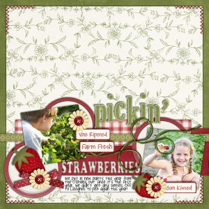
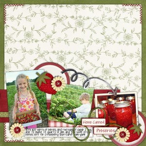
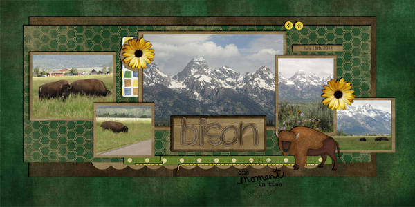
by Karen…I like how the large photo spans the page.
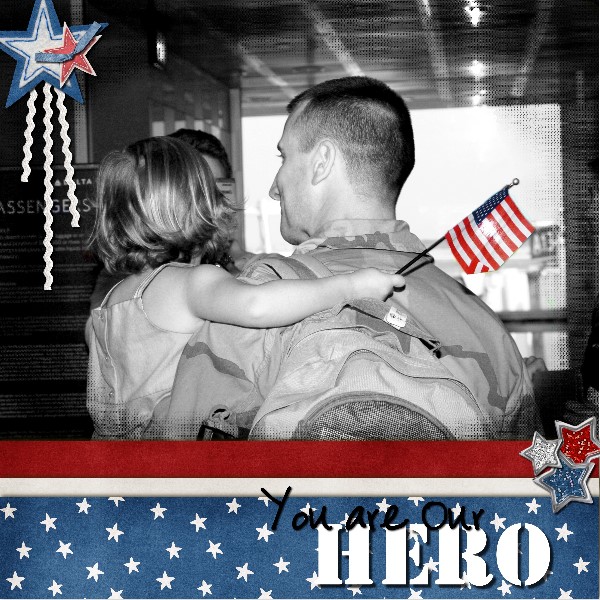
and by Mary Kate…love the Black & White…effectively stirs emotions
If you use Chelle’s Creations products, please upload them to the Chelle’s Creations Gallery at ScrapOrchard. We’d love to see your work!

September 2011 Desktop Freebie | Digital Scrapbooking Freebies
Howdy everyone!
I’ve always loved Chelle’s E-I-E-I-O Bundle and thought it would be the perfect kit to use for our September desktops. I hope you agree, cuz that little pig was just too cute that I couldn’t resist. lol
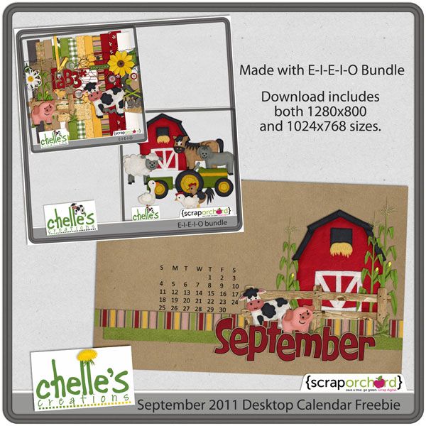
Download desktops here at box.net
Take care and keepscrappin’

8.26 Tutoriall: Vibrance
Hi Everyone! Hope you are all having a great start to your weekend! I’m Jenn (jk703) and I’m from NJ… right now, I have lots of grey skies, and rain on the way – including Hurricane Irene! So, for my tip today, I’m going to share a little secret to adding a little vibrance to your photos QUICKLY. We are always trying to do things faster, and that works with our scrapping too! Here we go…
Here is my original picture opened in Photoshop. (I use CS 5)
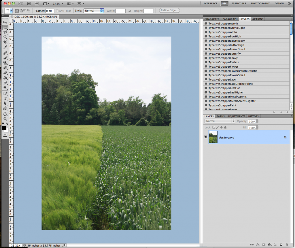
Now, in the Menu Bar, I choose Image > Adjustments > Vibrance.
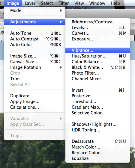
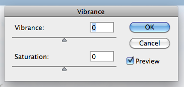
Next, a small pop up menu will appear. It will have sliders marked Vibrance and Saturation. Slowly move the sliders to the left and right. If you have the Preview box is checked off, you will be able to see the changes in your image as you are sliding the cursor.
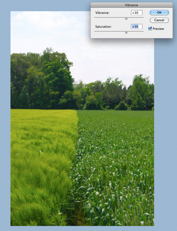
I moved my sliders to the right, and increased the vibrance and saturation. Play with them at different settings, and see what you like! A quick and easy way to add a little pop to your photo.
Thanks for stopping by and checking out a quick tip! Hope it added a little vibrance to your day!

Jenn (jk703/The Typative Scrapper)
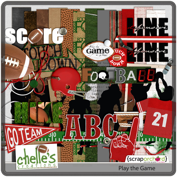
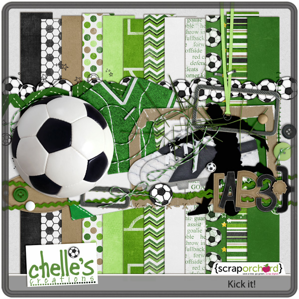
Kick It! and Play The Game
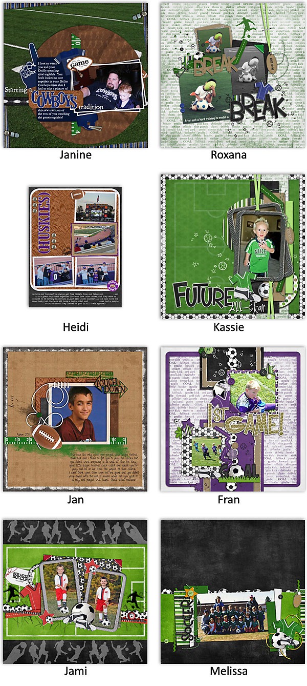
Chelle has some great sports kit out this week. Two re-releases, Kick it! and Play the Game, plus fun sports wordart, which is free with purchase this week.
Share your stories | Words on Wednesday
When Grandpa died 9 1/2 years ago, Grandma moved in with my Mom. I’m sure it was difficult for her to leave her home, but she couldn’t see well enough to take care of herself. In the end I think she actually enjoyed it. You see, we hang out at Mom’s A LOT, so it was pretty common to find Grandma in her room with one of her great-grandchildren at her feet listening to stories of how she loved to go to the dances or how she would sing for her Dad’s friends or…Grandma loved to share her stories.
Grandma died Monday. I’m excited for her to be relieved of dealing with her aging body and to be reunited with Grandpa. And I’m thrilled that she shared her stories. Hopefully I’m continuing in her footsteps.

Sneaky Peek!
This is what Chelle has coming to the shop this week!!!
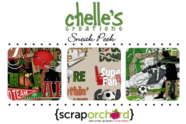 Stop back by to see some LOs and the full reveal tomorrow! Have a great week!

Gallery Standouts | Digital Scrapbooking Inspiration
Hi everyone! Roxana here with another editon of the Gallery Standouts.
First an amazing layout by kirstiegai, Monkeying Around. I love the composition of her page, the clustering is beautiful and the wire holding everything is just perfect! Awesome layout!
Then this beautiful page by Karen32, Cascade- Hike. The map, compass and all the nature elements give the outdoorsy feel to this LO, and the big pines and title as part of the pics are a great touch! Fabulous journaling as well!
And last but not least this amazing page by Hey Jude, The Grand Kitchen Remodel. Everything in her LO is fantastic, the blended photo in the BG is just awesome and the drawer with all the tools just so creative! Love it!!!
All these gorgeous pages are linked so you can leave some love. And remember to keep uploading your layouts to Chelle’s Gallery, you might be one of our Gallery Standouts next week!
Chelle Scraps 8.21.11 Saved the Best for Last…NOT
The end of a yearbook is NOT my favorite part. The only layouts left to be done are…well…there is a reason they haven’t already been done. Maybe because there are “too many” photos…maybe because I don’t have the perfect kit yet…maybe because I don’t know what to do for the journaling… Whatever the reason, I’m down to my last few layouts for 2009 and most of the remaining ones have TONS of photos from our vacation. I decided to use some of Yin’s Templates. WOWSERS! That was easy & quick. They don’t have a lot of “decorations” and they are pretty boring, but her templates made quick work of multiphoto layouts. (Her templates come in 12×24…I had to adjust them to fit my odd page size) For the record, I think her shadows are a bit harsh, but they were WAY faster than making them myself, so they’ll have to do. LOL!
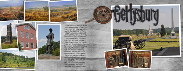
Gettysbury uses Yin’s Template 29 and my History Lessons kit.
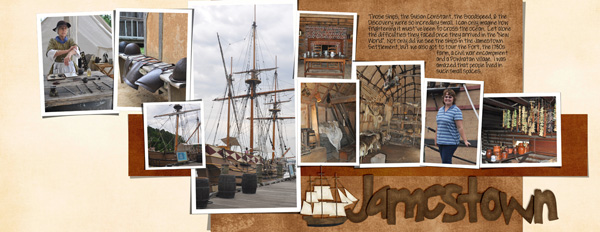
Jamestown uses Yin’s Template 69 and my History Lessons kit & Grandpa’s Garden
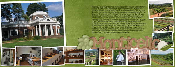
Monticello uses Yin’s Template 70 and History Lessons, Grandpa’s Veggies & Grandma’s Fruit
Two hours & 3 double page layouts later…I would DEFINITELY recommend Yin’s templates for those “tons of photos” layouts. Almost there…only a few more to go.

Friday Freebie! Zoopendous Cluster | Digital Scrapbooking Freebies
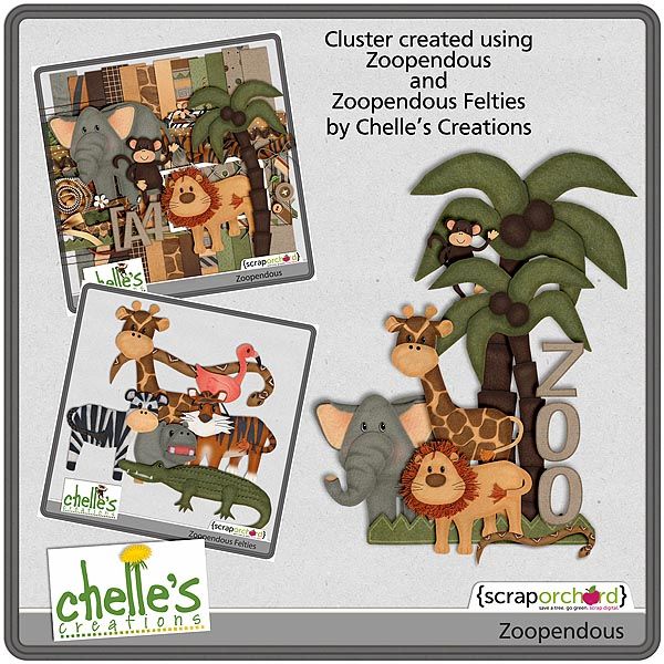
Happy Saturday, everyone!! Jan here and I’m guesting for Chelle this month. What great fun it’s been working with all of her amazing designs. Today I have a cluster freebie for you using her latest release at Scrap Orchard – Zoopendous! This is such a fun kit to use if you have made a summer time trip to the zoo, or maybe, like me, you just live in a zoo!! Just click the image for the download…hope you enjoy 








 Hi! I'm Chelle: a 40 something mom of 7. My husband & I live in a rural community in the rocky mountains with our 4 children still at home. In the winters we enjoy sledding & snuggling by the fire. I the cool fall evenings we love relaxing around the campfire & meeting friends at the county fair. Admiring the stars
