Farmer’s Market CU Products Reminder #1

Want to see what Chelle has going on during International Digital Scrapbook Day?


Sale ends 5-3-2015 at 11:59 PM EST


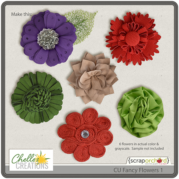
AND MANY MORE! Head over to my store and see them all. Check out these fantastic flower recipes.


CU Paper Flowers {Bitsy Daisy} & CU Ribbon Flowers {Rosettes) by Chelle’s Creations & CU Greenery Leaves 4 by Dream Big designs.


CU Paper Flowers {buttercup} & CU Fancy Flowers 2 by Chelle’s Creations & CU Foliage 19 by Kristin Aagard Designs.


CU Flower Center {Long Pips) by Chelle’s Creations, CU Exotic Flowers 3 by Dream Big Designs & CU Foliage 18 by Kristin Aagard Designs

Tutorial: DIY Circle Elements

Tutorial: DIY Circle Elements

Hi Everyone! Are you ready for iNSD weekend?! It’s so exciting… so much to see, do, and join in on! I (Jenn/jk703) won’t take up too much of your time here, but this Tutorial: DIY Circle Elements is a fun way to add a little fun to your layouts. Here is my final layout, and I’m going to show you how to make that circle with the writing. I’ve used some of Chelle’s Farmer Market releases – Green Thumb – WOOT! Check out her STORE to see what is available for $1 – Farmer’s Market!
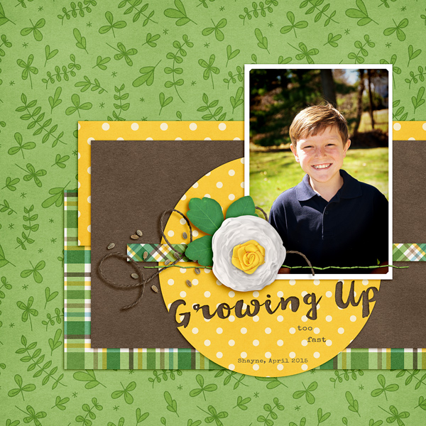
SO_CCGreenThumb_WanderlustSpecElite_ShayneApr2015Growing_WEB


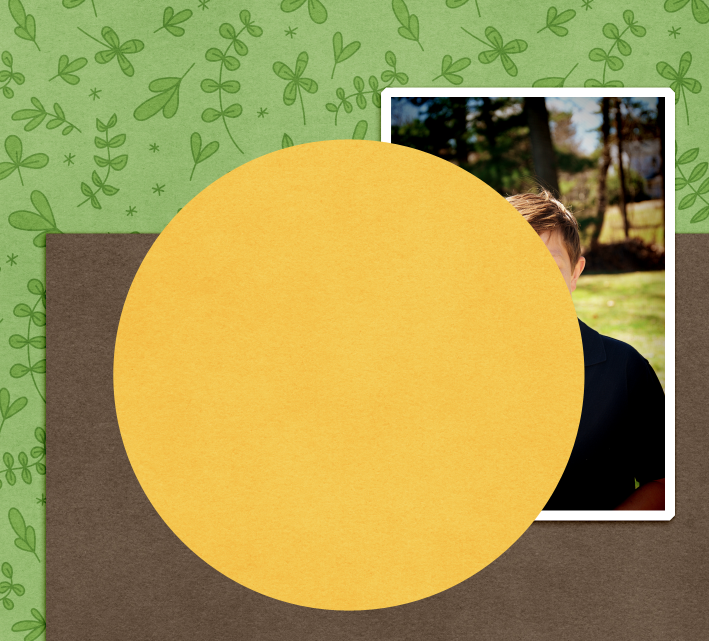
First, I used the shape tool to make my circle. Before we start, be sure to Rasterize your shape, if needed. You might get stick at some point. If you do, and your shape isn’t rasterized, do it them. :)

Right now, I have chosen to leave it above my photo, but I will move it below later. It’s yellow… for now. :)

1

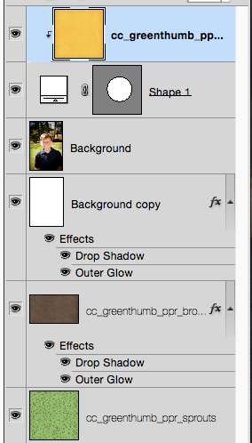
Here is my Layers Palette.
2

Next, I’ve chosen the Type Tool. I’ve used a font called Wanderlust. Any scripty, thicker font will look nice with this method. You can try Pacifico or Thirsty Script. I believe both have free versions. I’ve typed it and the layer is above my circle.

3

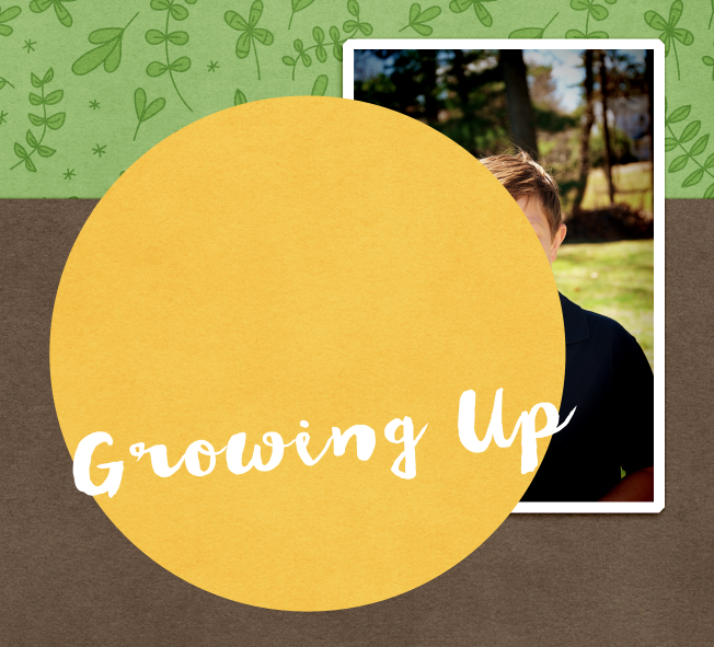
After my type was good, I used the move tool to tilt my letters a little. I also made sure that my letters overlapped the edge of the circle a little bit. This way, when I cut them out, I will cut a part of the edge off.
4

For the next step, you will have the text selected in the Layers Palette, and double click on the thumbnail. You will get marching ants around the letters on your layout.

5

After you have the marching ants, turn off your Type Layer. This is what your type should look like on your layout.

6

Now, you will choose the shape, and press delete. You will see where the marching ants was, the paper/shape inside will be deleted. Here is what mine looks like. Press D to remove the marching ants. Add a shadow style, and you are done.

Note – when you move the shape, paper and type, be sure to lock the layers together, so that they move together. In case you need to make changes for later on edits.

8

Now, I’ve tried out a couple of other paper layers and ended up with the yellow polka dot. Here is my final layout. Easy DIY Circle Elements. You can even add styles to them to make them look letterpresses, or acrylic!

SO_CCGreenThumb_WanderlustSpecElite_ShayneApr2015Growing_WEB

Hope you enjoyed this tutorial. Have fun during iNSD! Get all you can for the $1 Farmer’s Market!

by_Jenn

National Scrapbook Day $1 Sale & 4 Freebies | Digital Scrapbook Freebie

Hey Scrappers,

Farmer’s Market is here!Yay!

That’s right 40 products in my store for just ONE DOLLAR.  I have a great new collection called Green Thumb.

I’ve added 2 more sets of templates in my Lay It On There {Doubles} series. 17 & 18, 20 & 21.

I have other fantastic items that you can get for the reduced price of just $1. Score!

Hey did you notice that new Conqueror Alpha? Spoiler Alert! It’s coordinates with with little bits created by many of the Orchard Girls and there is a coordinating freebie on my blog.

SCROLL DOWN TO THE NEXT POST for this freebie & the rest of the blog train.

Here are some layouts using my new kit, Green Thumb.

Using LIOT {Doubles 17)

Using LIOT {Doubles} 18

Using LIOT {Doubles} 21

Using LIOT {Doubles} 22

And now it’s time for FREEBIES!

This one is available  in the newsletter.  Subscribe & the latest edition with be sent to you within 24 hours.

Links expire 5.13

This one is available here on my blog:

Links expire 5.13

And this one is in the Facebook Fan Club:

Links expire 5.13

Your New Go-To Alpha

The alphas for Green Thumb just might be your new go-to alpha.  With a darker green, a medium, lime, and a light yellow, they can be used to make nearly any color of the rainbow.  Check this out:

Using your Hue/Saturation adjustments, you can make a rainbow of colors:

Don’t forget to head over to the ScrapOrchard forums this weekend for some fun & exciting games.  Just look at those prizes!

Conqueror Blog Train Freebie

Hey Scrappers!

You should be coming from Danyale’s blog.

LastArrow_Conqueror_iNSD2015

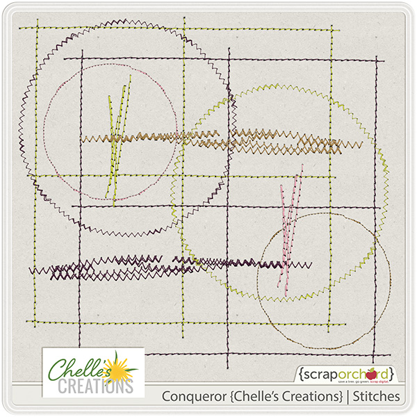
Welcome!  I have these fabulous stitches for you:

cc_conqueror_stitches

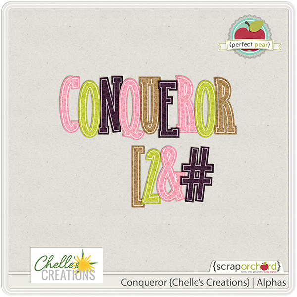
My contribution to this collab is these alphas.  Standing tall and strong, with a feminine touch.  You can snag them in the store.

cc_conqueror_ap

Next up, head to Kristin’s blog.

NextArrow_Conqueror_iNSD2015

If you get lost along the way, here is a list of the train stops:

1. WendyBird Designs

2. Laura Banasiak Digital Designs

3. Fiddle-Dee-Dee Designs


4. Hat of Bunny

5. SandyPie Creations

6. Etc by Danyale 


7. Chelle’s Creations 


8. Kristin Aagard Designs

9. Down This Road Designs

10. La Belle Vie Designs 


11. Createwings Designs 


12. Red Ivy Design 

Adding Texture

Hi Chelle’s fans! We have a real treat for you today. Three of Chelle’s talented Creative Team members have created digital scrapbooking pages employing varying techniques for adding texture to a large background photo. This can be very useful when the photo you want to use for a background is lower resolution than ideal, or when you just want to add that tactile feeling to a page with lots of textures in the subject.

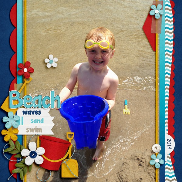
Jenny’s photo falls into the latter category: she had a photo of her son playing at the beach, and she wanted to add a little emphasis to the background. Here’s her original photo without any textures added. IMG_8656-s Now, here’s that same photo with a sand texture added but erased over his sweet face. Can you see the dimension it adds to the page? She used At the Beach for her page, and she used the sand paper in the kit for the texture.  BrayBeach2014SwLBigPho5_web

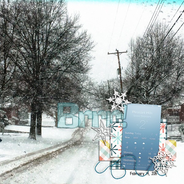
Next I have a page from Donna. I think she’s tired of the snow, but she made a gorgeous page with a texturized large photo in the background. Here’s what she said about her page. “The background photo was taken with my iPhone, and it was taken through the windshield of our car, so I knew that when enlarging to this size, the resolution would not be great. I used a snowflake paper from We Wish You a Merry Christmas, and changed the opacity to Overlay at 70%, then merged that to the photo layer. Still wanting more, I added Chelle’s CU Fabric Textures (linen) on top of the photo/snowflake layer and merged the two.”web_djp332_sbm_2ndtempchall_feb2015_a_zpsgg1qx3ug

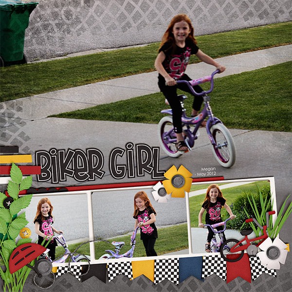
Finally, Kayla has used one Chelle’s latest kits Makin Tracks for her page. It was a perfect match for her photos. Here’s what she says: “ I wanted the tracks and grunge from the background paper to show on the photo. I placed the photo on top of the paper and scrolled through the blending modes with the photo layer selected.The overlay mode gave me the closest result to what I was looking for but it wasn’t quite enough. I needed the photo a little lighter, so I duplicated the photo layer again.That made it too light, so I adjusted the opacity down on the 2nd photo layer until it looked right. Then, I merged the 2 photo layers and used a layer mask with the linear gradient (foreground to transparent) tool to blend the bottom edge of the photo into the paper. I love how it looks like the photo and paper are all one layer.”

BikerGirl_May12_web


Personally, I LOVE it when friends tell me exactly how they achieved their artistic look on a page. A huge thanks to Donna, Jenny, and Kayla for sharing with us this week.

by_Cheryl

Gallery Stand Outs! | Digital Scrapbooking Fantastic Layouts

Hello Friends! Gosh! Lots of amazing layouts to share this week! This layout is by Chippi. She used Master Builder.

Chippi

cc_masterbuilder_super_bn

This layout is by Rebecca. She used Doctor’s Orders.

Rebecca Olson Vest

cc_doctorsorders_bn

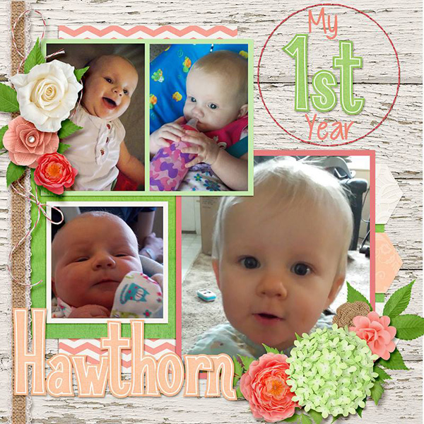
Next is Heatherdw.

Heather Walter

She used Creme de la Peche.

cc_cremedelapeche_bn

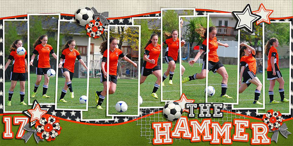
This layout is by Angie @ Down Thsis Road Designs.

Angie Iacobazzi

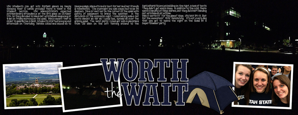
She used Sporty Soccer by Kristin Aagard & Lay It On There {Doubles} 9 Templates.

cc_LayItOnThereTemplates_Doubles_9n10 - Copy

Share your layouts in the SO Pin Board Gallery. I really enjoy seeing what you create.

by Sari