04.23 Video Tutorial: Using Layer Masks w/ Big Photos

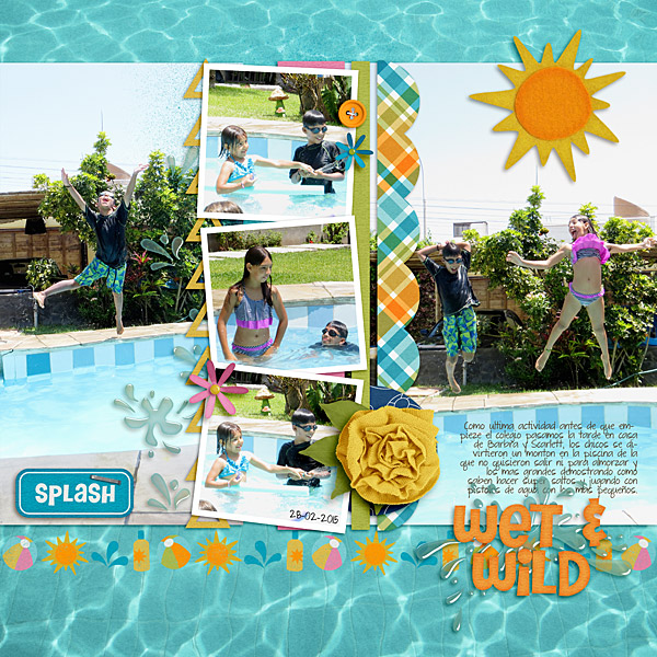
So sorry this is running a little late today. I have been busy getting outside with my two girls while the weather here in Florida is still a little reasonable. Soon it will be too hot to do much of anything but be in pool. Speaking of a pool watch as Chelle of Chelle’s Creations demonstrates how to get the look of her pool layout in the the video. In this video she is going to share how to use layer mask to use a larger photo in the background of a layout.

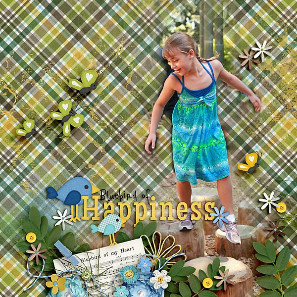
Carol (Iowan) shows the same technique on her gorgeous layout using Bluebird on My Shoulder. I really like how Carol positioned her cluster so that is appears as if her daughter is look at it.

If you loved the kit that Chelle used in her video head over to her store to check it out along with the coordinating Little People.


Creating Movement | Digital Scrapbooking Words on Wednesday

Hello Friends!

Today I wanted to show you some ideas for creating movement on your digital scrapbooking layout. Titles or words can instantly add dimension and contrast. You can change the font or color or even make them wonky or use more than one color. Another option is to use words that help convey movement. Most of our layouts do represent activities. {sleeping, reading, playing, etc.} Chelle has many products will help you out. Let me show you what I mean.

Roxana’s “Wet & Wild” and “Splash” words add a colorful and descriptive action to her layout.

ccwowa10

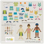
Roxana used In the Pool. Chelle has coordinating In the Pool “Little People.”

cc_inthepool     cc_inthepool_lp

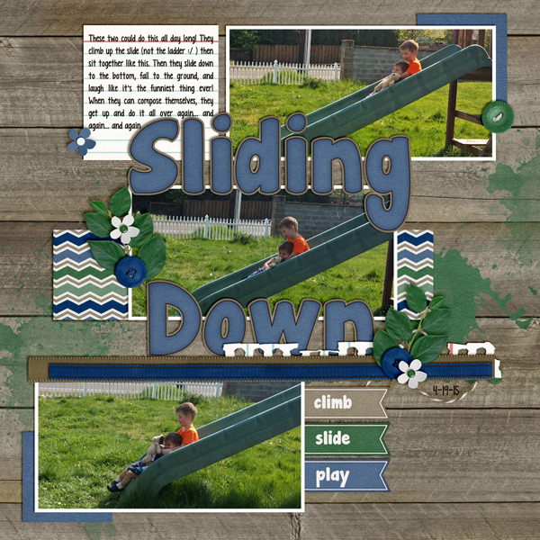
Now let’s look at Krista’s layout.  She created great movement in the layout using the angles of the slide photos. She also used little words “Climb, Slide, Play” to  convey movement.  Her title, “Sliding Down” adds texture to the layout.

krista

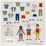
Krista used At the Park. Chelle also has coordinating “At the Park Little People.”

cc_atthepark.jpg     cc_atthepark_littlepeople

Have a great day!

by Sari

Lay It On There {Doubles} 13 Template | Digital Scrapbooking Resources

Have  you used the newest Tuesday Template at Scrap Orchard? It’s FREE! Our creative team has made some layouts for me to share with you.  They are sure to give you some great ideas if you are looking for inspiration.

cc_LayItOnThereTemplates_Doubles_13

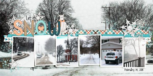
Donna was on a roll and made 2 layouts. She used Zoo Crew {Arctic} & Graduation.

Donna.arctic.cozy

Zoo Crew {Arctic} & Zoo Crew {Arctic} Alphas.  We recently released coordinating {instaLife} & {journal} cards. I’ve linked them up for you also.

cc_zoocrew_arctic  cc_zoocrew_arctic_ap  cc_zoocrew_arctic_il  cc_zoocrew_arctic_jc

Donna

Graduation & Graduation Word Art.

cc_graduation_kit.jpg  cc_grad_wa-01

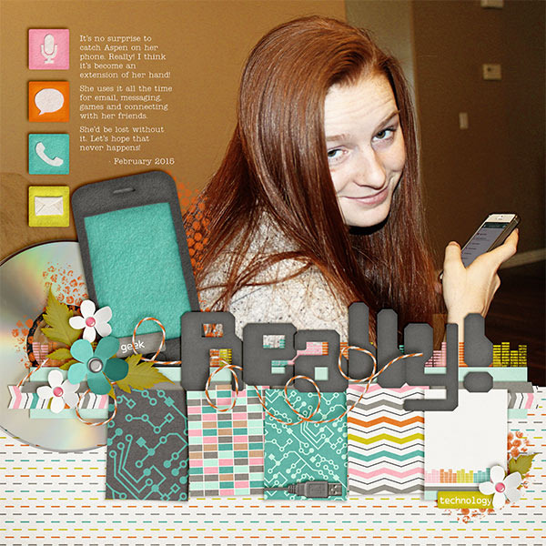
Kayla provided this layout. She used Techno Gee. Great expression, huh?

Kayla LIOT13

If you missed the coordinating {instaLife} or Journal Cards, I’ve linked them up for you.

cc_technogeek  cc_technogeek_il  cc_technogeek_jc

by Sari


Creme de la Peche Playdate | Digital Scrapbooking Week In Review

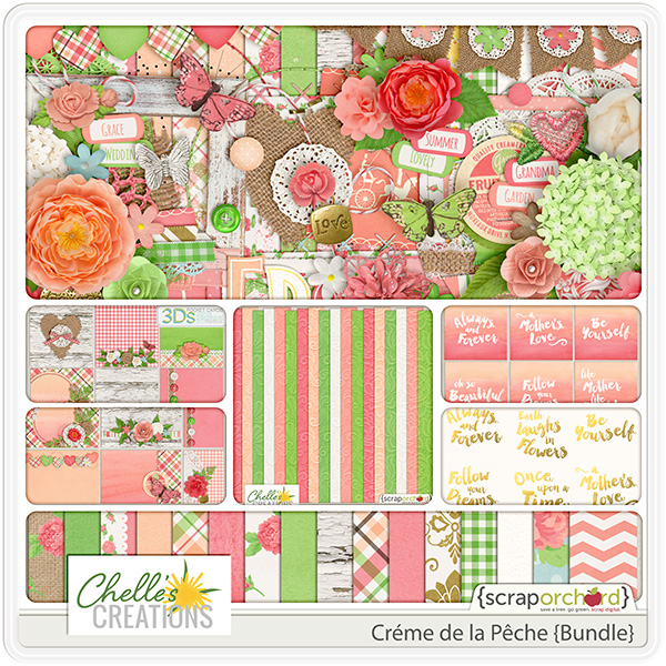
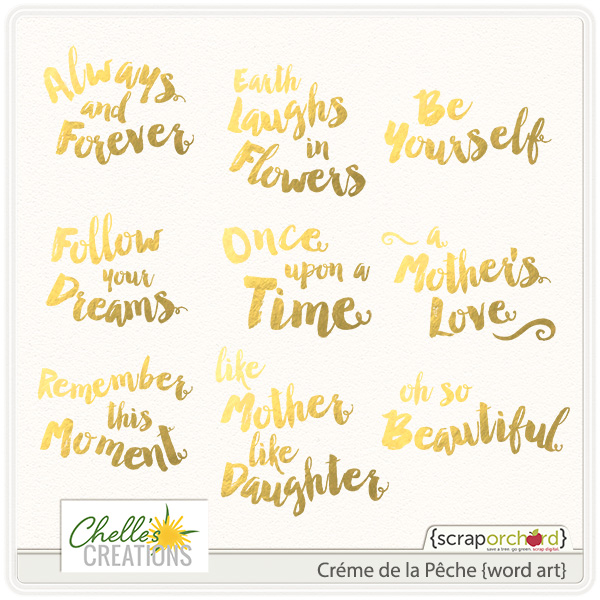
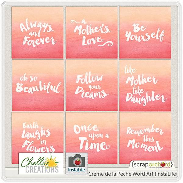
Hello Friends! Another busy week here at Chelle’s Creations.  For our fresh fruit releases in Chelle’s store at Scrap Orchard, we have Creme de la Peche Bundle. Creme de la Peche {Word Art} & Creme de la Peche Word Art {instaLife}. Gorgeous blooms in coral, peach, lime & white grace this trendy floral collection. Weddings, mother’s day, portraits, or just the welcome beauty of spring & summer will be perfectly complimented by these images. With textures ranging from burlap to lace with a vintage floral focus, you’ll be using this beauty again and again. Let’s take a look at them.

cc_cremedelapeche_bn

cc_cremedelapeche_wa_gold

cc_cremedelapeche_wa_IL

Here are a couple of layout ideas for you.

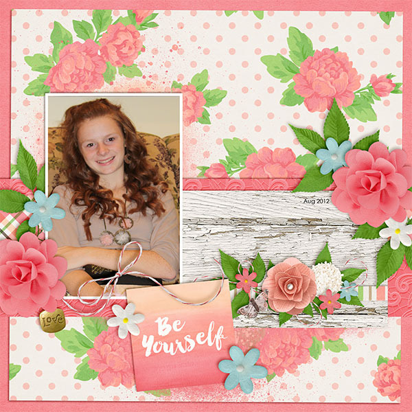
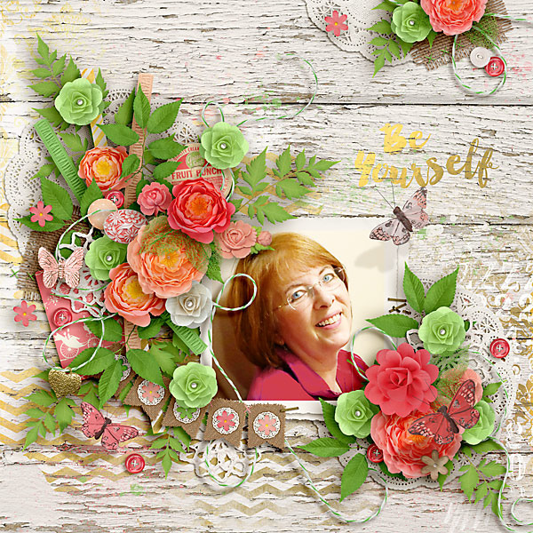
kayla (2) Carol

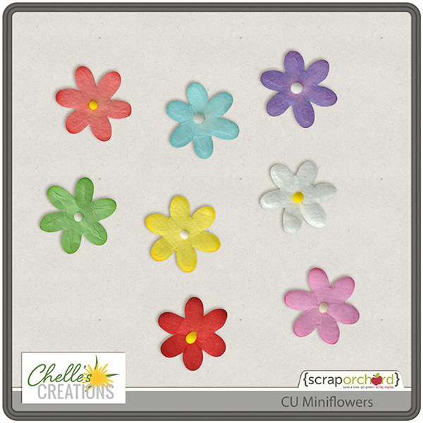
For our CU Friends, Chelle released CU Mini Flowers. A staple in your design toolbox, these simple little flowers will be used again and again.  Not only do scrappers love simple accent flowers for clustering, but also these cuties make perfect flower centers for all flowers.

CU Mni Flowers

Here are a couple of new video’s from Chelle’s You Tube Channel.

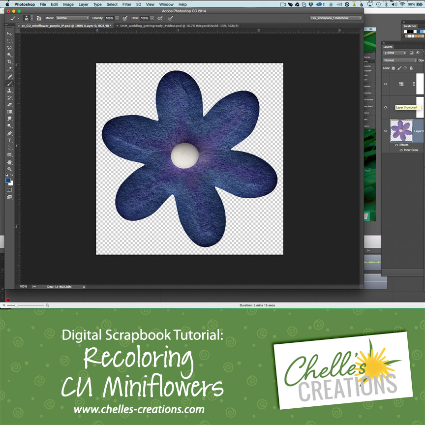
Recoloring CU Mini Flowers

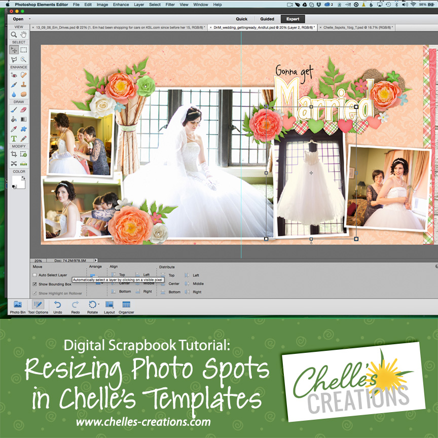
Resizing Photos in Chelle's Templates

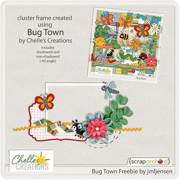
We also have our latest Friday Freebie to share with you.

cc_bugtown_042015_preview

{Hugs}

by Sari

Tutorial: Stenciling

Tutorial: Stenciling

Hi Everyone! It’s Jenn, aka jk703, here to bring you another tutorial! A lot of times I try to recreate what I can create on a paper layout! One thing that I always liked was paint and splatter…. but then I also liked the opposite. What is the opposite? Today’s post – Tutorial: Stenciling! :)

For my layout, I’ve used Chelle’s newest delight – Creme de la Peche! It is a gorgeous kit… but make sure you give it a chance, it is very versatile. I’ve used it today on a spring layout of my boys! My layout also uses a template by Scrapping with Liz, and the fonts – Special Elite and Wanderlust. Here is my final image: SO_Swl_Rcyclb36_CC_CremePeche_Wanderlust_SpecElite_FinSpring_Apr2015_WEB

Start out with your blank page (by blank – I mean paint-less, lol!):
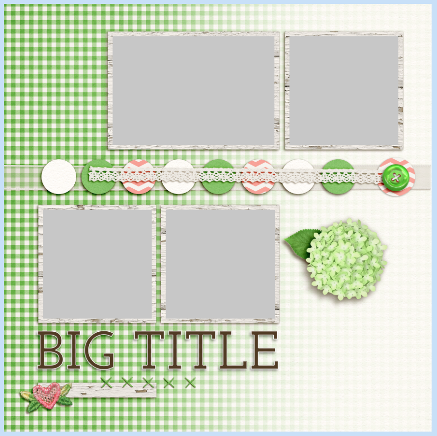
Screen Shot 2015-04-06 at 8.37.54 PM

Add your paint – I have 3 layers here.
Screen Shot 2015-04-06 at 8.40.17 PM
Next, you will place your shape above the paint. I’ve chosen leaves. Here are my two leaves layers, and my 3 paint layers:
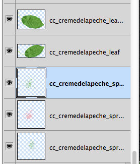
Screen Shot 2015-04-06 at 8.42.45 PM


Next, you will choose one of your leaves. Double click on the thumbnail image, and you will get marching ants around the shape. Now, On EACH paint layer, click on the layer and delete. The paint within the shape will be taken out. Do this for each shape you have, as I had to do it for each leaf, on each layer of paint.

Screen Shot 2015-04-06 at 8.42.30 PM


Once you are done deleting paint, turn off your shape layers. And my page after deleted paint, and turned off leave layers:
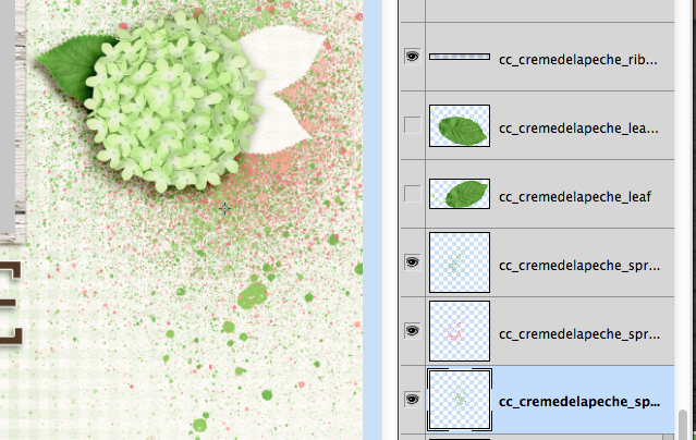
Screen Shot 2015-04-06 at 8.43.16 PM

That’s it!! :)

Really. That’s all that you have to do to mimic a stencil. You can do this with flowers, doily, and so much more. Here are some layouts the CT came up with for stenciling.

Karen made this lovely creation! Just look at the lacy edgers – perfect stenciling. :) Plus, I really like the mixed font and alpha title work. She used Creme de la Peche and SWL template Recyclables 29.
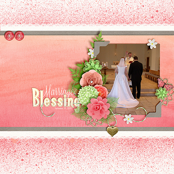
cremedelapeche_600


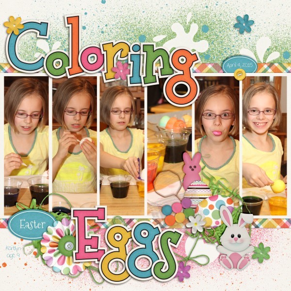
Lisa used Bunny Hop. She used the splashes and eggs to make her stenciling! Look at that line of pictures. My favorite is the candid silly one!
4 Assign1 Bunny Hop Stencil 600 x 600

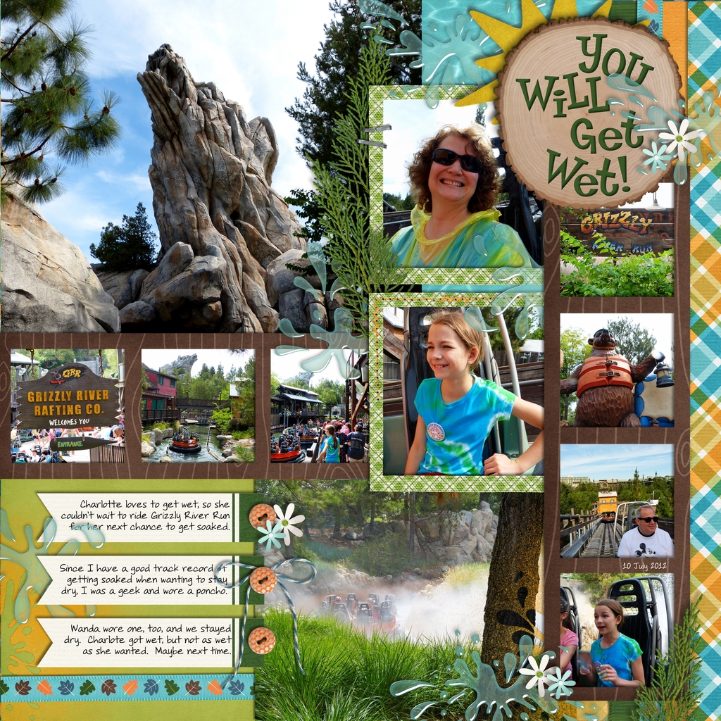
Jan made this super fun page from the Grizzly River Rafting Co. Ride – perfect for the water splash out of the spray – put on top of the bottom photo and behind the journaling tags. She used In the Forest and In The Pool, plus a retired Little Green Frog Designs template.
grr2

This Tutorial: Stenciling doesn’t have to be messy, and you will love the results! Give it a try.

Thanks for visiting and hoping to see layouts using this technique.
by_Jenn


Oodles of Doodles

Sometimes there are items in a designer’s digital scrapbooking kits that I look at and think, “that’s nice, but I don’t think I’ll use it.” That was my thought when I first saw doodles in a kit. I had no idea what to do with them. But, Chelle has a Youtube video here to show you all you need to know to be able to fill the doodles with any color or paper you want making those doodles some of the most versatile elements in any kit. Go ahead and watch – I’ll wait.

Wasn’t that cool? Although the particular kit Chelle used in the video is not currently available, she has lots of other doodles in the market. Let me show you some in use.

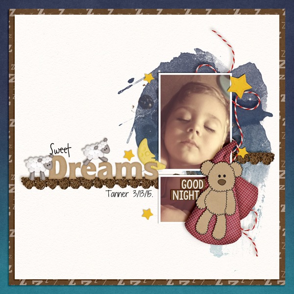
Krista used Good Night Teddy kit and {Doodles} to make her page and the teddy bear accent on her page, but you can find the kit and the doodles and a whole lot more in the {Bundle} if you’re looking for a great deal. Isn’t he perfect? It’s an adorable accent to her photo. SweetDreams__1
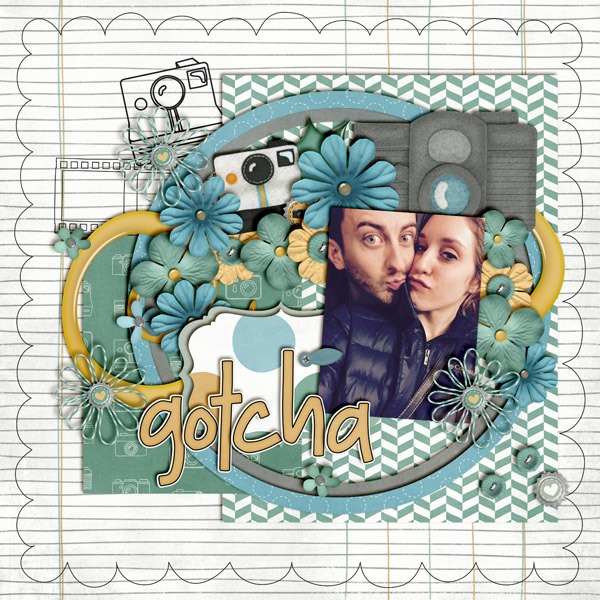
You don’t have to color in the the doodles. Sometimes, the doodles alone make the perfect accent to a page. Take Jenn’s page, for example. She used a lined ledger-style paper for her background, so the doodles she used from Oh Snap! look like they were hand-drawn on her page. The doodles are all included in this kit, one of the most versatile kits around. gotcha

Lots of Chells’a products have doodles. Ladybug Hugs has a doodled alpha; Tea for Two has a teacup border doodle; and Chelle has lots of CU doodle alphas (don’t let that CU designation scare you – anyone can use them!). So grab a doodle and have a play. I’m sure you’ll love the personal touch it adds to your memory keeping.

by_Cheryl

Perfect Pairs! Fleur de Violette & Master Builder Friendly | Digital Scrapbooking Kit Combinations

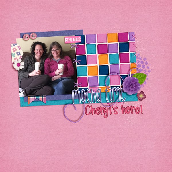
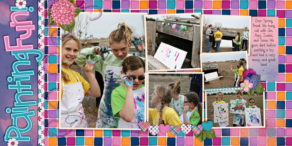
Hi! I bet you never would have considered combining Fleur de Violette & Master Builder Friendly. The fun summery colors of pink & purple in these 2 kits are some of my favorites. Let me show you what I’m talking about. I have layouts from Kimberly and Mel. Kim’s up first. Both of our Ladies’ used the color squares. I love them, they make we want to paint also. How about you?

Kimberly

Here’s Mel’s 2-page spread.

Mel

Here’s a close-up of each side.

Mel Left

Mel Right

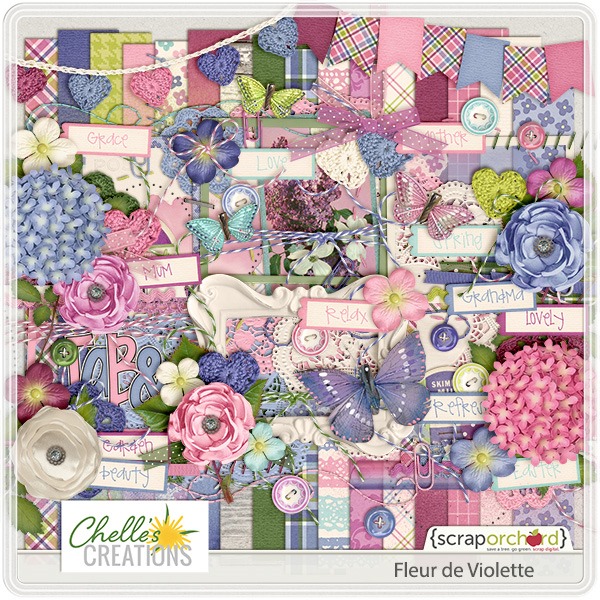
Here’s a close up of Fleur de Violette?

fleurdeviolettete.jpg

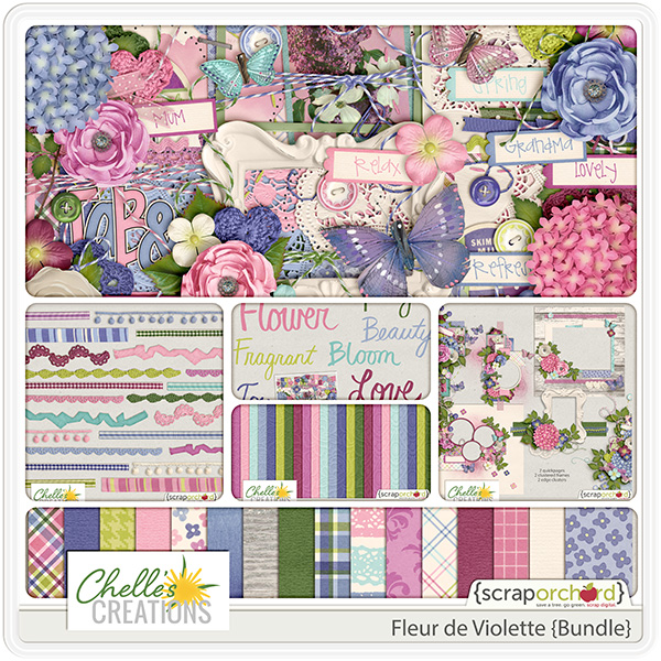
Want to see the Fleur de Violette Bundle?

cc_fleurdeviolette_bundle-01

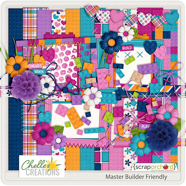
Next we  have Master Builder Friendly

cc_masterbuilder_friendly 600

How about Friendly’s coordinating alpha?

cc_masterbuilder_friendly_ap 600

I sure hope you’ll take a minute or two and make a layout using these 2 kits. Love to see what you scrap? Post ’em in the Pin Gallery using #Chelle. {Thanks!}
by Sari