Hey Everyone! I hope you are having a great Monday. I have a fun digital scrapbooking layout to share with you this week. It’s by Shari. She used Teacher’s Pet.
Here’s a link to the Teacher’s Pet Bundle.
Hugs!
Hey Everyone! I hope you are having a great Monday. I have a fun digital scrapbooking layout to share with you this week. It’s by Shari. She used Teacher’s Pet.
Here’s a link to the Teacher’s Pet Bundle.
Hugs!
Hey Everyone. Hope you are having a great day! Here’s a little cluster to add to your Halloween fun!
Here are the link to Toil N Trouble.
Enjoy!
Hi Fellow Scrappers.
Do you take advantage of Chelle’s social media? Facebook, Facebook Fan Page, Newsletters, Twitter, You Tube, Blog, Instagram, & Designer Club. This post is short & sweet, but oh so valuable. I’ve hooked you up with links to ALL Chelle’s social media sites. Make sure you “like” or bookmark all of these goodies. Hint! Chelle’s Creations Facebook Fan Page is NEW this week. That’s the place to look for FREEBIES that coordinate with Chelle’s New Releases.
Take a minute to ready yourself for Digital Scrapbook Day next weekend, November 1st. MOST IMPORTANTLY, go to her STORE at Scrap Orchard and put some goodies on your wishlist.
Hi Chelle’s Creations fans! Today we’re talking about a method for arranging items on your digital scrapbooking page called visual triangle placement. Simply put, it means placing your photos, or clusters, or combinations of such in a large triangle so the reader’s eye follows your three main points around the page. It can help to either draw your eye to the one large focal spot, or it can help you to see the page as a whole and not miss a single detail. Let me show you a couple of examples.
First, Heather has used a combination of elements from Roller Coasters & Cotton Candy to form her triangle. From her journal box on the top left to the large photo on the right to the title cluster on the bottom, she has the reader’s attention captured in a flow of the story of her memory of taking her children to the carnival. She didn’t have many pictures that day, so she used her one large photo, a large title piece (you can find that word art here), and her words to create a digital scrapbooking page that will elicit fond memories from her family each time they look at it. And isn’t that what we want? 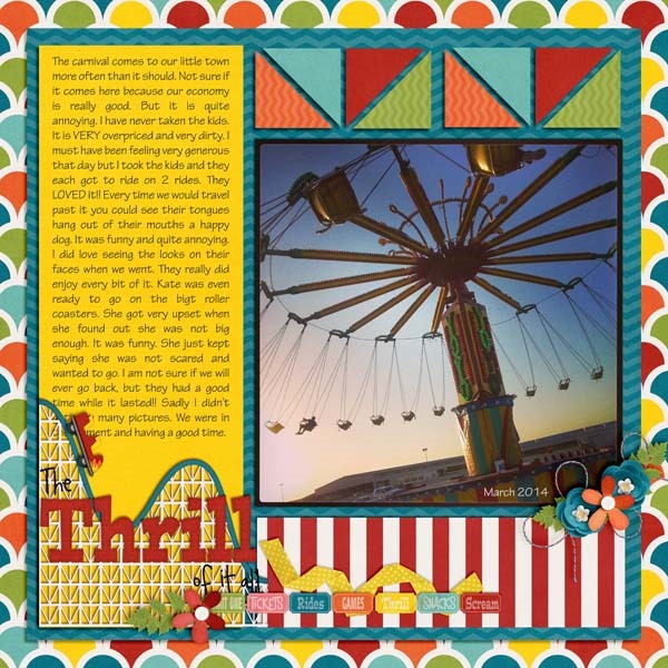
Krista used a slightly different technique for her visual triangle. The large photo on the page tells the obvious story, but it is anchored on the page perfectly by the clusters of beach elements from Chelle’s At the Beach kit, all placed at the corners of her visual triangle. This technique draws your eye to that focal point photo. Just a few simple touches were all that was needed to complete the story: the date, a few bits of word art, and the title art. 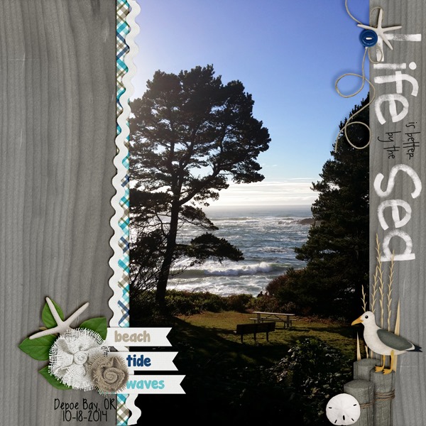
If you would like a closer look at the kits used for this blog post, check these out. The images are linked to the store.
Hey friends! Want a challenge? Create a digital scrapbooking layout using Lucky Me & Give Thanks! That’s what we challenged our Creative Team to do. Check out this layout from Christine.
Here are links to Lucky Me & Give Thanks!
What would you create in your digital scrapbooking layout?
Did you know that CU products aren’t just for designers? CU or commercial use products are the perfect addition to you everyday scrapbooking stash. They allow you to add elements to the kits you have easily or they can help enhance the look of the kit. This video tutorial by Chelle’s Creations shows you how to add her CU Watercolor Floral brushes to your designs.
Even though Chelle’s video demonstrates how to make a element for a kit let’s she how Chelle’s creative team used what they learned from this video to enhance their pages.
Kimberly (enjoyyourpix) added three watercolor flowers to add a nice balance between the other flowers on the page. For this page she used Boho Summer.

I love the watercolor assortment of flowers clustered behind Karen’s (zippyoh) photo and paper mats. Karen combined a Fiddle-Dee-Dee Designs templates with Chelle’s Fleur de Violette.

Hurry over to Chelle’s Creations store to pick up her CU Watercolor Florals.

While you are there check out the other CU Watercolor flowers she has available such as: CU Watercolor Florals {Poppies}, CU Watercolor Florals {Daisies}, and CU Watercolor Florals {Roses}.
Like Chelle’s Creations CU products head over here to learn more about Chelle’s Creations Designer Club.
Hey! I have a couple of digital scrapbooking layouts from Chelle to share with you.
This is the layout Chelle created during our October Scrap Twister game. She used Curled Frames, Toil N Trouble, Carve It Up (retired) & Bug Town Alpha.
Chelle used Curled Frames & Zoo Crew Jungle {Bundle}.
Have a great day.
Hi All. (This is Friday Freebie on Saturday) I was out of town and my laptop was at the doctor removing some background programs. So here’s the Freebie. Jenn J created this for you. Love these cards!
Here are the links to the Good Night Teddy Bundle.
Enjoy!
Hi! Hi! Hi! I’m so excited to share today’s Tutorial: Unmasked Mask! It’s so much fun! This is Jenn, jk703, here to share this cool technique with you! I’ve seen it around occasionally, and had this on my list of things to do, so now we can start a new trend, right!? Ok everyone… lets get going and Unmask that Mask! 😛
For my example images, I’m using Chelle’s At The Beach kit.
On the background paper, open up some paint splatters and cover a nice big area. Here, I’ve got two layers of paint from the At The Beach kit. 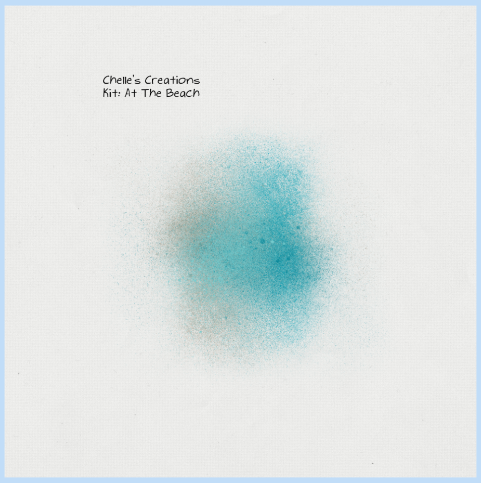
Next, I’ve brought in an element on to my page, the starfish. I’ve left 4 flat and shadowed one:
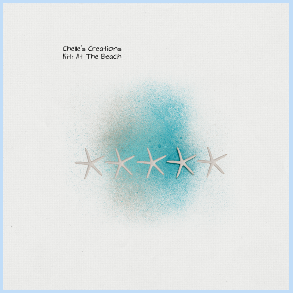
Before I completed the next step, I combined the 4 flat starfish onto one layer. All you have to do is highlight a star, press the shift key, and click on the other layers. Right click and choose merge layers. You don’t have to do this, it’s just an option that makes it a little easier later.
Double click on the element thumbnail in the Layers Palette. You should get marching ants around the shapes of the layer.

Here is my Layer Palette.
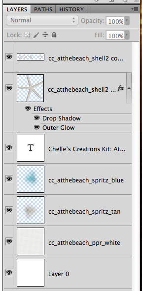
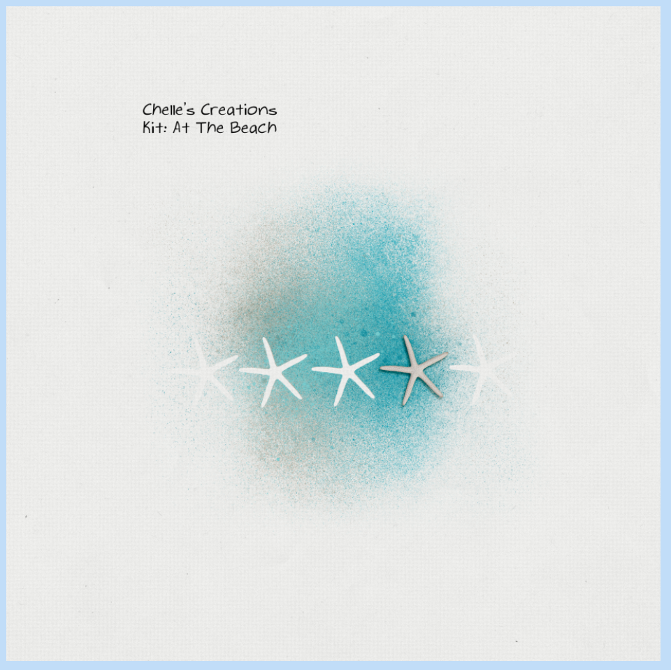
Here’s the tricky part. Choose your paint layer in the Layers Palette. Now, press the delete button. Do this for all paint layers. This will remove the paint from inside the marching ants. Here is what mine looks like. So simple, and so easy! Press Command + D to deselect and stop the marching ants.
Unmasked Mask! 😛
There are other options to this, but using shapes and text. Here’s how:
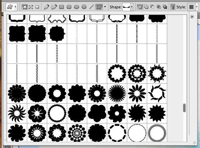
Choose the Custom Shape Tool, and find a fun shape.
Here are my shapes. I’ve chosen a border shape. Add one to your layout.
See the shape layer in the Layers Palette. You are going to double click on the actual shape mask (the right side) to get the marching ants.
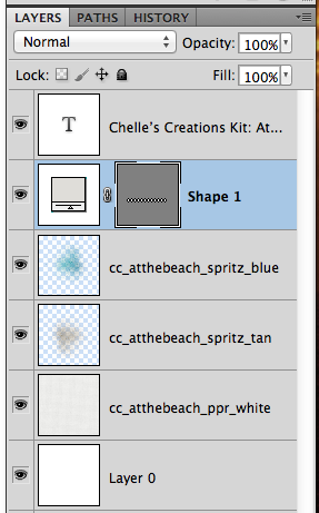
My marching ants and shape. Next, turn off the visibility of the shape by clicking on the “eye” that sits on the left side of that particular layer.
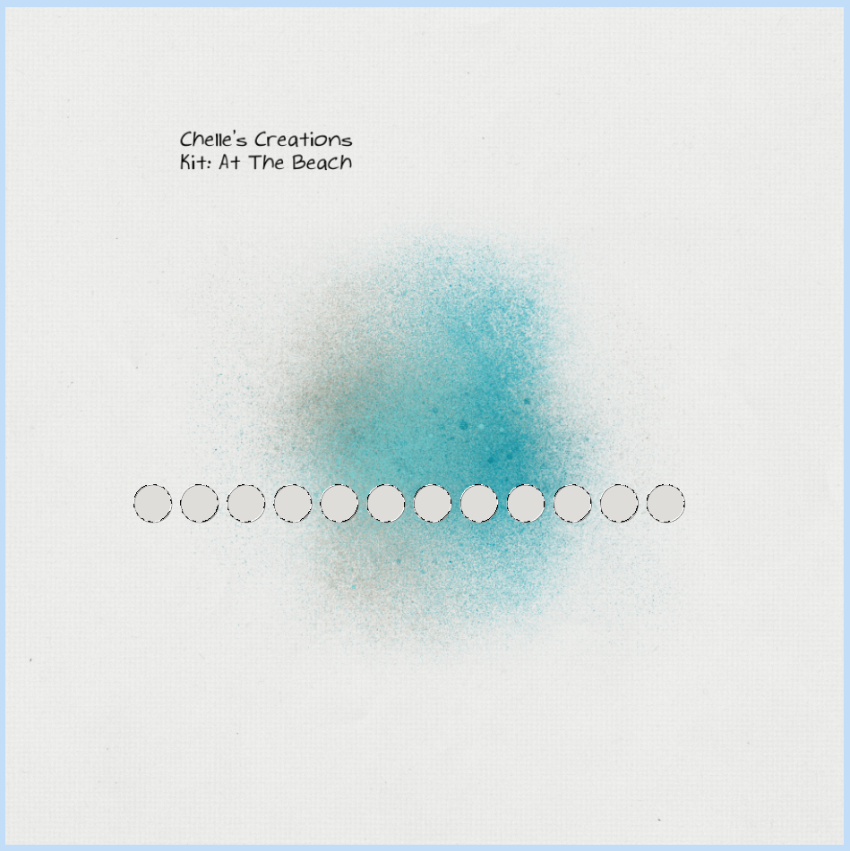
Next, go to each of your paint layers and press delete. No paint where the shape was! Cool, right!?!
Next option!
Using your type tool, type a large letter or symbol. Double click on the Type Layer thumbnail to get your marching ants.
Choose the paint layers, and then delete. Viola!
The CT helped me out and created some awesome layouts to show off this Tutorial: Unmasked Mask! Here they are:
This one is made by Roxana (Roxanamdm) and used Traveler Bundle (retired), CU Spritzers (retired) and CU Bubble Wrap Stamps. She used the tutorial for the stitches around the edges.
Jan (QuiltyMom) created this layout, and check out the roller coaster in the background! Cool! Jan uses SBC+, and shared how she completes this in her software below. Here are the products she used: Roller Coasters & Cotton Candy, CTR Trek, Yeehaw Bundle, Give Thanks and Gimme Layers Vol. 52 by Cluster Queen Creations.
Here’s how she did it in SBC+:
Place the element you want to use on your page, and fill it with a color that is both different and a higher contrast from the mask you are using. Resize and place it over the mask, then flatten the two elements together. Using the wand tool, select the shape, making sure all of it has been selected and hasn’t spilled over onto the mask. Then cut away the selected area.
Kayla (keepscrappin) used the Snowlandia kit and word art. She said she duplicated the spritz on top of itself, so it would show up better and merged those layers together. Then, copied and arranged the spritzes where I wanted them and cut out the snowflakes.
What do you think? Going to try out the Tutorial: Unmasked Mask? I hope so. It really is a cool technique.
Have a great week, and thanks for stopping by!
Hello Friends, Do you talk to the traffic as you drive? “Brakes, brakes would be good here!” Or talk to your plants? “Deadhead. Deadhead, it’s time to Deadhead!” How about groceries in your cupboards or fridge? “I know I bought some. Where are you hiding?” Sound familiar? What if your “things” could talk to you?
Sometimes an interesting way to tell your story is through a message to or from an inanimate object. For example, Do the monkeys at the zoo have something to say about people staring at them each day? Jenny shows us her “take” on what this monkey might be thinking.
She used Zoo Crew Jungle {Bundle}.
Helen’s layout allows us to wonder what a pumpkin thinks as it transitions into a jack-o-lantern. If I were the knife what would I think?
Helen used Falling 4 U.
Try writing your journaling from a different perspective. I wonder what the inanimate objects in your photo’s would say?