The Way Too Easy Watercolor Painting Tutorial

Hi Everyone! This is Jenn, jk703, here to make a favorite technique super duper easy for you to add to your layouts. I’ve seen watercoloring around and there are so many steps and it takes me too long. When that happens, I don’t want to add that technique to my pages, it ends up being too much work! So… I’ve found another way to watercolor – The Way Too Easy Watercolor Painting Tutorial! 😛

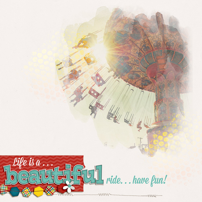
My layout uses the kit that Chelle created for The Daily Digi: Roller Coasters & Cotton Candy.  For the brushes, I’ve used Chelle’s CU Watercolor Brushes.  These brushes are perfect for also adding a painted spot on busy patterns for journaling. :)
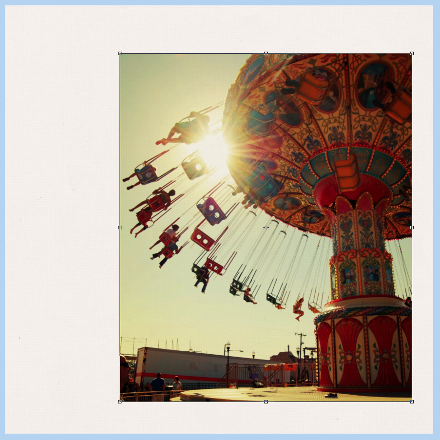
First things first. Open a paper that you plan to watercolor your image onto. Then on top of that paper place a copy of a photo.
Paint1

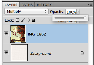
Here is what my layers look like:

Paint2

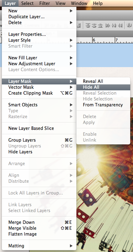
With the photo selected, click on Layer > Layer Mask > Hide All.
Paint3

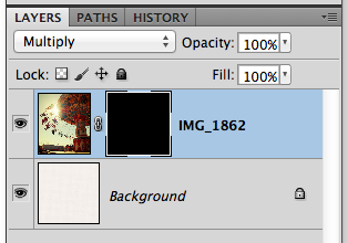
A mask will appear next to your photo in the Layers Palette. Change the Blend mode to Multiply – or whatever works well with your photo to allow a little texture of the paper to come through, and help it blend a little with the paper.
Paint4

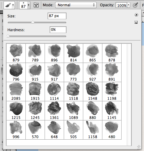
Next, choose the brush tool from the Tools. I’ve got Chelle’s watercolor brushes loaded and I’m ready to paint. If you need to load a brush, you can click on the little circle with the arrow pointing right and choose Load Brushes. Otherwise, you can use any type of brushes that you have or that come with Photoshop.

You will want to use a few different brushes, and different sizes. All of the brushes that I used were a 0% hardness. When painting on the mask, paint with white, and I change the opacity of the brushwork as you paint. If it is too light, you can re-do, but we can also try to fix it in the end. Keep reading! :)

Paint5

After I’ve played around and brushed my mask, this is what my page looks like so far. Not bad with a few brushstrokes!

Paint6

Next, if your painted image is too light, just duplicate with image/mask layer. Then you can lower the opacity based on the look of your image.

Paint7

Here is my darkened, double photo/mask.

Paint8

That’s it. Really, only a handful of steps for a great watercolored look!

Here’s my final layout:
SO_CC_RollerCoaster_MissionScpt_PaintedRide_FunSingle_WEB

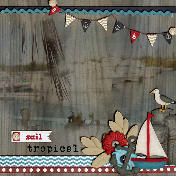
Here is what the CT came up with… some fantastic pages! Jenn (jennschultz) created a lovely waterside page. She used Anchor’s Away and Chelle’s Watercolor Brushes.

IMG_0081

sailtropical

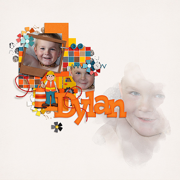
Melissa (pretty peaches) created this cool page of her son. She used CU Watercolor Brushes and Hard Hat.
Me8_zps766f2bda

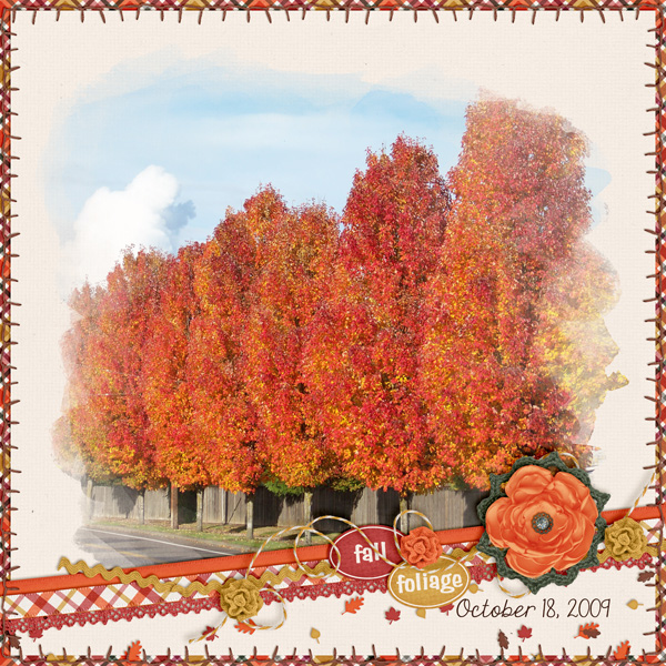
Krista also made a super beautiful fall page for this tutorial! She used Falling 4 You.
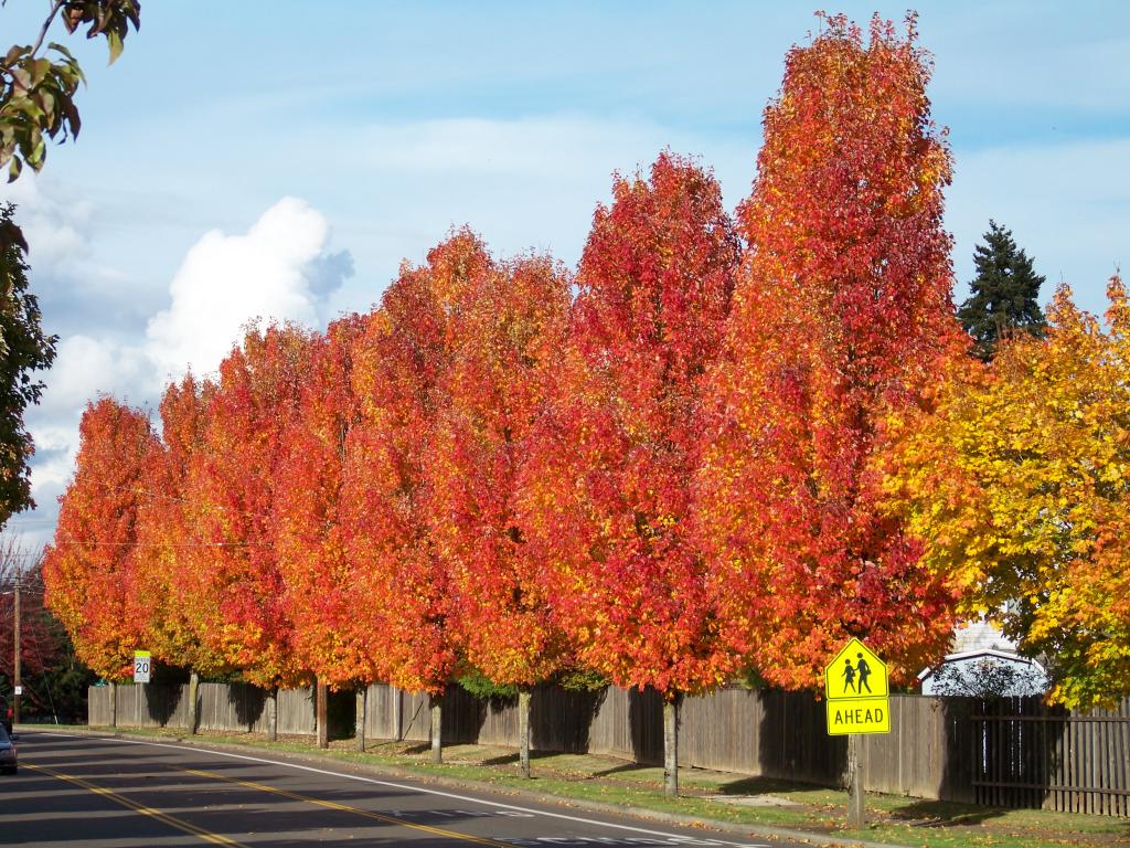
100_2440

FallFoliage_

Hoping you guys find this tutorial as easy as I did! We would love to see your pages i the ScrapPin Gallery! Thanks for stopping by!!

by_Jenn

Using a Graph or Chart | Digital Scrapbooking Words on Wednesday

Hello Friends!
Have you ever tried including a graph or chart in your digital scrapbooking layouts? They can really make an impact. They can be colorful or black and white, whatever you want to emphasize. Graphs can show weight loss, days exercising, or even the # of day your child made their bed or cleaned their room. Charts can be used for chores or potty training. Let me show you the ideas from our creative team.

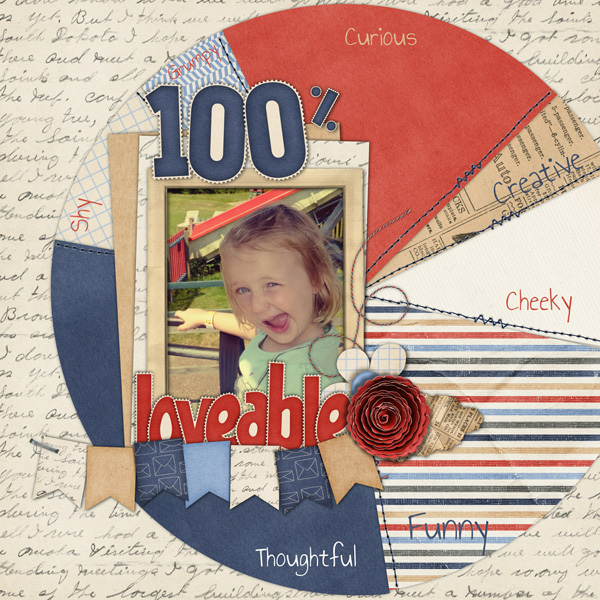
Look how HELEN used a pie chart to share descriptive words about her daughter. Helen shared this information about making charts. “I got a little bit stumped on how to split the percentage so I used this website, you can make all different types of charts for free. http://www.meta-chart.com/Helen

She used Letters From Home (retired)

Jenny made a chore chart for her little alien.
Jenny
She used Out of this World.
cc_outofthisworld_bundle

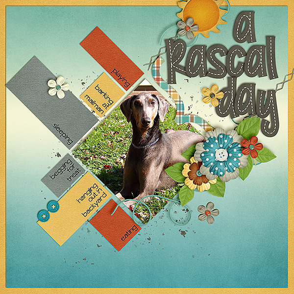
Krista thought she’d try the chart making website Helen provided above.
Krista
She used Aviator, Aviator Bonus Papers & Basic Black Alpha.
cc_aviator   cc_aviator_instaLife_4fb   cc_basicblackstitched copy

Try that funky chart maker out. I think you’ll be making charts for all your layouts.
by-Sari

Classics: Toil & Trouble

Hi Chelle’s Creations friends! It’s almost October, and that means it’s time for costume parties, carving pumpkins, and cauldrons brewing up fun! If you’re in the market for a great digital scrapbooking kit with a Halloween feel, check out Toil & Trouble. It’s full of all the spooky papers and elements you need to tell your fall & Halloween stories. Chelle’s talented team members have a couple of ideas to inspire you.

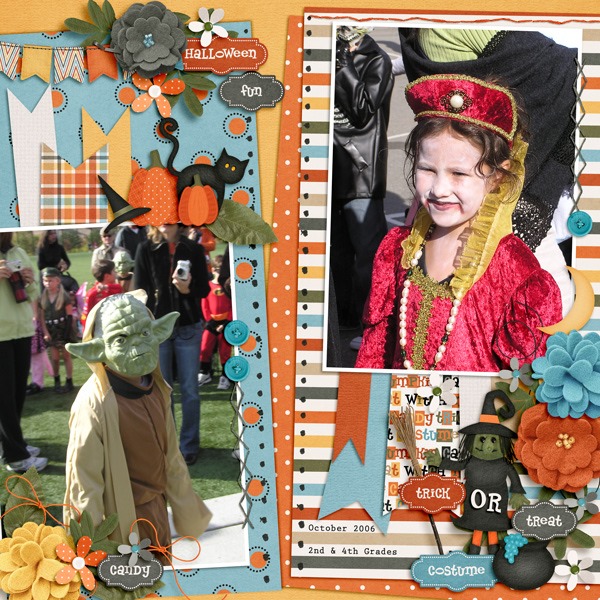
First, check out Kimberly’s digital scrapbooking page. She used a template by Fiddle-Dee-Dee Designs and Chelle’s Toil & Trouble to make this adorable page about her children dressed up and trick or treating. I love the cluster of word art with the cute witch and her broom on the lower right. It’s just too cute to be scary.  2006_10_31_fdd_ffPennants7_tp4_zps0a071350

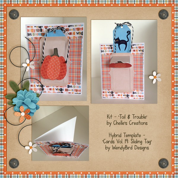
Krista used the kit to make a card with a tag that actually slides on the card. The template is by WendyBird Designs. I love the way she hid the black cat behind the tag so that he is revealed when the tag is pulled upward. And, then she made a beautiful page to showcase her wonderful card creation.  SlidingTagCardPreview_

Here’s a closer look at the kit in the market. The image is linked.  cc_toilntroubleby_Cheryl


Gallery Stand Out | Digital Scrapbooking Outstanding Layout

Hello Friends!

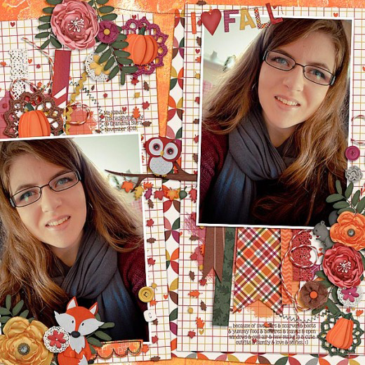
Check out this great digital scrapbooking layout I found over in the SO Pin Gallery by Livybug. She used Chelle’s newest collection, Falling 4 U. Great mirror image photo. The clusters are really fun and creative.

liviebug

She used Falling 4 U & Falling 4 U Gelli Print Papers. (Click on the images for more details.

cc_falling4u   cc_falling4u_gelli

Hugs!

by-Sari