Hey Scrapping Friends!
I’m giving away a copy of my newest collection. Head on over to my Facebook page to enter!
Hey Scrapping Friends!
I’m giving away a copy of my newest collection. Head on over to my Facebook page to enter!
Hello!
I found some fun new digital scrapbooking layouts to share with you from the SO Gallery. I think this layout is very clever. It’s by Sweetie Pie. The black letters combined with the black bear made me laugh. A very creative use of color.
She used Zoo Crew {Safari, Jungle & Arctic). Click on the images below for more details.
This layout is by Mary Whitbey. So lovely and peaceful. The orange and blue really pop when used together. The berry sprigs, string & flower cluster are a wonderful combination
She used Zoo Crew {Arctic}
Mrs. Ashbaugh used the Northern Magic Bundle created by Chelle’s Creations & Ziggle Designs.
Click on the image below for more details.
Have a great day!

Hello. Chelle’s been scrapping again and I have a few layouts to share with you.
Chelle used: Zoopendous papers (retired) & the camera and flash are from Oh Snap!
Chelle used Curled Frames, Play & Grow, & the wheels are from Vroooom! (Vroooom! is retired)
Chelle used Curled Frames, Groovy Party Alpha Doodles and a new kit coming soon.
Hello Friends!
Add a trendy hand-made look to your digital scrapbooking designs with CU Hand Carved Stamps {arrows} by Chelle’s Creations. When you stamp, you never get the exact same image twice, so I’ve stamped each of the 36 stamps THREE times for a total of 108 pngs/brushes. Mix them up for a true realistic look. Arrows in 9 shapes, each with solid, lined solid, outline, & stripe filled varieties. Use them to created paint/stamped elements, tags & journal cards, or papers.
We also had a new FREEBIE available that coordinates with the Fleur De Violette {Bundle.}
Here’s the FREEBIE. Click on the image for more information.
Have a great day!

Hello Friends!
Got some fun ideas for Back 2 School? Let me show you the digital scrapbooking ideas that our creative team came up with. Our ladies have used some products that have been retired, but Chelle has a fun, new school themed kit releasing this week that you can use to make your ideas.
First Jenn S. made this schedule up for her daughter.
She used: Chalked {Bundle}, Home Canning Mini, Lovin From The Oven Alpha.
Next, Kristi used Apple of my Eye & the Chalked {Boards} for this noteworthy idea. Sorry folks, Apple of my Eye has been retired.
Next Kimberly created this adorable school organizer. She made jar labels for pens and labeled a drawer unit that came with spaces to add photos. She provided this information about her project. She used the Chalked {Bundle) For fun, she used a binder clip from At the Beach and a paper clip from One Year Older.
For the pens, she recycled pickle jars. If you run them through the dishwasher a couple times and use a little alcohol, all the label adhesive comes right off. If you wanted to, you could use your Silhouette to do a print and cut for the labels, but Kimberly simply printed them off on brochure paper on her ink jet printer and cut just outside the chalked line. She said if she was making a lot of labels, she would have set up the machine, but it was quicker to just use scissors for this project. *Note, if you notice, the jars are a little lighter than the boxes. That is what happens when you forget to change your printer from black and white to color. Color, will give you darker blacks. But black and white will save a little money on your inks.
To attach the labels to the glass, she sprayed the back of the paper with E6000 adhesive and smoothed it into place and glued some ribbon over the edge of the jar using Aleene’s Original Tacky Glue, hiding the screw top of the jar.
This was a CHEAP and EASY DIY organizing project. If you use the CHALKED {bundle} around your house, we’d love to see it. Post a picture in the comments, over on Chelle’s Facebook Page, or in the Scrap Orchard forums.
I hope you’ll use some of these fantastic ideas.

Have you ever struggled with where to put your photos on a digital scrapbooking page? I tend to scrap with a lot of templates, so I struggle when I need to make a page from scratch. That’s when the Rule of Thirds is most helpful to me. You’ve probably read about it with regard to photography, but the same principle can apply to design of a good scrapbook page. Basically, you imagine placing a “tic-tac-toe” grid on your page, dividing it into 9 equal sections. Then, place the main focal point of your layout design on one of the crossing points. SusyQScraps wrote a terrific article about this a few few years back, and you can read it here if you want to know more.
Let me show you a page from Krista, one of our Creative Team Members. She used Chelle’s Anchor’s Away and Anchor’s Away {alpha} to make her page. She also took some help from a template freebie from Fiddle-Dee-Dee Designs and shifted the elements a bit to follow the design principle in the Rule of Thirds. The focal point is clearly the large photo in the group of three. It is placed on the imaginary cross point on the bottom right of the tic-tac-toe grid, and my eye is immediately drawn to it. Then, for further emphasis, Krista has placed the title banner directly below the large image, and she has repeated the image in the smaller two photo spots.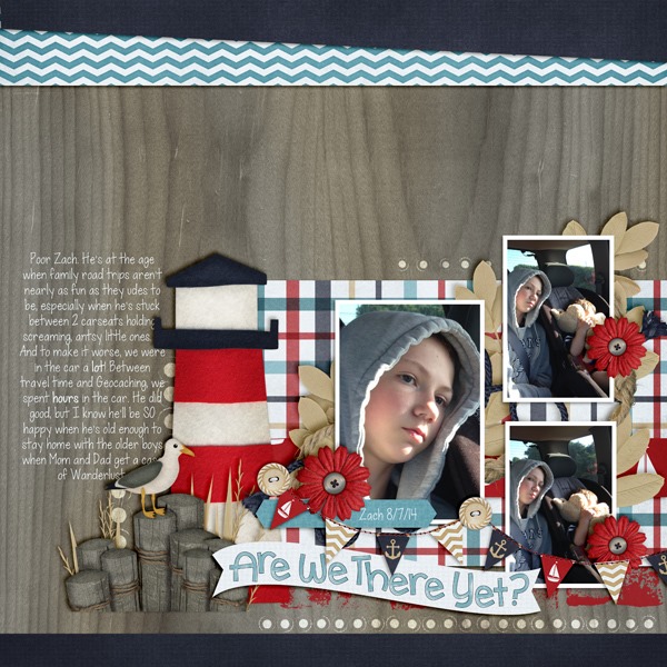
Likewise, Jennifer used the same lower corner spot to place her focal point, but she used a single photo on her page. She used Chelle’s Choose the Right {TREK} for her page. I love the wooden letters in that included alpha.
Would you like some help making your page? Fiddle-Dee-Dee Designs has a freebie on the Scrap Orchard blog that follows the Rule of Thirds perfectly. Her focal point is a single photo, and she has placed it in the top right cross of the imaginary grid. Here’s a look at that template; the image in linked to the Scrap Orchard blog where you can grab the template as a free download. 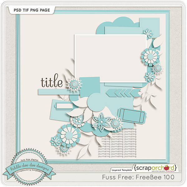
I hope you’re inspired to make a page using this design principle and preserve some of those precious memories you are making with your family.
Hello Friends!
This month we challenged our creative team to combine the 2 kits: One Year Older & Play N Grow into great digital scrapbooking layouts. Let me show you them.
and
Now for some yummy layouts. Lisa is up first. The ballons and ricrac really line things up.
Mel N created this layout. Love the paint spray(s).
Last up is Donna. Love all the angles she created with the different papers.
What layout could you create with these two kits?

As a kid I loved to place stickers everywhere. Did you know you can get your elements to have a sticker look to them. Chelle’s Creations has this video tutorial to show you just how easy it is. Chelle uses elements from her kit Play & Grow for this video.
Here is some creative team inspiration using what they learned from the video.
Jen (supergirljennie) adds the sticker look to different elements from the See Clearly Now kit. I love how she combines a font with the See Clearly Now {alpha} to create the title on the page. She used a template by Scrapping with Liz.

This technique does not have to be used with just elements. Melissa (prettypeaches) sticker-ized the Hard Hat Required {alpha} on her layout. I love the split design of the Little Green Frog template she used. Isn’t that cluster on the bottom of the page too cute? She used the Hard Hat Required kit for this adorable page.

Love the kit Chelle used in her video? You can pick Grow & Play up in here store.

I can’t wait to see what you decided to sticker-ize!
Hello Friends! Look at what Chelle has been scrapping lately.
This is the layout from Scrap Twister on August 12th.
Chelle used Curled Frames & Good Night Teddy.
Chelle used Curled Frames, About A Boy, & Techno Love (retired)
Chelle used Curled Frames, One Year Older (balloons & candles), Love Grows (backgrounds, retired) and the alpha is from Hard Hat Required (navy paper added), stars are from Liberty & Good Night Teddy.
Chelle used Curled Frames, Hard Hat Required& SuperCali Alphas (#2).