Can you believe the title of the post? 7.10 Tips: Web Saving – Pop, Sharpen and Save! That date – it’s July already! The year and summer for that matter are flying by fast! It’s Jenn, aka jk703, here to give you a little tutorial for saving your scrapbook pages for gallery uploading. Many things can be done differently, and this is just based on how I complete this process. Once you get the hang of it, you could even record an action, and make it even faster!
Saving has a few steps for me. Saving the .psd as I work, the the final psd, then the print copy and finally the WEB copy. I name them as to what they represent – Working Copy for layouts in progress, PSD copies with kit, font and file info when complete, Print copies have ALBUM Left or Right at the end, and Web copies have WEB on the end. This way, I’ve covered my bases. When saving your files for print, make sure you choose the Quality of 10 (at least) so your pages come out as beautiful as they really are! Web saving is a little different as you need to lower the dpi as well as the size of the image.
So, you’ve finished your layout and are wondering what to do next to save for the web. First things first, we need to flatten the image, and merge all those pesky layers. Click on the top most layer in the layer palette, and choose Flatten Image.
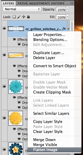
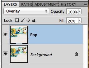
Next, you will make a duplicate of the Background. Right click on the Background layer, and choose Duplicate Layer. For my example, I’ve renamed the duplicate layer “Pop.” I’ve also gone ahead and changed the Blend Mode to Overlay, and lowered the opacity to 20%. Usually my opacity is anywhere between 20 and 80%, depending on the layout and coloring.
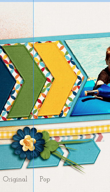
This pop layer give a little pop to your layout colors for uploading to the web. I find that my images don’t seem as bright or sharp when I upload, so I add those two things. Here is the slight difference you can see at 20% for the pop layer. You can see that the white pops a little more than the left side, the green has a little more color, and the flower has a slightly deeper blue.
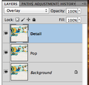
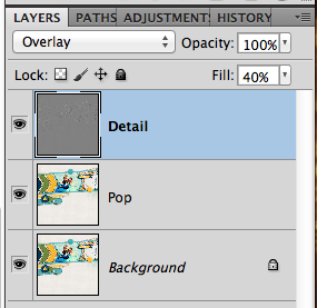
Next, we need to add a little sharpness. You are going to duplicate your Background Layer and move it to the top of the layers palette. I’ve renamed my layer “detail” for this example. Change the blend mode to Overlay. Here are my layers.
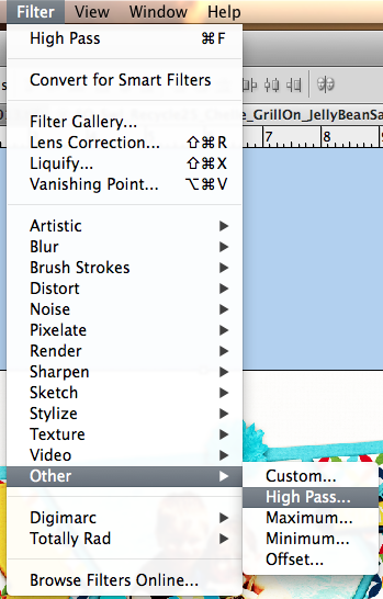
With the “Detail” layer selected, choose Filter > Other > High Pass.
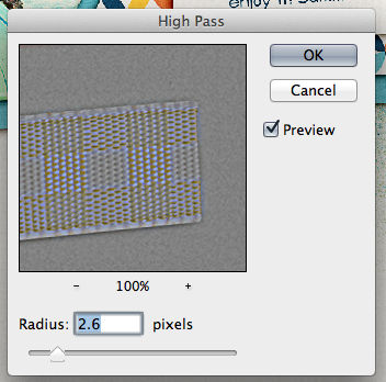
A pop up menu will appear. I move the slider to approx 2-4 pixels. It depends on the coloring to determine the amount. For this one, it is set at 2.6. I prefer to have the preview clicked so I can see the details on my larger image.
Here is what my layers look like at this point. For the Detail layer, I’ve lowered the opacity to 40%. Watch your page as you move the slider to determine what you like best, and how much detail you want. Sometimes, it can look over exposed, so be sure to look at the whole layout.
Here are two images that show the difference in detail when using this method. You can see the leaves have a little more detail showing, as well as the papers, and textures. It really makes the page look fantastic. 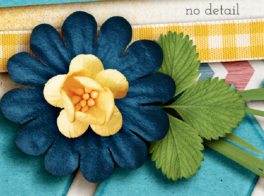

You can also do two other methods for sharpening. They would both be on the original background layer, and you would not need a duplicate/overlay blend mode layer. A straight Filter > Sharpen > Unsharp Mask with Amount approx. 20-150 and radius approx .01-2. Or you can also choose Filter > Sharpen > Smart Sharpen with the Amount approx 15% – 60% and a radius of .5-2. At this point, you can merge your layers, and then save the file for printing. Be sure to play with the blend modes and opacity to see what you like. What I do is my preference. As you scrap, you will find what pleases your eye. 
There are two ways you can do the next step. Here is what I think most people do, though I don’t complete this step.
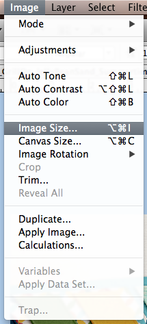
First, click on Image > Image Size.
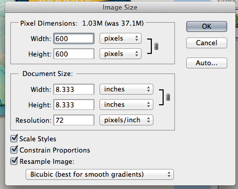
A menu will pop up and you will want to change the size to 600 x 600, and the dpi to 72.
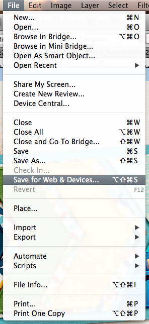
Once you complete this, you are ready to save for the web. Click on File > Save for Web and Devices.
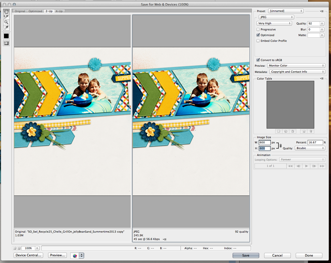
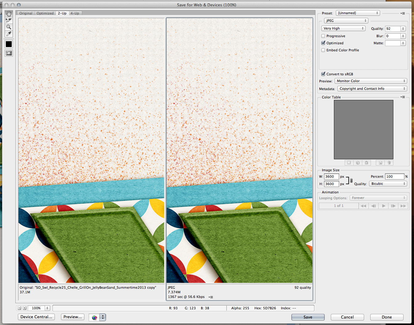
A large pop up will appear. It will be of your layout with a before/after view, and ability to change some settings. You will want to check that the image size is 600 x 600, and we will get the highest quality that we can in the next step.
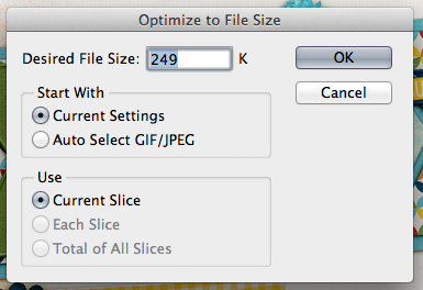
On the screen print below, in the top right corner is a small down arrow and lines next to it. click on this icon. A small pop up will appear, and you want to type in 198 or 249 – whatever the gallery limit is where you upload your images. I use a smaller number than the actual limit so that I don’t go over, and won’t have to repeat these steps.  After this step, you will click Save, and save your WEB version layout.
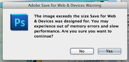
Going back a couple of steps, you might miss a step and hit a snag. If you accidentally get this pop up, don’t worry! Click ok, and let the image load. (This is actually my usual step. I don’t usually re-size before I click on the Save for Web and Devices. )
The same large pop up will appear and, you can adjust your image size here – right in the middle to right side of the pop up. Change it from 3600 to 600 for both areas.
When you click save, just make sure to at least put WEB so you know this is the WEB version of your layout.
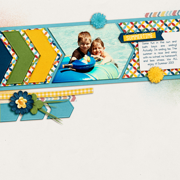
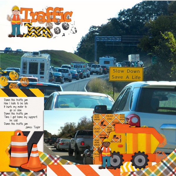
Here is my web sized layout – after. My layout uses Chelle’s Grill On kit, Scrapping with Liz Recyclables 25, and the font is Jelly Bean Sandwich. Fun kit and super versatile!
Lisa (kelseyll) also shared some wonderful information from her scrapping experience:
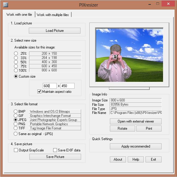
I didn’t start out digitally scrapping in PS so all the “save for web” tutorials I saw didn’t work with my program. When I first starting uploading to galleries and doing CT work I discovered PIXresizer, which is super easy to use. Even though I have PS now, I still use it! After downloading, unzipping and installing you are ready to go. I like that you can do an individual file OR a whole folder of images at once – and it is really fast. You can quickly change what final dimension you need and even change what format it will be saved as. I simply upload my 12×12 (3600×3600) layout by clicking “Load Picture”. I change the custom size to 600×600 and hit “Save Picture” and select where I want it saved. If I need multiple preview sizes for my designs for advertising I just go back and change the custom size and “Save Picture” again. For my photography, I can click the other tab at the top, “Work with multiple files” and navigate to a folder from a photoshoot and resize the entire folder in seconds. I honestly can’t compare it to other “save for web” actions, or scripts because I’ve never veered from PIXresizer and being a SAHM now, I couldn’t beat free!
Here is a screen shot of the software she uses:
That’s everything for saving your layout for the Web. Hope you got some great tips and pointers here from my post today – 7.10Tips: Web Saving – Pop, Sharpen and Save.
Have a great week and thanks for stopping by!
