9.30.2015 Selfies & 2 FREE Alphas | The Digital Media Scrapper

Hello Friends!

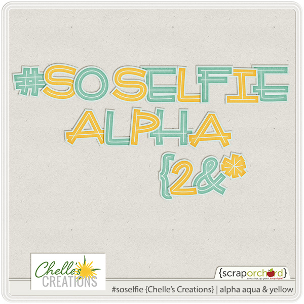
Selfies are everywhere! We all take those serious, silly, funny, and creative selfies. Then there are the selfie sticks. I think getting as many people in your selfie is almost like seeing how many kids you could cram in a Volkswagen Bug 20-30 years ago. We wanted to encourage you to scrap your selfies so Chelle is offering 4 different colors of her SO Selfie Alphabets for FREE. So..show us your selfie side!

cc_soselfie_alpha_aquayellow

Enjoy!

by Sari

Gymnastics

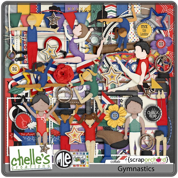
Here’s a look back at a classic kit from Chelle’s Creation celebrating everyone from the tumbling toddlers to the elite competition gymnasts in our lives. The Gymnastics kit is a collaborative kit by Chelle and mle Card with lots of brightly colored papers and hand rendered elements. But check out the digital scrapbooking pages Chelle’s CT members have created. I’ll show you three pages using the same kit, and you’ll be surprised at the variety.

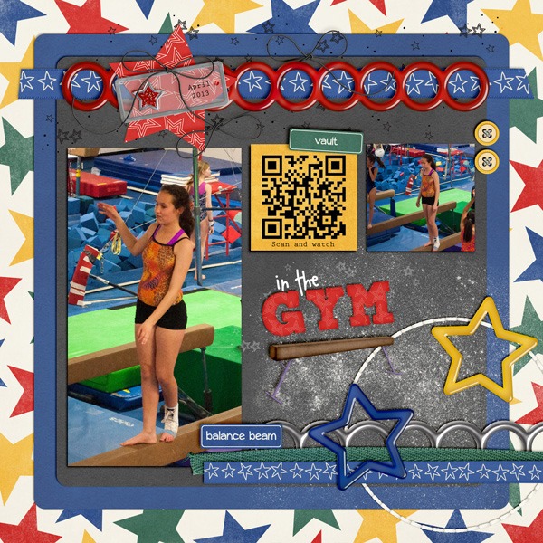
First, Kimberly has a daughter who does tumbling lessons and classes every day because she is a competition cheerleader in her high school. I’ve seen her in real life, and she is amazing. But, Kimberly’s scrapbooking skills are equal the task of capturing her daughter’s great moves. She used a layer mask on her large photo to mask away the bottom corner of her photo so she could tuck it behind the ribbon on the quick page (sold separately but made from parts and pieces of the kit). She even included a QR code which you can scan with your phone to see a video of her in action. The QR code comes out with a white background, so she used a blending mode on the yellow paper she clipped over the QR code. 2013_04-gymSwL_Feb2015SOTemplate2_zpsksbkfpol
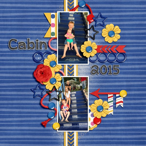
Next, Jenny took the same kit and made a layout that has nothing to do with tumbling, and yet the kit is absolutely the best choice. The bright colors and stars in the kit were a perfect match for her children, the stars of her show. I love the flow of movement down the page with the photos arranged vertically on the layered ribbons and clusters of flowers and stars. Cabin2015fdd_ffLABR2_tp2_web
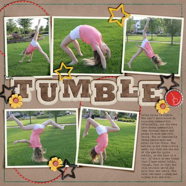
Finally, Jenn chose to use the neutral colors in the kit for her page. The tan paper and green stitched border are a great match for her outdoor photos. But the jumbled arrangement of the letters in the title caught my eye. They seem to pop off the page and complement her tumbling subject perfectly. tumble
Here’s a closer look at the kit in the market, but don’t miss the quickies or the bundle for a real bargain. cc_mle_gymnastics_kit
by_Cheryl

Scrap Twister | Digital Scrapbooking Socia Media Scrapping

Hello Friends!

Have you participated in Scrap Twister yet? It’s a great digital scrapbooking resource for you. We spend time watching Chelle scrap, but she also answer’s questions and does demonstrations. It’s usually on the 2nd Tuesday of the month, so in Oct5ober we will be meeting on Tuesday, October 13th at 7PM MDT.

We offer a participation prize, and if you are lucky enough to be a spinner, you also get a spinner coupon. We start out twister by asking who is new? You’ll get to see sneaky peeks on what Chelle is working on.
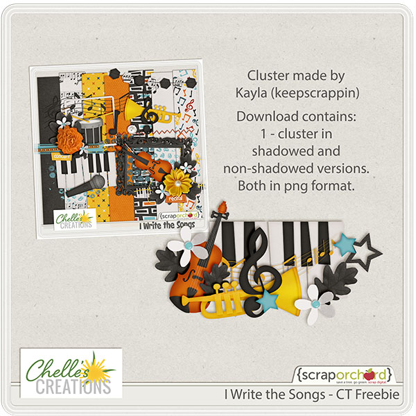
You don’t have to be there to participate. Chelle makes a link in the SO Forum listing our “instructions.” So you can post a layout and still get the participation prize. Look for a newsletter from Chelle that looks something link this.

Or perhaps one like this.

Have a great day! Hope to see you at ScrapvTwister!

by-Sari

9.24 Video Tutorial: Adding Realism with Reflected Light

We all like our pages to look at realistic as possible, right? We want the viewer to feel as if they were to run their hand around the page they would feel all the different textures and depths of things. Chelle’s Creation has created a video to help you add realism to flower centers using her CU Silkies V3. Take a look at how explains how to give the center of the flowers a realistic look.

Now let’s take a look at how Donna used this video to create her layout.

Look at the way the flower’s center on Donna’s (djp332) page appears to be at varying heights on the flowers. This is much like a real flowers center would look. To create this page Donna used The Great Outdoors Bundle along with the CU Silkies and CU Flower Centers Pearl Pips. To get the look of the terrific page she used a template from Scrapping with Liz.

Do you love the look of the Silkies, then head over to Chelle’s store to check out the different varieties she has to over. While there also check out the various pips you can use.

As always be sure to share with us the pages you create. Happy scrapping!

Mad for Monochromatic

Pick a color, any color, and use it as the ONLY color on your next digital scrapbooking page. You might discover details in your photos you hadn’t noticed before, or that other colors in your photos pop instantly. Or, you might just notice that the monochromatic scheme you’ve chosen has a calming effect on you when you view your page. Chelle’s Creative Team Members have a couple of pages to show you how they used a basic brown color scheme to achieve two different feelings on their pages. Let’s take a look:

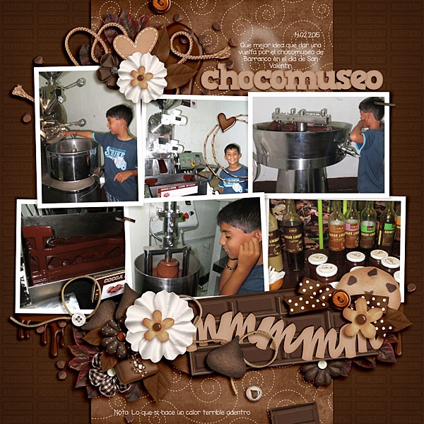
First, Roxana made her page from the brown elements in Give Thanks and Chocolate Lovers, the perfect choices for her trip to the Chocolate Museum. I can’t think of a better reason for a field trip than to visit that place of deliciousness, and Roxana’s page leaves me feeling satisfied and calm when I view it. I love the way she layered the flowers with the chocolate pieces in the Chocolate Lovers kit. ccsept11

In contrast, Jan’s page is also made from brown and neutral-toned papers, this time from Choo! Choo!, but the purpose of her color scheme was to bring out the exciting pops of color in her photos. Her page is very dear to my heart since I spent many wonderful years in that fun city of Chattanooga. The Choo Choo is definitely a fun destination and her color scheme has served her well in conveying that feeling. choochoo

I hope you’ve been inspired to try this technique. It might seem awkward to stick to shades of one color on a page, but I think you’ll find the results well worth it.

by_Cheryl

Big Screen Alpha & LIOT {Doubles} 27 & 28 | Digital Scrapbooking Week In Review

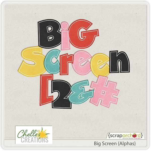
Hello Friends! This week Chelle released her digital scrapbooking Big Screen Alpha & her latest additions to her Lay It On There {Doubles} Series. #’s 27 & 28. Let me show you the goodies. I adore this alpha. It comes with it’s own personality.

cc_bigscreen_ap

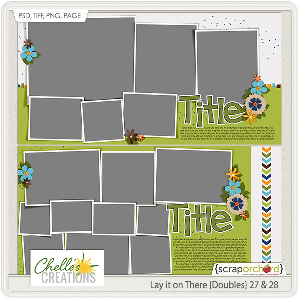
I also find Chelle’s whole Lay It On There {Doubles} series to be fabulous. The digital scrapbooking layouts it helps creates are so.. Squee!..fun.

cc_cc_layitonthere_doubles_27n28

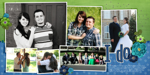
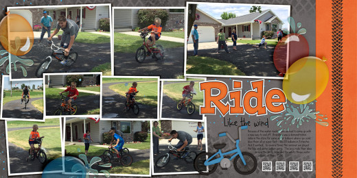
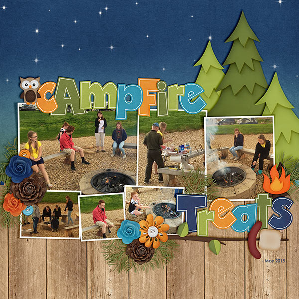
Here are some digital scrapbooking layouts to be inspired by. They use the templates & the Big Screen Alphas.

2 Ups Layouts copy

Here’s one more layout by Kayla.

kayla.bigscree.greatoutdoors.LIOT27 copy

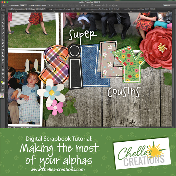
Chelle made  You Tube Video to help you Make the Most of Your Alphas you have bought.

Make_Most_of_Alphas

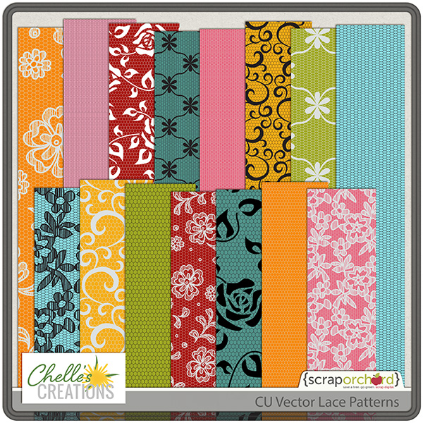
For our CU Friends, we have CU Vector Lace Patterns. These are positively divine. I urge you to pick them up just to play with if for nothing else.

cc_CU_vectorlacepatterns

Talk to you soon! Enjoy!

by Sari