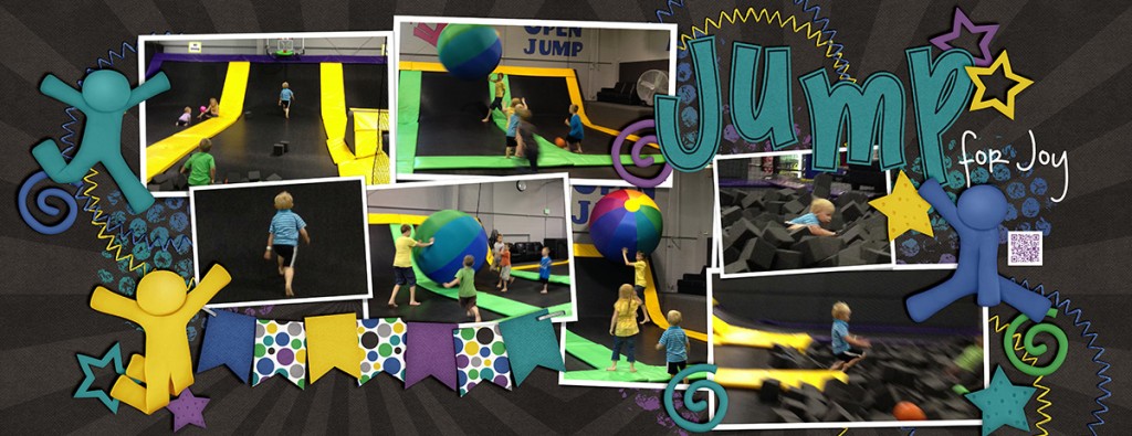
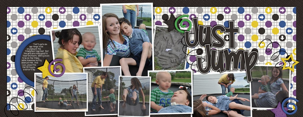
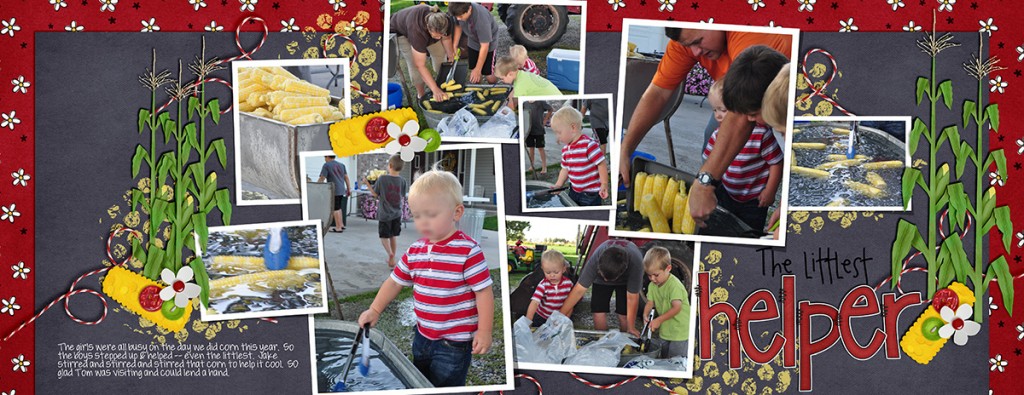
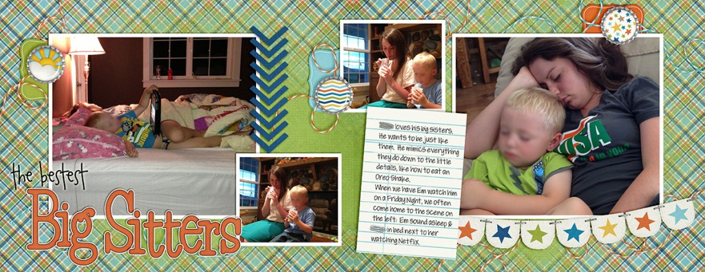
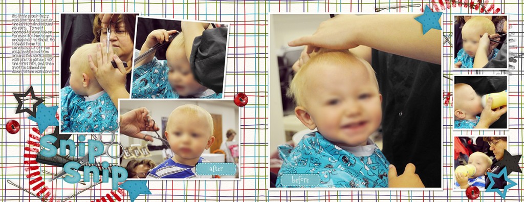
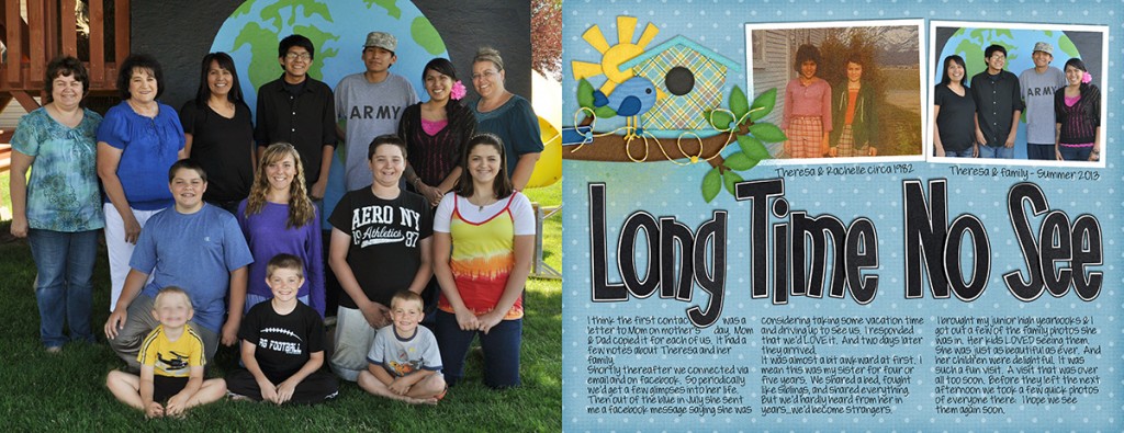
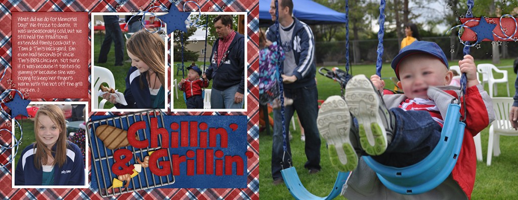
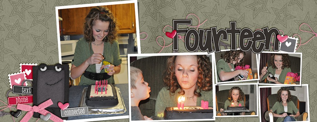
Hey Scrappers! What a crazy week. Just four doubles this week. (Officially I’m counting that as 8 layouts.)
CU Basketweave Patterns Playdate | Digital Scrapbooking Week in Review
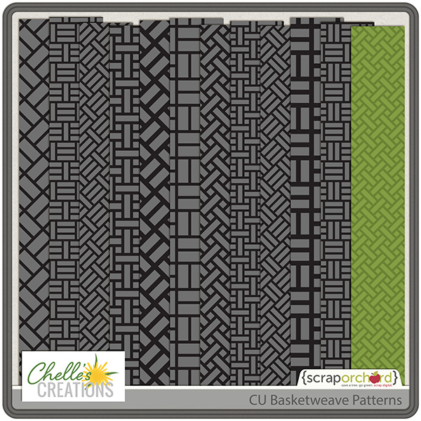
Hello Friends! We’ve had a quiet week as we’re still settling into the new year. This week Chelle released a CU product. CU Basketweave Patterns.
We also talked about the Pantone color of the year, Orchid. Do you have plans for your layouts to be in purple tones, like these? Orchid may be Panatone’s color of the year, but all shades of purple are showing up in trend-watch articles. Here’s a color pallet to look at? If you are a scrapper who likes your clothing to match the kit, better hit the stores looking for these marvelous shades of orchid. LOL!
See you on Monday for a gallery stand out.

Friday Freebie! Home for the Holidays Cluster | Digital Scrapbooking Freebies
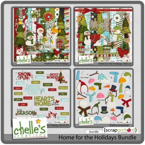
Hello Friends! Have you made any snowmen this winter? Kayla (keepscrappin) has made a cute cluster using Home for the Holidays.
Here are the links to the Home for the Holidays coordinating pieces in the market. Love the Build A Snowman pieces. Perfect if you’ve recently seen a movie with a snowman in it. Hmmm?
Thanks for Kayla for creating this for us all. Have a great weekend!

1.16 Tips: Shadowing and Preferences
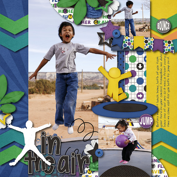
Hi Everyone, it’s Jenn (jk703) here to share some tips with you today. I’m going to focus on shadowing and preferences – because everyone shadows differently, and everyone has their likes and dislikes. It can depend on the blend modes, distance of your shadows, the size of your shadows, the color of the shadows, and the opacity of the shadows. There are so many different things that can change, so that is why I’ll show you a little of my shadowing and preferences. For today’s example, my page is using Chelle’s newest kit – Jump Zone and it’s coordinating (but so versatile) alphabet – Zone {Alpha}. Here is my page: 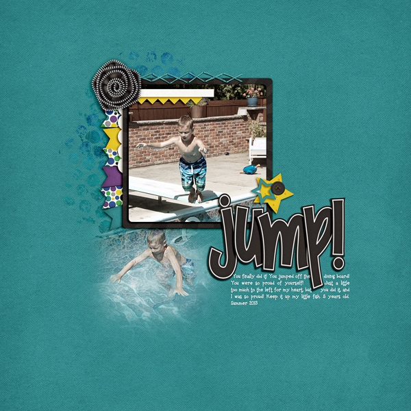
Now, let’s get a little closer. First up, the banner.
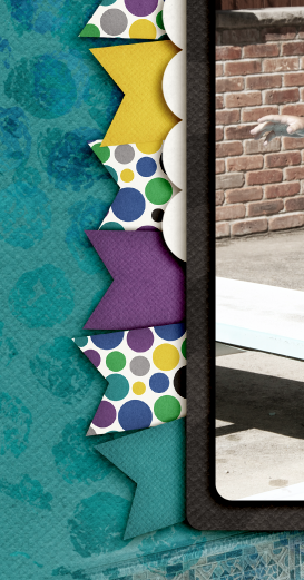
For this particular banner, I have it tucked under paper layers, so it is closer than if it were on top of the photo. For this and the paper layers, I use what I call “Paper Layer + Opposite Edge.”
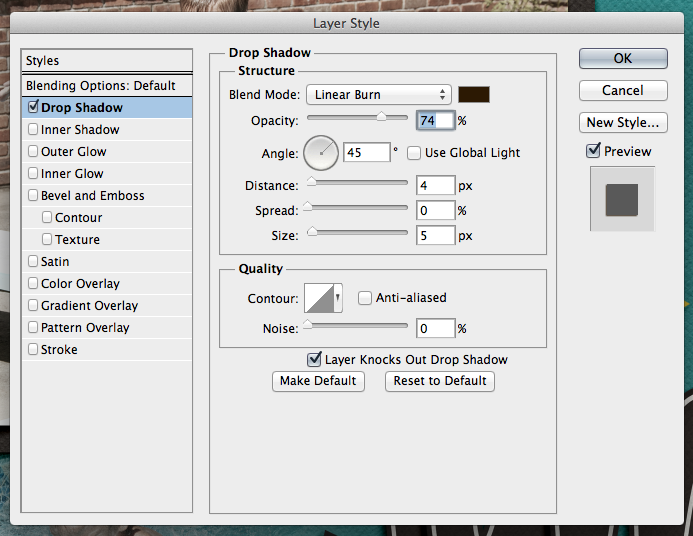
Here is the shadow information. For the basic Drop Shadow layer, my style uses a Linear Burn, 50% opacity, with a Distance of 13, and a sir of 24. The distance will change how far away the shadow will be from the paper or element. The size will determine how “crisp” your shadow is, or how blurry it is.
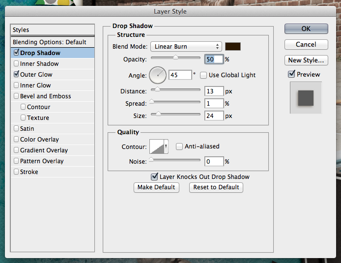
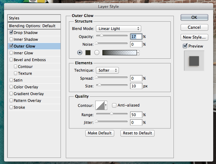
For this and most of my paper layers, I add a shadow to the opposite edge. When I look at a paper, it doesn’t sit perfectly on top of another when stacked – there is a slight shadow around the edge so you know they are separate pages. To get this effect, I add an Outer Glow. I use Linear Light, at 17%, color versus a gradient color, and my size is 10 with a softer Technique.
Next up, how I add shadows to stitches. They are really close to the pages, so I shadow these with a heavier “color.” For me, when I look at pages, the closer the item it and how “heavy” at item is will dictate what kind of shadow you need. You may think otherwise, and that’s ok. This is all about you and your preferences. Here are my settings for the stitching:
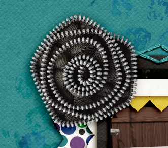
One last shadow, and then I’ll share what the CT made! Flowers. There are SO many different flowers, realistic, paper, doodles, etc, and there are so many more ways to shadow them. For this particular page, I have a zippered flower. To me, that is a heavier flower/fabric, and metal – which deserves a heavier shadow. Here is my normal “higher” flower shadow with a little added for the opposite edge. 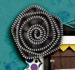
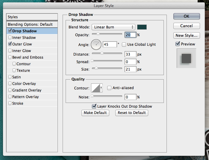
It looks too dark to me. Especially on the darker teal paper. So, I adjusted it, and the color of the shadow to make it more to my liking.
Here are the settings that I used for the second flower. I changed the color by clicking on the color box, and then clicking on my background paper. I then chose a color on the darker end of the slider. I also lowered the opacity, and made the size a little smaller than usual. This isn’t my normal settings, so it took some time to make it pleasing to my eye.
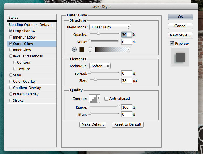
For the opposite edge of the flower, I used the Linear Burn Blend Mode at 30%, along with the Technique: Softer at 38 pixels in size.
Play with your shadows, and make them how YOU like them. Use the shadowing and preferences how you like them! Once you like them, get a test print of one page before printing. By doing that, you can make sure that you like how they look when printed. I wasn’t sure when I printed my first album, but it turned out wonderfully. Recently, I printed a Wedding Guest Book as a gift for a cousin, and again, I loved the book so much, and the shadows really made it stand out. People were “petting” the pages.
Here is what the CT shared with me. First, Ophelia (navaja77) uses Gimp for her scrapping! So she gave me some information to share with you all and a sample page of hers! She used Jump Zone and Zone {Alpha}.
“I used GIMP 2.6 and Drop Shadow Script-fu. For the papers – I typically use X: 15, Y: 15, Blur radius: 25 and 65% opacity. For this page, I used X: 20, Y: 20, Blur radius: 35 and 65% opacity. For the elements – X: 25, Y:25, Blur radius: 55 and opacity 65%. This page didn’t have stitches or washi tape but for those I typically use X:4, Y:4, Blur radius: 4 and opacity 40%. For leaves, to get the realistic feeling, I will increase to 30, 30, 60 and opacity 60%. My settings place the shadows on the lower right side. If you prefer lower left side, then change X to negative number (e.g. Papers: -15, 15, 25, 65%). If you shadow like Chelle, ten both X & Y would be negative numbers so you get shadowing at upper left.”
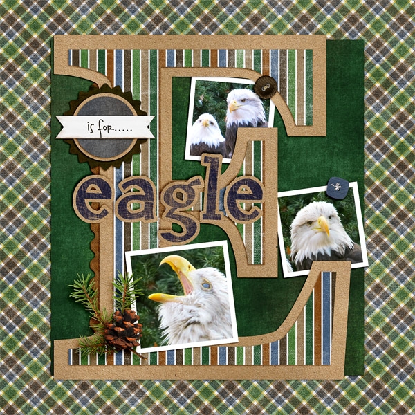
Next up, is Donna (dip332) who created this wonderful page. She added shadows using Chelle’s Me & My Shadow, and then tweaked it to her taste. She said “I made the pine and pine cone really stand out by using both an upper and lower large shadows. I also used a chipboard shadow on the word eagle. The buttons are both a flat button setting. The rickrack is a flat ribbon shadow style.” Perfect way to make it stand out – using two shadow settings on one element! Great idea! (She also used Let’s Camp S’more and On The Trail)
Lastly, here we have a honorable page from Leah (Cat Lady). She said “I start with Chelle’s shadows and expand from there. And I love to put shadows on their own layer and expand and move them to cause elements to “lift” off of the page!” She used Chelle’s Rolling Along kit and Scrapping with Liz’ December Tuesday’s Template.
Hope you enjoyed today’s post – Thanks for visiting!
Kraftabulous
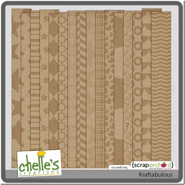
Chelle has a great kit in the market perfect for helping you to stretch your digital scrapbooking stash. It’s called Kraftabulous, and it is simply a kit of extremely versatile kraft papers with various patterns and textures. Her Creative Team has made some pages to show you how well these papers complement any of Chelle’s kits.
First, Jen used Toadally to make this adorable page about her children enjoying a children’s museum. The patterned kraft paper is a great neutral for the bright spring colors of the Toadally kit. 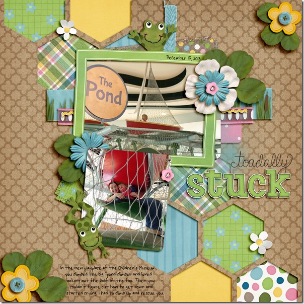
Next, Krista used a kraft paper with a chevron pattern for her background and combined it with the Play & Grow kit, Jump Zone alpha, a plaid paper from Street Smarts, and a template from Little Green Frog Designs. I love the movement across the page conveyed by the template design and the chevron pattern. 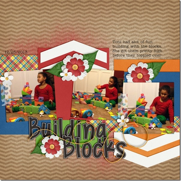
Next, Tammy used a freebie template from Fiddle Dee Dee Designs with Chelle’s Snowlandia kit and a diamond-patterned kraft paper for the perfect combination. I love the way the blues and purples look on the brown Kraftabulous paper.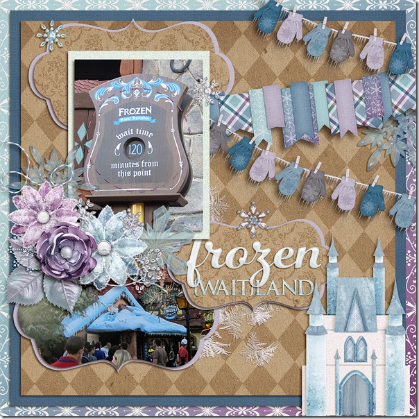
Finally, Donna made a double page using a Scrapping with Liz template and Chelle’s Letters from Home with a plaid patterned Kraftabulous paper. Again, it’s another perfect combination. 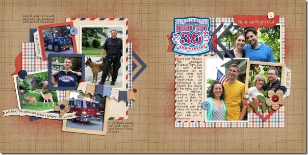
The team has shown you that all colors go well with the Kraftabulous papers. Here’s a closer look at the set in the market. I hope you’ll be inspired to create something new with it soon.
Then & Now | Digital Scrapbooking Words on Wednesday
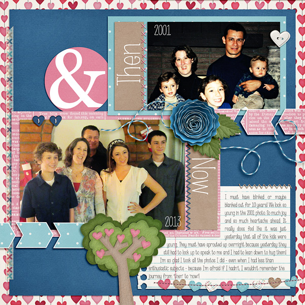
Have you created a digital scrapbooking then and now layout page? An Interview page? A layout designed to compare different periods of time? I love to look at them. They just make me smile.
There are 27 years between my older brother & younger brother. Between the boys, there are 7 girls. We have a picture of my older brother holding my younger brother. After thinking about this blog post, I’ve decided it might be really funny to do a then/now of them. Cleon is now 66 years old and Matt is 38.
When I was about 7 years old, I told Santa I wanted a set of baby size quilting frames. Why? My Mom & sisters were spending a lot of time quilting for trousseau items. I have 6 older sisters. Santa brought me lots of toys, but I didn’t “see” them, all I saw were my quilting frames. What did I want to do with them? Certainly not quilting. We (Chelle & I, and probably some of her sister’s) would spend hours playing under the quilt in our clubhouse? Or whatever we called them. Today I wish I had a picture of that Christmas or of the ladies’ around the quilt or of us kids under the quilt. Do you have a favorite hiding place that you or your kids like(d)?
- One idea that I’ve seen is creating a layout or photo of what people looked like then vs the same photo layout today. Your family when some of the children are born vs today when all the children might be adults or teenagers.
- Favorite foods ‘then” vs “now.” Decades apart.
- My family seems to take sibling photos when a family person has died. (the living people, not the dead)
- School spirit days. All those retro hair photos, surely you have some of them.
- High School senior pictures vs 20 year reunion photos.
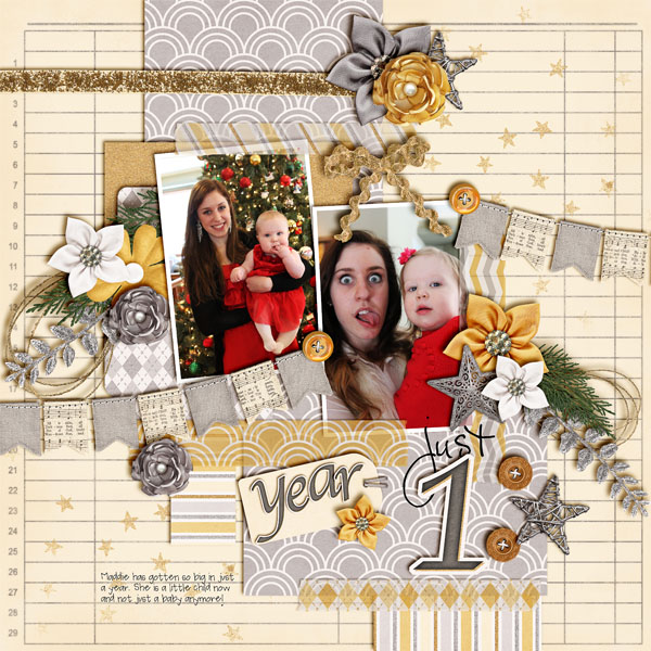
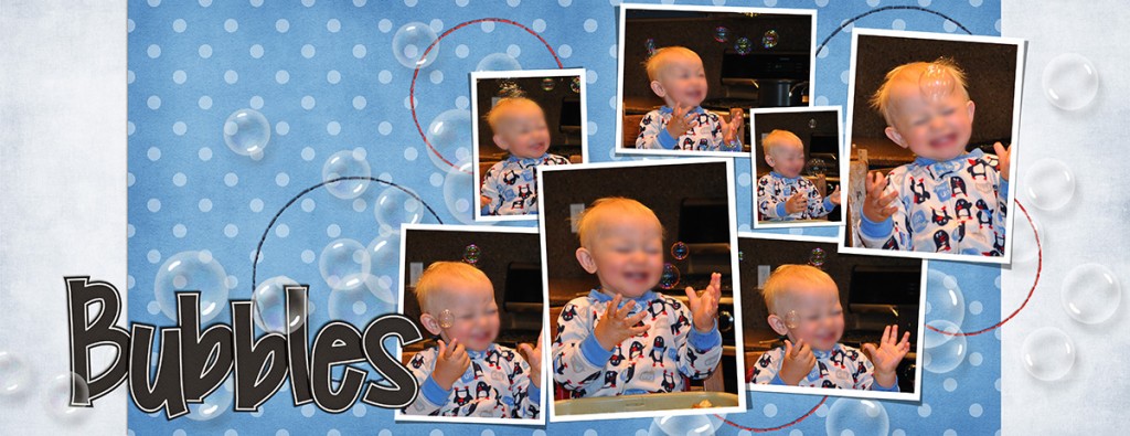
I’m sure you can think of some other ideas from our creative team. Jenn S (jennschultz) used the idea of 1-year photo of her daughter. Aren’t those goofy eyes funny?
Jennifer (jmljensen) created this layout. Do you have a 7-year itch layout?
and Tammy (CraftyTam)
I’m looking forward to see the layouts you create.

Gallery Stand Out | Digital Scrapbooking Ideas
Hello Friends!
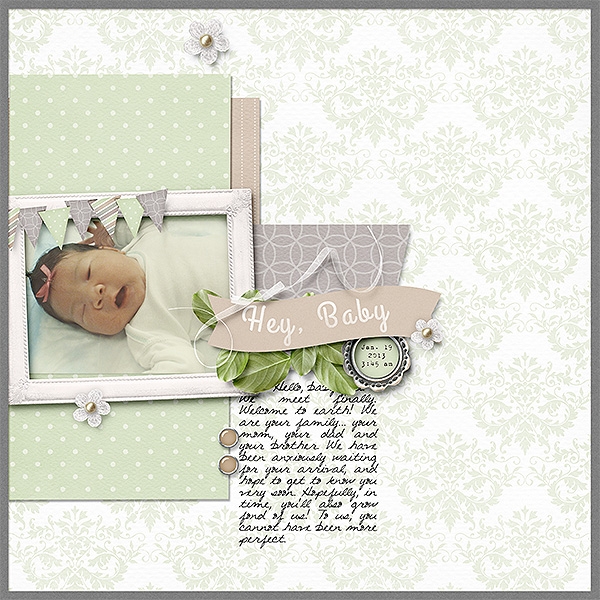
How is your January scrapping coming? I was just over looking at the gallery at Scrap Orchard. I found a layout I wanted to share. Zanthia122 created a sweet layout of her wonderful little baby. She used CTR {Eternal}. Aren’t the grays and light greens just elegant together?
Check out CTR {Eternal}. I’ve linked you up to the market.
Hugs!
