CU Sparkle {Trims} Playdate | Digital Scrapbooking Week In Review

Hello Friends!

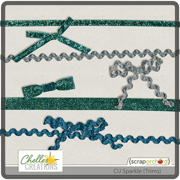
Hope you are having a great weekend and getting ready for the Holidays! Chelle’s been working on DSD Digital Scrapbooking Day – only 7 days away! This week’s release will help you get your sparkle on. CU Sparkle {Trims}.

cc_CU_sparkletrims

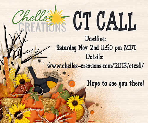
Chelle is having a Creative Team {CT} Call. Want to be part of the team? Get the “deets” by clicking on the image.

chelle_ctcall_fall2013

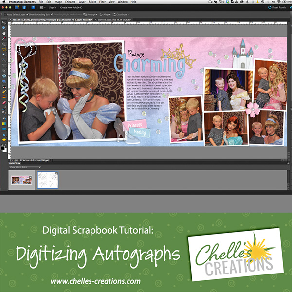
We’ve another Digital Scrapbook Tutorial on Chelle’s You Tube Channel. Want to learn how to Digitize Autographs?

vidimg_digitizesigs

Hope to see you here next week!


10.24 Tutorial: Adding Texture

10.24 Tutorial: Adding Texture

Hi everyone! *waving* Can you believe it’s almost the end of October!? I think I say this every time a month’s end is close! It’s Jenn (jk703) here to share a fun and I think unique way for adding texture on our pages. I often try to change up the textures on papers, elements, frames, and even fonts. Adding a style, using a blend mode and trying out new Filters in Photoshop are my favorite ways to do this. Often times, I use watercolors to add a little “see-through” color to my pages…but there are times when I wish they could be a little more substantial, and act as another element. Today, I’m going to give you a few tips about Adding Texture and I’m focusing on Chelle’s Painted Overlays.

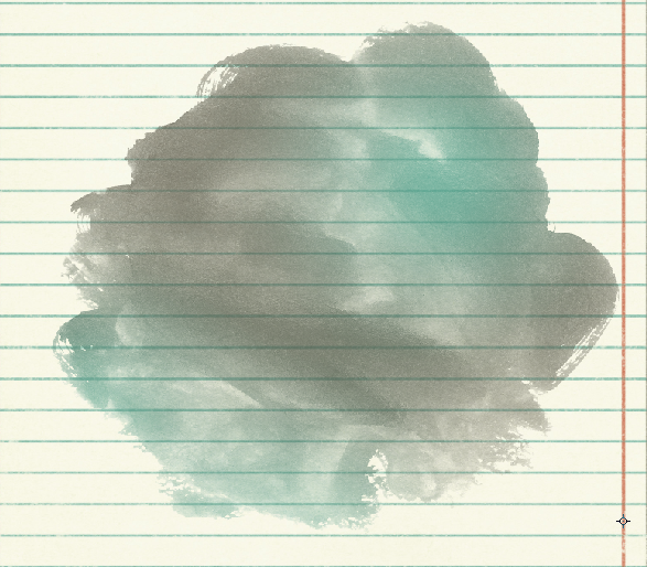
For my example images and layout, I used Chelle’s Aviator Kit, the Painted Overlays and a template from Scrapping with Liz. I’ve taken a light colored paper, and one of the few watercolor paints and opened them in Photoshop. My watercolor is above my paper, like so:
Texture1

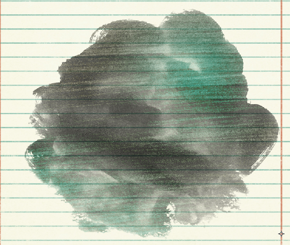
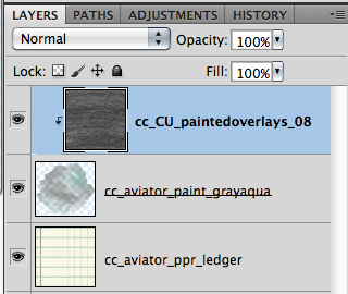
Next, I decide on which of the fun painted overlays I want to use, and I bring it in my layout. I place it above the watercolor paint. I also right click on the painted overlay, and choose Make Clipping Mack. This way, the overlay is clipped to the paint. Your paint will look funny right now, but we will fix it!
Texture2

Next, adding texture is as easy as changing the blend mode. Here are a few that I liked.

Overlay:
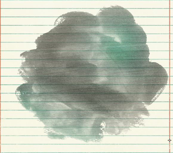
Overlay

Vivid Light:VividLight

Luminosity

Luminosity

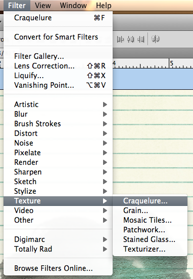
I have decided to leave the Painted Overlay on the Overlay blend mode, lol! :) Now… let’s make that texture stand out just a little bit.Texture9Click on Filter > Texture > Craquelure:Texture6
A big menu screen with lots of options will pop up, and the side with the preview will look black. (At least mine did!). Play around with the settings on the right – Crack Spacing, Crack Depth, and Crack Brightness to see what happens to the painted overlay. It will all change and look different. I decided on 49 for Crack Spacing, 9 for Crack Depth, and 10 for Crack Brightness.
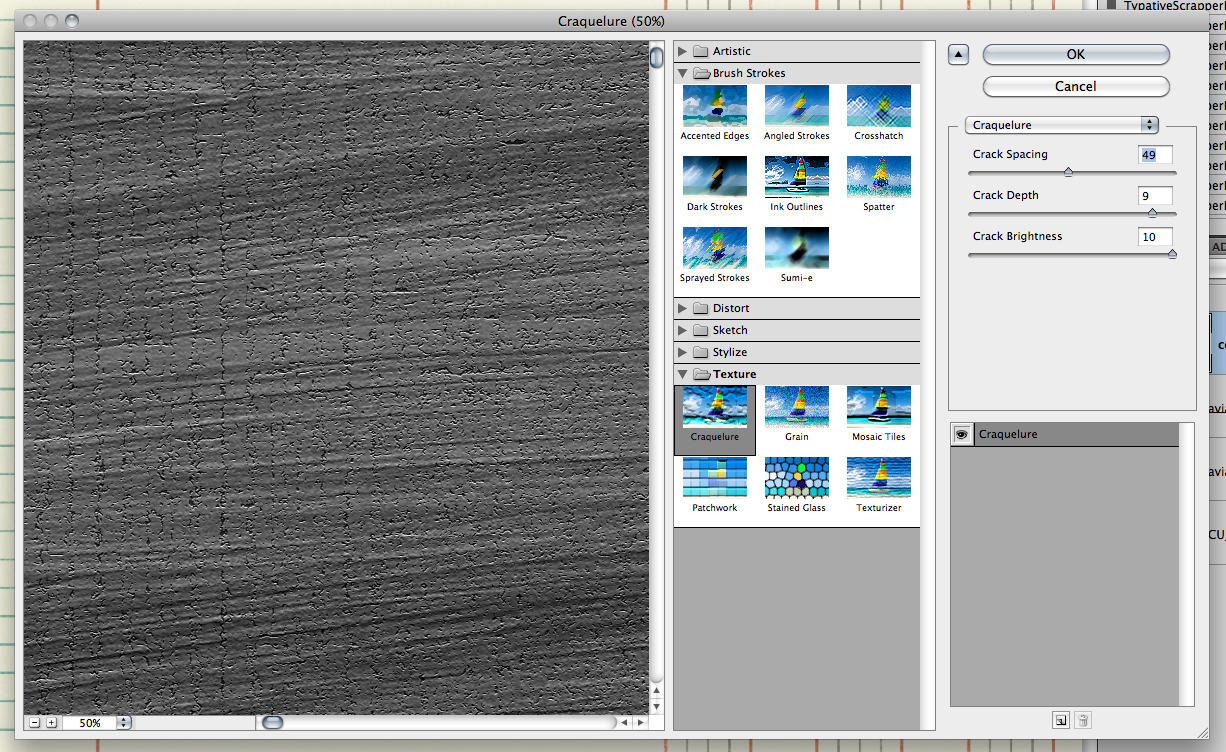
Texture7

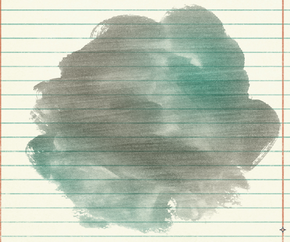
Click OK when you decide what you like. Here is what my paint looks like – it adds just a little texture:
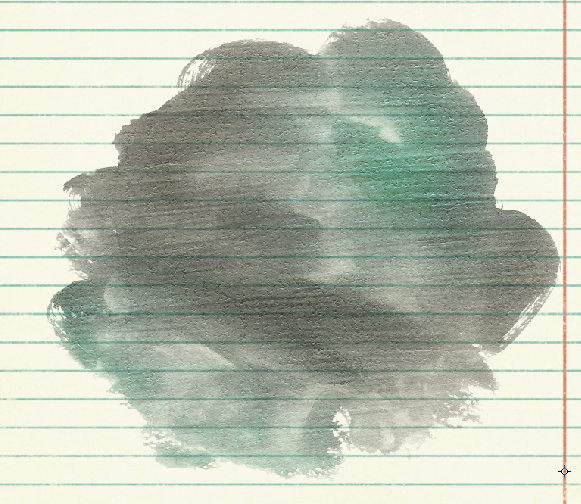
Texture8

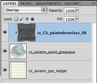
Here is my Layers Palette and what settings I have my layer on just in case your version looks different! I have the Overlay Blend mode at 100%, then I applied the Craquelure Filter and ta-daa!

Texture9

Here is the final page that I created – and yes, I changed out the graph/lined paper to a plain paper because my layout just called for a clean look.
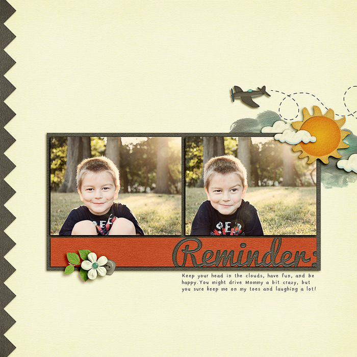
SO_CC_Aviator_SwlSimpleCalTopp_Pacifico_LDTeachHand_ReminderColin2013_WEB

Here is a detail of the clouds that I made using the textured watercolor paint. I just couldn’t chop my son out… that devilish look just makes me shake my head and laugh at the same time! But, take a look at the clouds below, a little texture can change the way you look at some elements! Cool, right!

Texture Detail

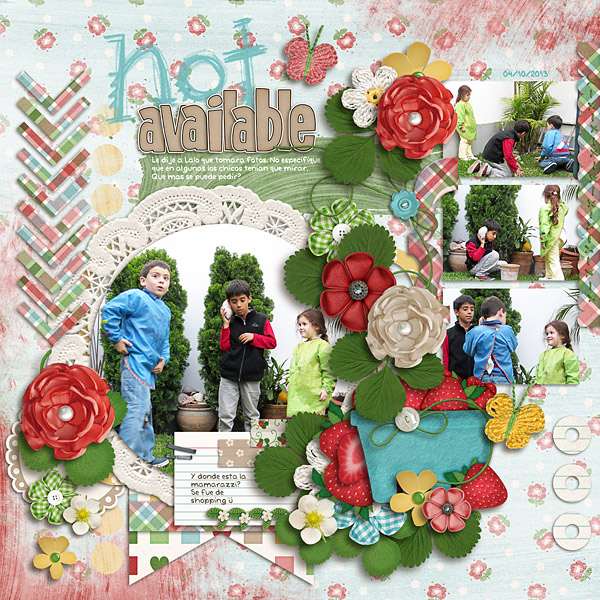
Roxana (Roxanamdm) created this fun page using the Painted Overlays, Berry Berry Sweet Kit, and the Marker Alpha.  She said to add texture to the paints, she used mostly Divide, Soft light and Overlay blending modes plus played with the % opacity. She also did the same for the background, so the colors werent too strong.
nomamarazzi-web

Helen (winipeg1) made this adorable page. She used Summer Lovin’ and Chelle’s Painted Overlays.  For her paint, she used the transparency tool and then duplicated the layer, and flipped it to put it along the bottom also. You can also see she added a paint effect to the paper with her journaling.

Helen-painted-overlay

There you go! Now, go try adding texture to your watercolors or paint spots, even your backgrounds and frames!  We’d love to see what you create, so let us know if you tried a tutorial, and link us up in the comments! Have fun, and thanks for visiting. Have a great week!


by_Jenn

Chelle’s Creations Creative Team Call Fall 2013

chelle_ctcall_fall2013

Hey Scrappers!  I’m looking for enthusiastic scrappers who love to create with Chelle’s Creations products and are excited to share their creations.

Here’s a few of the details:

Requirements:

  • 4 layouts per month (2 assigned, 2 free choice) posted in 4 high traffic places.
  • Up to 6 special projects per year (make a cluster/quickpage/etc)
  • Participate in forums & promote Chelle’s Creations

Benefits:

  • full access to my personal use items & CU items for personal use.
  • fun & friendship.

Full time spots require a commitment of at least 6 months.  Guest spots are also available.

To apply, complete this form.

Deadline to apply is Nov 3rd at 11:59 pm MDT.

Hope to hear from you soon!

by chelle

Be Controversial | Digital Scrapbooking Words on Wednesday

Hello!

Be Controversial? I’m not usually into controversy, but it’s a great idea in digital scrapbooking. It’s a great for titles or for capturing action. Here are some ideas that I came up with. I”m sure you’ll have plenty of your own.

Seriously? You did WHAT?
I hate Mac & Cheese.
Fall is my favorite season.
Red cars get pulled over more often by police.
I-pads are the best tablets.
I am not what you would call a handy man.
If I wanted to be a deliveryman, I would wear brown.
Zebra is the best animal print.
Football is better than baseball.
Dance Recital or Piano Recital
Home Canning is not for me
I will never be in the Tour de France.

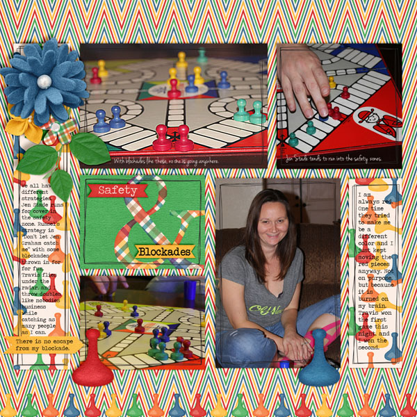
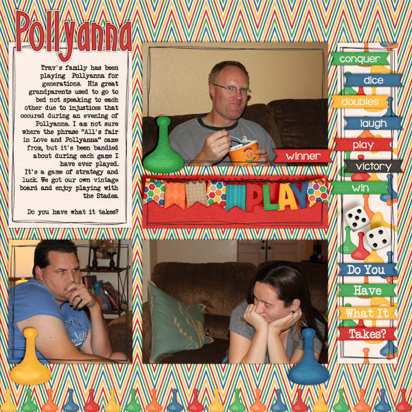
Here are the ideas the Creative Team came up with. Both ladies ended up using Chelle’s “Game On” kit. Both also wrote about avoiding controversy with points or winners. It helps improve {good} sportsmanship! Great minds think alike!

Wendy (NeverlandScraps)

Wendy (NeverlandScraps)

Jen G LO Right (grahamlikethecracker)

Jen G LO Right (grahamlikethecracker)

Jen G Right(GrahamLikeTheCracker)

Jen G Right(GrahamLikeTheCracker)

Try using controvery in your next digital scrapbooking layout.
Hugs!

Classics: Scribbles 2 Alpha

Ever feel the need to add a hand-written touch to your digital scrapbooking pages? You could grab some colored pencils and doodle a title right on your page after you print it, or you could just use Chelle’s Creations Scribble 2 Alpha. Chelle did all the hard part for you. All you have to do is plop those individual letters onto your page. Her team has been busy creating layouts to show you this alpha in use.

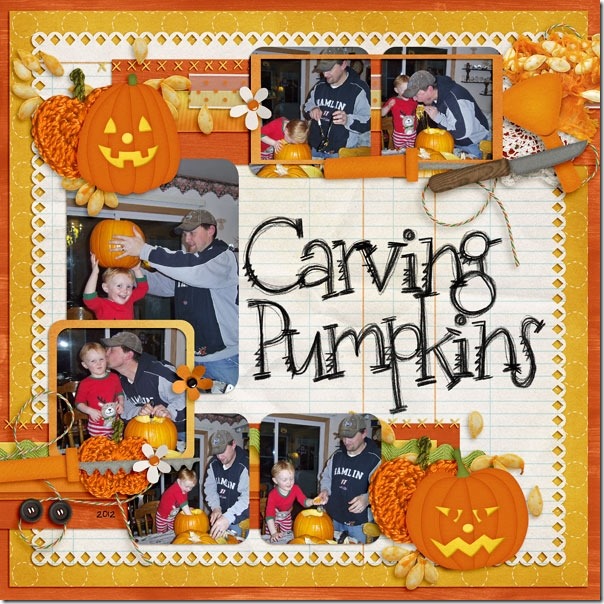
Jenny has a great page for this time of year. She used Chelle’s Carve it Up kit with the Scribbles 2 alpha in black – a perfect combination. I love the effect of the scribble writing on the trimmed notebook paper. It really adds to the texture well. 30707

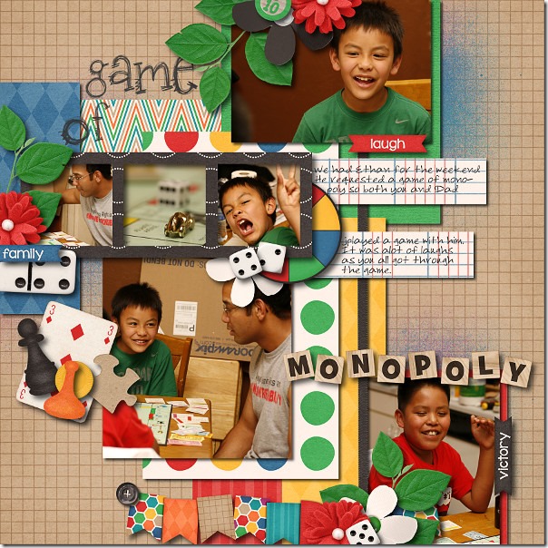
Next, Ophelia has used Chelle’s new Game On kit with the Scribbles 2 alpha in a gray shade, perfectly matching the hue of the grays in the kit. Looks like that Monopoly game was a ton of fun!  2013-05-28-gameofmonopoly_sm

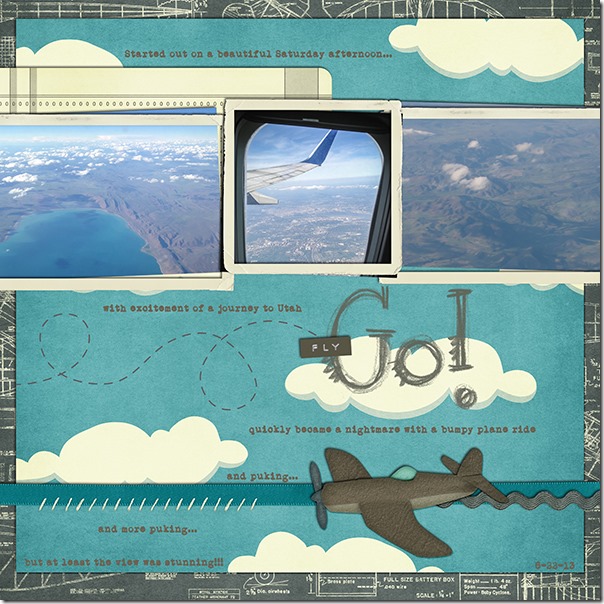
Finally, Jenn had a flight to Utah in which she was able to capture some gorgeous shots of the scenery out of the window. Even though the flight didn’t go well after those first few images, she made the best of it by creating this beautiful page. She also used the alpha in a gray color to match the grays in Chelle’s Aviator kit. 39_2013_flyGO_600_zpse8c72cf5

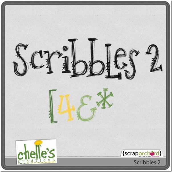
The Scribbles 2 alpha (preview shown below and linked to the market) comes in black AND it comes with brush files making it ultra easy to recolor to match any color on your layout. Need some help? Chelle has lots of videos on her YouTube channel that teach you how, and she has one specifically for this alpha. Check it out here. cc_scribbles2

by_Cheryl

Gallery Stand Outs | Digital Scrapbooking Layouts

Happy Monday!

I have some fun, new digital scrapbooking layouts to share with you from the Scrap Orchard Gallery. Have you been there? I start to admire everyone’s work and next thing I know, it’s been a while. The layouts are amazing.

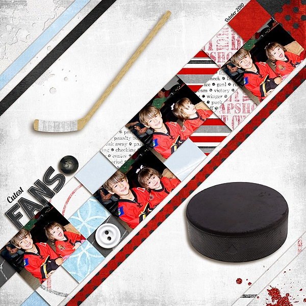
First look at this great layout by Mom2Jackaia. The contrast between red and white is very cool and the touches of blue add dimension.

Mom2Jackaia She used Penalty Box.

Mom2Jackaia She used Penalty Box.

She used Penalty Box.

cc_penaltybox_kit

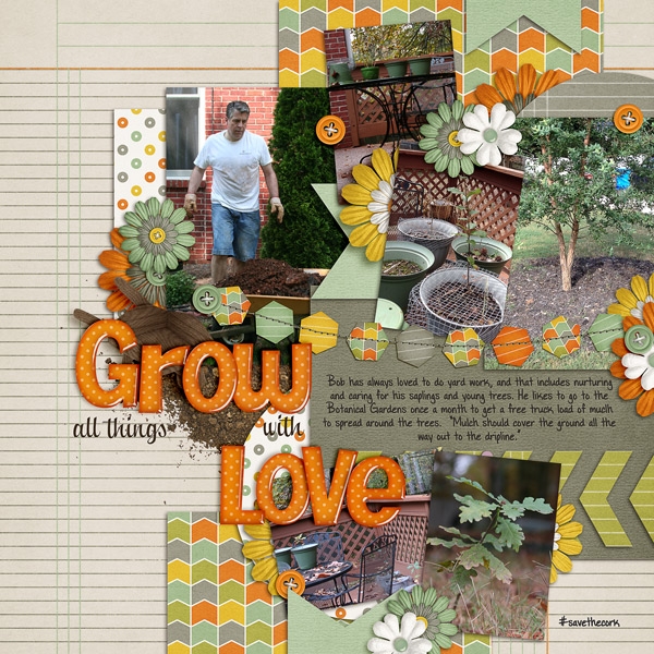
DigiCheryl created this wonderful tree-inspired layout. The colors work well together with her little trees, lovingly taken care of by her husband. I really like the flower clusters spread throughout the layout.

DigiCheryl She used See Clearly Now

DigiCheryl She used See Clearly Now

She used See Clearly Now.
cc_seeclearlynow

Hugs!